The network for creativity
Join 1.25M professional creatives like you
Connect with clients, get discovered, and run your business 100% commission-free
Creatives on Contra have earned over $150M and we are just getting started
Back to feedPost
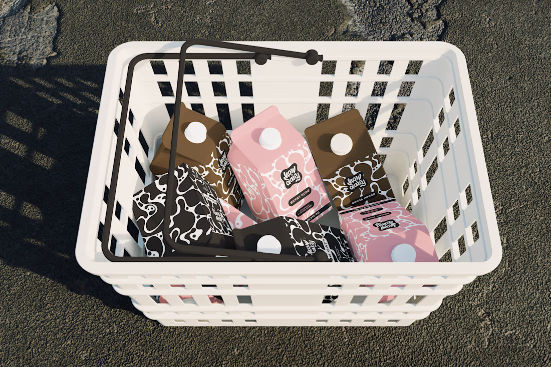
Every milk brand wants to be "bold."
However, most of them just slap a cow on the carton and call it a day.
How Dairy needed to actually feel bold. Not "we added a sans-serif" bold. Bold as in: you see it from 10 feet away and you already know it's not the same organic plain thing you've seen 50 times.
I built the brand identity and packaging system from scratch. The name does the heavy lifting tonally (playful, modern, irreverent), so I let the visual system match that energy: high-contrast colors, type hierarchy, and zero overused dairy imagery. The carton design reads more like a streetwear drop than a dairy aisle staple.
The goal: make someone grab it because it looks like it has personality and speaks to their values, not just protein content.
If your product is blending into the shelf, let's talk → contra.com/shakya_vaughn
#PackagingDesign #CPG #BrandIdentity #FoodAndBeverage
Brand StrategyPackaging DesignAdobe IllustratorpackagingdesignexpertsbranddesignerBrand DesignAdobe Photoshop
The network for creativity
Join 1.25M professional creatives like you
Connect with clients, get discovered, and run your business 100% commission-free
Creatives on Contra have earned over $150M and we are just getting started
Related posts
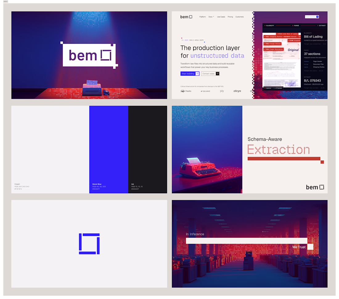
I've had so much fun working on bem. Came in with logo marks and colors, and we're looking for an identity to call home. After doing some research and inspiration exercises, we came up with this concept, which I absolutely love.
Impressive work !
Designed and developed the complete brand identity and digital experience for The Mine, a boutique cinematography studio.
From the logo and visual identity to UX/UI, art direction, 3D visual elements, motion design, and full website development, every aspect was crafted to reflect the studio's cinematic approach. Inspired by the concept of a mine, the visual language features floating stone formations, creating a distinctive and memorable brand experience.
The website also features a fully custom cinematic navigation system, replacing conventional page browsing with an immersive storytelling journey through smooth transitions and carefully choreographed interactions.
Wow! Such an UNEXPECTED experience! 🤩✨️
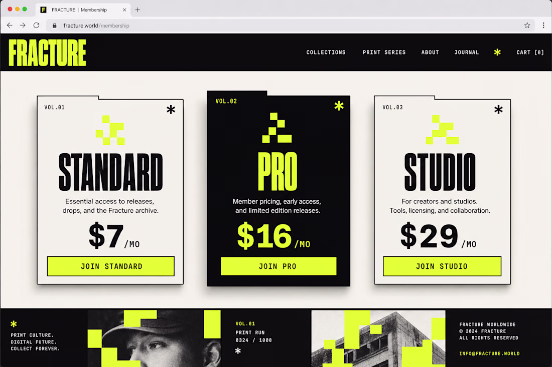
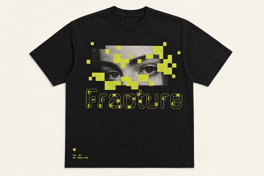
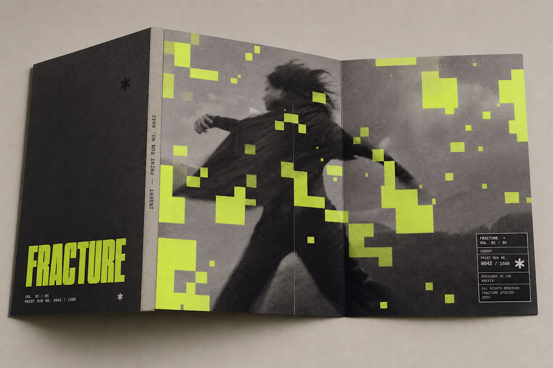
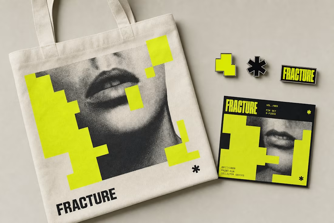
Fracture's identity doesn't stop at posters — it survives a t-shirt, a pin set, a phone screen, and a mailer box without breaking the rule: yellow blocks occlude, never distort. Same system, five very different surfaces.
See the full case study → Check it out
Used my 1st upgoat on this platform. Amazing job!
Challenges
View allTrending
Claude
Claude has entered the design space. How are you using Claude Design?
Contra University
Learn from expert creatives how to earn more using next-gen AI tools.
fifaworldcup2026
The World Cup is here and the whole world's watching. How are you designing for the world stage?
creativeaiflow
Creative AI workflows are evolving. What tools do you use, and what are their strengths and weaknesses?
freelancerlife
Freelancer life is wins, pivots, and everything in between. What’s yours right now?