The network for creativity
Join 1.25M professional creatives like you
Connect with clients, get discovered, and run your business 100% commission-free
Creatives on Contra have earned over $150M and we are just getting started
Back to feedPost
Taste Test

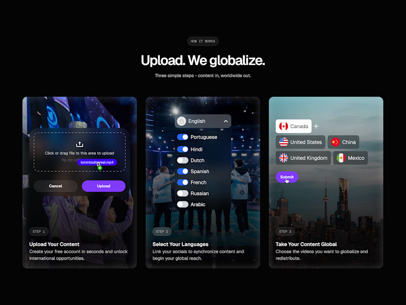
Been going back and forth on this "How It Works" section, trying to incorporate assets that resonate with the brand of the client, but it just didn't feel right.
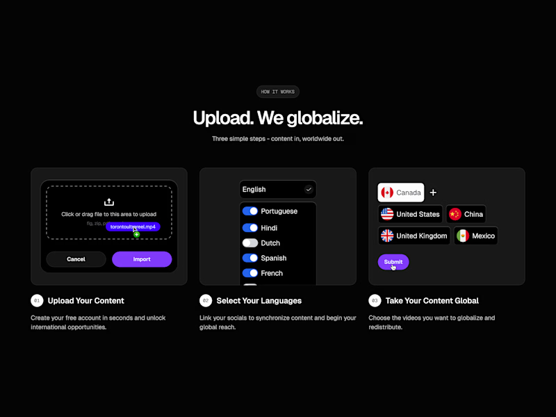
I ended up settling on the much more minimal and cleaner design.
Which one do you prefer?

45 voted
58%
32 voted
42%
77 votes
Closed

Thank you!

that is a great one right there
Thanks!

Option A for me
Thanks Jonathan!

B for me. The focus stays on the feature and the flow is much easier to scan.
It’s clear, direct, and doesn’t fight for attention.
In A, the background becomes the hero, not the feature, and that hurts comprehension.
Thanks Juan! I had the same thought, what's most important here is the content, not necessarily the flashy imagery
I felt as if they were fighting for attention and it didn't become clear what the copy was trying to convey on first glance

For me I choose option B its more clear, ui feels modern but doesn't deviate the user from the info they want to get clearer description on how it works. Even tho option A feels visually appealing it deviates users from the information they are trying to get on how it works hence leads to confusion later on
Nailed it, my thoughts exactly!

Thanks!

i love option A

Option B feels much more premium. While A has nice personality, the minimal version (B) makes the globalization concept feel faster and more efficient. Great call on the pivot!
Thanks Rana! I agree, I felt what was more important was the content not necessarily the imagery
I feel Option B is easier to scan and gets right to the point, which is the overall goal with this section

Option B feels cleaner and more minimal. Both are strong but B has better visual flow!
Thanks Stephanie! I agree

B looks more cleaner😊
I agree Muhammad!


I will go with B. I am a fan of clean and less clustered interfaces .
Thanks Onifade! I agree
You are welcome

UI designers Chose A, UX designers Chose B, Motion deigners; Both 😂
LOL this is the best comment so far

B looks good

I always prefer non-clutter, but in this "Option A" is the winner!!
Thanks Sufyan!

B for me, looks clean!
Thanks Shobrun!

option B is cleaner but honestly both look solid! the minimal approach really lets the content breathe
Thanks Faith! I'm leaning towards the minimal approach myself, wanting to focus on the content and let the imagery support it rather than take away from it

The minimal design works much better for digital products imo... The other one is a little over the top for a rather technical section ig
Yeah I agree. For sections with detailed and complex copy, minimal is always a good way to go

this is rlly good!
Thanks man!

B all the way

Always 🙌

Thanks man!

B works 🙌

I’ve had clients ask for more visuals here, but after launch we usually notice the cleaner version performs better. Less thinking required
Exactly. Clarity and communication of the idea always wins in the end. Don't make it harder for the user to understand what you do haha
The network for creativity
Join 1.25M professional creatives like you
Connect with clients, get discovered, and run your business 100% commission-free
Creatives on Contra have earned over $150M and we are just getting started

Challenges
View all


Related posts


“Or similar” leaves a lot to the imagination.
A few billboard designs I made for Sync as part of the rebrand. The campaign centres on a simple promise: the car you see is the car you drive.
I kept that message big and direct, with the cars up close and enough pink to make you look twice.
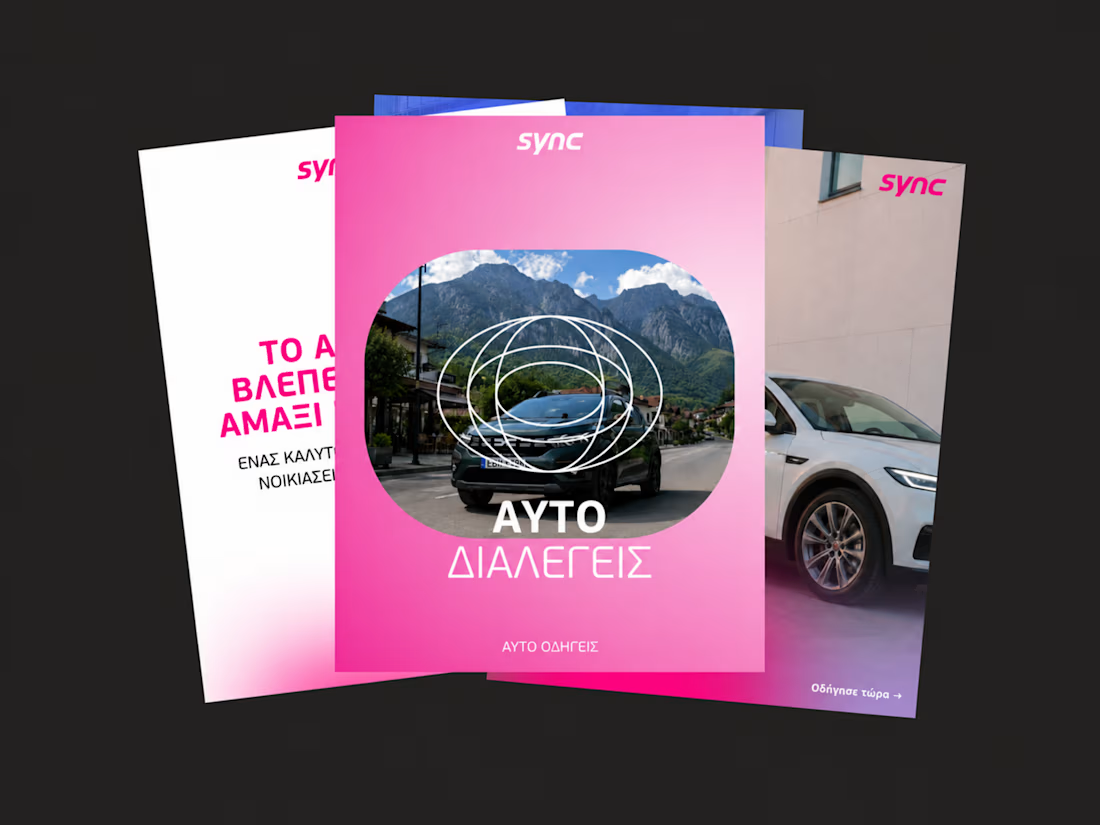
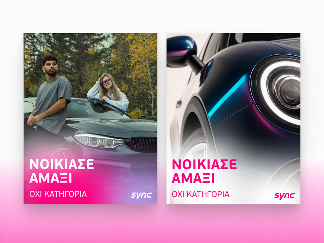
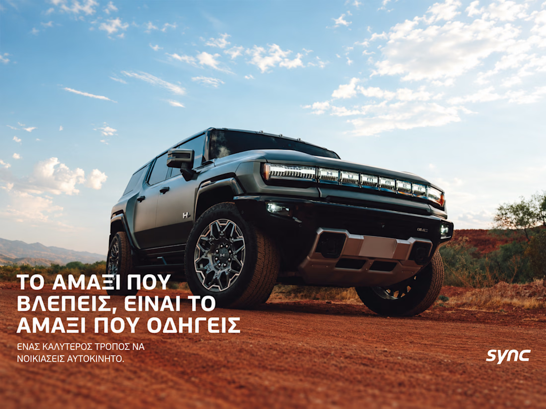
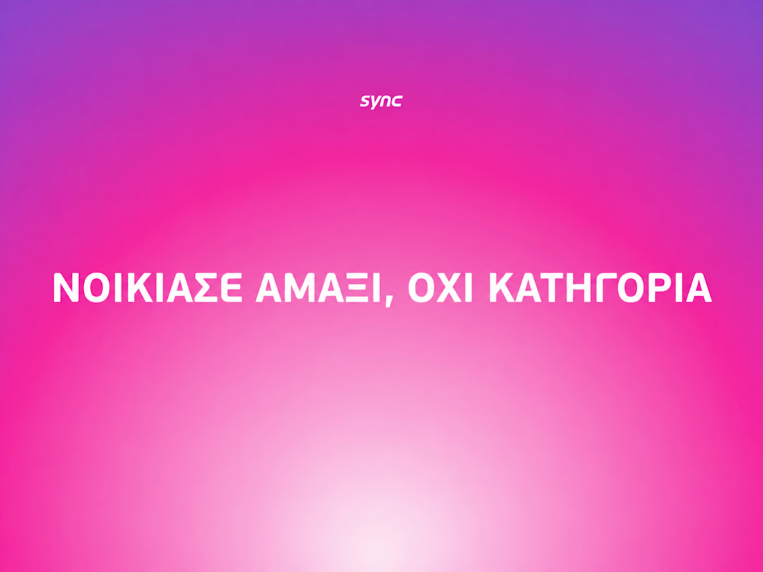

The way the oversized promise carries through the pink palette is really effective—the close-up crops make the car feel immediate without losing the campaign idea.

did some home cleaning - works page is now my homepage
i've lost over 50% of traffic because people dropped off on my previous homepage (about now) that didn't give any value
check it out yourself: https://seb-astian.com

looking great! i love that loading animation.

SENE car rental Website Projects
A car rental website shouldn't make people think too much. It should help them find the right car, understand the price, trust the service, and book with confidence.
I designed SENE around exactly that principle.
Need a website that turns visitors into customers?
I help businesses create modern, conversion-focused websites that look premium and make the user journey easier.
Available for website design & redesign projects.

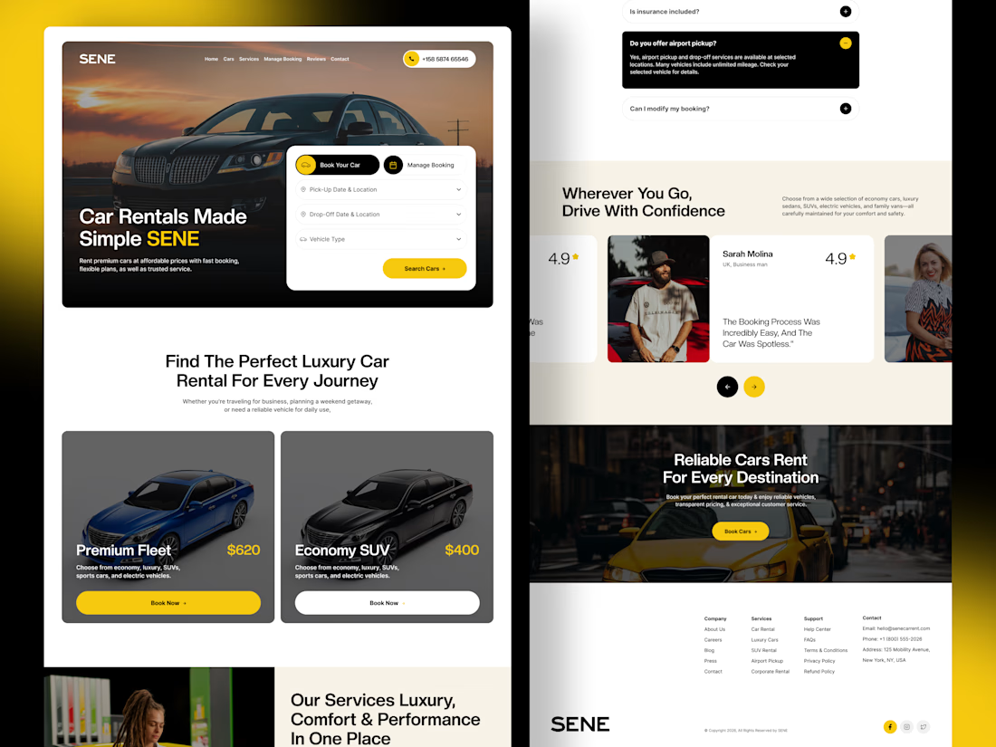

The composition is extremely clean and well organized. It’s impressive how you managed to fit so much information into the layout while keeping everything visually comfortable.