The network for creativity
Join 1.25M professional creatives like you
Connect with clients, get discovered, and run your business 100% commission-free
Creatives on Contra have earned over $150M and we are just getting started
Back to feedPost
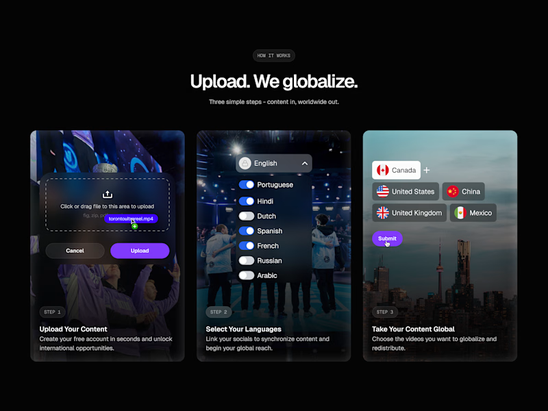
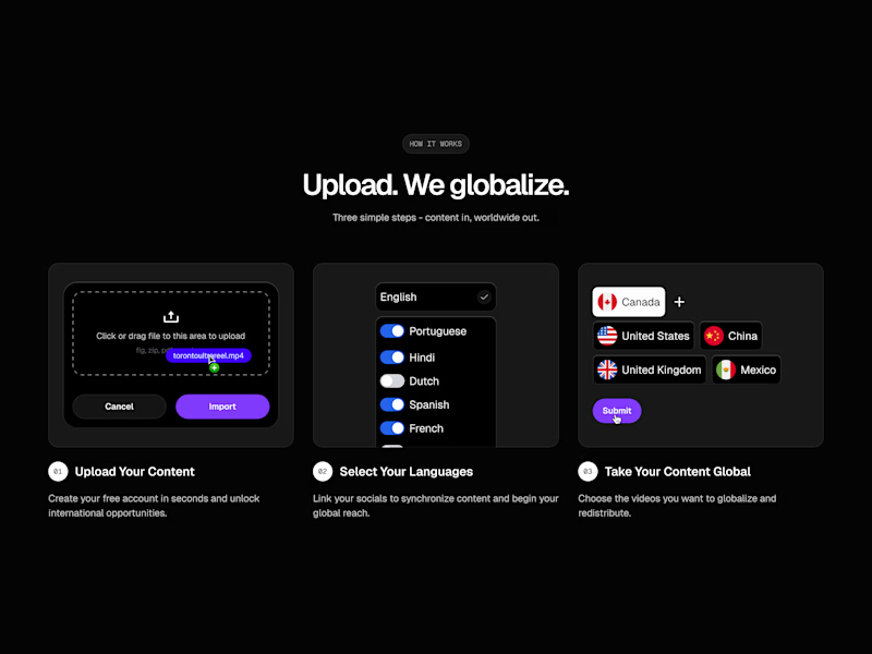
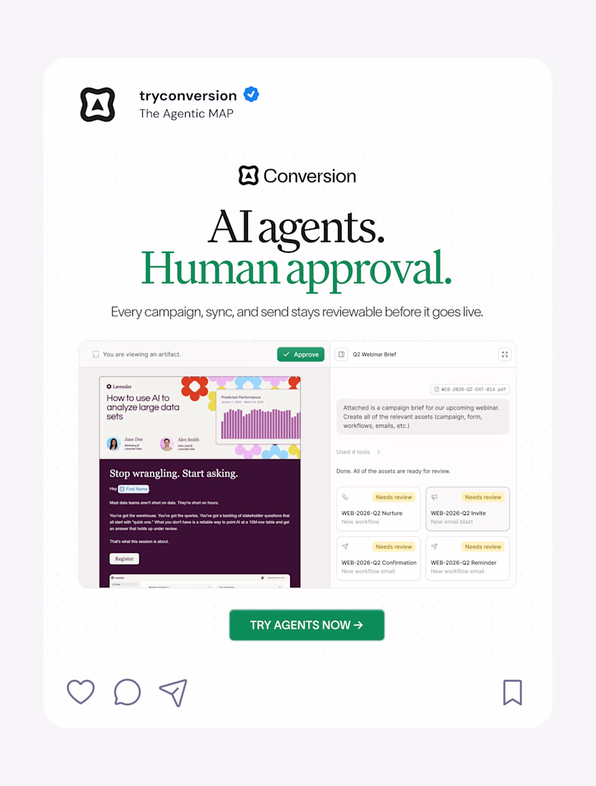
Taste Test
Been going back and forth on this "How It Works" section, trying to incorporate assets that resonate with the brand of the client, but it just didn't feel right.
I ended up settling on the much more minimal and cleaner design.
Which one do you prefer?
45 voted
58%
32 voted
42%
77 votes
Closed
Thanks man!
Thank you!
that is a great one right there
Thanks!
Option A for me
Thanks Jonathan!
B for me. The focus stays on the feature and the flow is much easier to scan.
It’s clear, direct, and doesn’t fight for attention.
In A, the background becomes the hero, not the feature, and that hurts comprehension.
Thanks Juan! I had the same thought, what's most important here is the content, not necessarily the flashy imagery
I felt as if they were fighting for attention and it didn't become clear what the copy was trying to convey on first glance
For me I choose option B its more clear, ui feels modern but doesn't deviate the user from the info they want to get clearer description on how it works. Even tho option A feels visually appealing it deviates users from the information they are trying to get on how it works hence leads to confusion later on
Nailed it, my thoughts exactly!
Thanks!
i love option A
Option B feels much more premium. While A has nice personality, the minimal version (B) makes the globalization concept feel faster and more efficient. Great call on the pivot!
Thanks Rana! I agree, I felt what was more important was the content not necessarily the imagery
I feel Option B is easier to scan and gets right to the point, which is the overall goal with this section
Option B feels cleaner and more minimal. Both are strong but B has better visual flow!
Thanks Stephanie! I agree
B looks more cleaner😊
I agree Muhammad!
I will go with B. I am a fan of clean and less clustered interfaces .
Thanks Onifade! I agree
You are welcome
UI designers Chose A, UX designers Chose B, Motion deigners; Both 😂
LOL this is the best comment so far
B looks good
I always prefer non-clutter, but in this "Option A" is the winner!!
Thanks Sufyan!
B for me, looks clean!
Thanks Shobrun!
option B is cleaner but honestly both look solid! the minimal approach really lets the content breathe
Thanks Faith! I'm leaning towards the minimal approach myself, wanting to focus on the content and let the imagery support it rather than take away from it
Your work on this project is impressive.
Thanks Koushik!
The minimal design works much better for digital products imo... The other one is a little over the top for a rather technical section ig
Yeah I agree. For sections with detailed and complex copy, minimal is always a good way to go
this is rlly good!
Thanks man!
B all the way
Always 🙌
B works 🙌
I’ve had clients ask for more visuals here, but after launch we usually notice the cleaner version performs better. Less thinking required
Exactly. Clarity and communication of the idea always wins in the end. Don't make it harder for the user to understand what you do haha
The network for creativity
Join 1.25M professional creatives like you
Connect with clients, get discovered, and run your business 100% commission-free
Creatives on Contra have earned over $150M and we are just getting started
Related posts
New resource: Auria AI Rebuild Prompt ✦
I turned the complete Auria homepage into one detailed prompt for Codex and Claude Code.
Auria is a luminous Framer template created for modern service businesses, wellness brands, and productized offers.
Usually $19. Free for anyone who supports Auria on its Framer Marketplace page.
Get the prompt:
https://startfrom.co/templates/auria
Created with Framer, Midjourney, Claude Code, and Codex.
Rebuilding a whole landing page with just one prompt is such a cool experiment, Alex! Did Claude Code manage to handle the Framer-specific layout structure well on the first try?
recent static ad work for an AI-native B2B marketing automation platform
Nice work as usual! The layout balance here is exactly what makes high-converting landing page hero sections work.
⚡ Just published my latest case study: ChargeIndia.
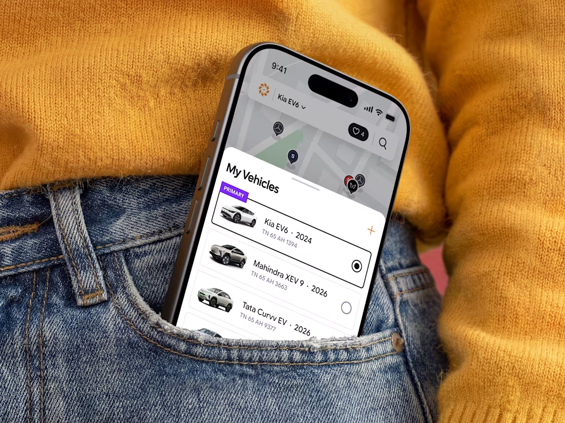
Branding and Mobile app for an EV charging platform focused on creating a seamless, scalable, and user-friendly charging experience.
Proudly made for the Indian market.
Amazing work!
Trending
Claude
Claude has entered the design space. How are you using Claude Design?
Contra University
Learn from expert creatives how to earn more using next-gen AI tools.
creativeaiflow
Creative AI workflows are evolving. What tools do you use, and what are their strengths and weaknesses?
freelancerlife
Freelancer life is wins, pivots, and everything in between. What’s yours right now?