The network for creativity
Join 1.25M professional creatives like you
Connect with clients, get discovered, and run your business 100% commission-free
Creatives on Contra have earned over $150M and we are just getting started
Back to feedPost
Seasonal identity for Beat Film Festival. The challenge: create a concept where cinema helps audiences process a turbulent cultural and historical moment — staying relevant and resonant rather than offering escape from it.
The identity metaphor for BFF is a shared journey —
audience and festival alike searching for solid ground.
"Get on Board" is an invitation to hop into the same boat, riding together the waves of emotion sparked by film and shaped by the turbulence around us. Beat becomes the lighthouse in that storm — a sense of safety, belonging, and a moment worth sharing.


Great work!

Great concept — the shared journey idea gives the festival identity a meaningful story.

The shared-journey metaphor carries beautifully through the system—especially the mix of cinematic imagery and bold, editorial type. The “Get on Board” language makes the identity feel participatory rather than just promotional.

The shared journey metaphor is a smart way to handle a heavy subject without leaning on escapism. How has the audience responded to it in person, does it read the way you intended?

The concept primarily serves as a solid buildup/foundation for a spectrum of sensations and ideas. While I can’t fully isolate the specific effectiveness of the design itself, I am confident that, combined with the copywriting and marketing, the concept was perceived as the team had envisioned


the red circle on the poster is so good

The gradient makes the whole identity special, what do you think?
The gradients here are a consequence of the concept. The graphic technique on its own would not be nearly as powerful without the idea behind it.
Yep, you are absolutely right

Looks amazing!

Amazing work Evgeny!

Great work!!


This is such a fresh and innovative take. So inspiring! 😍

Good Work!!!

Love the copy on the last card in frame 4 , great work🙌

Super cool job Evgeny! These look 🔥

Love this direction! 👌

The lighthouse as the calm point in the storm metaphor gives the festival brand something to hold onto beyond just illustrating turbulence.

Such a clean design! 💙


Cool overlay graphics style! 🤩

Wow! Amazing😍

he concept of cinema as a tool to process turbulent times rather than escape them is incredibly powerful. The 'shared journey' metaphor translates beautifully into this raw visual identity.

Composition looks great. Loved it.

Love this direction

The "shared journey" framing is really powerful for this kind of brief. Using cinema to sit with the turbulence rather than escape it takes real conviction to pitch. The visual tension in these posters carries that weight well.


Nice work👏🔥🔥

Love the movement in the gradient and the colour palette communicates the industry so well when combined. Great work.

Love it! More Kubrick than Kubrick 😊
The network for creativity
Join 1.25M professional creatives like you
Connect with clients, get discovered, and run your business 100% commission-free
Creatives on Contra have earned over $150M and we are just getting started





Related posts

Brand identity work for WesoftAI


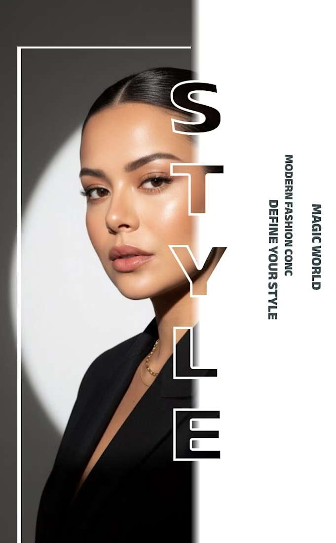
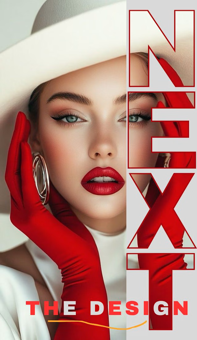
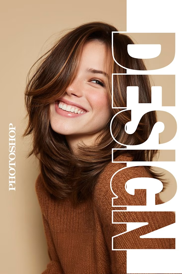
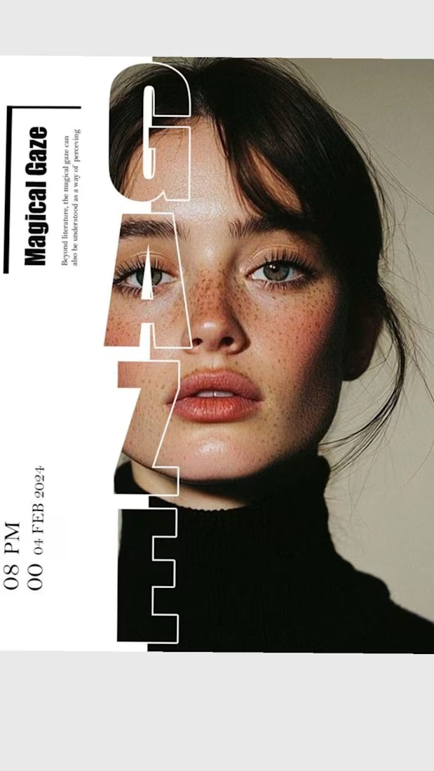
✨ Modern Fashion Poster Design - STYLE ✨
Designed a clean, high-fashion poster concept focusing on bold typography and minimalist aesthetics.
Concept: Modern Fashion | Define Your Style
Tool: Canva / Photoshop
Style: Luxury, Minimal, Editorial
Open to feedback and freelance work!
#GraphicDesign #PosterDesign #FashionDesign #Canva #ContraCommunity


The way you let the bold type dominate the empty space really drives the luxury feel.

A new visual direction for Friedrich Naumann Foundation - Jordan.
I developed a visual sub-identity for the “Nau Media” project, a media training initiative focused on digital communication, human rights-sensitive media, and combating misinformation.
The goal was to build a distinct visual system that could stand on its own while remaining connected to the broader FNF Jordan identity.
This is an initial look at the project. The full visual identity and its applications will be shared soon.

Great visual identity I like the way you show the brand that's unique 🎉❤️