The network for creativity
Join 1.25M professional creatives like you
Connect with clients, get discovered, and run your business 100% commission-free
Creatives on Contra have earned over $150M and we are just getting started
Back to feedPost
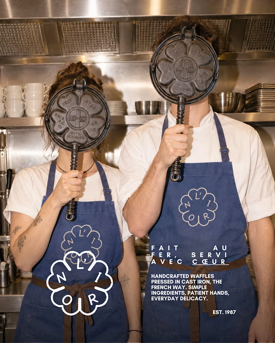
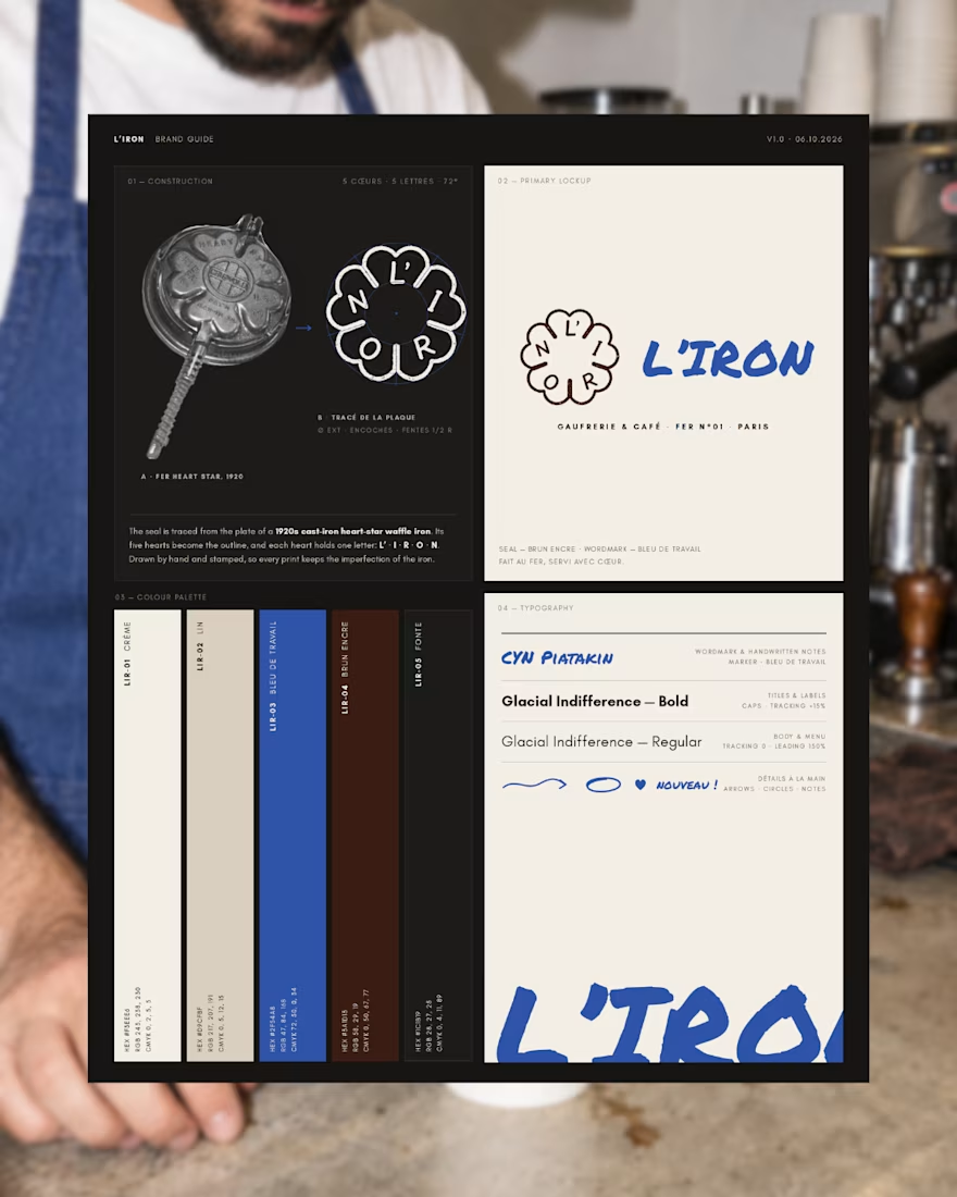
L'IRON is a brand identity for a modern French waffle house, created for the Designerbriefs weekly challenge (Brief 181). The logo is traced from the plate of a 1920s heart-star waffle iron: five hearts, five letters, L' · I · R · O · N. It works as a hand-stamped seal paired with loose blue marker notes, bringing an old iron craft into a café that feels young, warm and a little cheeky.
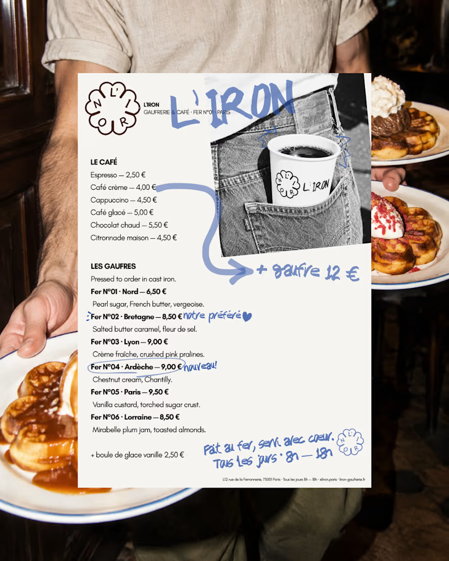
The project covers the logo, menu, packaging and a flash-lit, analog-style photo series.
Would you order a waffle from L'IRON? I'd love to know what you think of the logo and if it fits the brand.
See the full project on Instagram: https://www.instagram.com/p/Dd63blwDh7M/?utm_source=ig_web_copy_link&stkn=MzRlODBiNWFlZA==



this is beautiful work, wow!

Thank you so much, Nicolette! Thanks also for leaving positive comments on all my work :)

thanks Alaa 😃

Deserves more love, great work!
Thank you very much Cameron!!!

So, so gooood!
Thank you Bella! Thanks also for the GOAT!

Very good


Beautiful work, made me hungry!
Thanks a lot Natalia!!
Very good
thanks Jos

now I'm hungry aha😂
hahhaa the branding works then

😍 amazing

Premium branding


So clean!

I'd order one. The heart-star iron mark stamped on the aprons fits the cheeky tone perfectly.
THANKS!!
The network for creativity
Join 1.25M professional creatives like you
Connect with clients, get discovered, and run your business 100% commission-free
Creatives on Contra have earned over $150M and we are just getting started


Related posts

Brand New project🍓🍎🍒🫐
A colorful protein cereal bar brand for active young women. I designed the naming, logo, color system, packaging for five flavors, brandbook, social media posts and AI-generated product photography and video. The packaging was used as a reference in every image so the product looks exactly as designed.

That's really great motion graphics color palettes and visuals great packaging design ❤️❤️
Nice job Melina🔥


A little excerpt from the brand guidelines for a recent project


The APS mark built from the four small symbols reads like a map legend, which suits a psychology service. Nice that the guidelines page shows it on the dark teal, most would have played it safe on white.

Xoto brand identity and logo design for a B2B data intelligence and analytics platform. Built on Intelligence in Motion: a 45° angle and an X that turn data into direction.
Visual identity and brand system for SaaS and tech.
Visit full case study: https://www.behance.net/gallery/254709921/Xoto-Brand-Identity-Data-Intelligence-Branding


That mint is doing serious work. Never thought I'd want an analytics tote bag, yet here we are.









