The network for creativity
Join 1.25M professional creatives like you
Connect with clients, get discovered, and run your business 100% commission-free
Creatives on Contra have earned over $150M and we are just getting started
Back to feedPost

Fruzin – Let Food Be Thy Medicine
A bold, fiery brand identity for a modern restaurant that celebrates the passion, energy, and transformative power of great food.
The logo features a dynamic flame-inspired mark paired with a playful yet elegant custom script wordmark.


The network for creativity
Join 1.25M professional creatives like you
Connect with clients, get discovered, and run your business 100% commission-free
Creatives on Contra have earned over $150M and we are just getting started



Related posts

Ovéa — care with character.
One skincare identity across bottles, jars and tubes. I designed the wordmark, pink-and-cobalt packaging system, campaign applications and digital mockups, then brought the collection into motion.
A consistent visual language, with room for each product to feel individual.
View the full case study. Building a skincare brand? Let’s talk about your identity and packaging.

Love the colour direction and the visual language. Everything feels so well thought out. The overall look is beautiful.

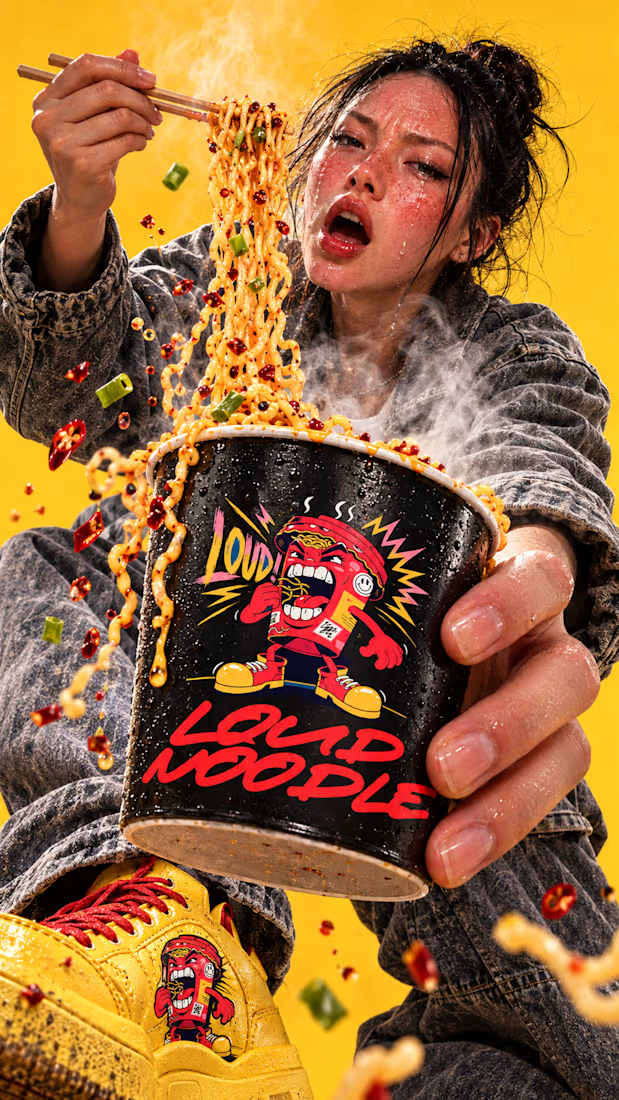
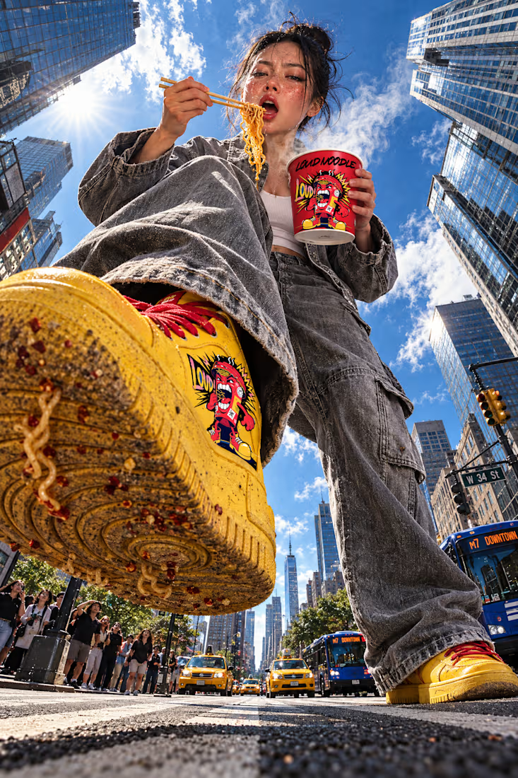
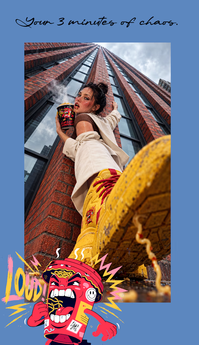
Ever cried at your own dinner and still gone back for another bite?
That’s the whole idea behind LOUD NOODLE.
Case study dropping soon. 🔥

Testing designs for a Gran Reserva wine label that needs to feel traditional, sober, and confident. I chose a design with minimal ornamentation, where information hierarchy plays a key role in a clean layout.
Which of the two do you think reads better?
13 voted
43%
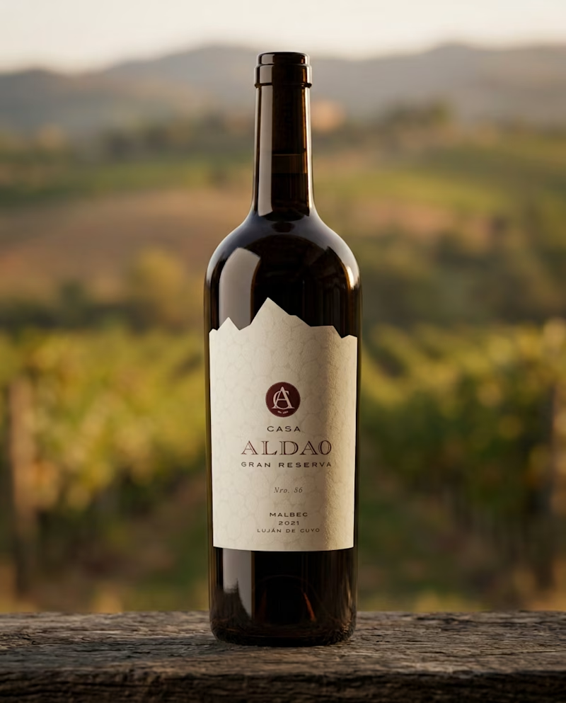
17 voted
57%
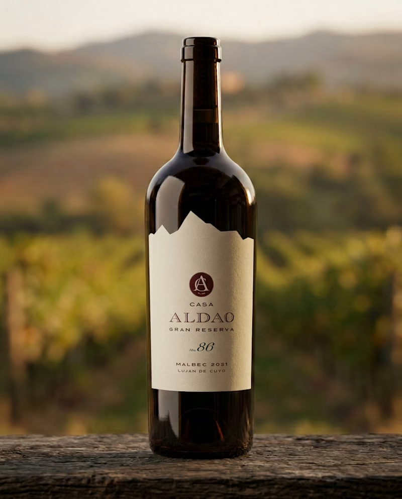
30 votes
Closed

Hola Luci! Cómo estás? Soy Argentina también!
De que provincia es el vino? Me encargo de las redes de una vinoteca en mi ciudad, y me llamó la atención. Tenemos cata este finde, y me gustaría proponer esta opción.