
MD Abdul Alim
Logo, Brand & Packaging Designer
Ready for work
MD Abdul is ready for their next project!
Ready to dominate?
👉 Say goodbye Unmemorable Logo, Branding, Social Media Post & Packaging Design Hello to memorable and Recognisable design!🌟
📩 Available for new projects
1
3
58
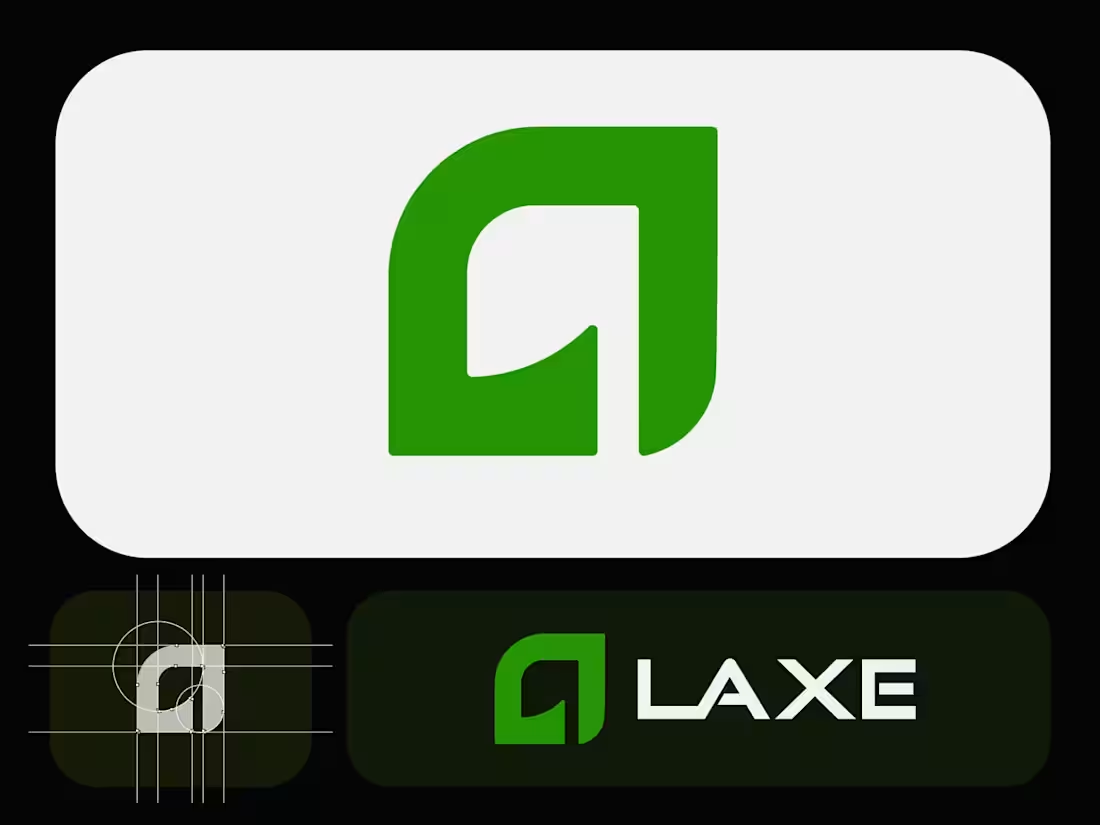
Laxe – Modern Minimalist Logo for an Axe & Tool Brand
Crafted a bold yet refined logo for Laxe, a premium axe and outdoor tool brand. The abstract mark combines a strong "L" with a subtle blade-like curve, symbolizing precision, power, and craftsmanship.Clean geometric construction, balanced proportions, and a vibrant yet sophisticated green palette make it versatile across packaging, apparel, digital, and physical products.
Focused on minimalism with just enough edge to feel tool-ready.Explored multiple color directions (deep green, red, inverted) before landing on this crisp light-background version for maximum adaptability.
What do you think? ready for the workshop or still needs more bite?
Ready to dominate?
👉 Say goodbye Unmemorable Logo, Branding, Social Media Post & Packaging Design Hello to memorable and Recognisable design!🌟
📩 Available for new projects
1
2
49
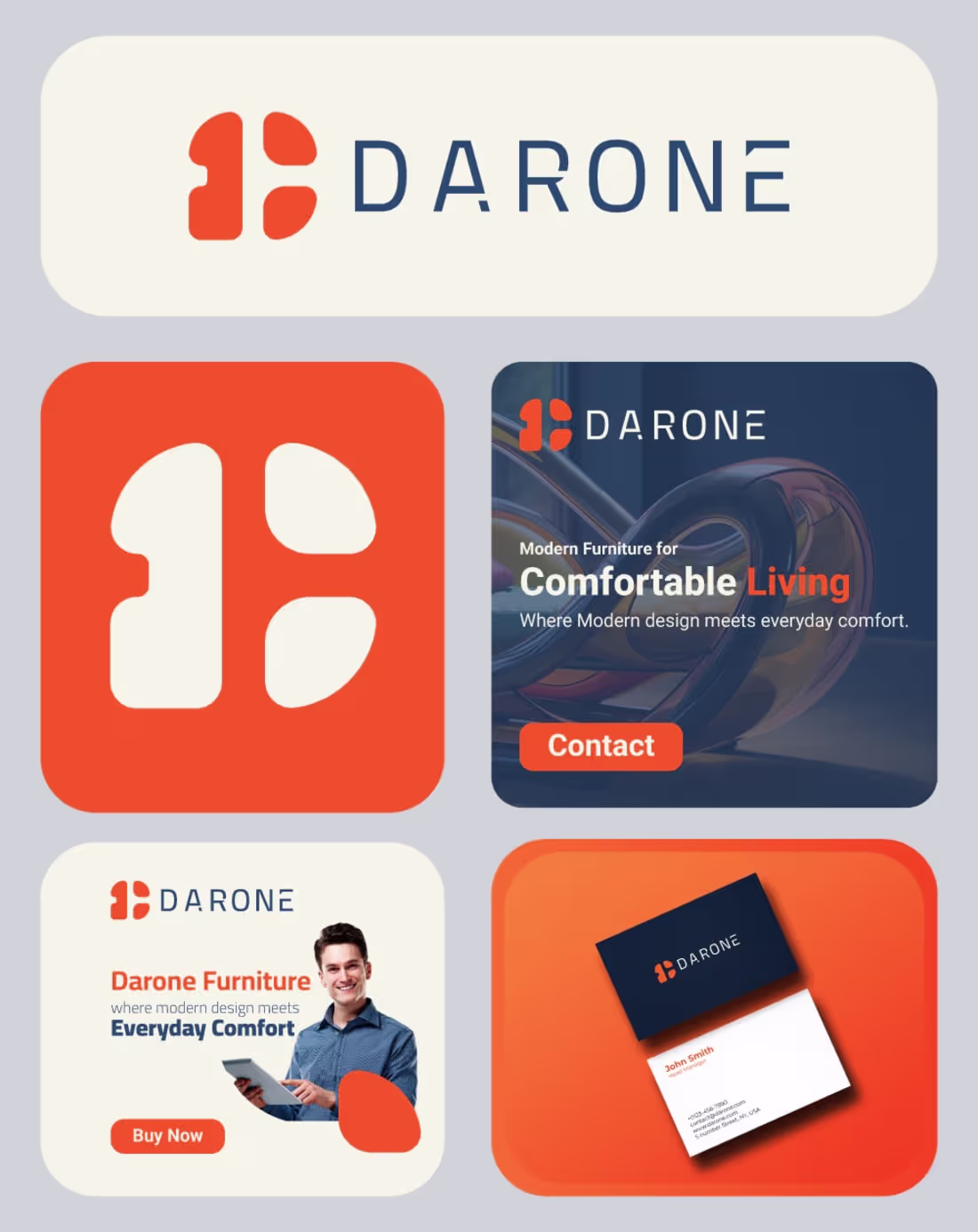
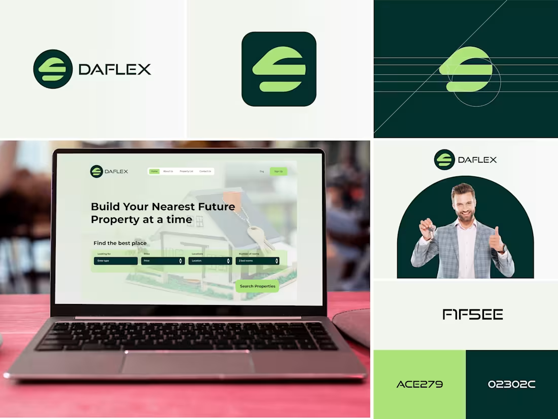
Darone – Premium Modern Furniture Logo, Branding and Social Media Design
A clean and warm logo for a contemporary furniture brand. The custom abstract mark combines soft, rounded forms that subtly suggest cushions and modern seating while forming a stylized "D". Paired with a confident navy Wordmark, the vibrant orange symbol brings energy and approach ability to the identity.Designed with versatility in mind — works beautifully in both digital and physical applications, from website favicons to signage and packaging.
What do you think? Feedback always welcome!
Ready to dominate?
👉 Say goodbye Unmemorable Logo, Branding, Social Media Post & Packaging Design Hello to memorable and Recognisable design!🌟
📩 Available for new projects
2
45
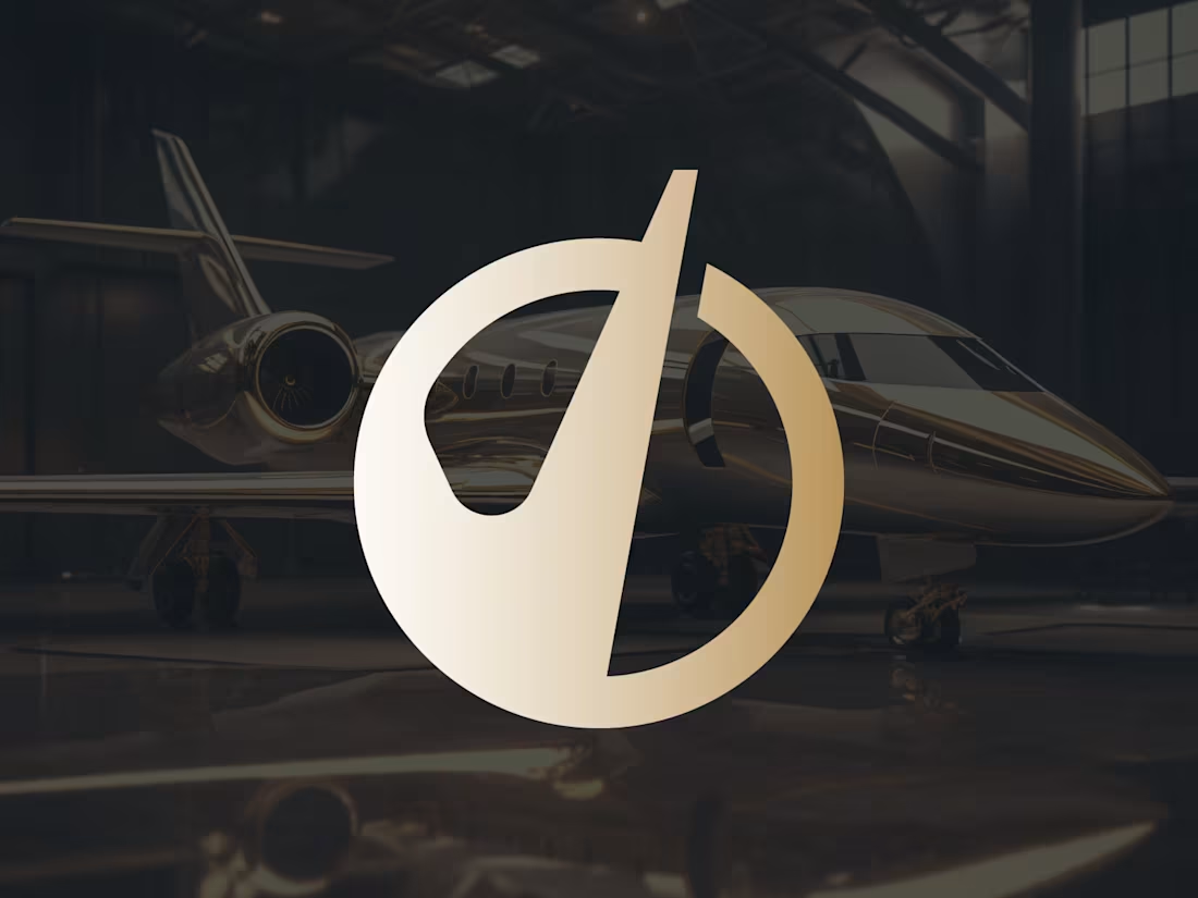
Customized O Letter Luxury Logo Design
Custom luxury monogram logo for a high-end travel & private aviation brand.
Custom luxury monogram logo featuring a stylized lowercase 'o' seamlessly integrated with a bold checkmark.Designed for a premium travel and private aviation brand, this mark symbolizes excellence, approval, and the highest level of service.
The rich metallic gold-to-cream gradient enhances the exclusive, sophisticated feel while maintaining a clean and modern aesthetic.The circular form represents completeness and journey, while the checkmark adds a confident, positive touch — perfect for luxury travel, concierge services, boutique hospitality, or high-end lifestyle brands.Versatile, timeless, and instantly recognizable across light and dark backgrounds, print, and digital platforms.What do you think — does this capture premium travel vibes? Open to feedback!
Ready to dominate?
👉 Say goodbye Unmemorable Logo, Branding, Social Media Post & Packaging Design Hello to memorable and Recognisable design!🌟
📩 Available for new projects
3
46
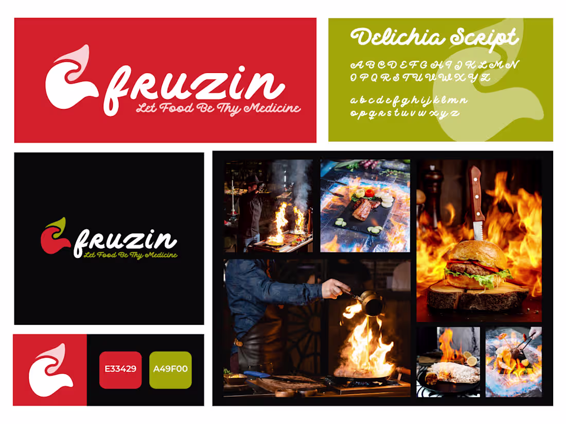
Fruzin – Let Food Be Thy Medicine
A bold, fiery brand identity for a modern restaurant that celebrates the passion, energy, and transformative power of great food.
The logo features a dynamic flame-inspired mark paired with a playful yet elegant custom script wordmark.
2
5
84
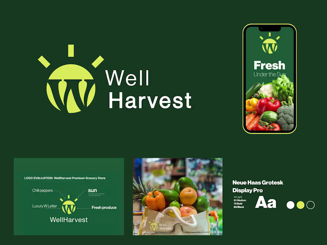
WellHarvest — Premium Grocery Store Logo & Branding
Sun-ripened freshness meets modern simplicity. Designed for a premium natural grocery store, WellHarvest captures the essence of "fresh under the sun" with a clean, vibrant identity. The mark cleverly combines a rising sun (symbolizing growth and daily freshness) with stylized hanging produce, forming a subtle "W" monogram. Paired with crisp typography and the tagline "Fresh Under the Sun," the brand feels wholesome, trustworthy, and appetizing.The deep forest green + bright golden yellow palette evokes nature, health, and vitality — perfect for organic, farm-to-table, or everyday premium groceries.
Fully vector, scalable, and versatile across packaging, signage, app icons, shopping bags, and digital platforms.This branding aims to stand out in a crowded market while building instant trust and emotional connection with health-conscious customers.
Open for custom grocery, supermarket, organic food, or farm market branding projects.
Let's create something fresh together!
6
68
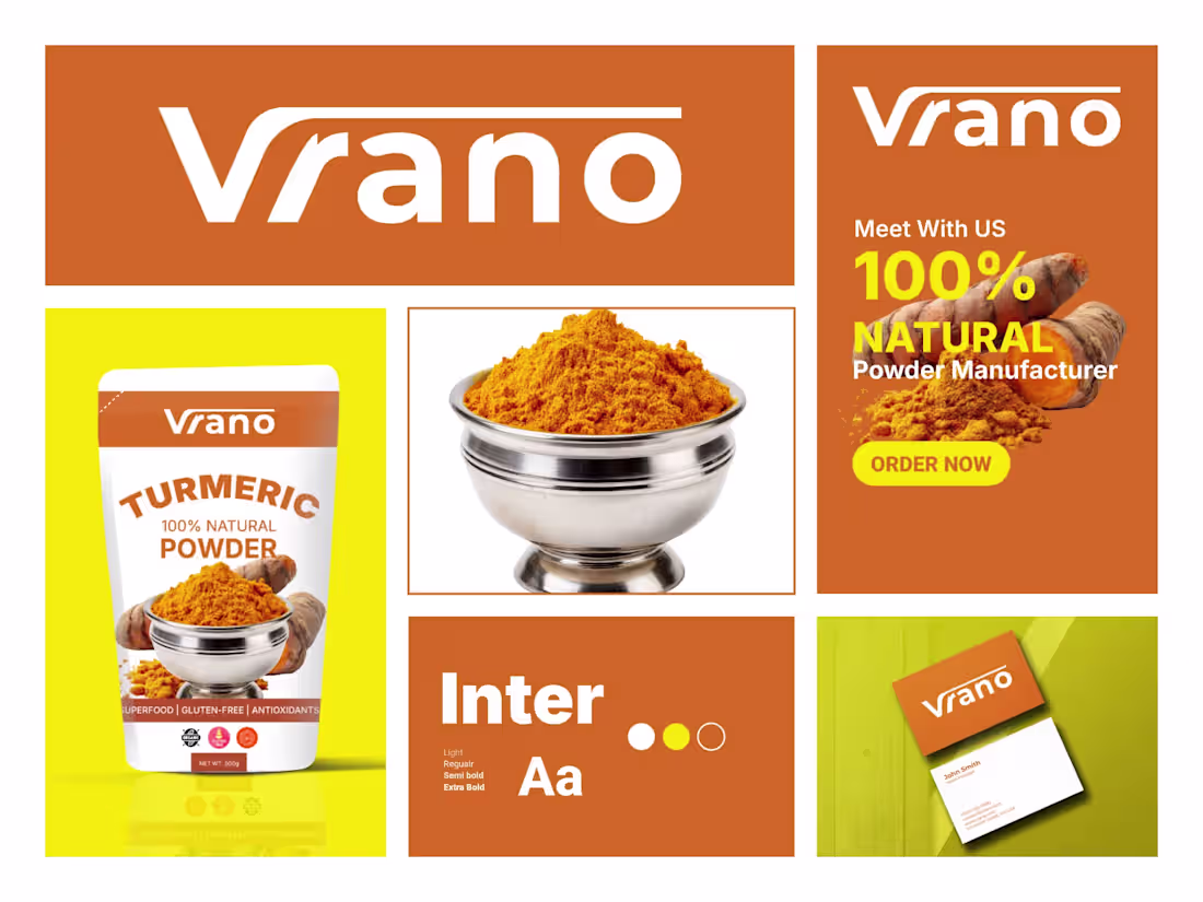
Vrano – Turmeric Powder Brand Identity & Packaging Design
Complete brand identity design for Vrano – a premium 100% natural turmeric powder manufacturer.The identity features a bold, modern logo with warm orange tones that instantly communicate energy, purity, and the vibrant essence of turmeric.
The system includes:
1. Primary logo lockup
2. Packaging design for stand-up pouch (500g)
3. Color palette with signature orange and complementary yellow-green
4. Typography system (Light, Regular, Semi Bold, Extra Bold)
5. Business card mockup
6. Promotional banner with strong call-to-action
The design aims to position Vrano as a clean, trustworthy, and appetizing superfood brand that stands out on spice shelves while maintaining a premium yet approachable feel.Focused on shelf impact, clarity, and natural product storytelling through vibrant turmeric imagery.What do you think of this brand system?
Feedback is always appreciated!
Ready to dominate?
👉 Say goodbye Unmemorable Logo, Branding, Social Media Post & Packaging Design Hello to memorable and Recognisable design!🌟
📩 Available for new projects
5
4
74
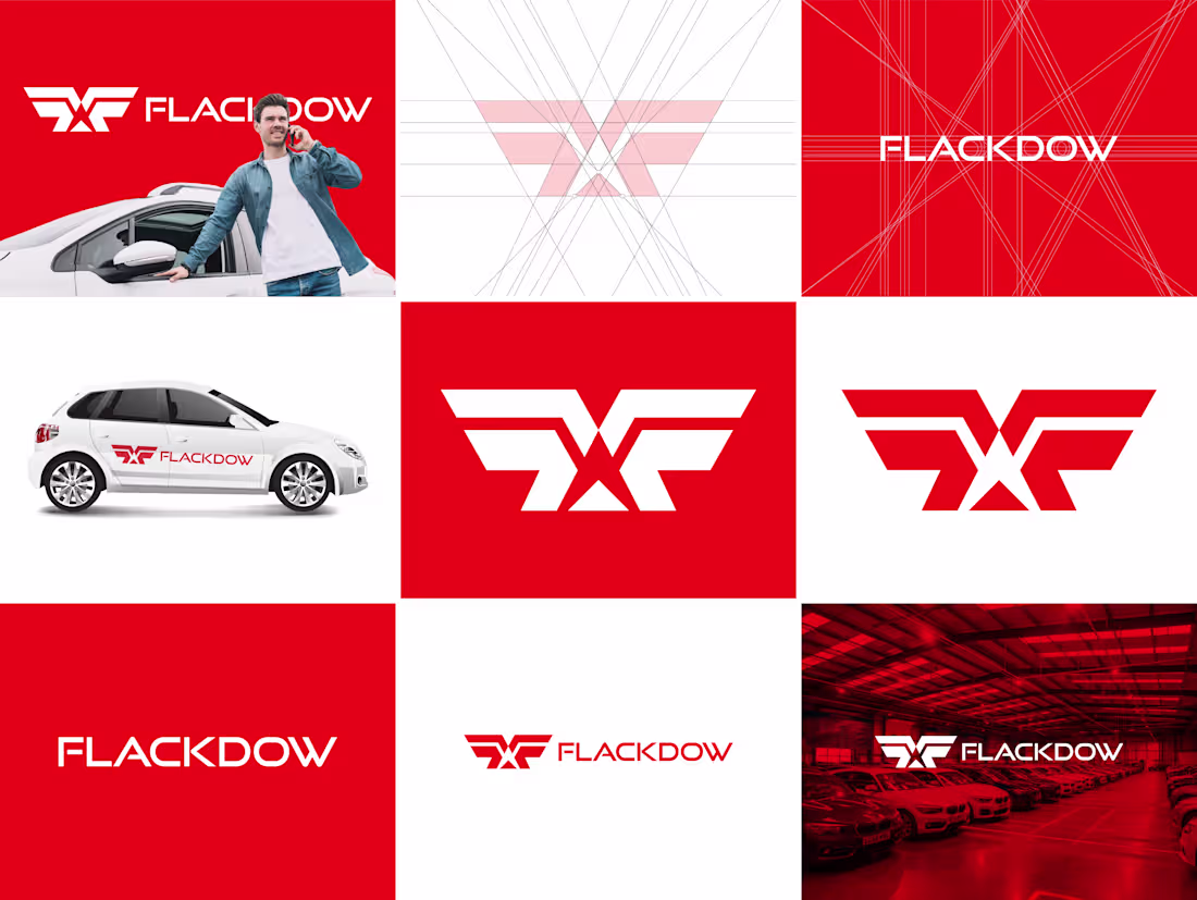
Flackdow Automotive car company logo design
7
8
168
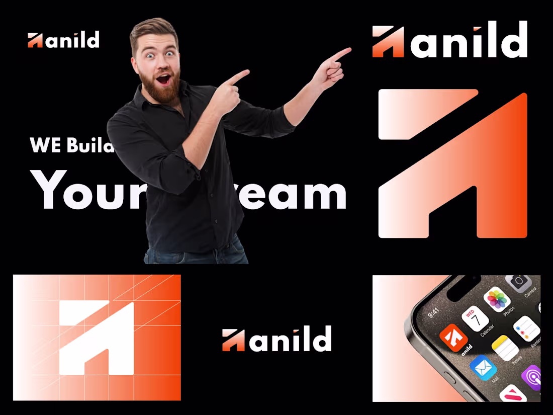
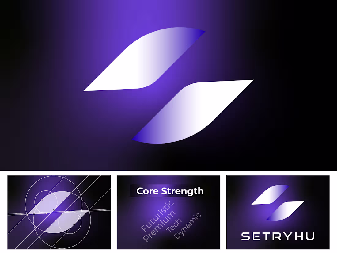
Anild Logo & Brand Identity
Anild is a modern, dynamic brand identity featuring a bold, stylized "A" mark that combines sharp geometric forms with a vibrant orange-to-white gradient. The logo symbolizes energy, innovation, and forward momentum.The wordmark "Anild" uses a clean sans-serif typeface with a distinctive orange accent on the letter "A", creating strong visual consistency across all applications. The identity is designed to feel energetic, tech-forward, and approachable.From app icons and digital interfaces to large-scale branding, the versatile mark works beautifully across multiple touchpoints — making it perfect for a forward-thinking tech, creative, or service-based brand.
4
69
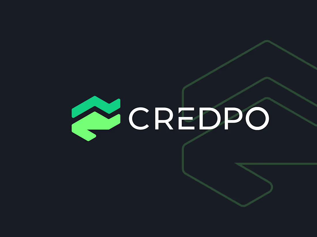
CREDPO — Property Valuation Logo Design
Clean, modern, and trustworthy brand identity for CREDPO, a professional property valuation company. The logo mark combines a stylized roofline with an upward chevron, symbolizing growth in property value, stability, and accurate assessment. A sophisticated teal-green gradient adds a premium and reliable feel, while the bold all-caps typography communicates confidence and credibility — essential qualities in the real estate valuation industry.Designed to work beautifully across digital and print applications, from business cards to website favicons.
4
64
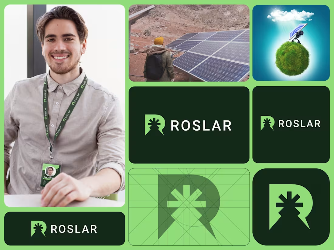
Solar Company Logo and Brand Identity Design
4
68
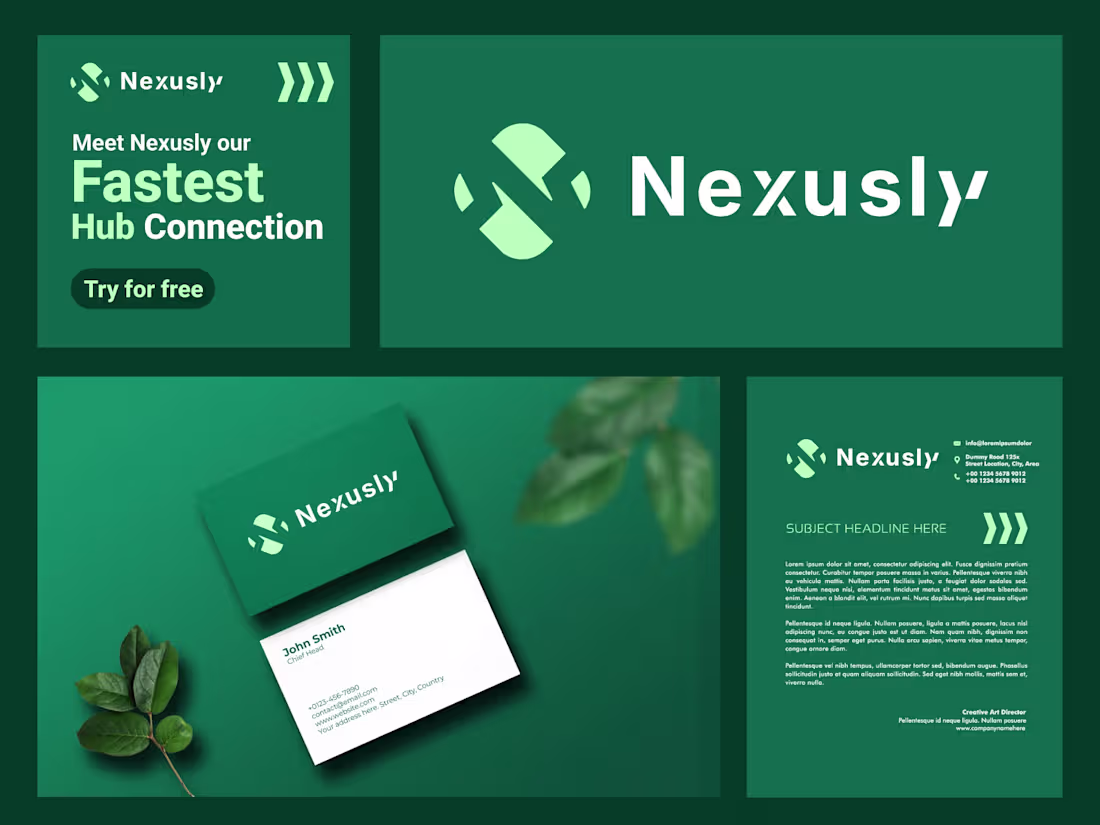
Nexusly Logo, Brand Identity and Social Media Design
Nexusly — Fastest Hub Connection
Introducing Nexusly — a modern tech brand designed for the fastest hub connection. The abstract "N" mark symbolizes dynamic connections, breaking barriers, and seamless networking. Paired with a deep emerald and fresh mint palette, it conveys innovation, growth, and trust. Presented with logo variations, business cards, and marketing applications. Perfect for SaaS, AI platforms, or collaboration tools. What do you think?
Feedback always welcome! 👇
Ready to dominate?
👉 Say goodbye Unmemorable Logo, Branding & Packaging Hello to memorable and Recognisable design!🌟
📩 Available for new projects
3
86

Zenaup — Modern Logo Design for Business Growth & Leveling Up
Fresh identity for a growth-focused business platform. Bold lime-green mark + clean typography that screams energy and professionalism.
Ready to dominate?
👉 Say goodbye Unmemorable Logo, Branding & Packaging Hello to memorable and Recognisable design!🌟
📩 Available for new projects
1
76
AI, tech, SaaS products Logo and Branding Design
Ready to dominate?
👉 Say goodbye Unmemorable Logo, Branding & Packaging Hello to memorable and Recognisable design!🌟
📩 Available for new projects
1
76
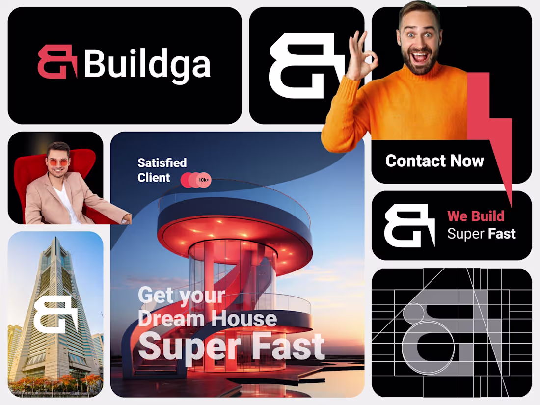
Buildga logo design for Luxury real estate businesses
1
69
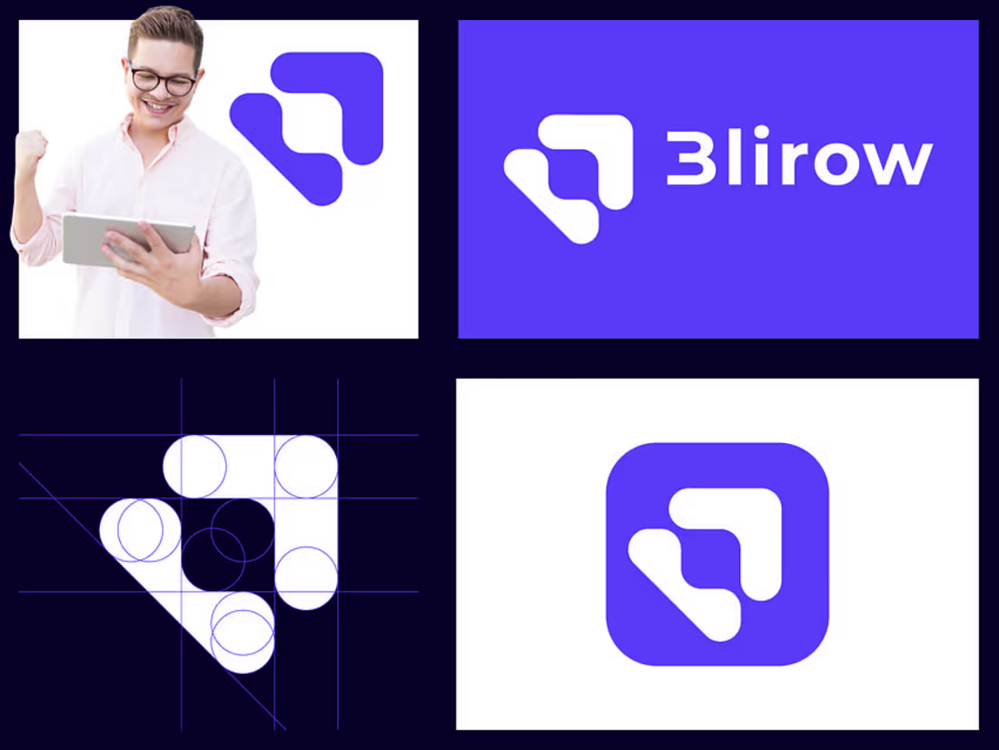
Blirow logo design for saas tech company
#saaslogo #geometriclogo #techlogo #logo #logodesign
1
65
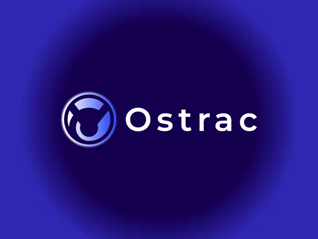
Ostrac Cyber Security Logo Design
👉 Say goodbye Unmemorable Logo, Branding & Packaging Hello to memorable and Recognizable design!🌟
📩 Available for new projects
Feel free to reach out
1
96
Real Estate Logo and Brand identity Design
👉 Say goodbye Unmemorable Logo, Branding & Packaging Hello to memorable and Recognizable design!🌟
📩 Available for new projects
2
84

Codehub logo for web development Saas Platform
👉 Say goodbye Unmemorable Logo, Branding & Packaging Hello to memorable and Recognizable design!🌟
📩 Available for new projects
2
82
Initial S Letter Saas Tech logo design
👉 Say goodbye Unmemorable Logo, Branding & Packaging Hello to memorable and Recognizable design!🌟
📩 Available for new projects
1
83
Design agency, Design community logo, Saas logo design
👉 Say goodbye Unmemorable Logo, Branding & Packaging Hello to memorable and Recognizable design!🌟
📩 Available for new projects
1
83

Saas, technology, tech logo and Brand Identity Design
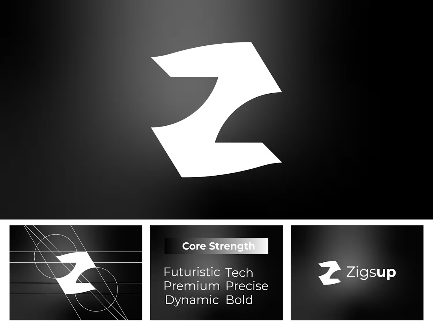
Geometric Z Letter Modern Logo Design
👉 Say goodbye Unmemorable Logo, Branding & Packaging Hello to memorable and Recognizable design!🌟
📩 Available for new projects
1
83