The network for creativity
Join 1.25M professional creatives like you
Connect with clients, get discovered, and run your business 100% commission-free
Creatives on Contra have earned over $150M and we are just getting started
Back to feedPost
Taste Test

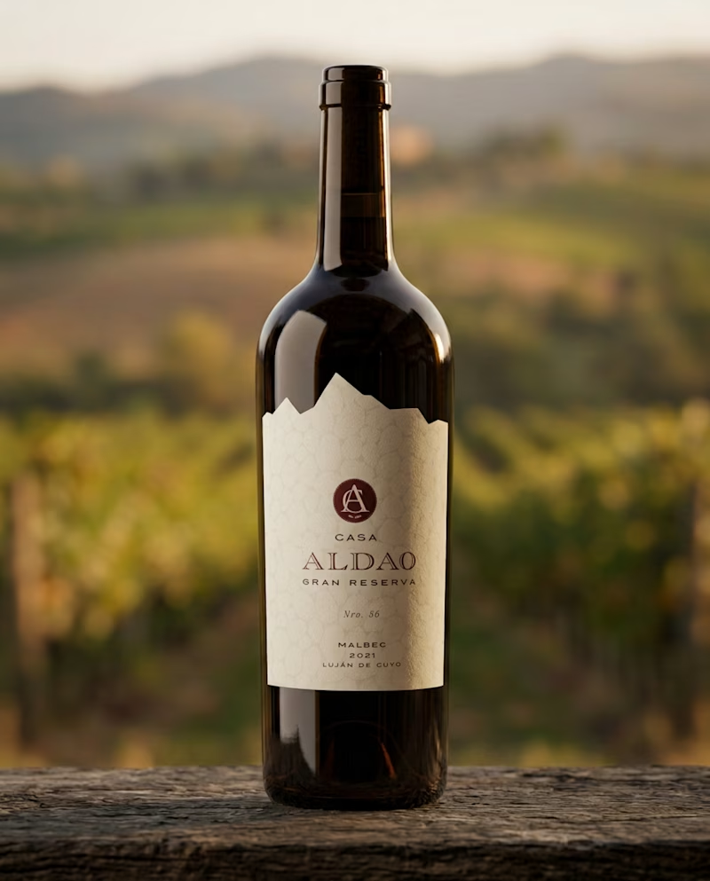
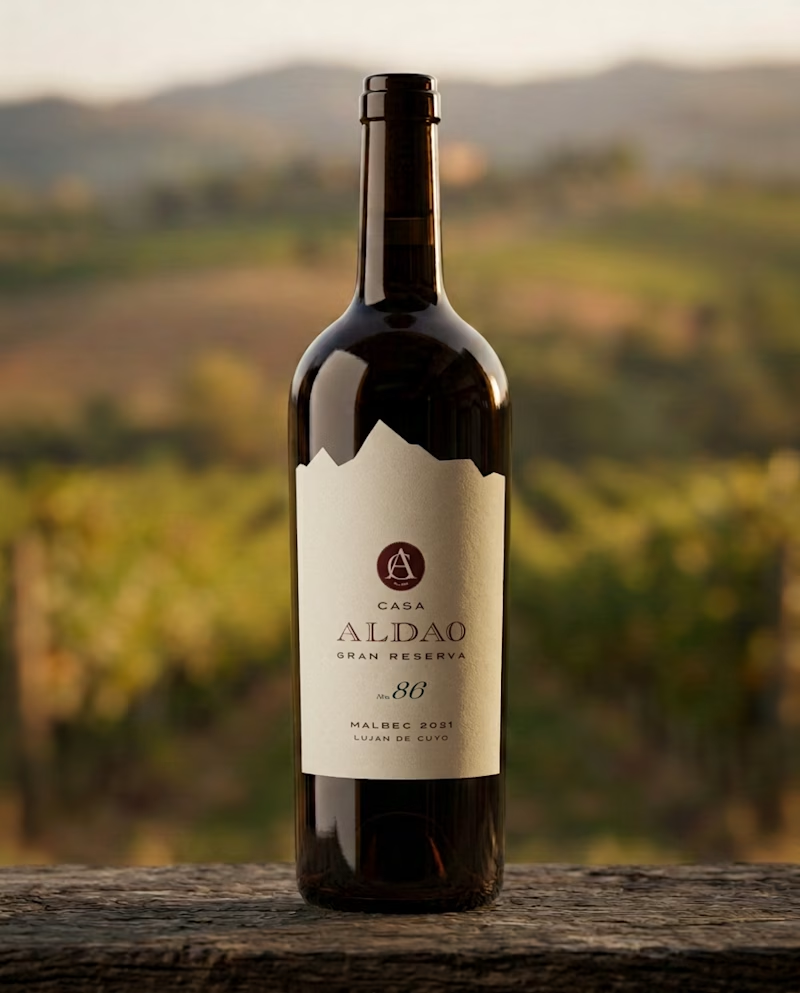
Testing designs for a Gran Reserva wine label that needs to feel traditional, sober, and confident. I chose a design with minimal ornamentation, where information hierarchy plays a key role in a clean layout.
Which of the two do you think reads better?

25 votes
Ends in 14h


Both designs look elegant and communicate the premium, traditional character of a Gran Reserva wine.
I would go with Option 1 because the typography and overall visual hierarchy feel more balanced and refined. The spacing gives the label room to breathe, making it easier to read...

Honestly both are really good.... but if I were to pick one I had go for option 1

Hola Luci! Cómo estás? Soy Argentina también!
De que provincia es el vino? Me encargo de las redes de una vinoteca en mi ciudad, y me llamó la atención. Tenemos cata este finde, y me gustaría proponer esta opción.
Hola Vanesa! Que bueno que te haya gustado! Es un proyecto creativo autogestionado, no existe en el mercado aún.
Hola Luci. Ya que te gusta trabajar con vinos podrias probar un diseño especulativo que represente la visita del Papa a nuestro país ! Sería verdaderamente genial !!! Yo soy de Rosario.

Nice!

This is beautiful
The network for creativity
Join 1.25M professional creatives like you
Connect with clients, get discovered, and run your business 100% commission-free
Creatives on Contra have earned over $150M and we are just getting started


Related posts

From AI-generated artwork to a more polished vector illustration.
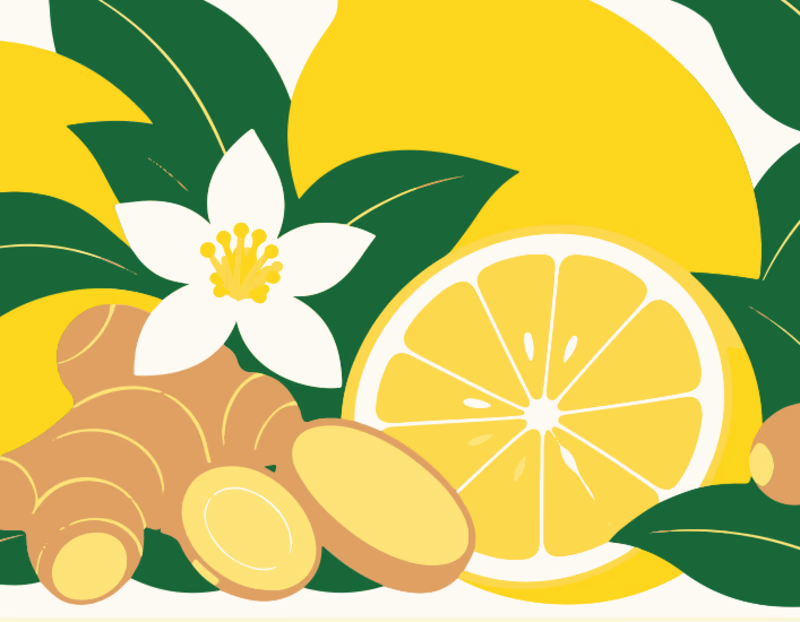
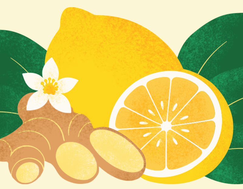
I tested Ideogram Vector by generating an illustration for a lemon ginger tea packaging.
The raw output was a good starting point, but it still needed some work.
So I converted it into an editable SVG, refined the shapes, rearranged and resized the elements, and added a bit of texture to give the illustration more depth.
Here's a look at the before and after!
What do you think? 🍋

4 voted
9%
41 voted
91%
45 votes
Closed

After is absolutely better it focus on the main image🎉🎉

LOGO vs. BRANDING — What's your take? 🍵
I'm curious...
Which one makes a stronger first impression?
Do you prefer the simplicity of the logo or the personality of the complete branding?
I'd love to hear your thoughts! 💚
0 voted
0%
7 voted
100%
7 votes
Closed

makes me want a matcha haha, cool


🎉 It’s live! I’ve finally updated my design portfolio:
👉
This space has been a long time coming, a reflection of the stories, systems, and identities I’ve been lucky to shape across wellness, healthcare, community & events!
It’s still evolving (aren’t we all?), and I’ll be adding more projects soon, but I’m excited to finally share a fresh look at my work and creative direction!

Congratulations on the new portfolio, Kajal! The grid of bold reds, magenta and cobalt mockups, with that confident serif G repeating throughout, makes the whole identity feel energetic yet cohesive. What guided the way you sequenced your wellness and healthcare projects?