The network for creativity
Join 1.25M professional creatives like you
Connect with clients, get discovered, and run your business 100% commission-free
Creatives on Contra have earned over $150M and we are just getting started
Back to feedPost
Taste Test
LOGO vs. BRANDING — What's your take? 🍵
I'm curious...
Which one makes a stronger first impression?
Do you prefer the simplicity of the logo or the personality of the complete branding?
I'd love to hear your thoughts! 💚
0 voted
0%
7 voted
100%
7 votes
Closed

"Branding all the way! 🍵 While a strong logo is the anchor, the full branding ike that is what actually gives a product its soul and personality.

Branding for me. The matcha tin and texture make the green logo feel like a real product.

Branding is so cool🔥🔥

Both was amazing.

makes me want a matcha haha, cool
The network for creativity
Join 1.25M professional creatives like you
Connect with clients, get discovered, and run your business 100% commission-free
Creatives on Contra have earned over $150M and we are just getting started






Related posts

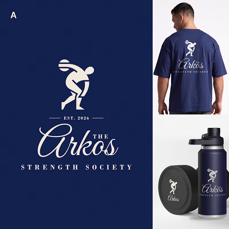
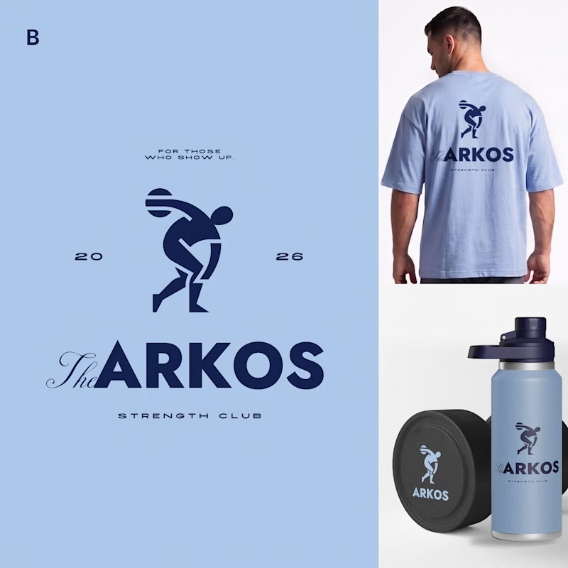
Most gyms follow a pretty similar approach to branding. I wanted to see what a strength club could look like if it drew more inspiration from a private-membership club vibe, since that's really trending right now.
Designed two directions for Arkos using the same mark. A is more refined and traditional, while B takes a bolder, more modern approach.
Which direction would you go with?
11 voted
50%
11 voted
50%
22 votes
Closed

The darker one is the best for me, but both are really good, man

two brands, one tiny taste test.
would you rather look through an Oriel or answer a Calling?
winner gets the full brand. reply with your pick.
35 voted
85%
6 voted
15%
41 votes
Closed

The biggest misconception about branding is thinking it's just a logo. What actually saves founders time and money later is a compact system a focused 2–3 color palette and clear sub-brand rules so every new deck, social post, or product launch looks cohesive without starting from scratch.

A system makes it work. A brand makes it matter.
Through Adora Garden, we explore how a structured visual system can evolve into a cohesive brand identity — bringing consistency, character, and a more meaningful visual experience to every touchpoint.
Because branding isn't just about how a brand looks. It's about how it feels, speaks, and connects.
6 voted
27%
16 voted
73%
22 votes
Closed

Identity 💯