The network for creativity
Join 1.25M professional creatives like you
Connect with clients, get discovered, and run your business 100% commission-free
Creatives on Contra have earned over $150M and we are just getting started
Back to feedPost
Taste Test
Two directions. One brand. ⛳
While developing the identity for CityGolf, I explored two very different approaches, one clean and modern, the other expressive and rooted in the idea of a golfer’s signature.
Both explored different ways of bringing the character of golf into a modern indoor experience, premium and aspirational but still approachable.
Curious which one you would choose 👀
01 — Signature
02 — Modern
Vote below! ↓
36 voted
69%
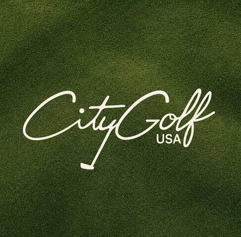
16 voted
31%
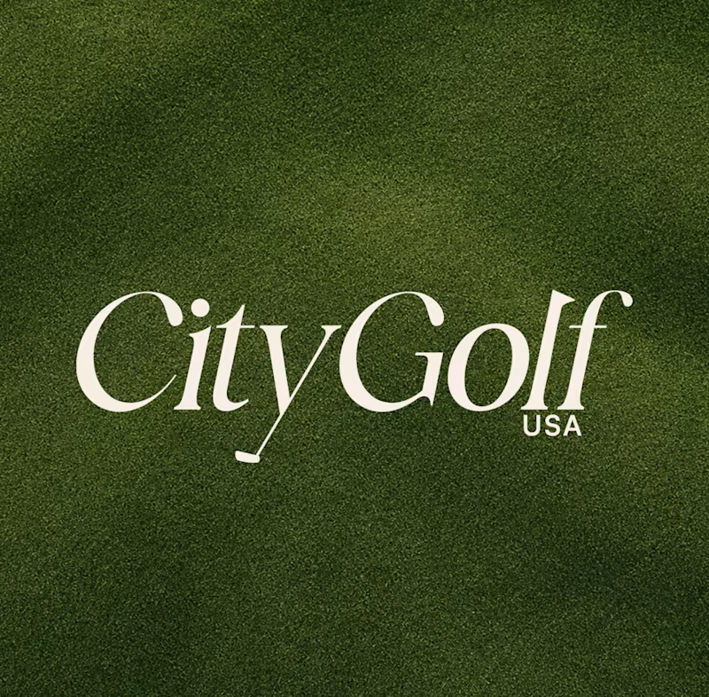
52 votes
Closed


signature one for sure

The script version has way more warmth to it, feels like it could live on merch beyond just the course signage. Genuinely torn between the two though. Did the client have a strong gut reaction one way, or were they leaning toward playing it safe with the modern option?

It was actually a really close one! There were a few people involved in the decision, and both directions were well received. Ultimately, the team felt the modern direction was the stronger fit for the brand, and we explored some refinements from there before landing on the final identity.

the signature gives a more community vibe to me!

Sydelle both are great 🔥
Thank you!

Signature draws attention instantly!
Thank you! That was definitely the intention with Signature, something that catches your attention right away 😊

I’d go with Signature, I love how distinctive and memorable it feels. The personal signature concept connects nicely with the golfer’s identity while still keeping the brand premium and modern
Thank you! I really appreciate this perspective, the connection to the golfer’s identity was a big part of the thinking behind Signature.

Superb 🔥
Thank you!

modern doesn't always feels premium, specially for golf premium is more preferred than modern, and the signature one looks very premium

signature is better

Option 1 does it for me, more authentic, unique and special! 😍


Leaning towards Signature. But I would get braver with the tail of the 'y' becoming the club. Proportion between the club head ans shaft length can be adjusted and made a little longer.

this one gives me a hard time to decide hahahaha
i choose the signature for aesthetic but i also like the modern because it matches more of the context of how a citygolf would feel like if im in it

Signature

Looks amazing
signature, no contest

I see im in the minority but I definitely prefer the 2nd version. Golf always seemed high end and fancy to me, I think the 2nd option preserves that better.

The signature logo reminds me of old, classic golf design that can be long lasting with its design!
The network for creativity
Join 1.25M professional creatives like you
Connect with clients, get discovered, and run your business 100% commission-free
Creatives on Contra have earned over $150M and we are just getting started

Challenges
View all


Related posts



This looks great

My previous poll showed unexpected results (I am very grateful to everyone who took the time to vote and comment 🤍).
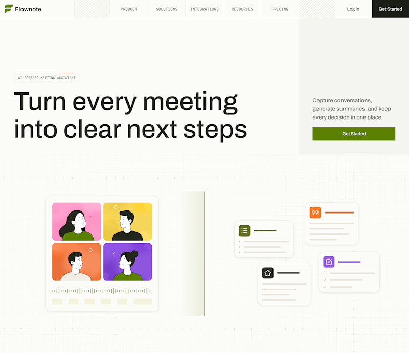
Now I am curious about your opinion on the color mode for this hero section. I definitely like a light theme. What about you?
By the way, I made a nice animation for this design. You can see it on my profile

28 voted
54%
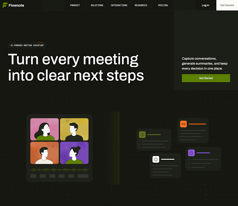
24 voted
46%
52 votes
Closed

To be honest the dark mode looks really good

Bold, without a doubt. The “Safe” direction feels polished, but the “Bold” approach has more personality, stronger visual tension, and a much better chance of stopping the scroll. It feels more distinctive and memorable while still communicating the skincare message clearly.

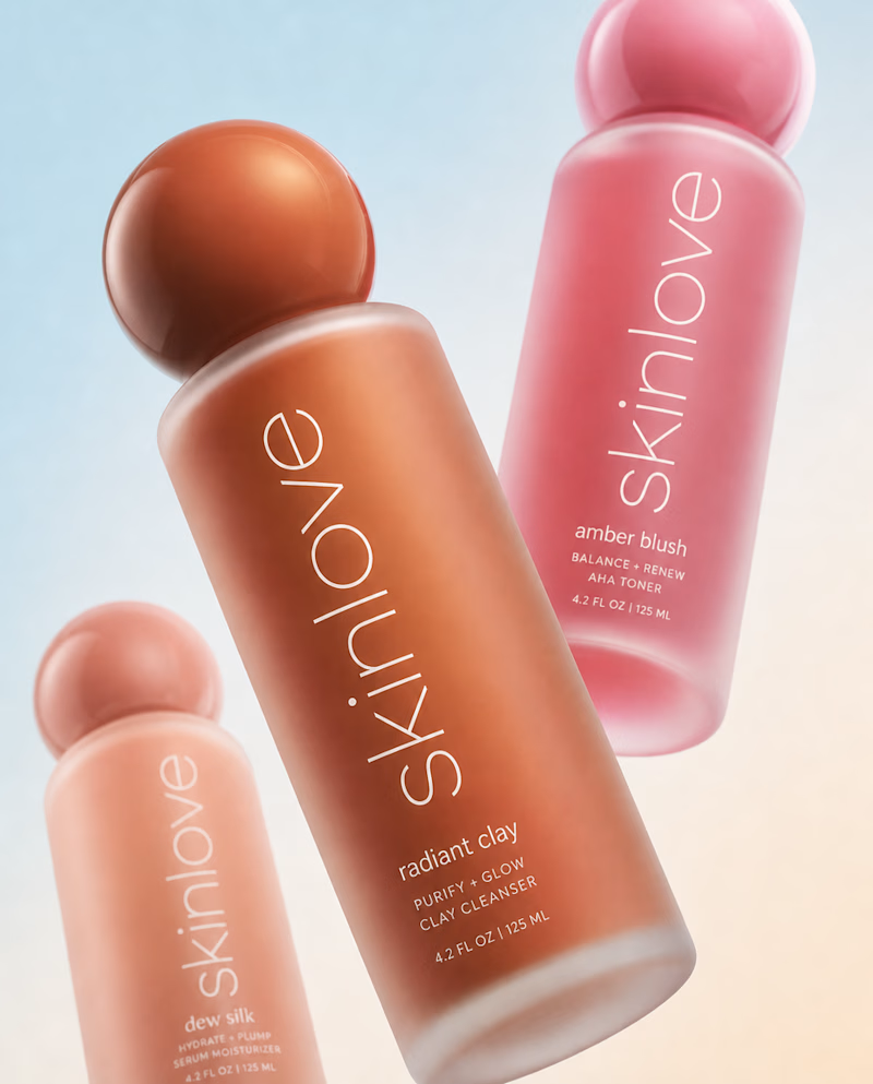
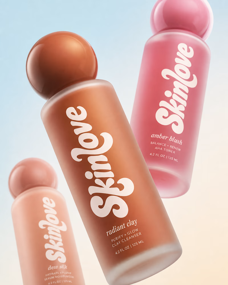
Safe or bold, which one actually makes you stop scrolling? 🤔
Sans: the serif, tight tracking, one accent color playbook every skincare brand is running right now.
Bold: the same idea, redesigned with attitude. 💅
25 voted
32%
53 voted
68%
78 votes
Closed


BOLD is better