The network for creativity
Join 1.25M professional creatives like you
Connect with clients, get discovered, and run your business 100% commission-free
Creatives on Contra have earned over $150M and we are just getting started
Back to feedPost


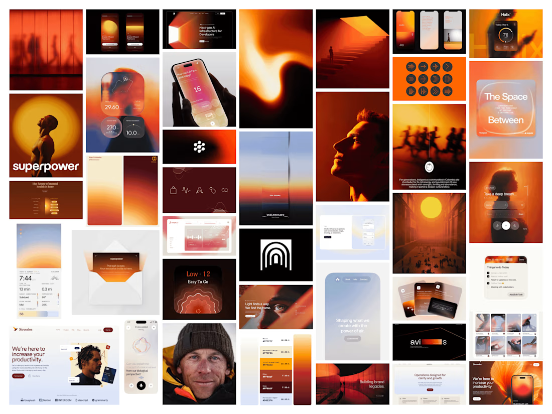

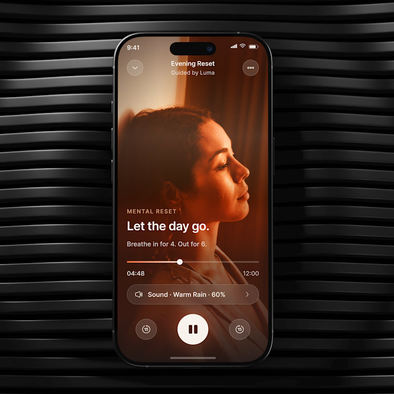
The warm orange system gives the mood board a lot of emotional clarity—love how the varied modules still feel cohesive for a stress-management product.

Inspiring work 🌟

This looks great

Warm desert tones for a stress management brand is an interesting choice, most of that space defaults to cool blues and greens. Was that a deliberate move away from the usual "calm app" cliche, or did it come from something specific in the founder's brief?

Love the visual tone really feels like a stress relieve product

feels energetic, great UX:⚡️


Awesome work🔥👏👏
The network for creativity
Join 1.25M professional creatives like you
Connect with clients, get discovered, and run your business 100% commission-free
Creatives on Contra have earned over $150M and we are just getting started

Challenges
View all


Related posts

Which cover for a new case study do you like more?

19 voted
40%

29 voted
60%

48 votes
Closed

Really inspiring work!

Not every growing brand needs to look dynamic to feel ambitious.
With Auren, the challenge was almost the opposite.
The brand needed to work across real estate, development and wellness without becoming a generic identity trying to fit everything.
So the direction became more restrained, solid and precise.
Less visual noise.
More consistency to support different sides of the business.
For me, that’s one of the most interesting parts of building brands meant to last:
flexibility doesn’t have to mean losing personality.
Full project: https://www.behance.net/gallery/255378471/Auren
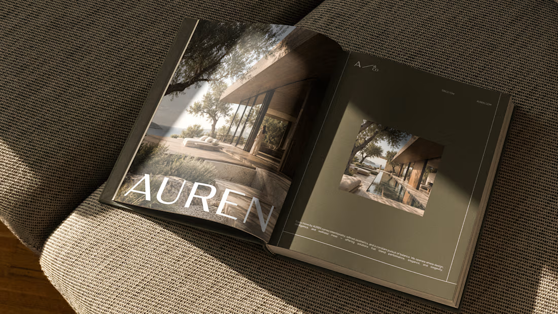
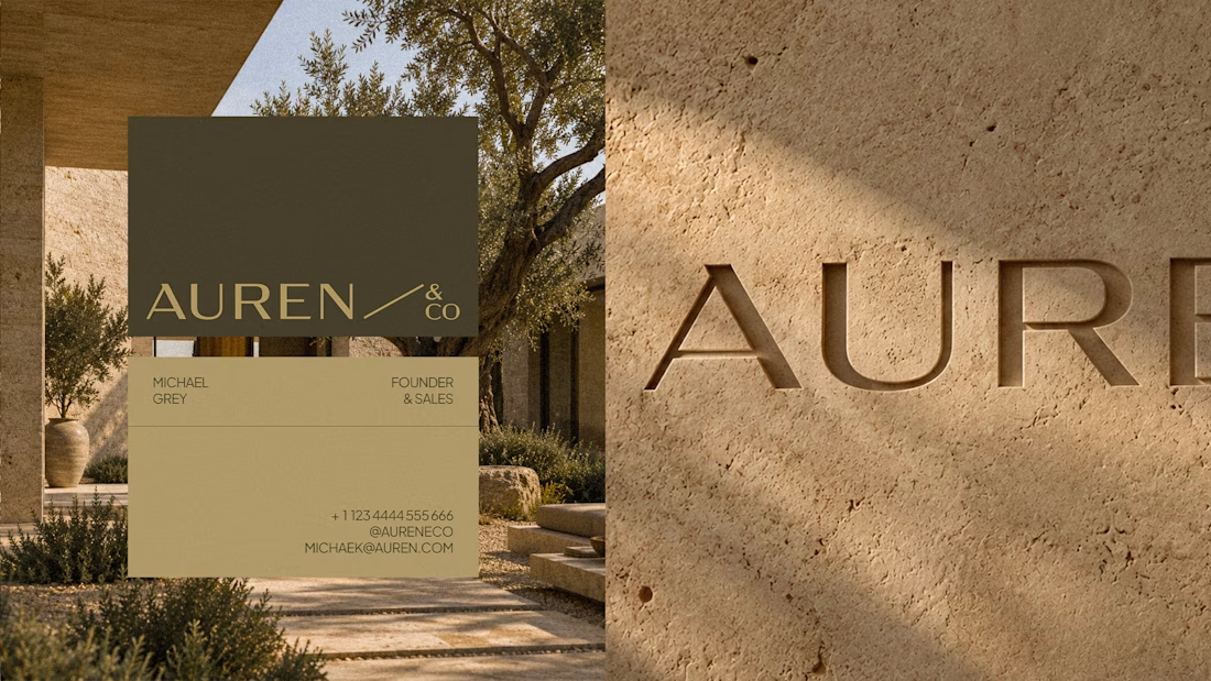


the Auren book mockup looks nice. did you make the logo too?


🧪 TASTY TEST 04/30
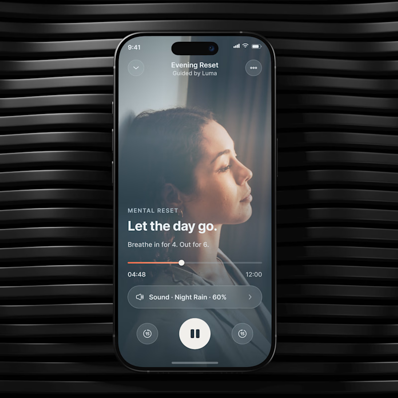
Which mood would make you more likely to start?
🔥 A Grounded Warm, intimate, cocoon like.
🌫️ B Weightless Cool, airy, spacious.
Same UX. Different emotional temperature.
💡 Growth Insight: visual mood can change how easy the same action feels.
Which one would you choose? A or B?
04/30. 26 experiments left. Follow for the next one.
👉 BOOK A MOBILE APP STRATEGY SESSION
https://calendly.com/asol_design/book-diagnostic-call-linkedin-clone
#MobileAppDesign #MobileUX #GrowthDesign #WellnessApp #AsolDesign

26 voted
26%
75 voted
74%
101 votes
Closed

Really cool direction!