The network for creativity
Join 1.25M professional creatives like you
Connect with clients, get discovered, and run your business 100% commission-free
Creatives on Contra have earned over $150M and we are just getting started
Back to feedPost
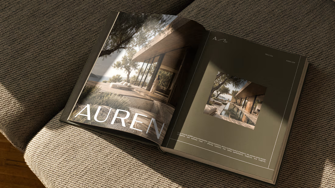
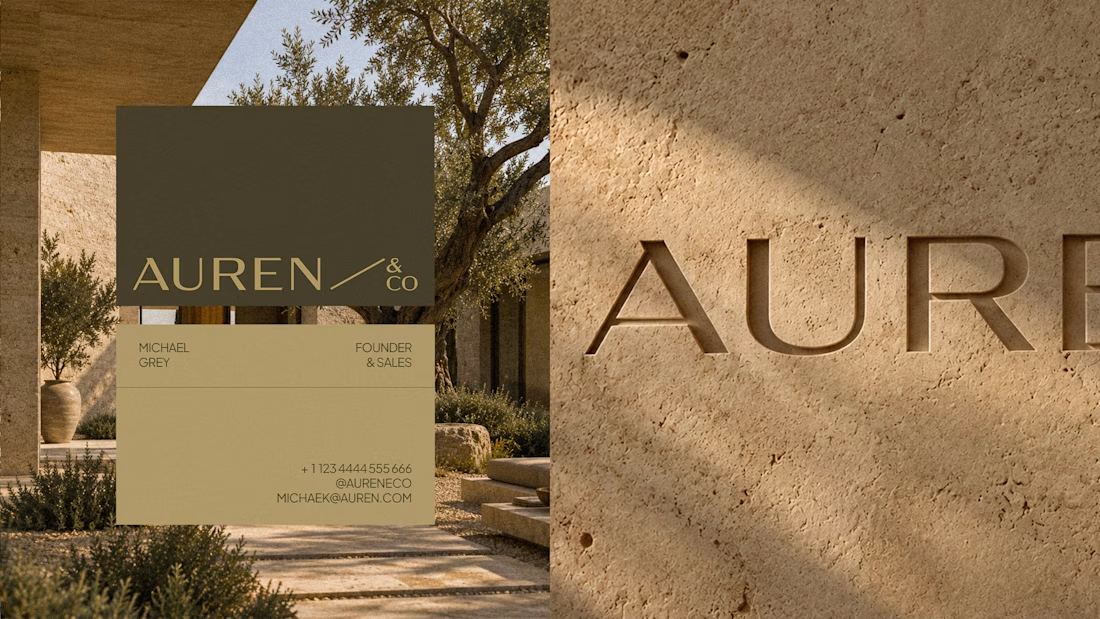
Not every growing brand needs to look dynamic to feel ambitious.
With Auren, the challenge was almost the opposite.
The brand needed to work across real estate, development and wellness without becoming a generic identity trying to fit everything.
So the direction became more restrained, solid and precise.
Less visual noise.
More consistency to support different sides of the business.
For me, that’s one of the most interesting parts of building brands meant to last:
flexibility doesn’t have to mean losing personality.
Full project: https://www.behance.net/gallery/255378471/Auren

Really like the typemark! Feels so elegant and precise 👏

thanks

Good Work!
thanks


the Auren book mockup looks nice. did you make the logo too?
Thanks! Yes, we did.

Love the simplicity here, it gives the brand such a nice feel

Love the layout.

Building one identity that works across real estate, development, and wellness without going generic sounds like a tightrope walk. What was the first direction you tried that didn't survive?

The network for creativity
Join 1.25M professional creatives like you
Connect with clients, get discovered, and run your business 100% commission-free
Creatives on Contra have earned over $150M and we are just getting started





Related posts

I'm excited to share the full case study from our collaboration on the Unik Mindz logo design and branding, completed in August 2026.
Unik Mindz is a creative design studio born from the legacy of the Unik family brand. Founded on the belief that every idea begins with a unique mind, the studio needed an identity that could carry that message and become the face of the brand.
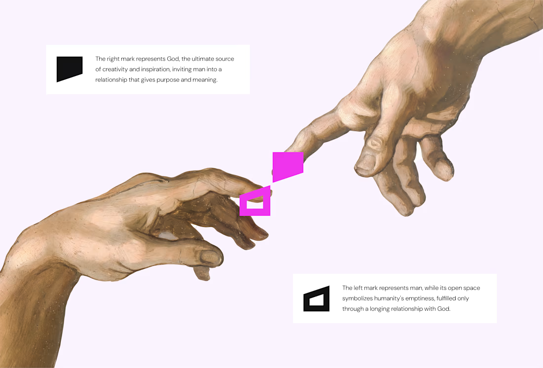
The logo draws inspiration from Michelangelo’s The Creation of Adam, focusing on the idea of connection. It captures the moment two minds meet to create something greater, reflecting the brand’s conviction that meaningful creativity starts with connection.
We wrapped the project with a clear system and guide for how the brand assets should be used going forward.
Want to work with us? Send a DM or email to info@donatus.agency


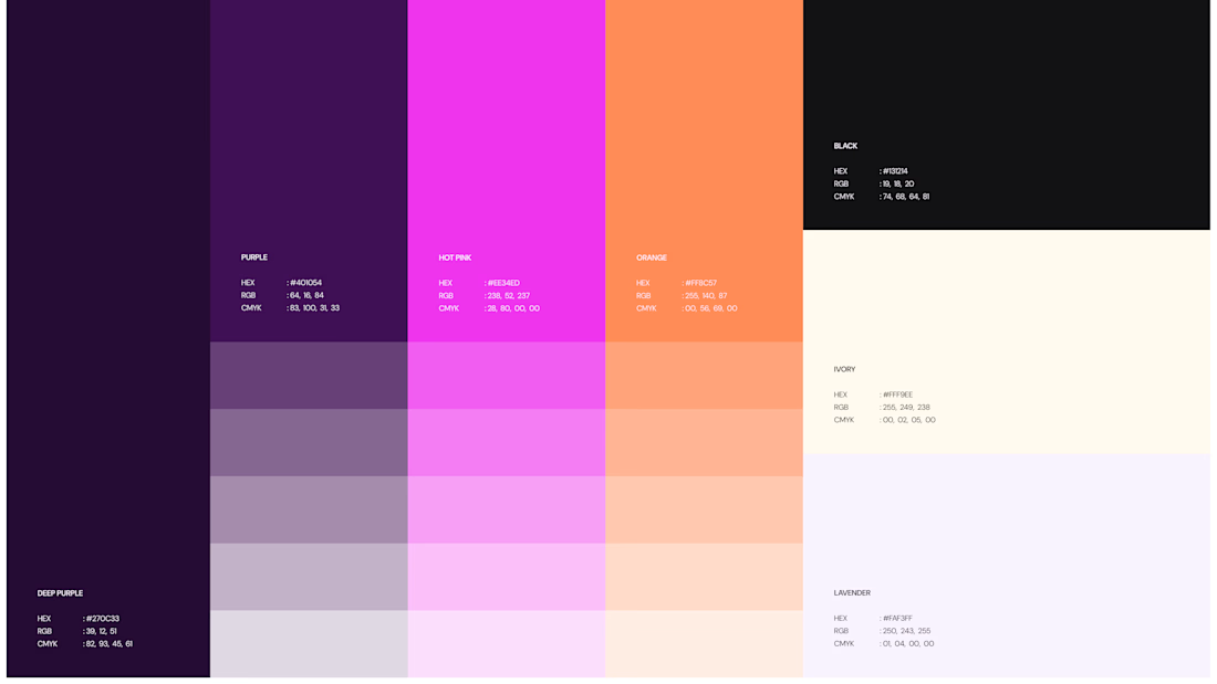
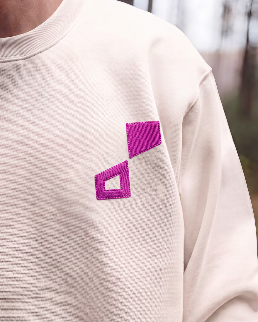

Honestly I never see something like this before I love the uniqueness of the design and it's vibrant color palette great job 🎉🎉


The INKFLESH mark I designed starts with an empty profile avatar. A deliberately plain shape for an identity full of strange characters.
The characters needed room to change. The identity also had to work on a woven label or an app icon, where a detailed illustrated face has very little space to do its job.
I kept the silhouette and palette constant, then let the artwork change around them. The mark can hold an illustration, appear as a solid stamp, or sit on its own at a small size. Each version still has the same shape underneath.
That was the useful constraint: decide what someone should recognise when the most expressive part of the design disappears.
If your identity depends on a detailed illustration, try its smallest application before approving the whole world around it.

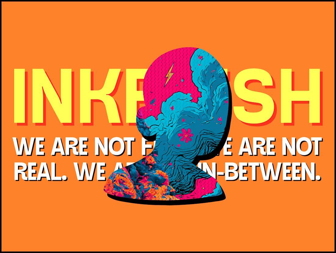

Super bold and creative! Love the vibrant colors. 🔥

Jordan Reid - Sportswear Brand Identity
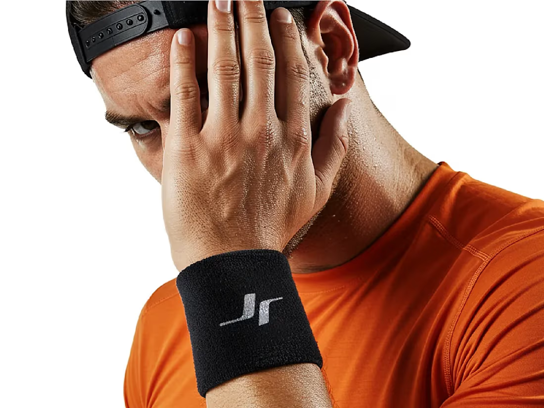



Like the logo direction