The network for creativity
Join 1.25M professional creatives like you
Connect with clients, get discovered, and run your business 100% commission-free
Creatives on Contra have earned over $150M and we are just getting started
Back to feedPost
Taste Test
🧪 TASTY TEST 04/30
Which mood would make you more likely to start?
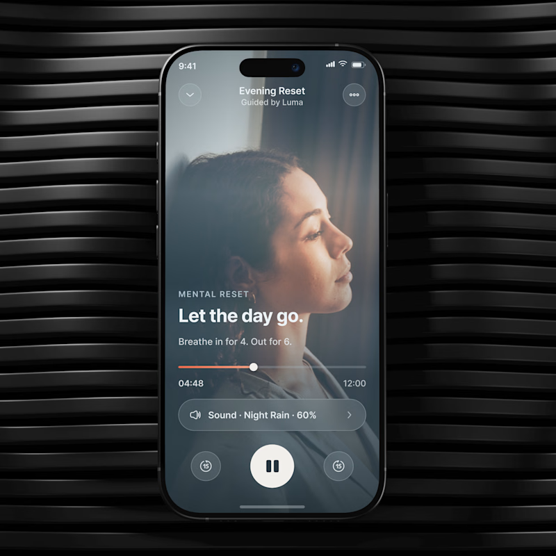
🔥 A Grounded Warm, intimate, cocoon like.
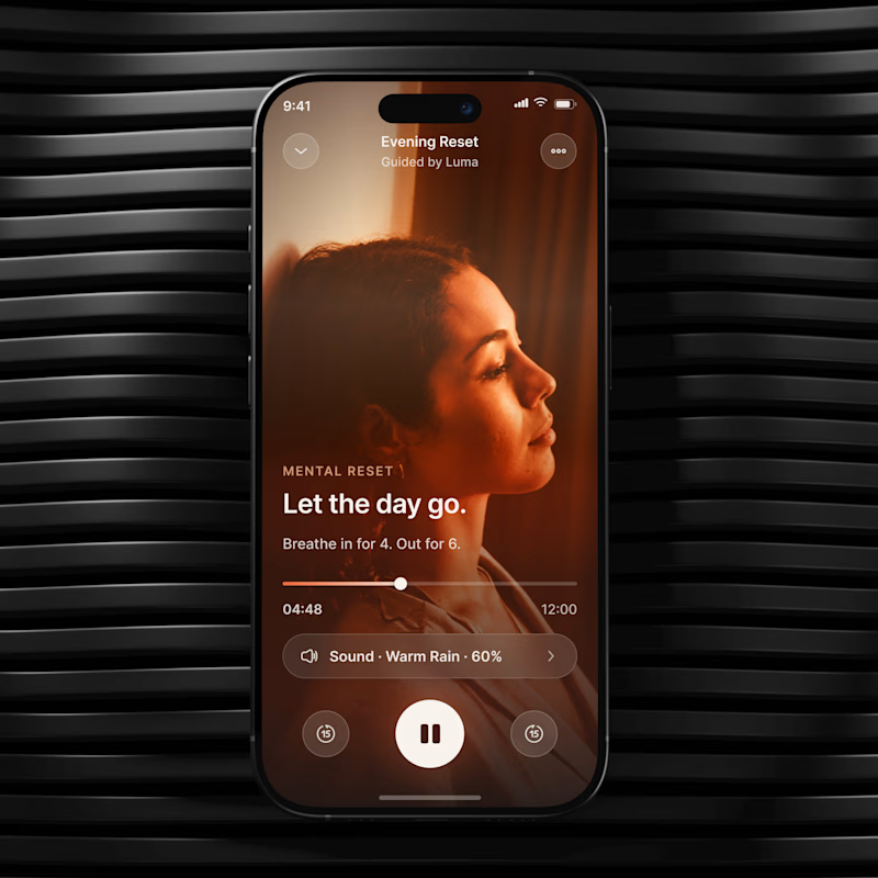
🌫️ B Weightless Cool, airy, spacious.
Same UX. Different emotional temperature.
💡 Growth Insight: visual mood can change how easy the same action feels.
Which one would you choose? A or B?
04/30. 26 experiments left. Follow for the next one.
👉 BOOK A MOBILE APP STRATEGY SESSION
https://calendly.com/asol_design/book-diagnostic-call-linkedin-clone
#MobileAppDesign #MobileUX #GrowthDesign #WellnessApp #AsolDesign

26 voted
26%
75 voted
74%
101 votes
Closed


Thanks


A. fantastic!

Really strong product thinking here. The interesting part is not the visual direction itself, but how clearly it connects mood, decision friction, and session start behavior. This is the kind of design test that can actually inform product strategy

the warmth in A is such a win!
😍

B One is🔥

Grounded vs weightless is such a clean way to name emotional temperature instead of just talking palette. Does one mood actually win outright across your tests, or does it come down to what action you're asking someone to take right after?

😍

More worm is matching the vibe if the song, well designed 👏👏

A Grounded Warm, intimate, cocoon like - looks best.
Thanks😍

A one with fire emoji kills🤘
Thanks😍

A feels more better than B

I like B

Thanks😍

A fits well

Really cool direction!
Thanks


A for me. The warm mood feels more inviting and makes the action feel easier to start.
Thanks😍

A 🔥
Thanks😍

A got my vote
Thanks😍

I lke the warm feeling!
Thanks😍

The design looks awesome. Great project!
Thanks😍


A
Thanks😍


❤️❤️❤️
Thanks😍

Both looks great🔥
Thanks😍

A
Thanks😍

Thanks😍

I instantly knew it's the warm directio, Good work!
Thanks😍


Totally going for A
Thanks😍

A
Thanks😍
MY PLEASURE ✨

I'm in-love with A 😍
Thanks😍
The network for creativity
Join 1.25M professional creatives like you
Connect with clients, get discovered, and run your business 100% commission-free
Creatives on Contra have earned over $150M and we are just getting started











Related posts

Hey everyone! 👋
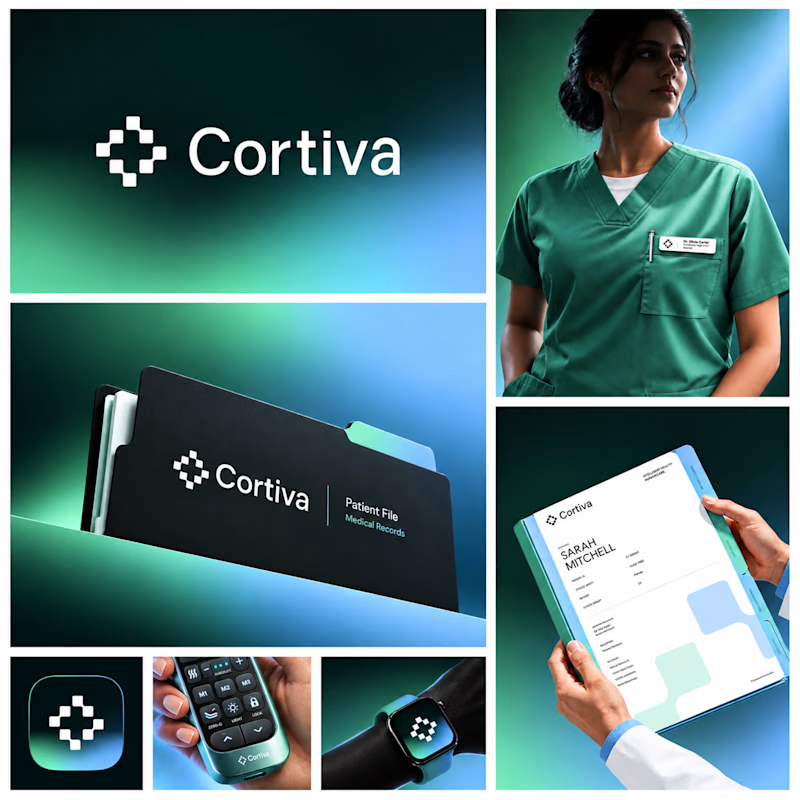
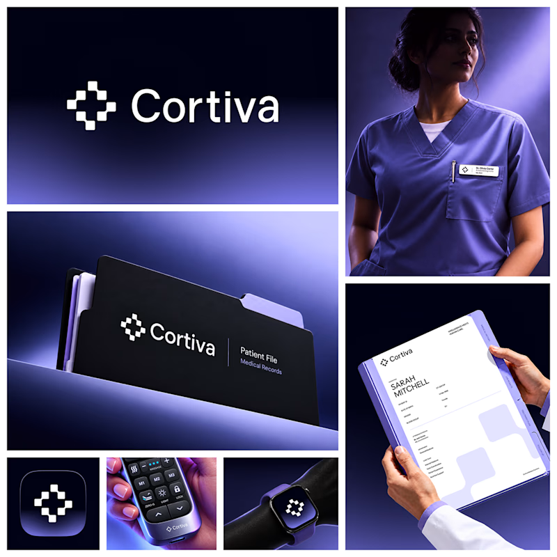
Working on Cortiva, an AI-first hospital branding project.
I've already finalized the color direction, but I thought it would be fun to explore two different moods.
Option 01💚 or Option 02? 💜
Both have their own personality, and I'm curious to see which one you prefer!
Let's see which one wins! 👀
5 voted
33%
10 voted
67%
15 votes
Closed

Both directions are strong, but I'm leaning towards Option 01. The green feels instantly like "care" and trust, which is perfect for a hospital. Option 02 looks more techy and premium. Curious, which mood are you aiming for - clinical and calm, or friendly and modern?


Which Kajabi direction would stop your scroll?
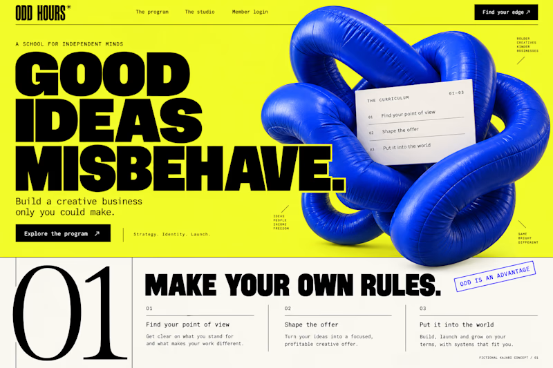
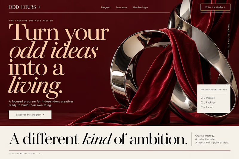
Meet ODD HOURS, a creative-business academy concept.
A / Acid Play: electric yellow, oversized type and a sculptural blue knot.
B / Velvet Rebellion: oxblood, chrome and velvet with fashion-editorial typography.
Two original AI-generated concepts. Same offer. Completely different energy.
Which one pulls you in, and why?

15 voted
65%
8 voted
35%
23 votes
Closed

It's only Acid Play it's unbelievable 🔥🔥🔥🔥
Great job Kraig🎉🎉
Which Kajabi photography-course design makes you want to explore?
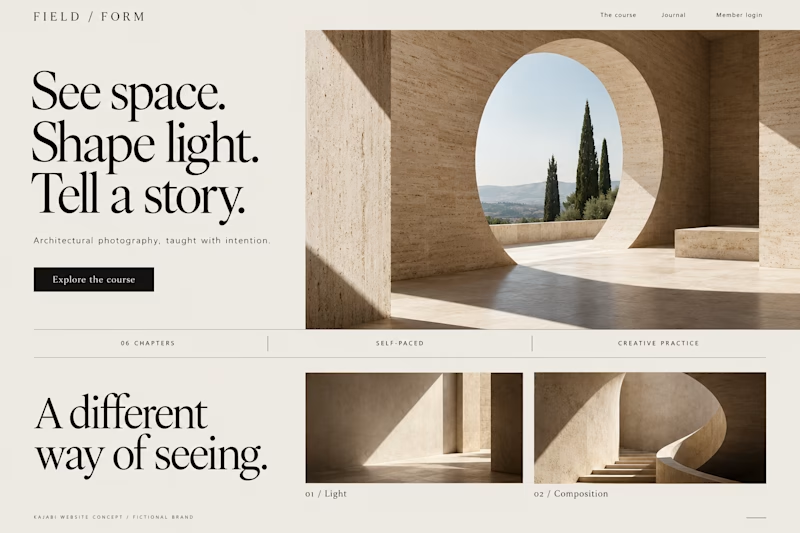
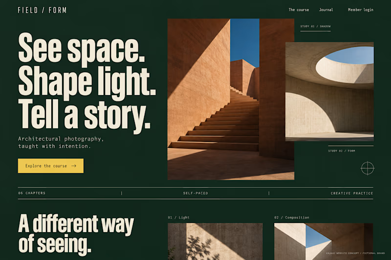
Two original AI-generated concepts for FIELD / FORM, a fictional architectural-photography school. Gallery Study pairs expressive serif type with warm stone and generous space. Field Journal uses forest green, bold condensed type and a layered photo study.
Same course, two directions. Which would you choose, and why?
15 voted
75%
5 voted
25%
20 votes
Closed
Galary study Hits better to me❤️❤️
great job Kraig🔥🔥