The network for creativity
Join 1.25M professional creatives like you
Connect with clients, get discovered, and run your business 100% commission-free
Creatives on Contra have earned over $150M and we are just getting started
Back to feedPost
Taste Test

Hey everyone! 👋
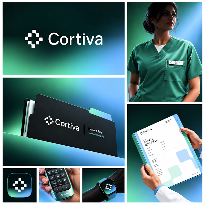
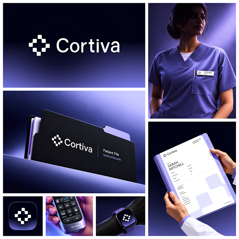
Working on Cortiva, an AI-first hospital branding project.
I've already finalized the color direction, but I thought it would be fun to explore two different moods.
Option 01💚 or Option 02? 💜
Both have their own personality, and I'm curious to see which one you prefer!
Let's see which one wins! 👀
1 vote
Ends in 1d

Option 01 for me. Green gets to "care" faster in a hospital setting, while the violet pulls the whole system toward a tech product. Since the identity is AI-first, I'd be curious whether you want patients to read it as clinical or as friendly first.

Great work

Honestly my heart go to Option 02 but both of them are great choice❤️❤️
Great job Kiran 🎉🎉🎉
The network for creativity
Join 1.25M professional creatives like you
Connect with clients, get discovered, and run your business 100% commission-free
Creatives on Contra have earned over $150M and we are just getting started






Related posts



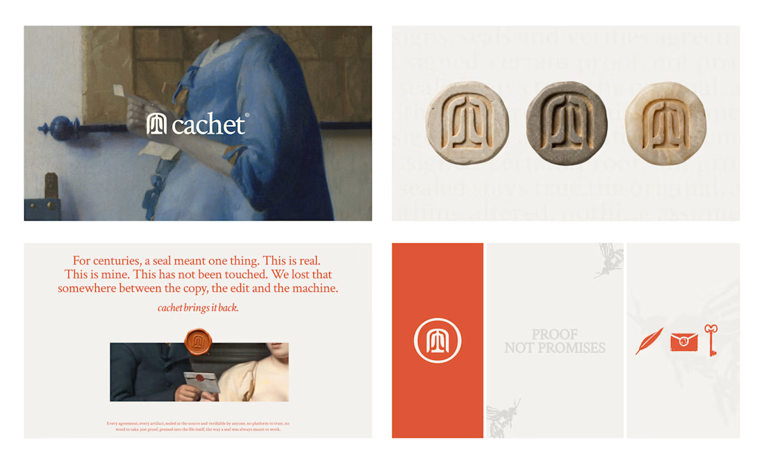
Cachet brand exploration.
Exploring patterns, textures, materials and hand-drawn illustrations
That's interesting I like it that's really unique ❤️❤️🎉🎉

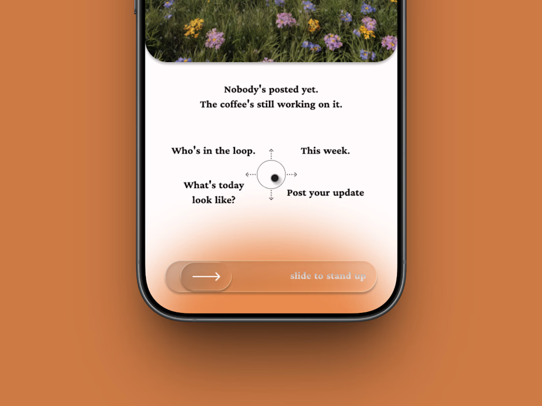
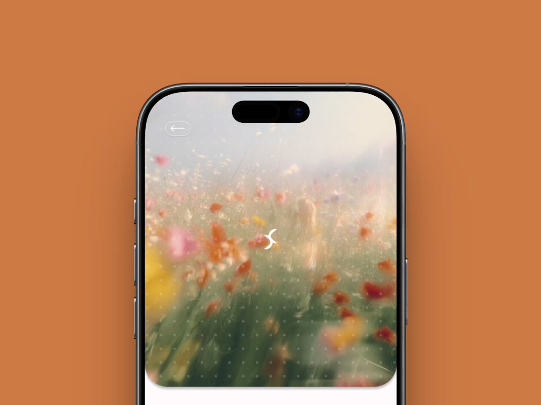
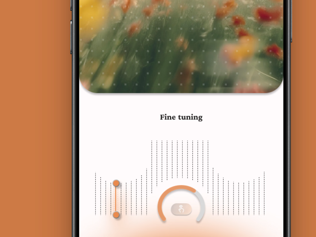
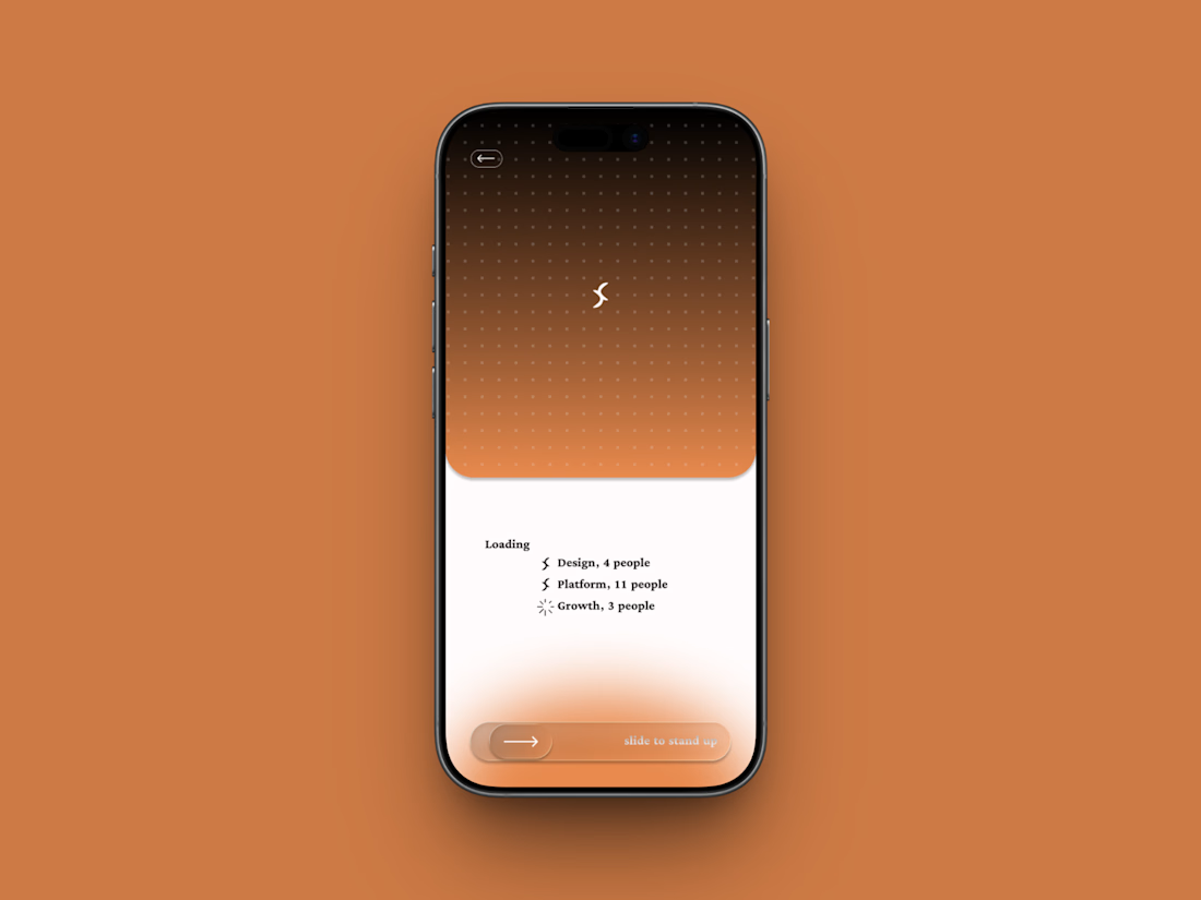
Friday app: Loopin
A fictional async standup app where the meeting is one gesture: slide to stand up.
Film-photo window up top, a four-way compass below, and a loading state that resolves your team one row at a time.
Concept project.