The network for creativity
Join 1.25M professional creatives like you
Connect with clients, get discovered, and run your business 100% commission-free
Creatives on Contra have earned over $150M and we are just getting started
Back to feedPost
Zejtaria
Brand identity for the Albanian National Chamber of Crafts
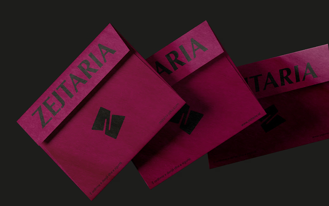
Zejtaria was developed for the National Chamber of Crafts to reposition traditional trades as a serious, viable path — for a generation more inclined to doubt them than choose them.
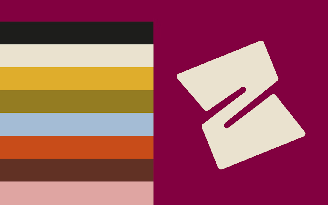
The visual system centers on a single letterform — Z — folded until it opens into a window, a gesture that reads as both a turn of material and an opening.
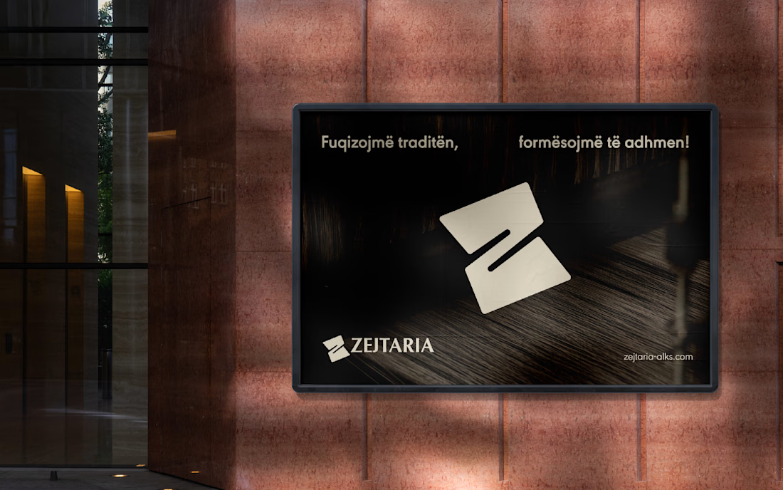
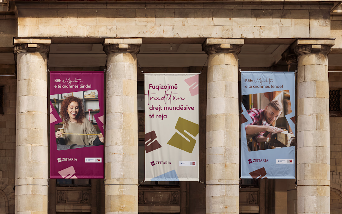
Across posters, stationery, packaging, and outdoor applications, the identity holds a deep burgundy as its anchor, extending into terracotta, mustard, powder blue, and blush — with the same restraint carried through every touchpoint: no ornament standing in for meaning.



So goooood

Thank you Bella

Well done! 🙌
Thanks Samer!

Thank you!

The folded Z reading as both material and a window is a strong concept for a crafts organization specifically, it literally illustrates the making process. Restraint on the ornament is the harder sell internally though, curious if the client pushed back wanting more decoration.
Thanks, Rafee! Surprisingly, no pushback. The client accepted it as is. Once the fold was seen as part of the making process, restraint felt right rather than like something missing.

The Z folding into a window is such a strong single idea to hang an entire system on, no ornament standing in for meaning really shows in the outdoor applications especially. What almost made the cut that you ended up cutting for being too literal?
Thank you, Maty! There was a more organic symbol early on that leaned into the artisanal touch more directly. The client preferred the Z fold in the end, it said the same thing with far less.
That makes sense, less can carry more weight once the idea is trusted. Did the client need convincing on that, or were they already looking for restraint going in?

This design communicates the brand clearly while staying modern and functional.

Nice work 👍 👍
Thank you!

beautiful design
love the colors
Thank you Joseph!

Such a clean design! 🔥🔥
Thank you!


Awesome

impressive!


Nice design

Awesome 👍

This logo has a really joyful energy, I love it💚

excellent design

The network for creativity
Join 1.25M professional creatives like you
Connect with clients, get discovered, and run your business 100% commission-free
Creatives on Contra have earned over $150M and we are just getting started

Challenges
View all


Related posts


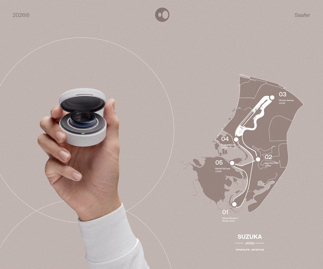
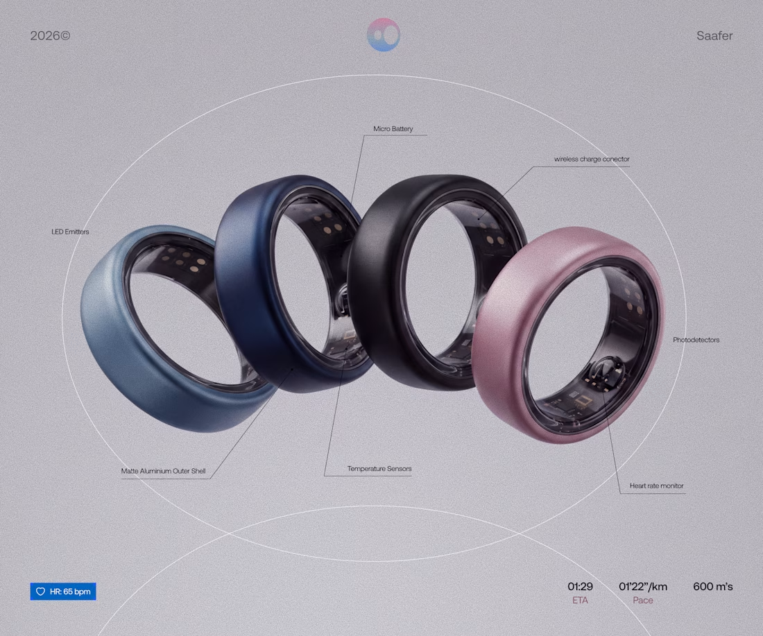
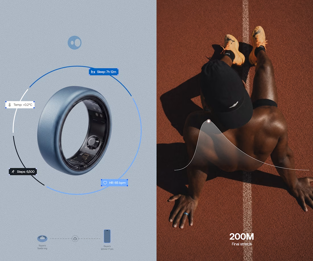
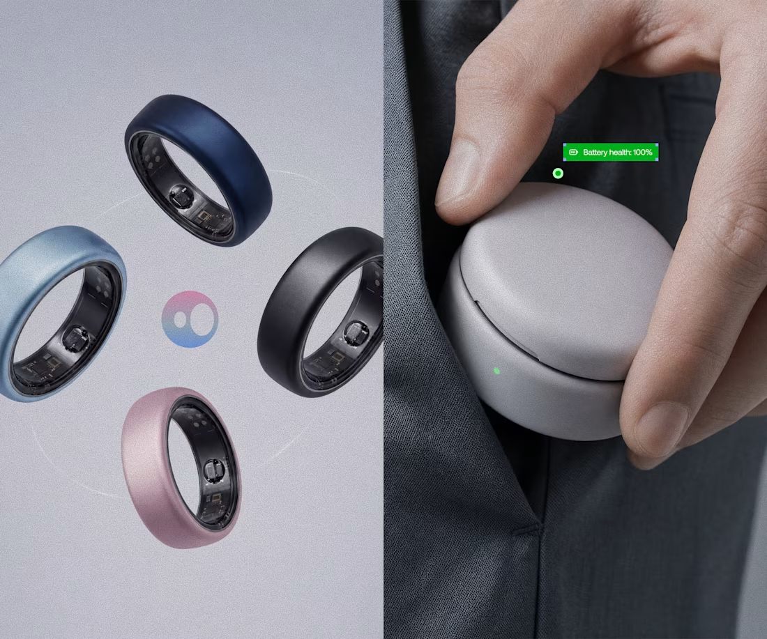
Model rendering and branding done for Saafer's smart ring (Health tech)



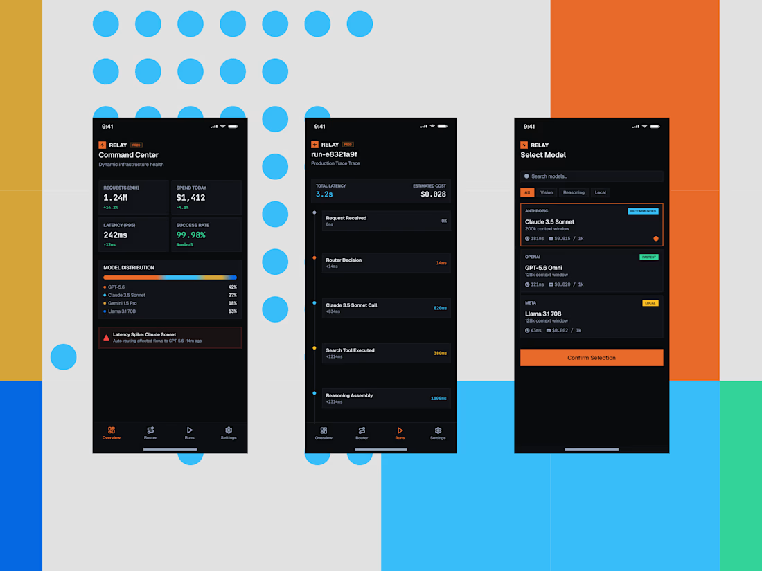
Some quick mockups for Relay, an AI infrastructure platform concept built around model routing, observability, and performance.
Exploring what a mobile command center could look like for teams managing multiple AI models, with a focus on clear data, fast decisions, and a developer-first UX.
Product design, mobile UI, AI tools, and a little systems thinking all in one.



the blue dots and orange blocks pop. did you build this in Framer?