The network for creativity
Join 1.25M professional creatives like you
Connect with clients, get discovered, and run your business 100% commission-free
Creatives on Contra have earned over $150M and we are just getting started
Back to feedPost
Zejtaria
Brand identity for the Albanian National Chamber of Crafts
Zejtaria was developed for the National Chamber of Crafts to reposition traditional trades as a serious, viable path — for a generation more inclined to doubt them than choose them.
The visual system centers on a single letterform — Z — folded until it opens into a window, a gesture that reads as both a turn of material and an opening.
Across posters, stationery, packaging, and outdoor applications, the identity holds a deep burgundy as its anchor, extending into terracotta, mustard, powder blue, and blush — with the same restraint carried through every touchpoint: no ornament standing in for meaning.


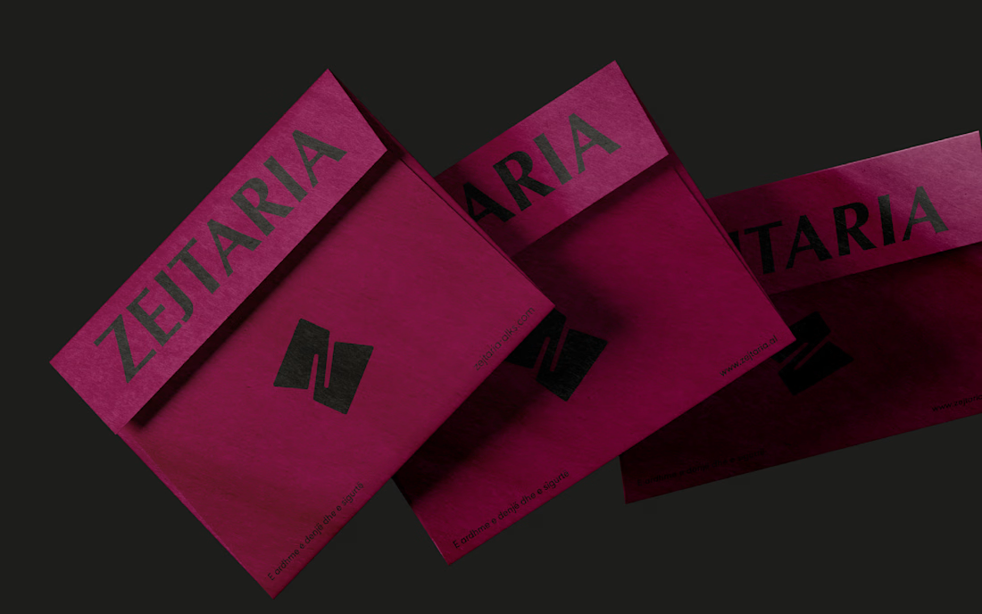
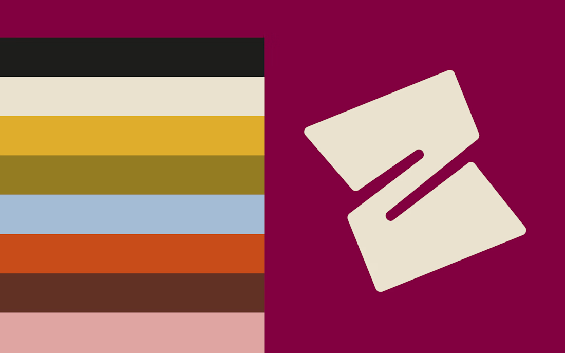
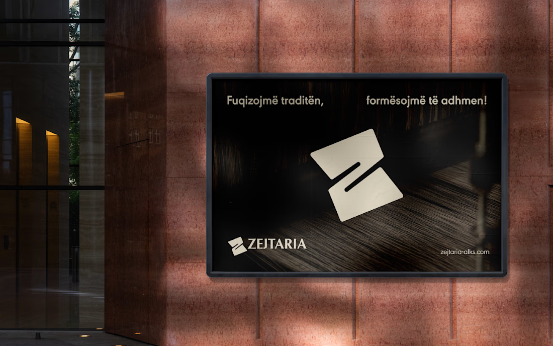
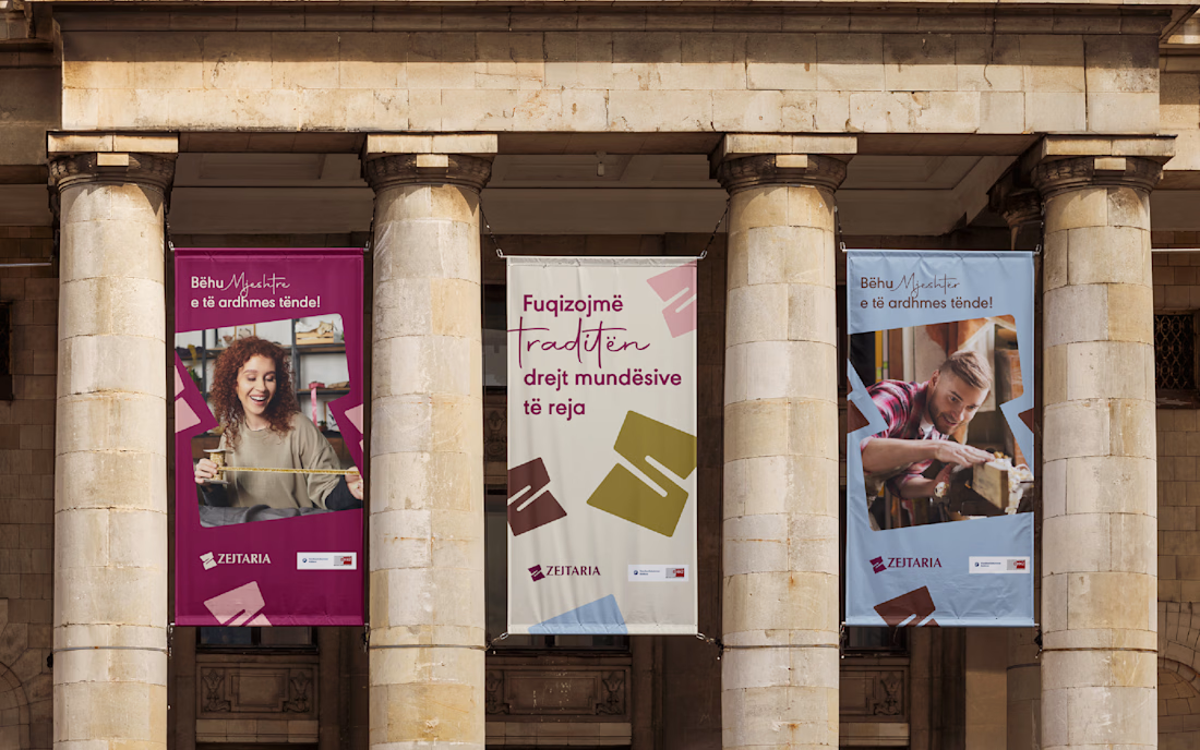

This design communicates the brand clearly while staying modern and functional.

So goooood

Thank you Bella

Well done! 🙌
Thanks Samer!

Thank you!

The folded Z reading as both material and a window is a strong concept for a crafts organization specifically, it literally illustrates the making process. Restraint on the ornament is the harder sell internally though, curious if the client pushed back wanting more decoration.
Thanks, Rafee! Surprisingly, no pushback. The client accepted it as is. Once the fold was seen as part of the making process, restraint felt right rather than like something missing.

The Z folding into a window is such a strong single idea to hang an entire system on, no ornament standing in for meaning really shows in the outdoor applications especially. What almost made the cut that you ended up cutting for being too literal?
The network for creativity
Join 1.25M professional creatives like you
Connect with clients, get discovered, and run your business 100% commission-free
Creatives on Contra have earned over $150M and we are just getting started
Trending

Claude
Claude has entered the design space. How are you using it?

Contra University
Learn from expert creatives how to earn more using next-gen AI tools.
Brand Design
The best brand designers are on Contra. Scroll to see what's trending in brand design. What are you building?
creativeaiflow
Creative AI workflows are evolving. What tools do you use, and what are their strengths and weaknesses?
freelancerlife
Freelancer life is wins, pivots, and everything in between. What’s yours right now?






Related posts

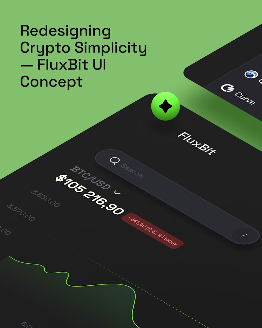
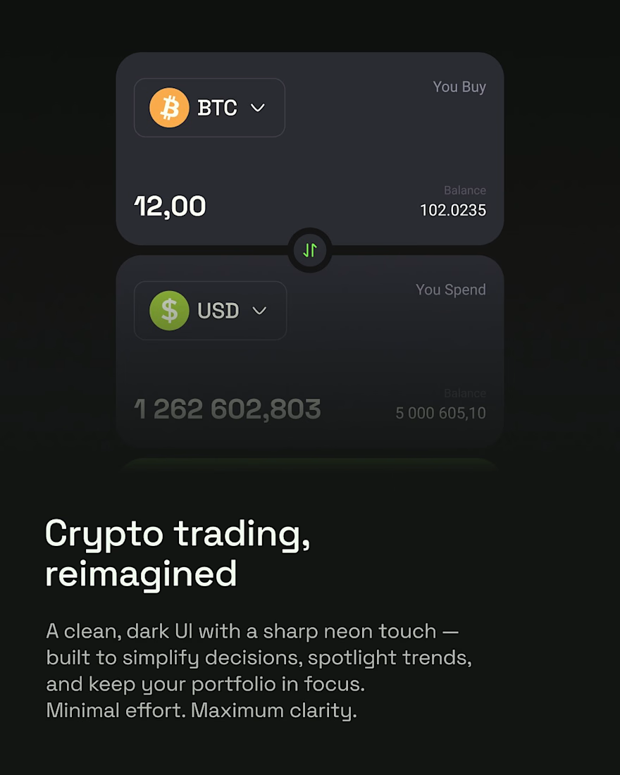
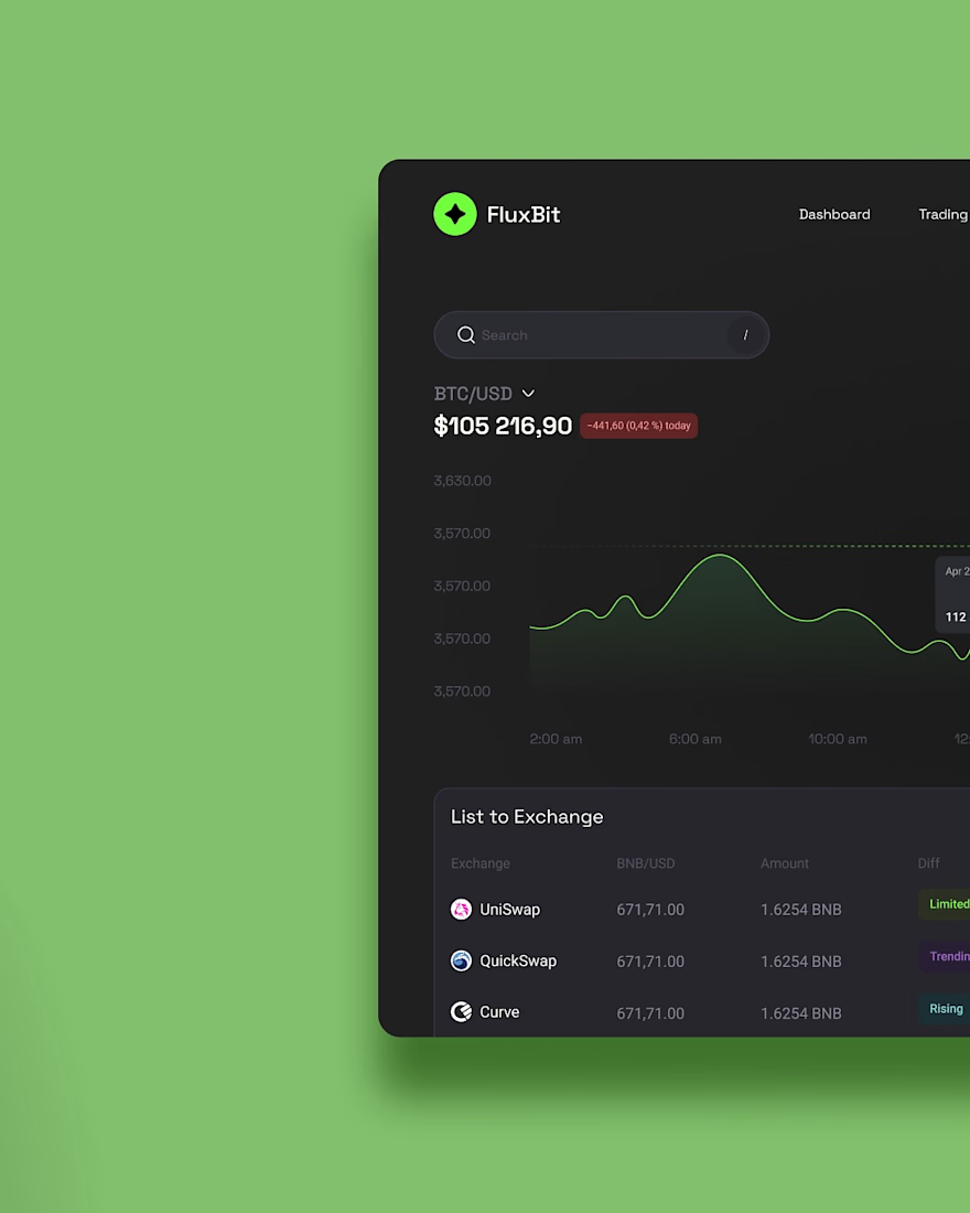
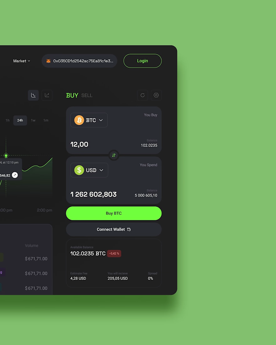
Revisiting one of our earlier UI concepts.
FluxBit was our take on how a crypto trading platform could feel if simplicity came before complexity.
Instead of overwhelming users with endless charts and distractions, we explored a cleaner experience with a focused dark interface, subtle neon accents, and layouts that make market data easier to understand at a glance.
Every screen was designed to reduce visual noise while keeping the tools traders actually need within easy reach, creating an experience that feels modern, confident, and intuitive.
It's always fun looking back at concepts like this and seeing how timeless a clarity-first approach to product design can be.


love the UI

Project,
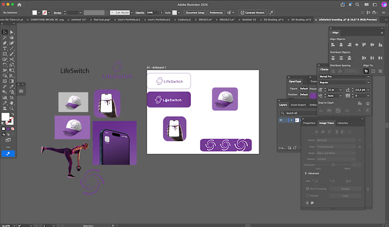
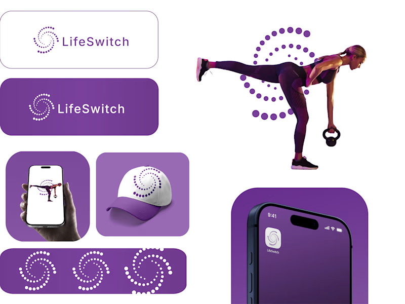
Target audience is people interested in losing weight, lifting weights, tracking data and seeing real results.
0 voted
1%
0 voted
1%
0 votes
Closed

This looks clean and well thought out. How long did it take you to bring everything together?

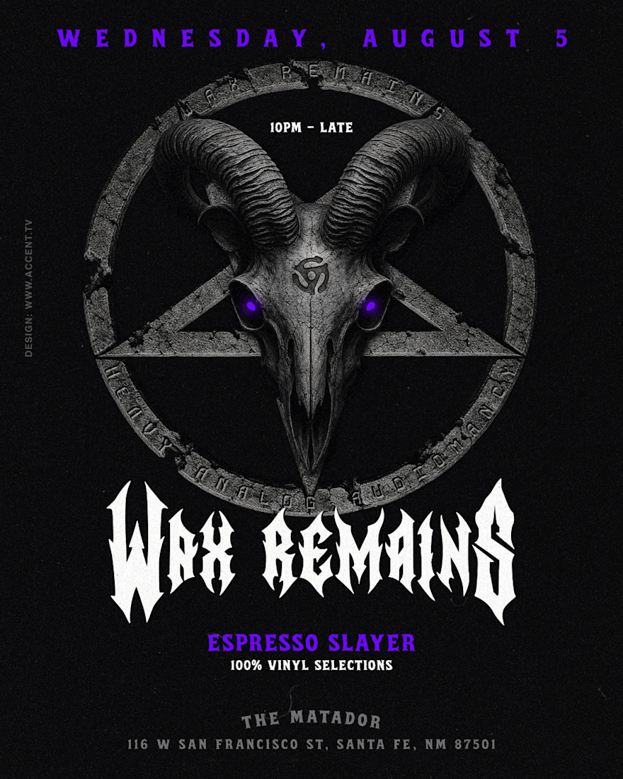
Working on identity for a metal event out in New Mexico called "Wax Remains"
Client wanted a custom baphomet visual with a 45 adapter on it's forehead. I then worked on a quick social story loop so they can communicate events online by editing it with their phone. What do you guys think?

The 45 adapter on the baphomet's forehead is such a specific, memorable detail, it instantly signals the vinyl angle without needing extra text. For the social story loop, are you planning to reuse this same illustration across future event dates, or will each one get its own variation?