The network for creativity
Join 1.25M professional creatives like you
Connect with clients, get discovered, and run your business 100% commission-free
Creatives on Contra have earned over $150M and we are just getting started
Back to feedPost
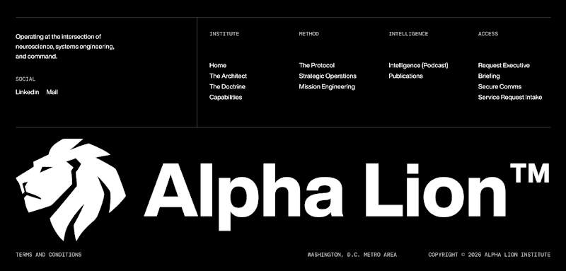
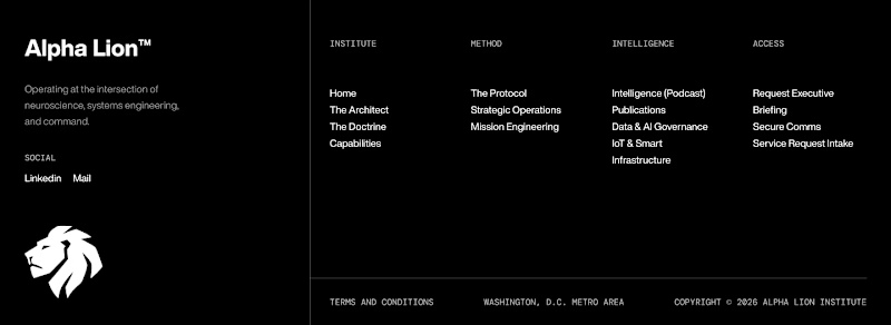
Taste Test

Bold logo or clean layout which footer should I choose?
.
.
More of this over on X, in real time ideas, questions, and the people building cool stuff https://x.com/rightnextstep?s=11


13 voted
52%
12 voted
48%
25 votes
Closed

Footer 1 looks better


Both looks good but the first one's better

I love the bold logo one! Gives the whole layout support and it looks really pleasing.

Personally, I prefer 2

I prefer the layout of footer one. Both look cool though

Footer 2 feels more premium to me with the mark repeated smaller, but Footer 1 might win on scannability for a supplement brand. Which way are you leaning after seeing the early votes?

Footer 1

Ohh It's tough. I'll go with footer 1

The network for creativity
Join 1.25M professional creatives like you
Connect with clients, get discovered, and run your business 100% commission-free
Creatives on Contra have earned over $150M and we are just getting started

Challenges
View all


Related posts

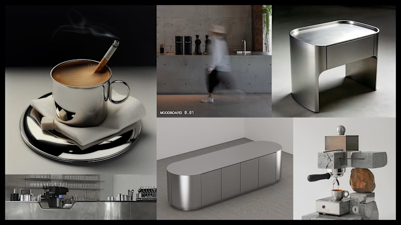
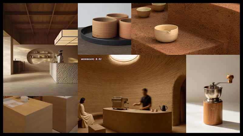
We're stuck 😅
Which one feels more premium and unique to you?
Comment 01 or 02 below your opinion will genuinely help us lock this in.
7 voted
33%
14 voted
67%
21 votes
Closed


did some home cleaning - works page is now my homepage
i've lost over 50% of traffic because people dropped off on my previous homepage (about now) that didn't give any value
check it out yourself: https://seb-astian.com

looking great! i love that loading animation.


“Or similar” leaves a lot to the imagination.
A few billboard designs I made for Sync as part of the rebrand. The campaign centres on a simple promise: the car you see is the car you drive.
I kept that message big and direct, with the cars up close and enough pink to make you look twice.
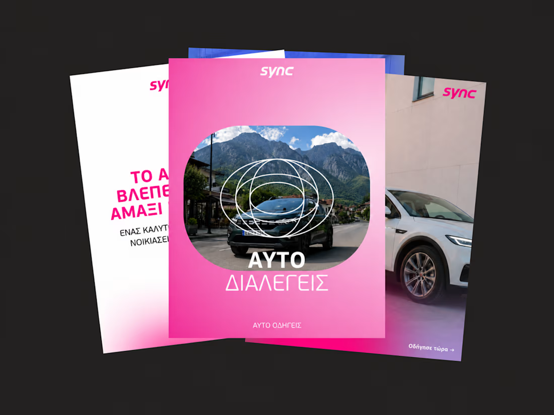
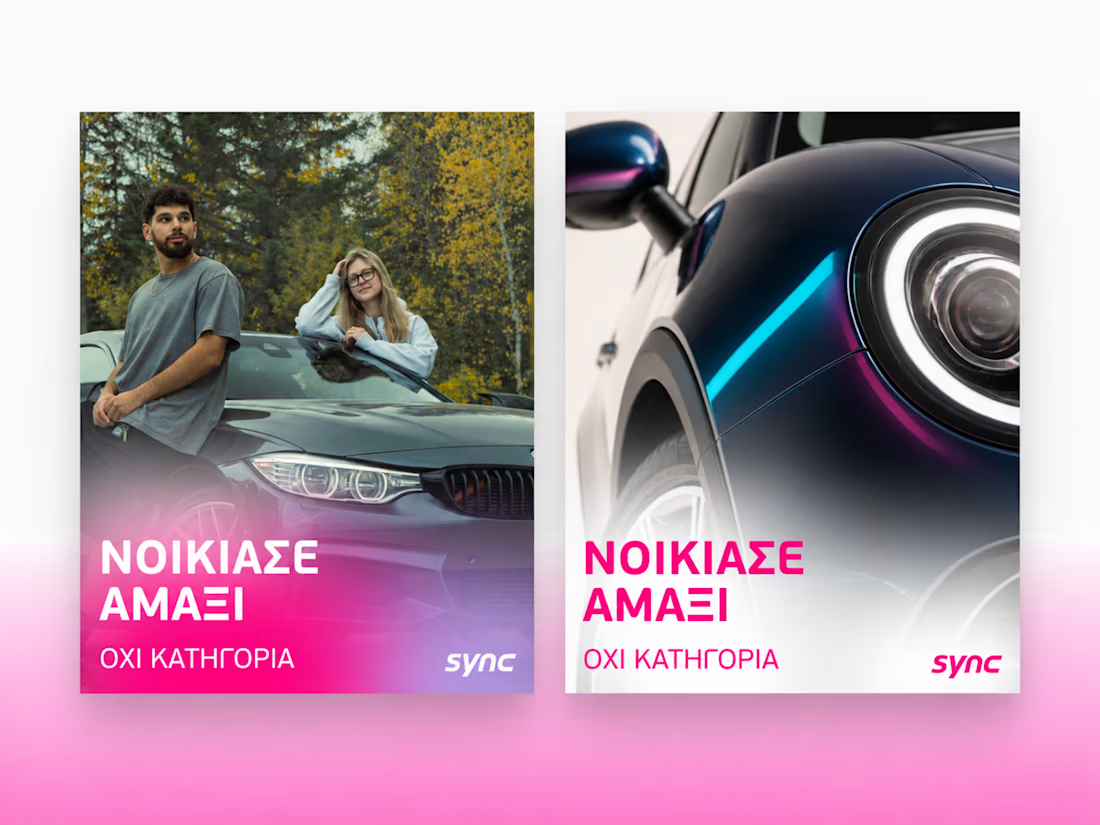
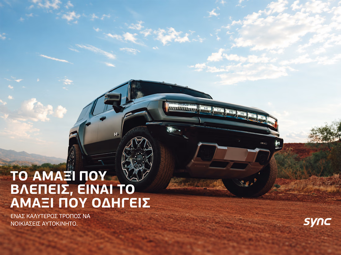
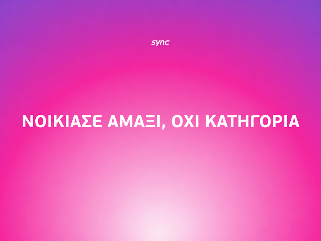

The way the oversized promise carries through the pink palette is really effective—the close-up crops make the car feel immediate without losing the campaign idea.