The network for creativity
Join 1.25M professional creatives like you
Connect with clients, get discovered, and run your business 100% commission-free
Creatives on Contra have earned over $150M and we are just getting started
Back to feedPost
Taste Test

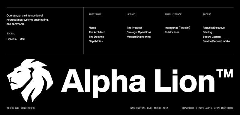
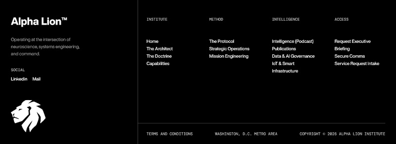
Bold logo or clean layout which footer should I choose?
.
.
More of this over on X, in real time ideas, questions, and the people building cool stuff https://x.com/rightnextstep?s=11


16 votes
Ends in 1d

Footer 2 feels more premium to me with the mark repeated smaller, but Footer 1 might win on scannability for a supplement brand. Which way are you leaning after seeing the early votes?

Footer 1 looks better


Both looks good but the first one's better

I love the bold logo one! Gives the whole layout support and it looks really pleasing.

Personally, I prefer 2

I prefer the layout of footer one. Both look cool though
The network for creativity
Join 1.25M professional creatives like you
Connect with clients, get discovered, and run your business 100% commission-free
Creatives on Contra have earned over $150M and we are just getting started






Trending

Claude
Claude has entered the design space. How are you using it?

Contra University
Learn from expert creatives how to earn more using next-gen AI tools.
Brand Design
The best brand designers are on Contra. Scroll to see what's trending in brand design. What are you building?
creativeaiflow
Creative AI workflows are evolving. What tools do you use, and what are their strengths and weaknesses?
freelancerlife
Freelancer life is wins, pivots, and everything in between. What’s yours right now?
Related posts


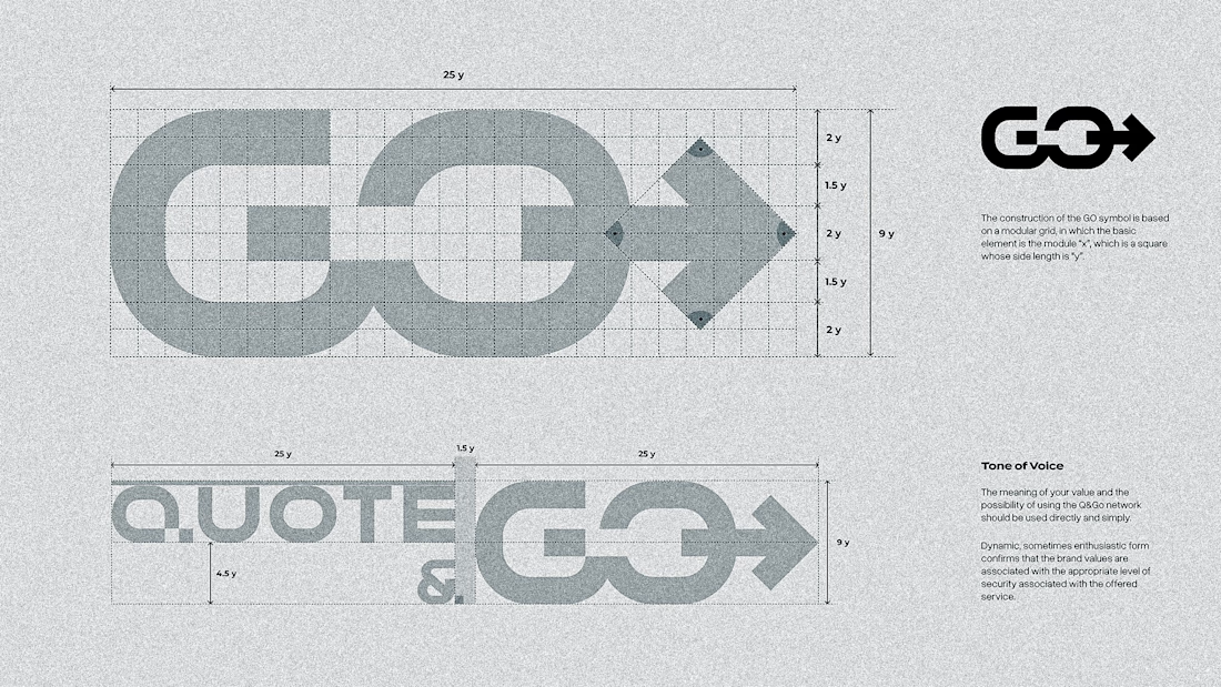
Just wrapped up another project we're really proud of ✨
This one was a complete redesign, and it's a great reminder of how much trust can impact the creative process.
We originally planned about a month for the project, but everything came together in just two weeks. The biggest reason? Our client trusted us from the very beginning.
The first Figma concept was approved right away – no second round of revisions needed. That allowed us to focus on building instead of constantly revisiting the design, making the whole process faster and smoother for everyone.
We genuinely love working on projects like this. Great communication, mutual trust, and a shared vision always lead to the best results.
A big thank you to our client for such an enjoyable collaboration. We'd happily do more projects like this! 💙


Rounded accurate and smooth! Good job Serge!



Awesome 🔥


Great job.
The Brandin Feels calm and peaceful


