The network for creativity
Join 1.25M professional creatives like you
Connect with clients, get discovered, and run your business 100% commission-free
Creatives on Contra have earned over $150M and we are just getting started
Back to feedPost


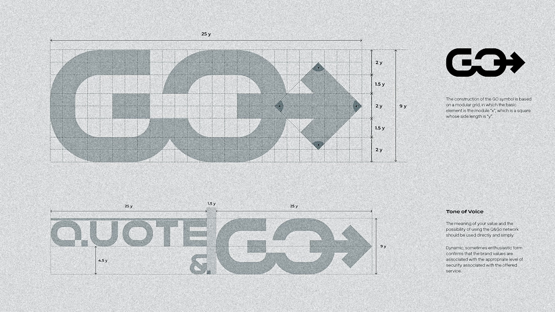

Curious how much of that negative space arrow was there from the first sketch versus something that only clicked once you built the grid out. Also love that you kept the construction lines visible, most people would've hidden that part.

Awesome 🔥

Love it🔥

Super clean work!

The GO mark doubling as an arrow within the grid construction is clever, it justifies the geometry instead of just showing math for its own sake. Nice touch documenting the tone of voice alongside the grid too.


That's neat.


In grids we trust!

nice work 😊

Clean, intuitive, and thoughtfully crafted
The network for creativity
Join 1.25M professional creatives like you
Connect with clients, get discovered, and run your business 100% commission-free
Creatives on Contra have earned over $150M and we are just getting started



Related posts

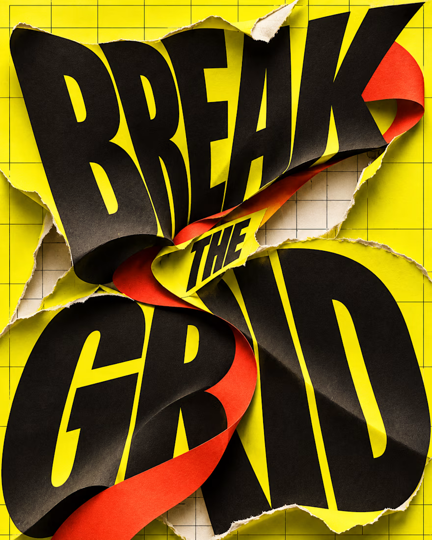
What happens when typography refuses to stay inside the grid?
BREAK THE GRID — an AI-generated visual experiment combining oversized lettering, torn-paper textures and bold colour. The words become the action: bending, tearing and breaking through the layout.
Controlled structure or creative chaos—which draws you in?

Investors and users judge your brand first.
here is the first impression it should make.