The network for creativity
Join 1.25M professional creatives like you
Connect with clients, get discovered, and run your business 100% commission-free
Creatives on Contra have earned over $150M and we are just getting started
Back to feedPost
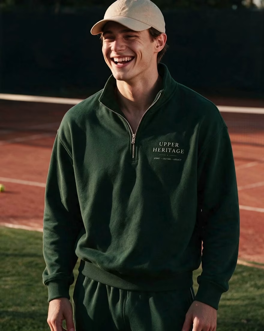
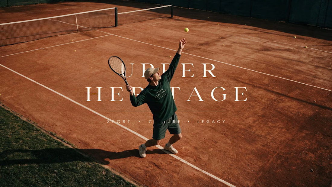
Built to Look Like It Has Always Existed 🎾
Some brands want to look new. This one wanted the opposite.
Upper Heritage borrows the codes of club tennis — crests,
hand-painted signage, court green. Designed to feel founded
in 1934 and simply never advertised.
The hardest part of heritage design isn't adding history.
It's knowing what to leave out.
You can see the full project here.

Really lovely banding

Thank you Sekinat 🤍

beautifully done, definitely fits the energy you described as the goal!
Thank you! That energy was the whole brief — glad it landed:)

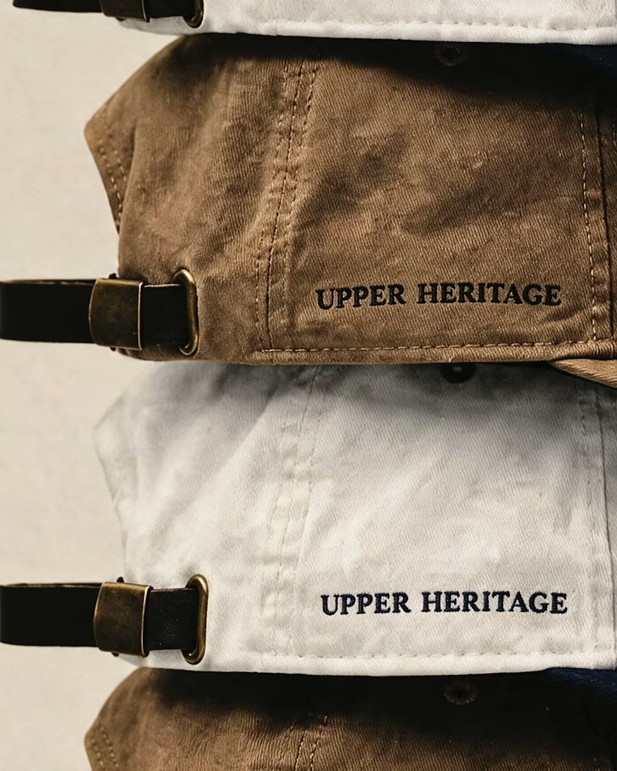
Leaving things out is also why fake heritage ages well - every added crest is a claim someone can date, while restraint has no birthday. The cap embroidery sells it hardest for me: slightly uneven type reads pre-digital in a way clean vectors never manage. Was there an element you cut that genuinely hurt?
"Restraint has no birthday" is better than anything in my post.
The crest had a full motto ring at first — Latin, the works.
Gorgeous alone, illegible on a cap. Anything that only survives
at one scale isn't a system, it's a poster. Cutting it made the
whole thing quieter and...

I love the vibesssss, old money style!! 💯
Thank you!! That was exactly the target 🎾

A brand doesn't really exist until you see it on
a cap and a sign. Thank you Nirooz:)

Lovely!
thank you Damilola:)

Awesome!
thank you Victrex:)

Mine too. Clay does half the work — it's the one surface that
hasn't changed in a century:)

Nice Work
thank you Orunna:)

Love the creative approach.
Thank you! Appreciate you taking a look 😊

wow this is nice
Thank you Olabisi!:)

Made me smile like that guy from Ratatouille :) Really good work!

Great job. I like it.

LEGENDARY

Now this is what we call Branding , Great work

CLASS!

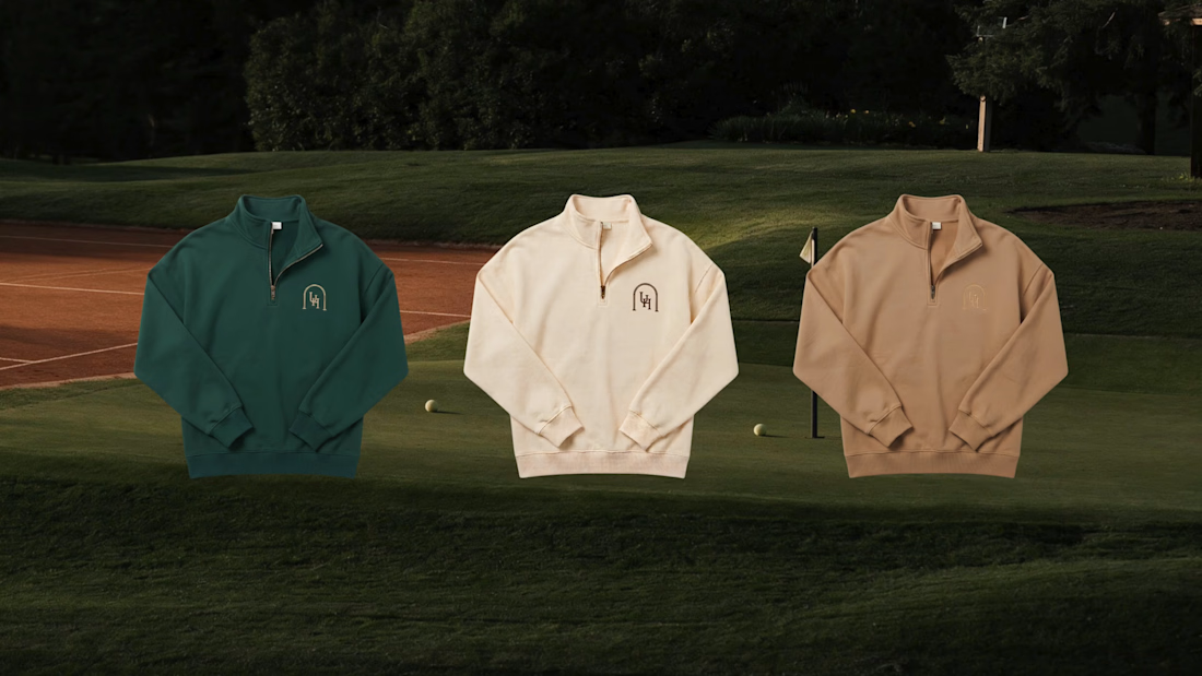
Looks like a great start, the serif type choice feels right at home, the kelly/white/tan half zipper options look like strong choices and feel on par with the vibe you are going for.
I would work a bit on that serve photo, the position of of the player on the court and the...

Super clean work! 👌

Looks nice. love the colors

"Knowing what to leave out" shows in the crest and the belt stamp staying separate marks rather than merging into one busy logo lockup — restraint most heritage rebrands claim but don't actually practice.

🔥 🔥

Absolutely awesome

One of the best designs I’ve seen today. Really solid work 👏 Borrowing club tennis codes gives the identity such a timeless heritage feel.

Old Money + Colour combination... Goodly put together

Awesome 🔥

Truly heritage embodied. Good work!

The photography in this project is so classy, I went through the complete project as well. Yes this is great work guys!

Beautiful

This is such a strong take on heritage branding. 🎾 The restraint really sells the authenticity—everything feels timeless without being overdesigned. Love the “built to look like it has always existed” approach. 👏
The network for creativity
Join 1.25M professional creatives like you
Connect with clients, get discovered, and run your business 100% commission-free
Creatives on Contra have earned over $150M and we are just getting started






Related posts

Which ZVEZRA logo direction do you prefer? 👀
I’ve been exploring two variations of the wordmark. Both follow the same visual direction, but each has its own character.
Vote below!
I’d love to hear your thoughts! 👇

39 voted
53%
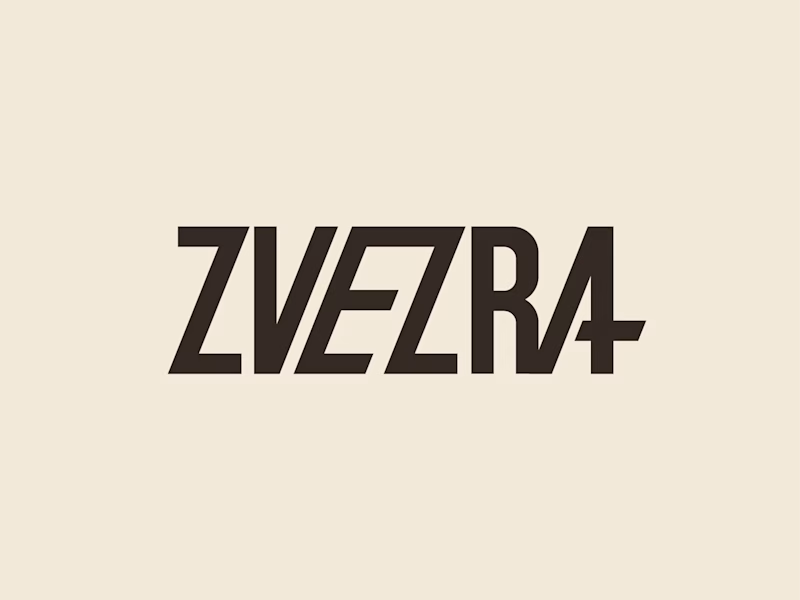
34 voted
47%
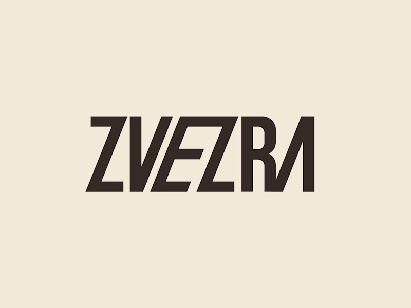
73 votes
Closed

Option 1 for me, it has a bit more personality. Both are strong though, tough call



Beautyy

Recovery Brand Identity / Logo & Visual Direction
A new identity project for a recovery-focused brand that wanted to move away from the conventional clinical look of its category.
The direction combines clinical credibility with a more modern, movement- and performance-driven visual language.
First look at the logo. Full identity coming next.
Logo design and creative direction by Lepisov Branding
Social media Branding: collab with Mike Creative Mints
