The network for creativity
Join 1.25M professional creatives like you
Connect with clients, get discovered, and run your business 100% commission-free
Creatives on Contra have earned over $150M and we are just getting started
Back to feedPost

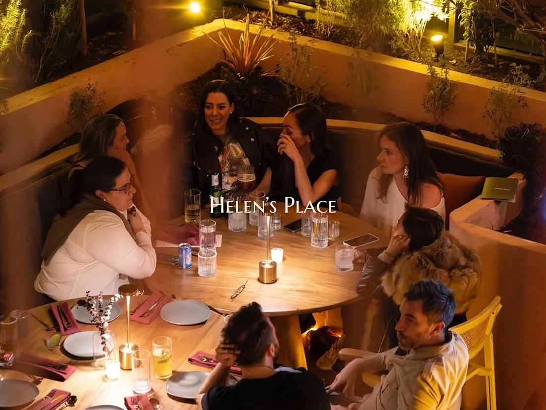
Some meals are about the food. Others are about the people around the table. At Helen’s Place, you get the best of both.
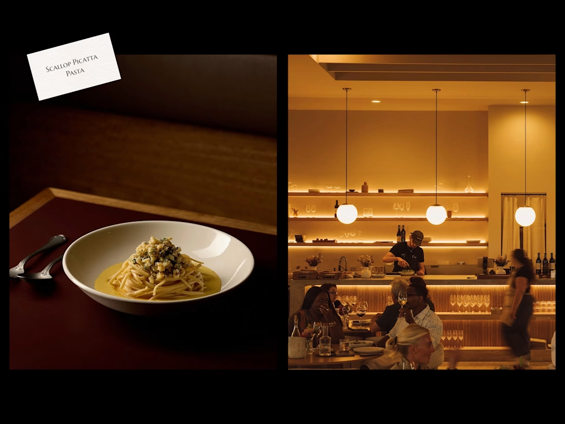
Rooted in the rich culinary traditions of the Mediterranean and Italy, guests enjoy the warm and welcoming ambiance of eating good food with family and friends.
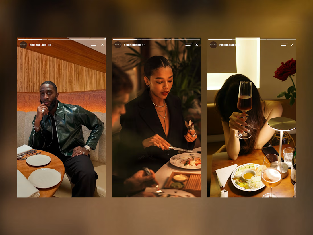
Great food brings you in. The experience is what keeps you coming back.
There’s no place, like Helen’s Place. 🌿
Check it out.

Beautiful work!
Thank you, Bella!

Ohhh this is such a vibe!! The website feels nice.
Thanks, Reda!

The warm photography and the family table story fit Helen's Place really well. Restaurant templates live or die on the menu and reservation flow, curious how you handled those.

The visuals alone are more than enough to convince me that this place is worth visiting. As a brand identity designer, I think the visuals are doing exactly what they're meant to do, creating interest and making people want to experience the place.
The network for creativity
Join 1.25M professional creatives like you
Connect with clients, get discovered, and run your business 100% commission-free
Creatives on Contra have earned over $150M and we are just getting started
Related posts


Keeping the Halloween-inspired concepts coming! 🕯️✨
This time, we're sharing Ovelle — a luxury candle e-commerce website with warm tones, elegant typography, and a moody editorial aesthetic. Would love to hear your thoughts! 🎃


What if your biggest streaming platform got a Halloween makeover? 🕸️
As Halloween is closing by, I decided to do a short campaign teaser for one of the biggest streaming platforms.
I redesigned their logo and played with the wording as part of their brand messaging in a spooky theme for the upcoming Halloween event.
I retained the brand consistency across the typography and overall logo shape and changed few details within.
Any twitch streamers, viewers or halloween celebrants here?


Fun concept and perfect timing. The spooky wordmark twist still feels on brand, nice one.


