The network for creativity
Join 1.25M professional creatives like you
Connect with clients, get discovered, and run your business 100% commission-free
Creatives on Contra have earned over $150M and we are just getting started
Back to feedPost

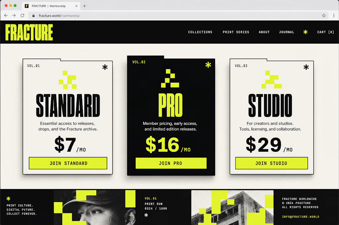
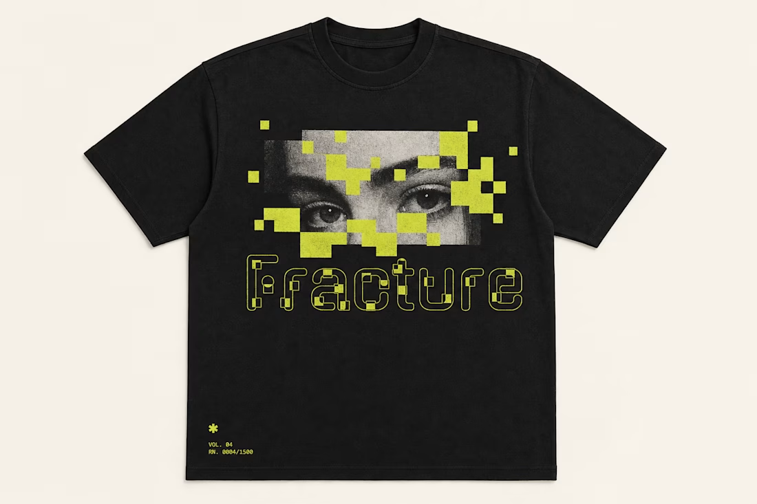
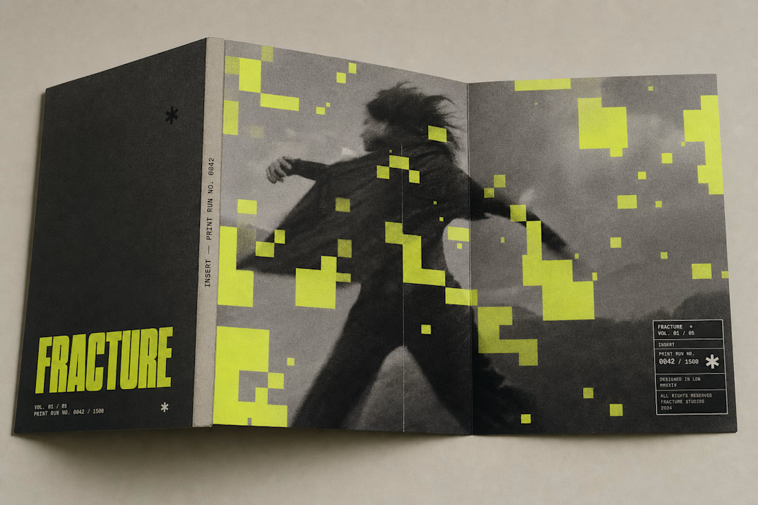
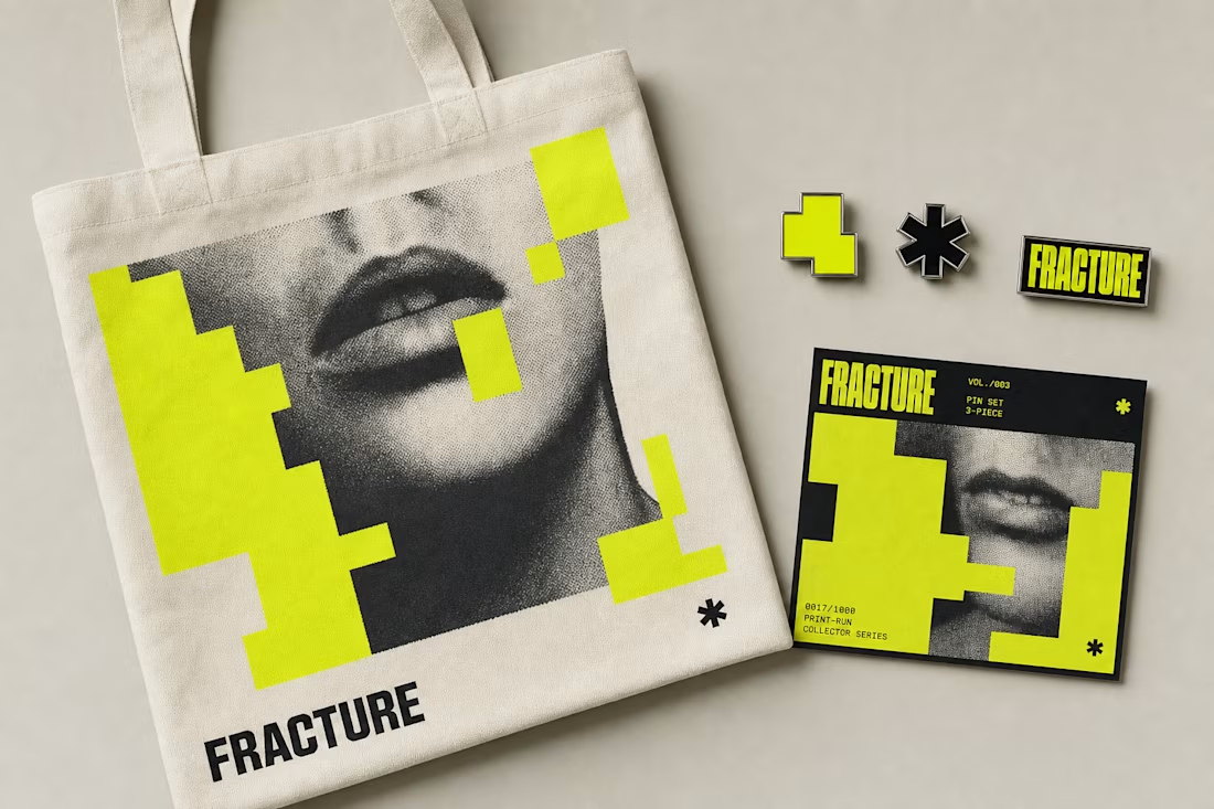
Fracture's identity doesn't stop at posters — it survives a t-shirt, a pin set, a phone screen, and a mailer box without breaking the rule: yellow blocks occlude, never distort. Same system, five very different surfaces.
See the full case study → Check it out

great! gud job man!

Outstanding work

"Yellow blocks occlude, never distort" is such a tight rule to design around — that kind of constraint is usually what makes a system actually hold up across five different substrates instead of falling apart on the weird ones like the mailer box. Was the rule there from day one, or did it emerge after a few applications broke?

Used my 1st upgoat on this platform. Amazing job!

Well spent

Nice Design

You have an upgoat from me as well

ohh nice😍

Flawless execution.

Goated!

Love seeing a brand system that scales this well. The consistency across every application is super satisfying.


LOVE the main color being this lime/yellow neon. Really stands out!

amazing

Great job

The occlusion rule really holds up across formats, especially seeing it survive from a halftone tote bag print to a pricing table without looking like two different studios did the work. Curious how you kept the yellow block placement from feeling random on the smaller applications like the pin set.


Nice work

Love this!

elegant design approach


Outstanding work

The yellow block rule is such a smart constraint to build a whole system around. Seeing it hold across pricing cards, a t-shirt, a mailer, and editorial layout without ever feeling forced is exactly what good brand architecture looks like.

Dope stuff

Having a core design rule like "occlude, never distort" is what separates top-tier identity systems from simple logos. The way those acid-yellow pixel blocks adapt from raw halftone print layouts and merch to a clean web pricing interface is exceptional. It keeps the brutalist,...


This deserves more than just liking, this deserves to be featured! 🏆 That bold yellow block system would make for an insanely cool, high-impact web layout.

this feels so unique the branding and the brand assests are on point would love to see more work from you

The network for creativity
Join 1.25M professional creatives like you
Connect with clients, get discovered, and run your business 100% commission-free
Creatives on Contra have earned over $150M and we are just getting started


Trending
retrofuturism
Share your favorite designs from the past exploring the distant future. Or your own take on the aesthetic 🚀
halftone
Dots. Texture. Grain. Let's see your designs using the halftone technique.

Midjourney
Creatives are showing off what they're making with Midjourney.
colorgrade
Video editors sound off: How do you enhance the mood of your video in color grading?
Related posts

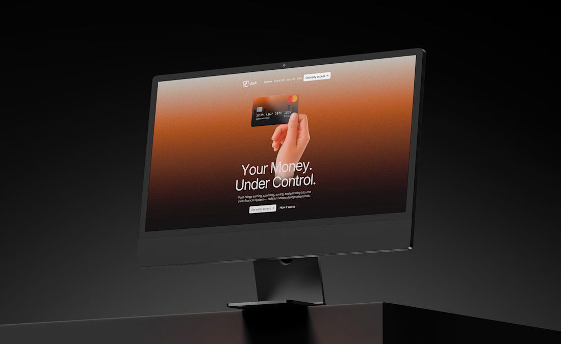
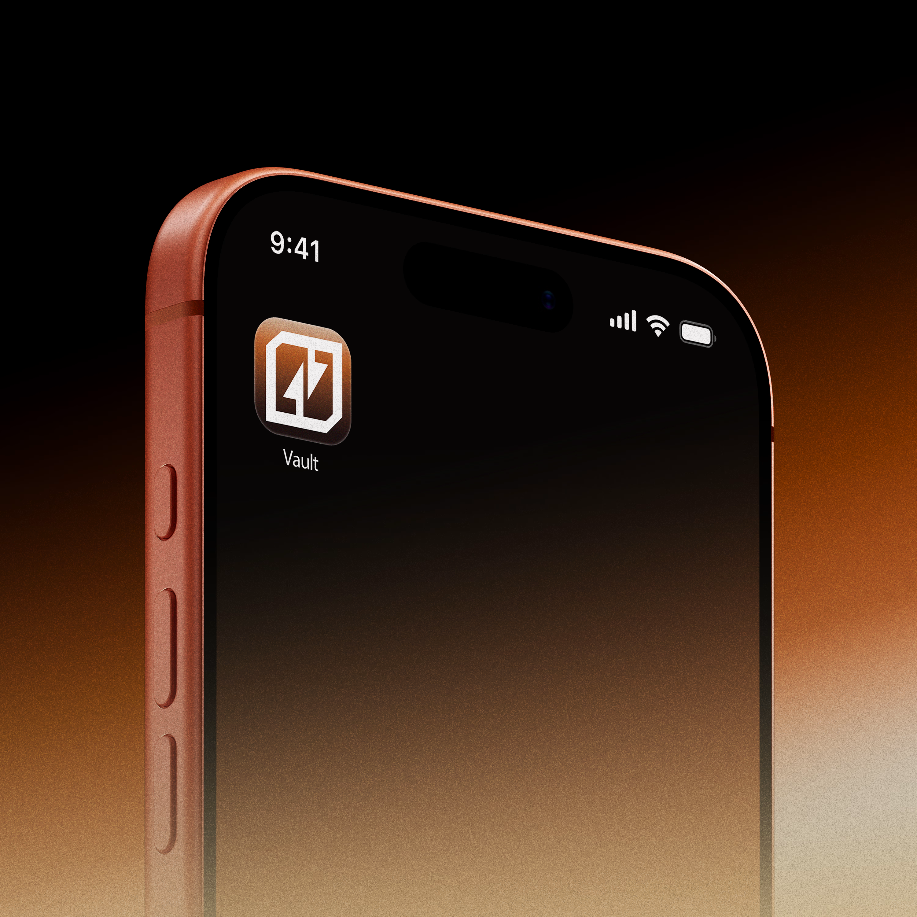
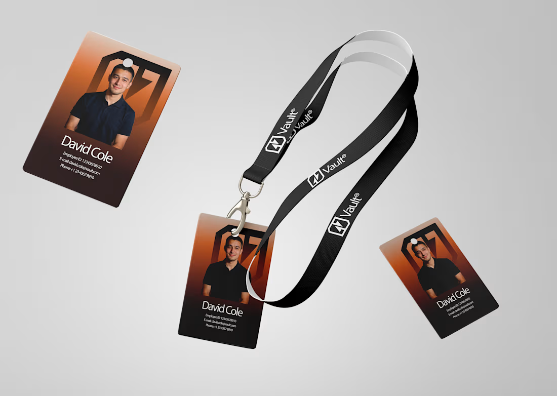
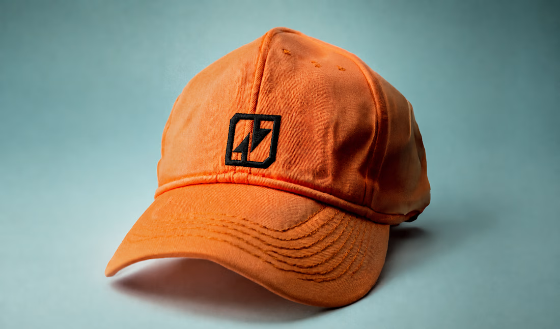
one last look at Vault® before i call it finished.
added a few more brand applications across the website, app, ID card, cap, and more.
really enjoyed seeing how the identity holds up across completely different touchpoints.
strategy → identity → digital → product

So gooooood


Incredible. Love the way you put this together