The network for creativity
Join 1.25M professional creatives like you
Connect with clients, get discovered, and run your business 100% commission-free
Creatives on Contra have earned over $150M and we are just getting started
Back to feedPost
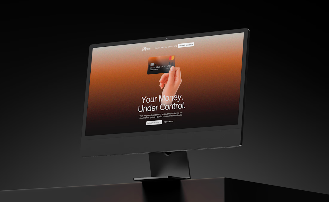
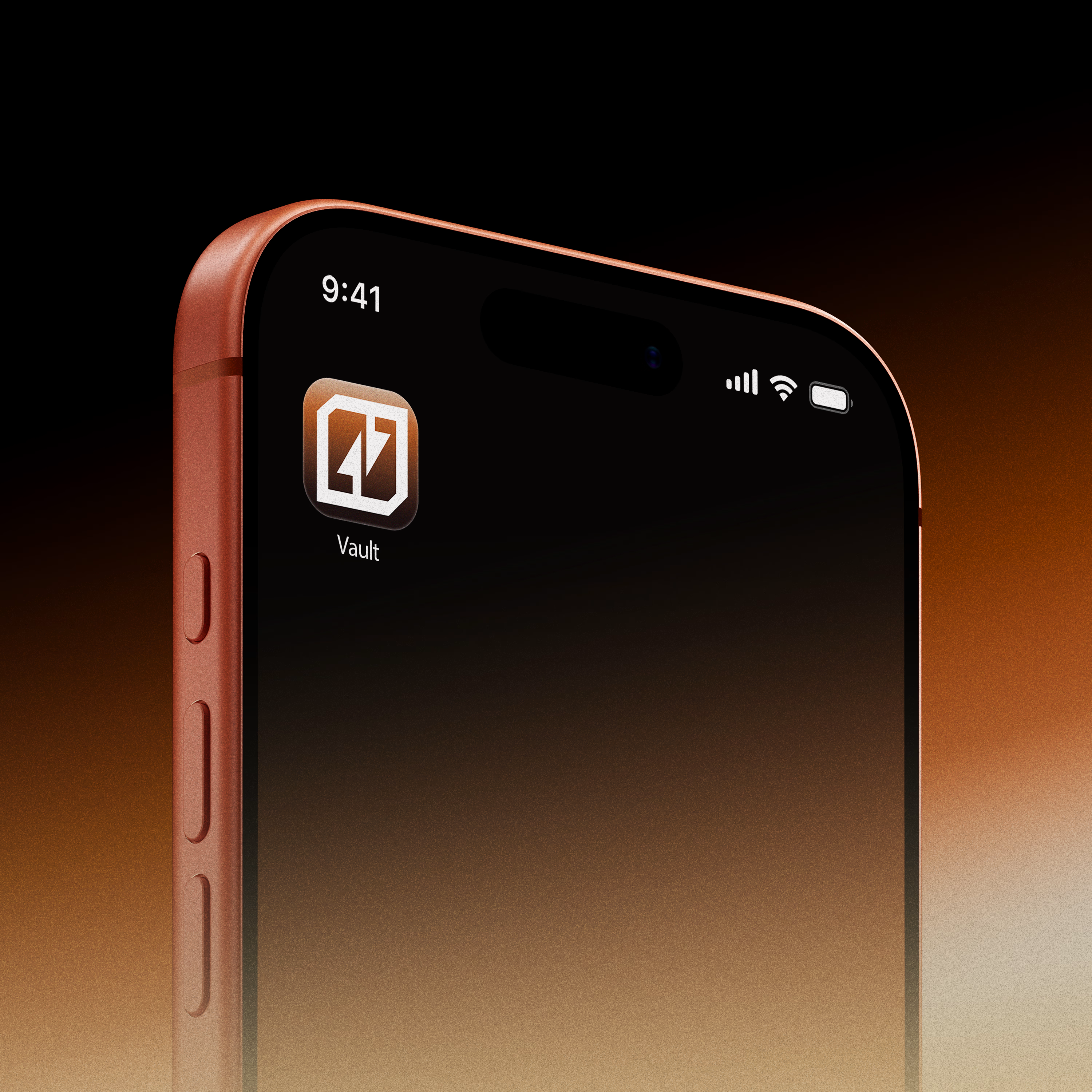
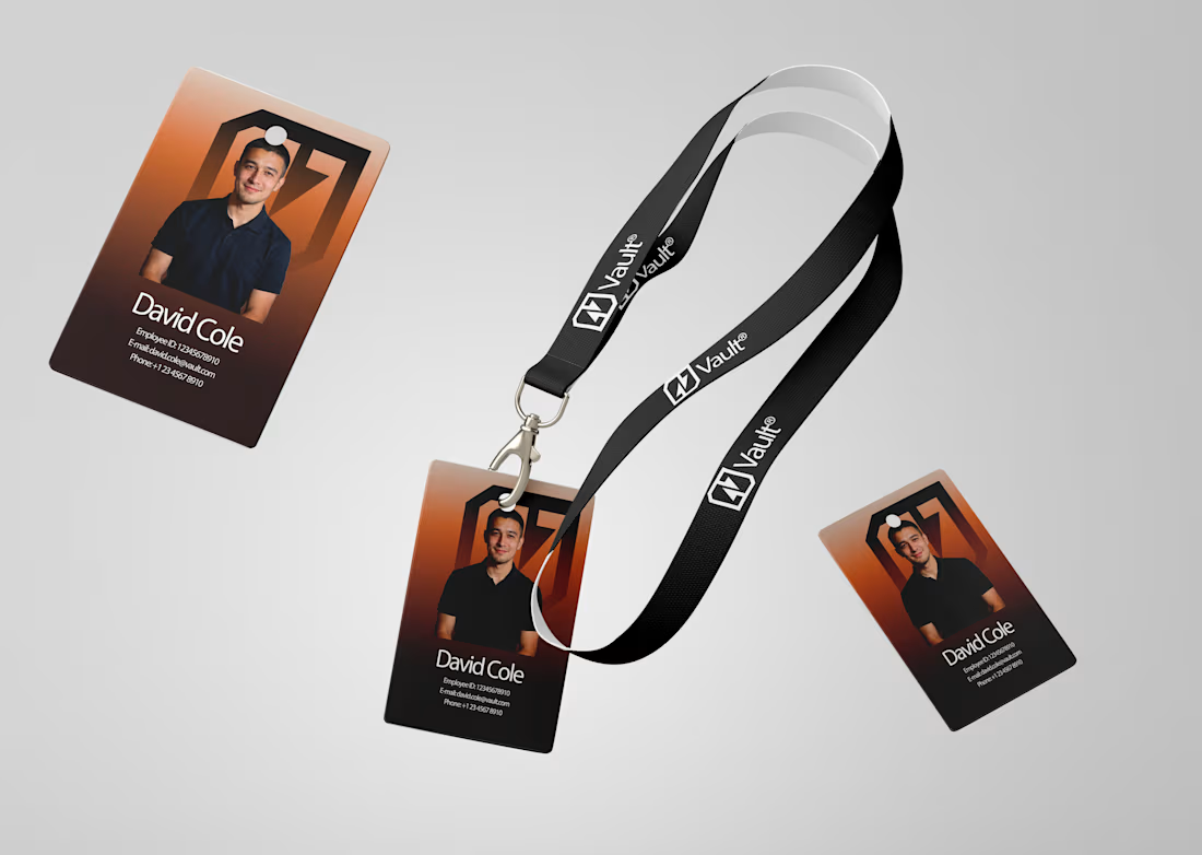
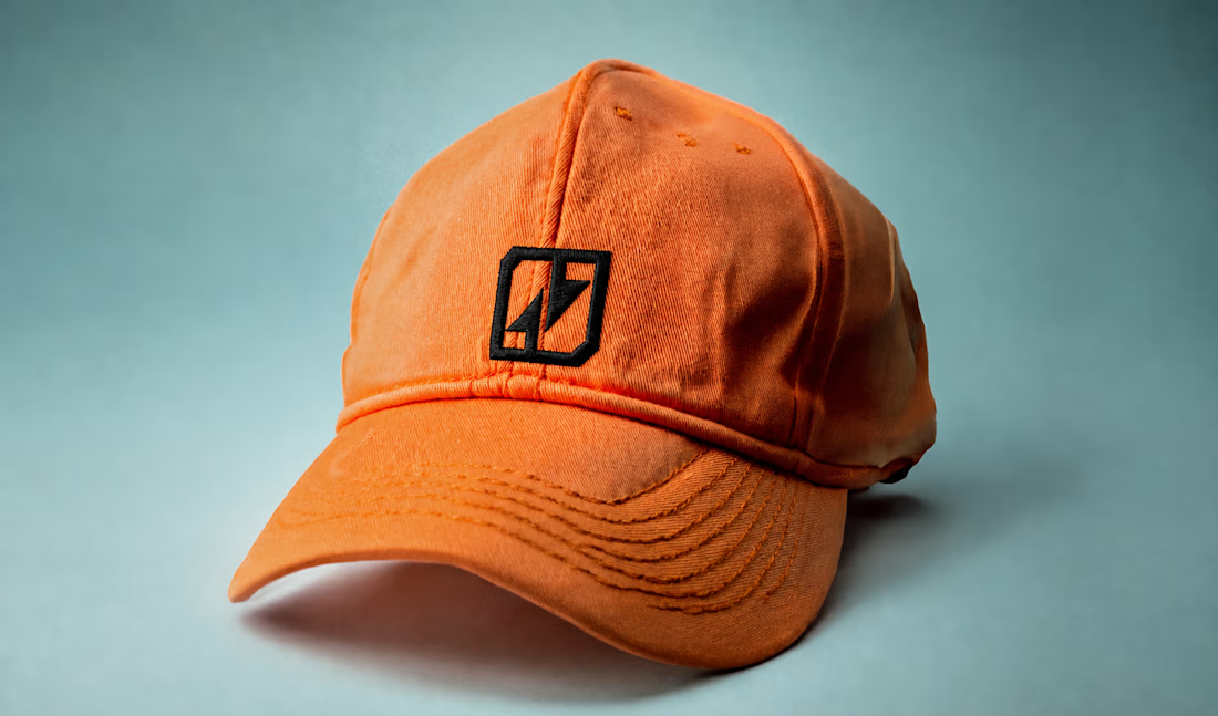
one last look at Vault® before i call it finished.
added a few more brand applications across the website, app, ID card, cap, and more.
really enjoyed seeing how the identity holds up across completely different touchpoints.
strategy → identity → digital → product

So gooooood

thanks!! :)

Elegant execution

that's awsomee dudeee
thanks!!

love it


Love it, next level stuff.
thanks Daniel!! i’ve been following your work for a while here on contra and x, so it genuinely means a lot to have you say that 🙌


Love seeing the same identity work across so many touchpoints. That consistency is what makes a brand feel real.
thank you! that consistency was a big focus throughout the project, so i’m really glad it came through!!

Great work

Great work💥

This looks awesome! 🤝

Looks cool!


Awesome work👏🔥🔥

great work

Next tier! 📈


the cap sold me ngl

Impressive 🤘🤘


Cooked 👏


The ID card and lanyard shot is the real test for a system like this, most identities fall apart the second they leave a screen. the orange cap actually makes the mark stronger, simpler geometry reads better embroidered than most logos would.

Looks so good 💯

Insane design right here

Awesome!

The brand direction is on point👌
The network for creativity
Join 1.25M professional creatives like you
Connect with clients, get discovered, and run your business 100% commission-free
Creatives on Contra have earned over $150M and we are just getting started










Related posts

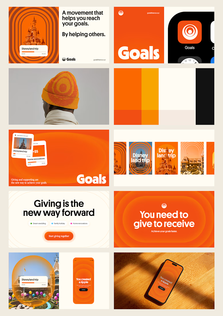
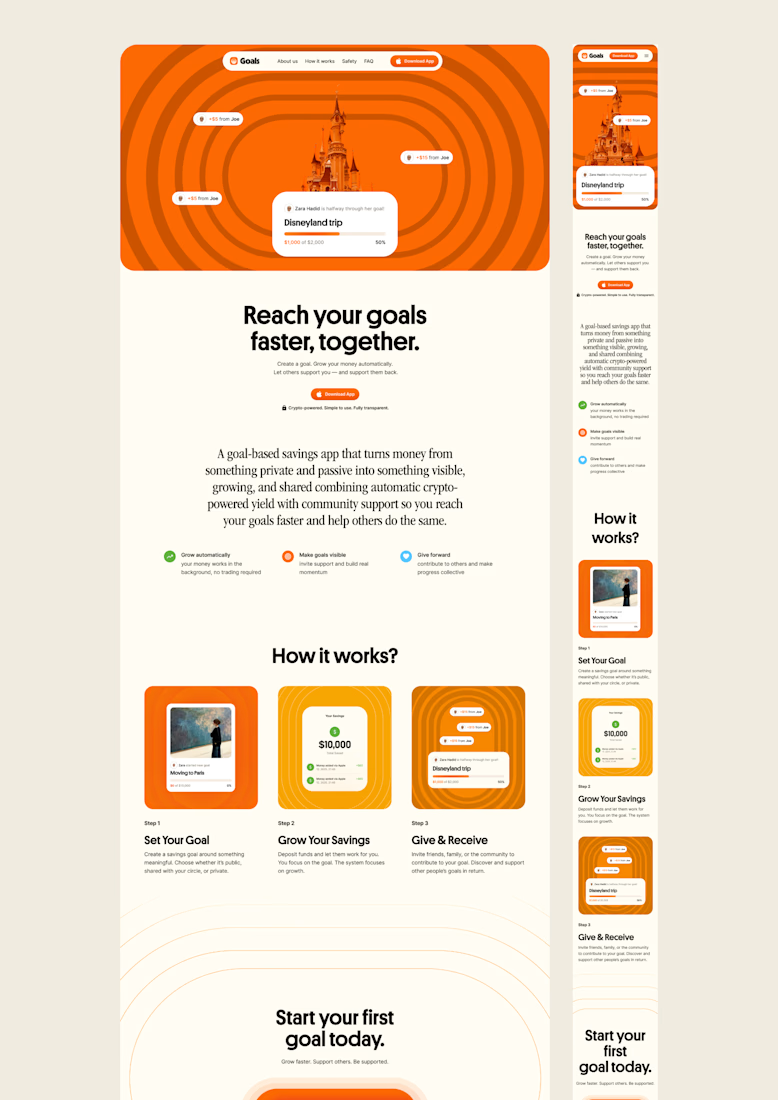
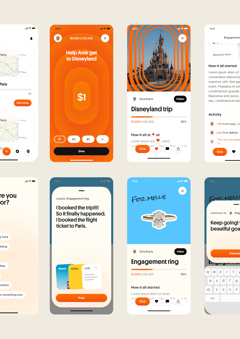
one of my favourite things about running a one-person studio is that nothing gets lost in translation.
the idea behind the brand is the same idea that shapes the website and the product.
no handovers, no starting from scratch, no trying to explain the vision to someone new.
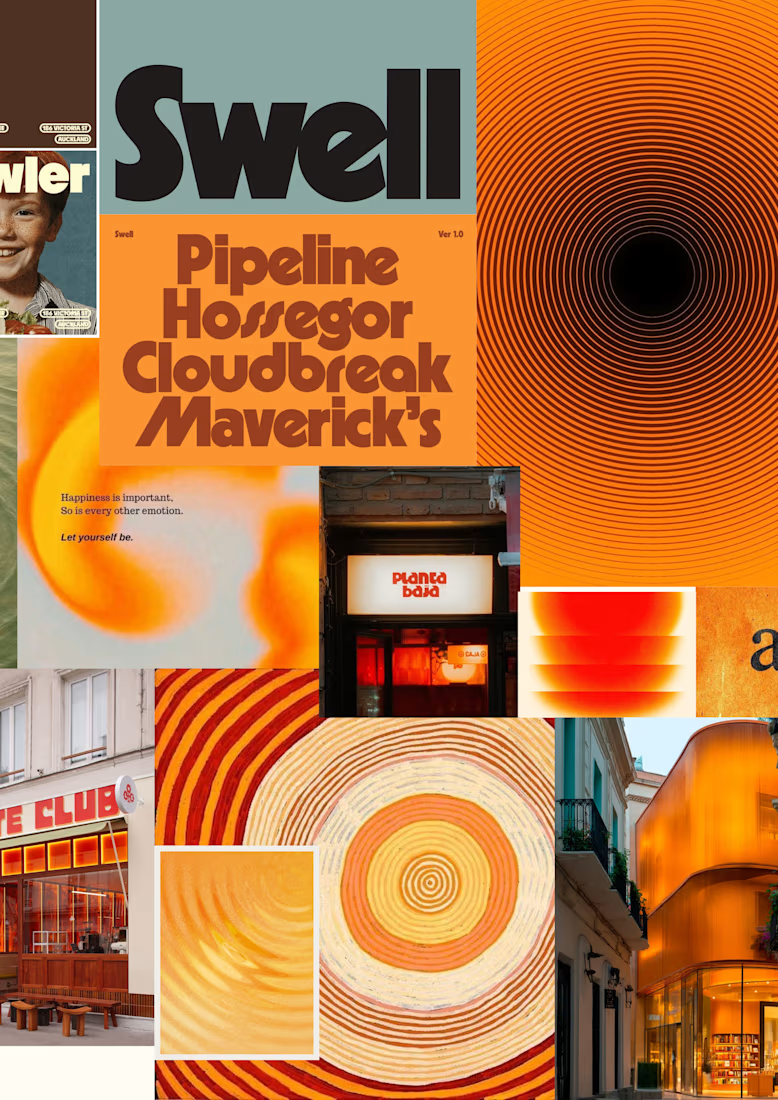
a little look at how that came together for goals, from the first moodboard to the app ↓

Love it!

Recruitment is a people business. The brand should feel the same way.
Wayforce connects top talent with businesses and needed an identity that spoke to both sides at once. Sharp enough for the companies hiring. Human enough for the candidates being placed.
The mark does two things: reads as W, moves like a direction. Acid yellow that stands out in a category full of grey corporate sameness.
Not another recruitment agency. A force that knows where you’re headed.

This is wonderful man. love the branding


Visual identity revision for a psychology and management consulting firm



handsome works! anyway did you use any ai to generate mockups on that? or you did manual