Abdul Aleem - Web Designer | Contra
Work by Abdul Aleem
Sign Up
Post a job
Sign Up
Log In
Abdul Aleem
UI/UX designer that designs responsive and intuitive designs
Message
Follow
Ready for work
Abdul is ready for their next project!
Lagos, Nigeria
Work
Posts
Services
About
Lagos, Nigeria
1
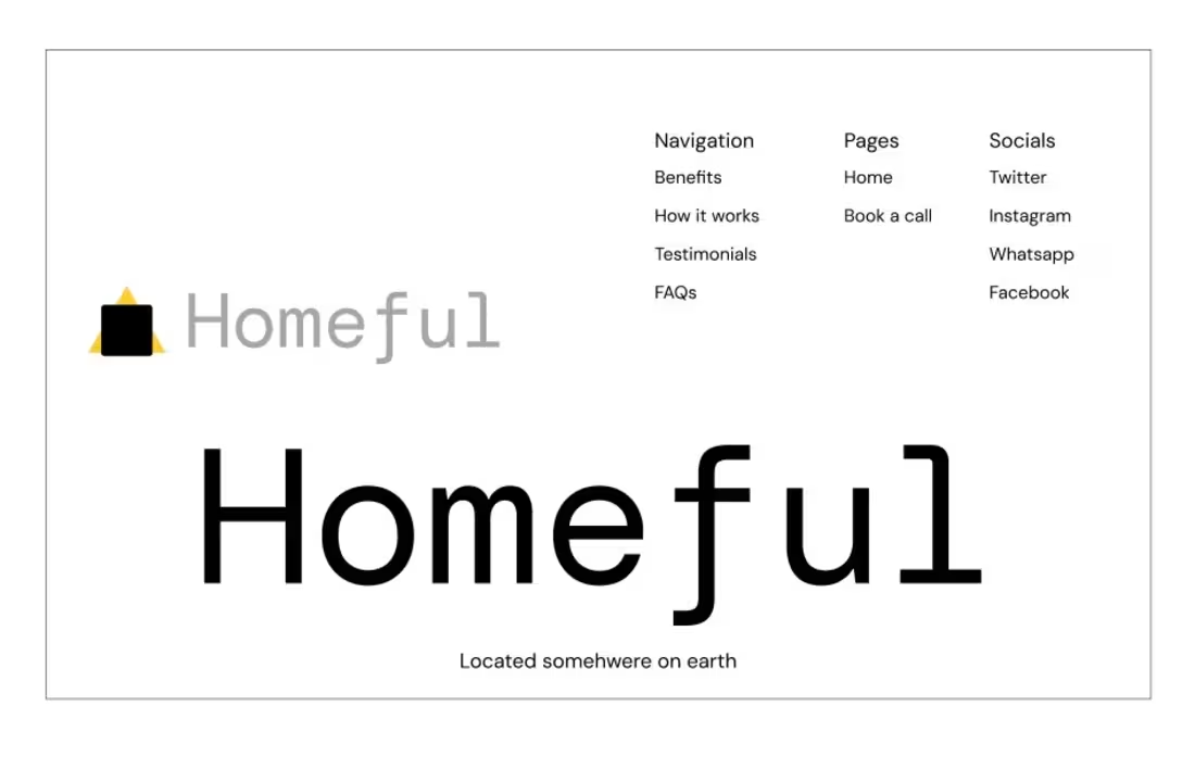
A website should do more than look good. It should make the next step feel obvious. I designed Homeful, a modern accommodation platform focused on making it easier for users to discover and compare places to stay. From the landing page to the accommodation listings, I focused on creating a visual system that feels clean, trustworthy, and easy to navigate while keeping the experience conversion-focused. This is the kind of work I enjoy most turning ideas into thoughtful digital products and websites that look great and actually work. If you’re building a product, launching a website, or redesigning an existing experience, let’s talk.
1
4
1
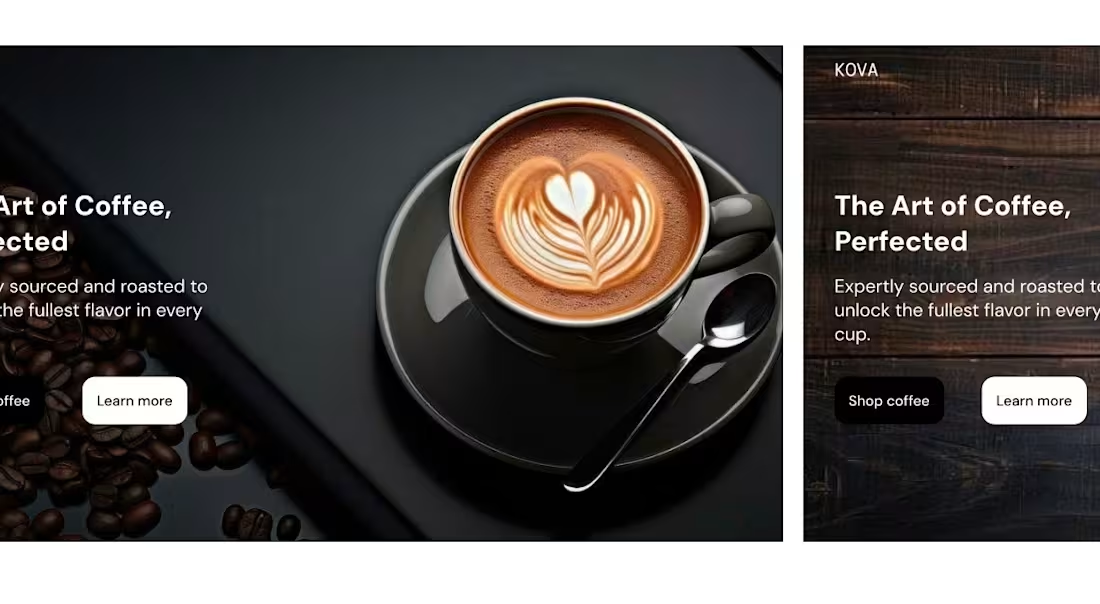
Two directions. One brand. Two completely different moods. I explored two visual directions for the same coffee packaging concept ; a light/clean version and a dark/bold version. Both communicate the same brand, but they create completely different moods. Option A — Light: clean, minimal, fresh Option B — Dark: bold, premium, more dramatic If you were the client, which one would you choose? And more importantly, what makes you choose it? I’m curious to hear how other designers and creatives approach this kind of visual decision. Do let me know in the comments.
1
26
2
Atelier — Skincare E-commerce Landing Page A bold, premium landing page designed for Atelier, a modern skincare brand focused on effective products and confident, healthy-looking skin. The design combines minimal typography, editorial imagery, and a dark luxury aesthetic to create a visual experience that feels premium while keeping the brand’s products at the center. Designed with: Figma Focus: Art Direction • Landing Page Design • E-commerce • Visual Identity • Responsive Design #ProductDesign #WebDesign #LandingPage #EcommerceDesign #SkincareBrand #Figma
2
52
1
Leève — Brand Identity Design Leève is a modern brand identity built around simplicity, movement, and recognition. The visual identity combines a distinctive custom logo mark with bold, contemporary typography to create a brand that feels confident, approachable, and memorable. The identity was developed with versatility in mind, ensuring the logo works effectively across digital platforms, print materials, packaging, and other brand touchpoints. The minimal color palette and clean visual language give Leève a refined personality while maintaining strong visual recognition. Scope of work: • Logo & symbol design • Typography selection • Color direction • Visual identity development • Brand mockup presentation • Brand application concepts Design approach: Minimal • Modern • Memorable • Versatile
1
30