The network for creativity
Join 1.25M professional creatives like you
Connect with clients, get discovered, and run your business 100% commission-free
Creatives on Contra have earned over $150M and we are just getting started
Back to feedPost


High-end Execution.

I like the quality of image!


simplicity speaking, you are goated

Great work Dario! 🙌

Legacy landing pages are always such an interesting challenge, so much history to respect while still modernizing things. What ended up being the trickiest part of that transition?

Incredible. Love the way you put this together

Looks so sick man 🔥

Pairing that editorial serif headline with a gated "Request Invitation" CTA instead of a plain email field does double duty — it reads heritage and exclusivity at once, which is the harder balance for a generational-wealth product to strike without tipping stuffy or gimmicky.


that scroll is smooth

Smooth🔥

font choice💯 , color pairing💯 , photography style💯, marbe background💯
superb work!


Seriously obsessed! Incredible vision + execution!

Incredible

clean work

nice one

Nice work 🧡

this is beautiful

This is so clean!


Nice

Great Design

deserves a goat, clean

Looks nice!

this is beautiful

Loved the Interface : )

Fantastic Finishing

There’s smooth and there’s this.
This design outdid smooth 🔥

So cool work!
The network for creativity
Join 1.25M professional creatives like you
Connect with clients, get discovered, and run your business 100% commission-free
Creatives on Contra have earned over $150M and we are just getting started

Challenges
View all


Related posts

NURV® now has a home on the web 🟠
Same cream canvas, same dot-matrix numerals, same single orange. Scroll it and nine dots in the margin fill up one by one.
Pool to plate to pill, nine scenes, one system.

Should I go for left or right? Focusing on updating and finishing up my portfolio... and then I came across this crossroads. Another alternative is to make them switchable themes through a toggle, but I still need to decide which should be the default.
27 voted
75%
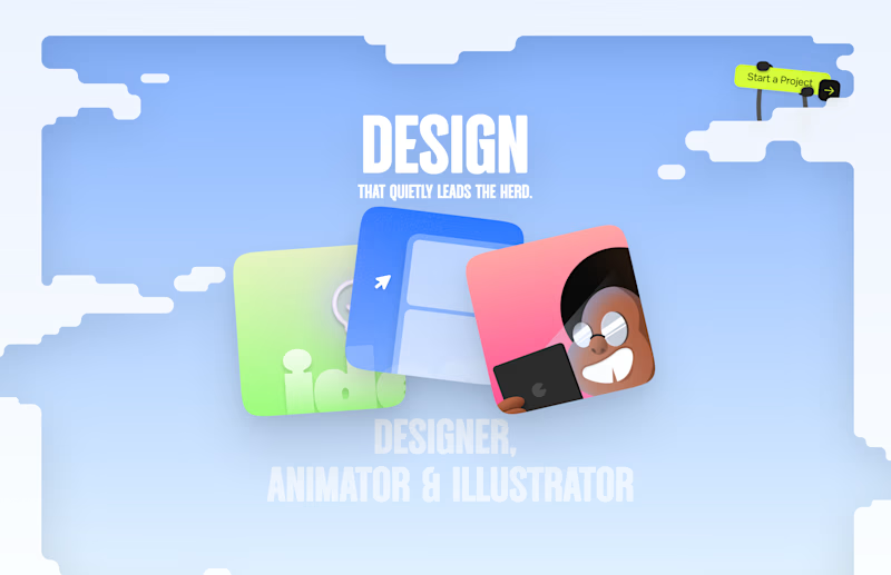
9 voted
25%
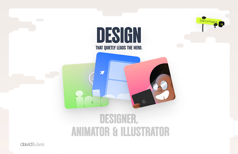
36 votes
Closed

Left is better because the text is readable, the overall blue background is not flashing to the eyes as compared to the right one.
For the top right button " Start a project ", you can add some animation so that it stands out and encourage users to click on it.


The app looks amazing, but do you think the number font might be a bit hard for people to read quickly when checking their money?