The network for creativity
Join 1.25M professional creatives like you
Connect with clients, get discovered, and run your business 100% commission-free
Creatives on Contra have earned over $150M and we are just getting started
Back to feedPost

Built this in Framer as a concept project. Goal was to make it feel run by ex-journalists. Choices: editorial serif (Libre Baskerville), a dark photo with one color accent, and copy that positions against blast-style PR.
Where I’m unsure: text legibility over the photo and whether the two CTAs compete. What would you change?


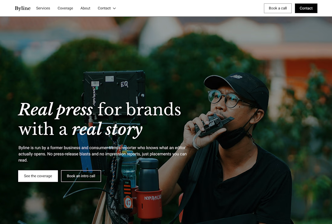

That's great design it feels professional I like how the background mixed with interface ❤️❤️
Great job Cheree🎉🎉
Thanks so much!
Pardon Cheree❤️


Looks great! 👌

good one

I like that font choice a lot!
Use book a call in the nav as the primary cta? Contact is repeated in the nav menu and on the button.
Thanks for flagging

If both buttons mean "talk to us", I'd keep one. If one is for people ready to hire (Book a call) and the other is for people still checking you out (See our coverage), they can sit side by side as long as only one is filled. For legibility, check contrast at the brightest part...
Appreciate the input. Thank you!

Libre Baskerville sets the journalistic tone perfectly. Invert the hero buttons make "Book an intro call" solid white and "see the coverage" ghost to immediately fix the CTA competition.

Setting the copy against loud PR is the sharp call here, since the serif and one accent do the credibility work before anyone reads a line.

I'd darken the photo a touch behind the text. The CTAs read fine, the filled one wins.

The network for creativity
Join 1.25M professional creatives like you
Connect with clients, get discovered, and run your business 100% commission-free
Creatives on Contra have earned over $150M and we are just getting started



Related posts


Niceee

A little preview of a website concept I've been working on in Framer
Exploring visual direction, typography, layout and subtle interactions.
More coming soon!

Nice work on this project mate this is super awesome. The line spacing and colors are bold and vibrant

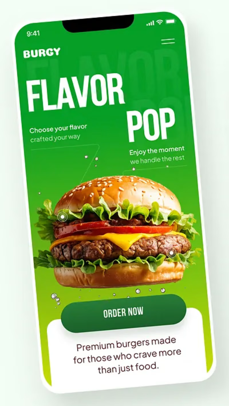
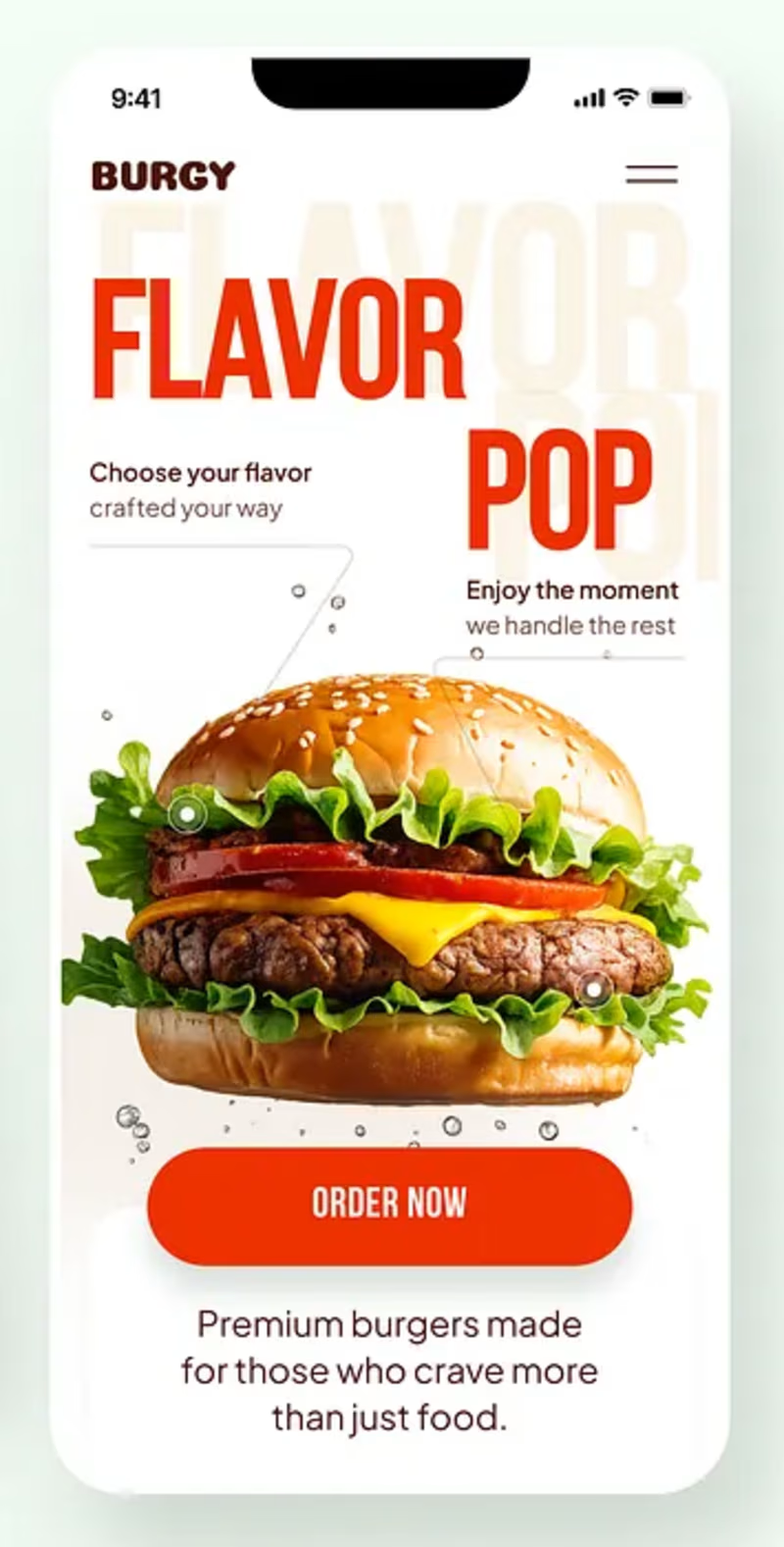
Burgy, a mobile concept for burger ordering. 🍔
Bold type, premium food visuals, and a fast path from craving to checkout.
Two color directions for the hero screen. Which one converts better?
Vote and tell me why 👇
Poll options: 🟢 Green | 🔴 Red
#UIDesign #MobileApp #FoodApp #AppDesign #UX #RestaurantApp

13 voted
43%
17 voted
57%
30 votes
Closed

Green for me, and I'd bet on it converting better too. The red version is loud in the way every food app is loud, while the green makes the burger the hero and the screen instantly recognizable in a feed. The green background also gives the white FLAVOR POP type far more contrast, so the message lands a beat faster.


