The network for creativity
Join 1.25M professional creatives like you
Connect with clients, get discovered, and run your business 100% commission-free
Creatives on Contra have earned over $150M and we are just getting started
Back to feedPost

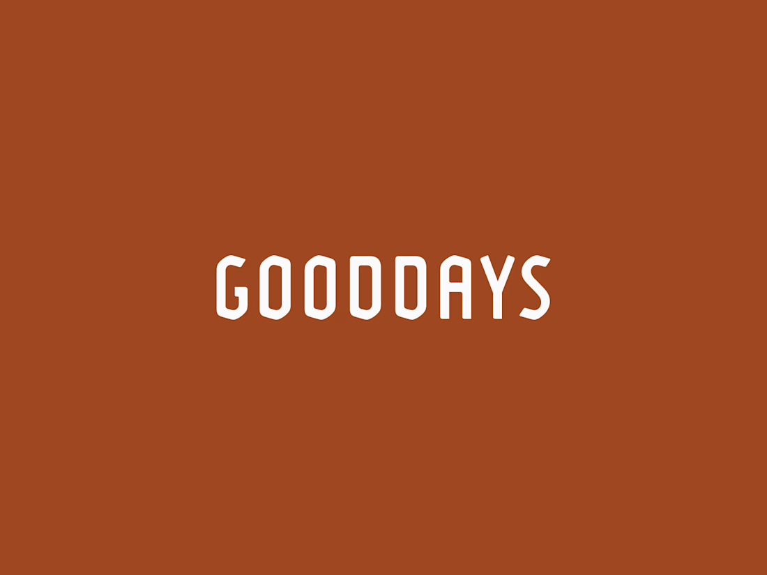
This logo mark began with research into South African heritage. I kept returning to the country’s flag, especially the green Y-shaped form at its center. I isolated that shape, refined it, and rotated it around a central axis until each piece aligned into one balanced symbol.
The result feels warm, natural, and rooted in heritage, while still giving the skincare brand a modern and distinctive identity.





Rotating the flag's Y-shape around a central axis to get a balanced symbol is such a clever way to keep the heritage reference without it feeling like a literal flag rip-off. Interesting that it landed on a skincare brand too, did the client come in already wanting something...

Awesome work!
Thanks!

Really nice!
Thanks!
Great work. Research-led design almost always leads to stronger identities, and this is a perfect example.
Thats the best part, digging into why you do what you do as a company and whats important to you will never steer you wrong.

Magnificent


The Y rotation is such a nice solve. It keeps the heritage reference subtle without losing it.
The network for creativity
Join 1.25M professional creatives like you
Connect with clients, get discovered, and run your business 100% commission-free
Creatives on Contra have earned over $150M and we are just getting started
Related posts


We're excited to share our latest launch: the new brand and website for Kin & Co.
Founded by Toronto-based editorial and commercial photographer Samuel Engelking, Kin & Co. is a boutique portrait studio for families who've always been intentional about how they live, and how they're seen.
We met Samuel in person and connected right away over a shared belief: family photography had gone stale, and design-conscious families deserved something with real editorial intention behind it. We partnered with him to build a brand and website that could carry that vision.
From the custom serif logotype to the tactile, print-first identity system, every detail was built to let Samuel's photography lead.
No clichés. Just intention, taste, and images made for the wall.



This is so nicee

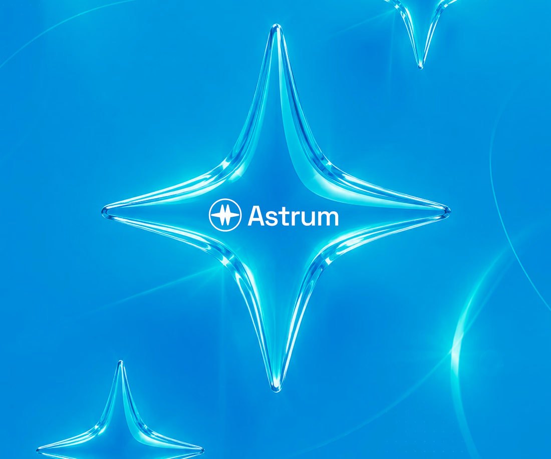
Branding for a B2B SaaS company.
This is what you get from strategic branding.
Every element has a purpose. For Astrum, the guiding star represents direction and clarity, while the cyan palette communicates trust, intelligence, and innovation. Together, they tell the story of a platform built to simplify complex work—not just decorate it.
Good branding helps people understand your business before they experience your product.
I'm so happy working on this project.
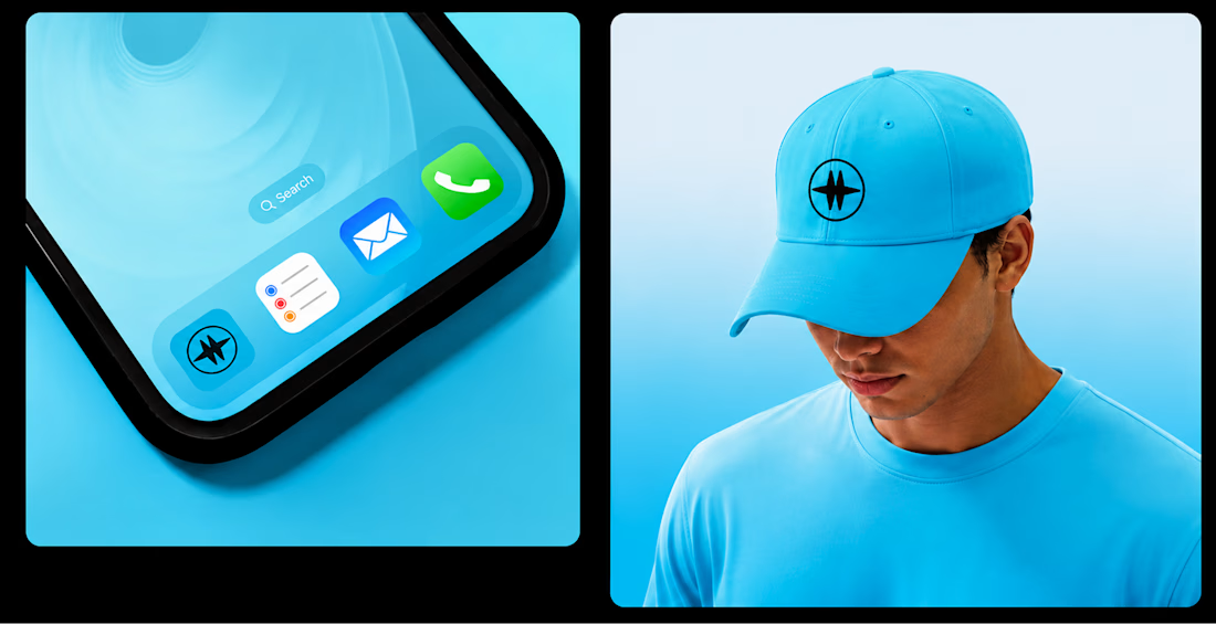
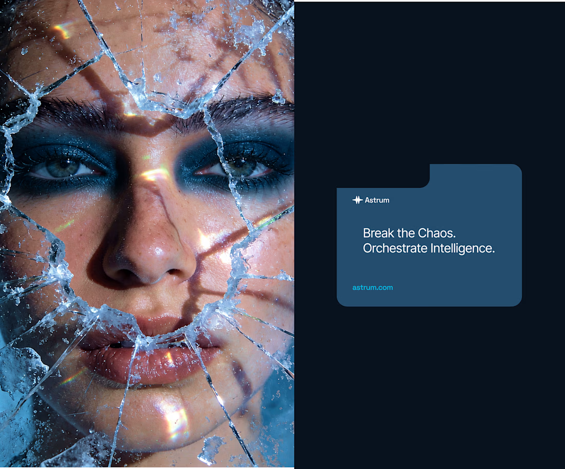
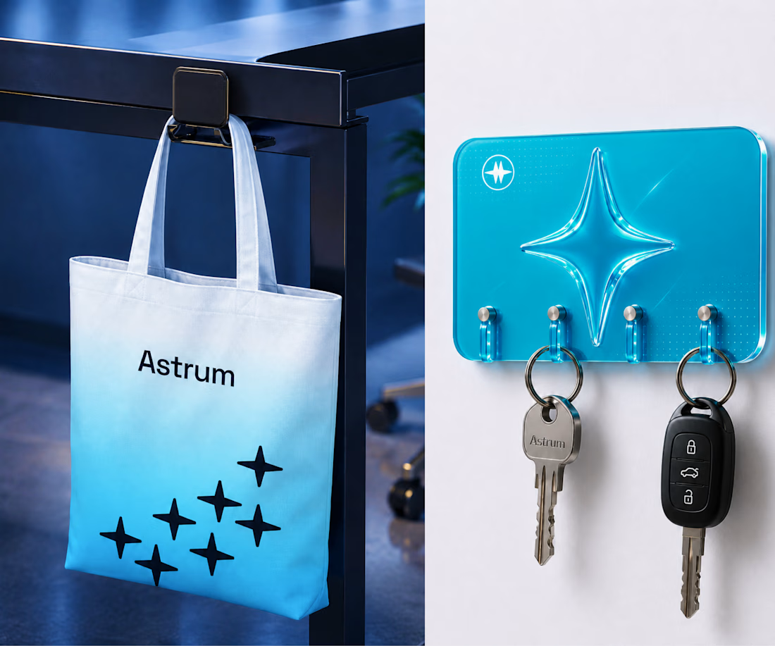

Love the focus on purpose-driven design! The guiding star concept for Astrum and that cyan palette really hit the mark for B2B SaaS clarity. 🌟

Let me introduce our branding project, Nexgen.
They approached us to create a symbol that reflects strong geometry and a modern mindset. The goal was to create a look that felt professional, sleek, and visionary.
By combining the letter "N" with a sharp yet rounded key visual, we created a bold identity and paired it with a bright blue color to give Nexgen a more innovative feel.
Explore more of our work → https://www.behance.net/potarastudio












Trending

Claude
Claude has entered the design space. How are you using Claude Design?

Contra University
Learn from expert creatives how to earn more using next-gen AI tools.
creativeaiflow
Creative AI workflows are evolving. What tools do you use, and what are their strengths and weaknesses?
freelancerlife
Freelancer life is wins, pivots, and everything in between. What’s yours right now?