The network for creativity
Join 1.25M professional creatives like you
Connect with clients, get discovered, and run your business 100% commission-free
Creatives on Contra have earned over $150M and we are just getting started
Back to feedPost

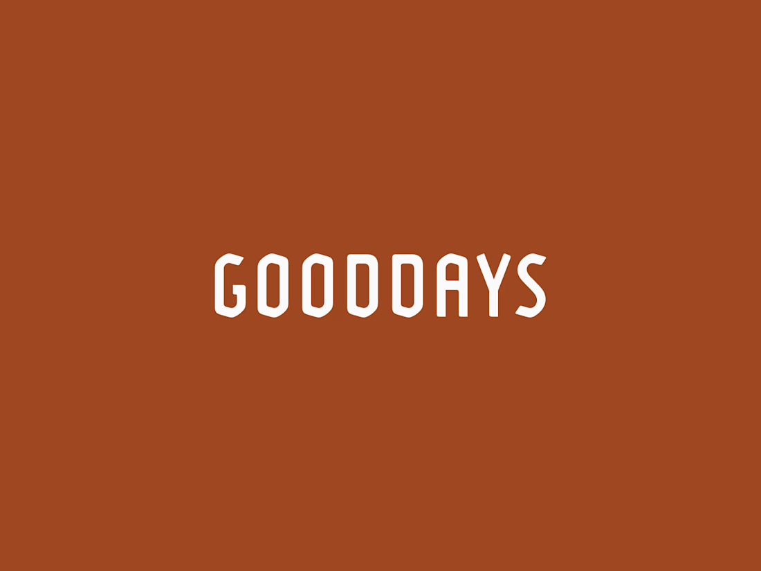
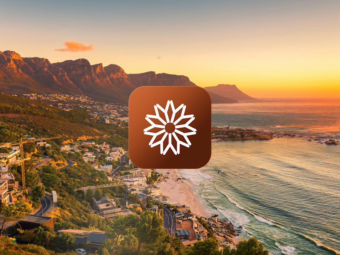
This logo mark began with research into South African heritage. I kept returning to the country’s flag, especially the green Y-shaped form at its center. I isolated that shape, refined it, and rotated it around a central axis until each piece aligned into one balanced symbol.
The result feels warm, natural, and rooted in heritage, while still giving the skincare brand a modern and distinctive identity.



Really nice!
Thanks!

Rotating the flag's Y-shape around a central axis to get a balanced symbol is such a clever way to keep the heritage reference without it feeling like a literal flag rip-off. Interesting that it landed on a skincare brand too, did the client come in already wanting something...

Awesome work!
Thanks!

The network for creativity
Join 1.25M professional creatives like you
Connect with clients, get discovered, and run your business 100% commission-free
Creatives on Contra have earned over $150M and we are just getting started
Related posts

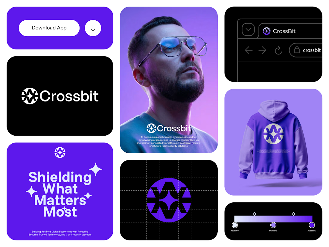
Crossbit — Cybersecurity Brand Identity & Logo Design
Crossbit needed an identity that felt secure without relying on tired lock-and-shield visuals. I designed a geometric shield-star mark — clean, modern, and built to hold trust at a glance.
The system carries across app UI, packaging, and merch, giving the brand a consistent, premium feel wherever it shows up.
What I delivered:
Logo design, brand mark, visual identity system, app UI direction, merch mockup
Specializing in logo and brand identity for tech, SaaS, fintech, and cybersecurity startups. Open to new projects — let's build something sharp together.

Project Update: Behind the Scenes Go behind the scenes and see how I created a logo, complete brand identity, and promotional video using only Envato assets.


A behind-the-scenes breakdown is such a good move for this challenge, it shows the process instead of just the polished output. Building a full brand identity plus a promo video from only Envato assets is no small feat, what took the most iteration, the logo or the video edit?

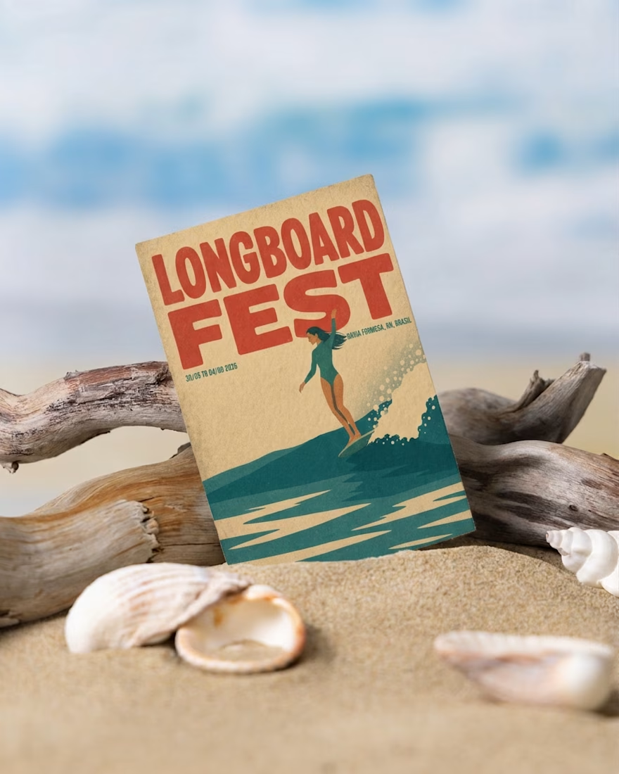
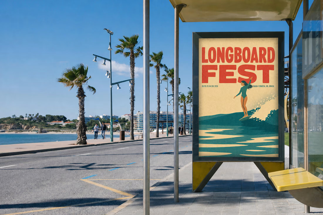
What started as a poster for a local Longboard Fest turned into a creative playground.
I began by generating an illustration from two reference images. After a LOT of iterations, I finally found the direction I was looking for.
Then I experimented with Envato's Style Transfer, exploring different visual styles until one really stood out.
My first idea was simple: place the poster into mockups and animate a flyer falling onto the sand. But once I saw it... it just didn't feel right.
So I changed direction.
While browsing Envato's video templates, I found one with layered posters. Instead of choosing a single design, I decided to animate five different versions of my poster.
That unexpected decision completely transformed the final result, and became my Human by Design moment.
AI helped me explore possibilities, but the creative direction, the decisions, and the final story were entirely human.
Created for the Contra × Envato Human by Design Challenge.
Envato assets used: AI Image Generation | Style Transfer | Mockups | Video Generation | Music | Voice Gen
@envato
envatochallengehumanbydesignenvatoaiAI Agent DesignerAI ArtAI VIsual DesignerAdobe After EffectsEnvatoFigma
I like that you shared the changes in direction instead of just the final result. Those creative pivots are usually where the strongest ideas come from.







Trending

Claude
Claude has entered the design space. How are you using Claude Design?

Contra University
Learn from expert creatives how to earn more using next-gen AI tools.
creativeaiflow
Creative AI workflows are evolving. What tools do you use, and what are their strengths and weaknesses?
freelancerlife
Freelancer life is wins, pivots, and everything in between. What’s yours right now?