
Victor Onifade
Brand, Editorial & Product Designer
New to Contra
Victor is ready for their next project!
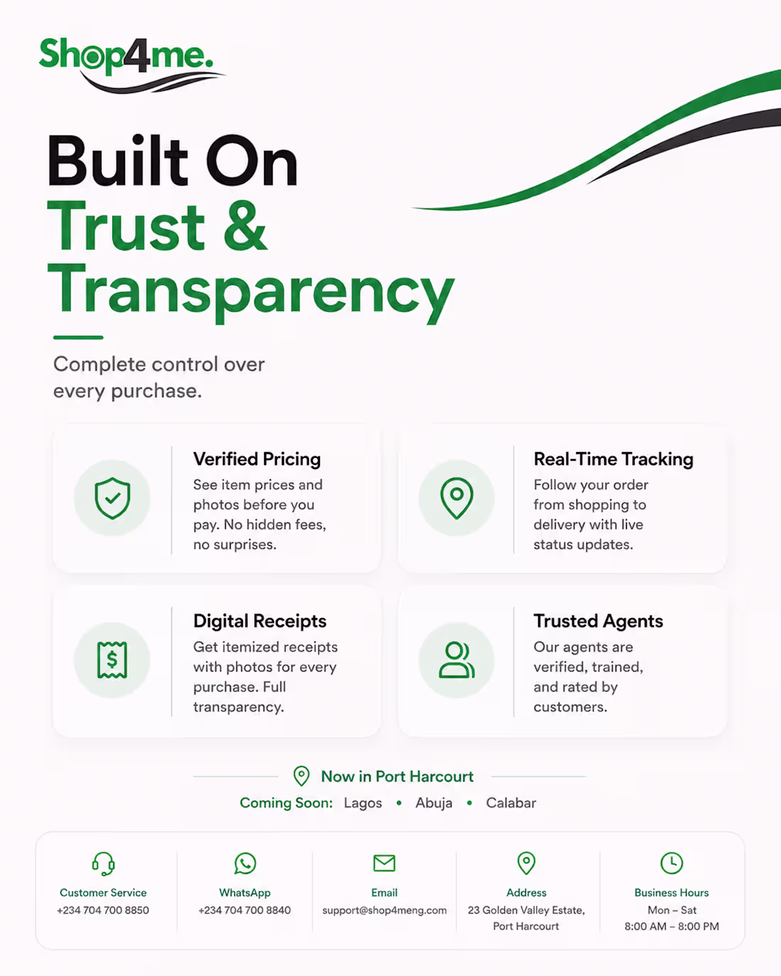
Shop4Me is a product and shopping-focused brand where I created promotional and social media creatives aimed at communicating services clearly and improving audience engagement.
My work involved translating product information into visually appealing designs while maintaining brand consistency across multiple campaigns. I focused on clean layouts, hierarchy, and marketing-driven visuals that helped present offers and services in a clear and engaging way.
Role: Graphic Designer
Deliverables: Social media creatives, promotional graphics, and campaign assets.
0
32
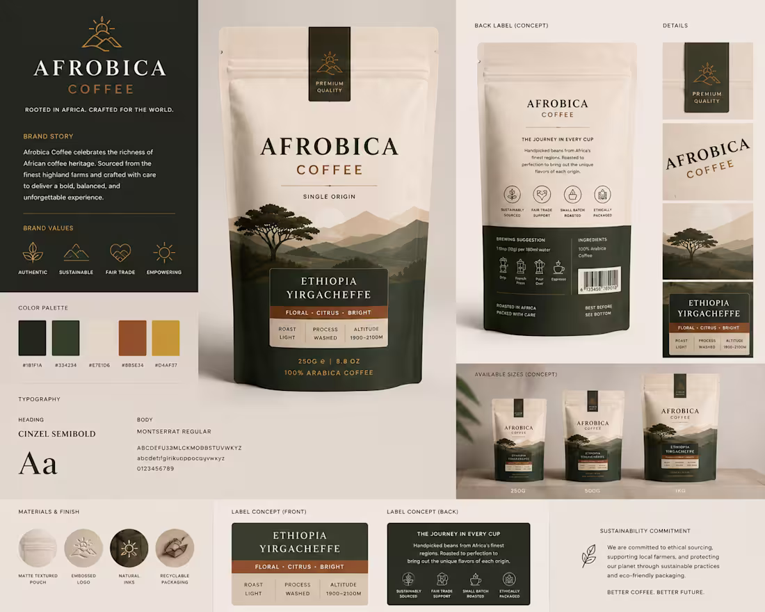
Packaging design concept for a specialty coffee brand. The project demonstrates packaging consistency across multiple product sizes, label hierarchy, typography, and presentation design for food and beverage products.
0
67
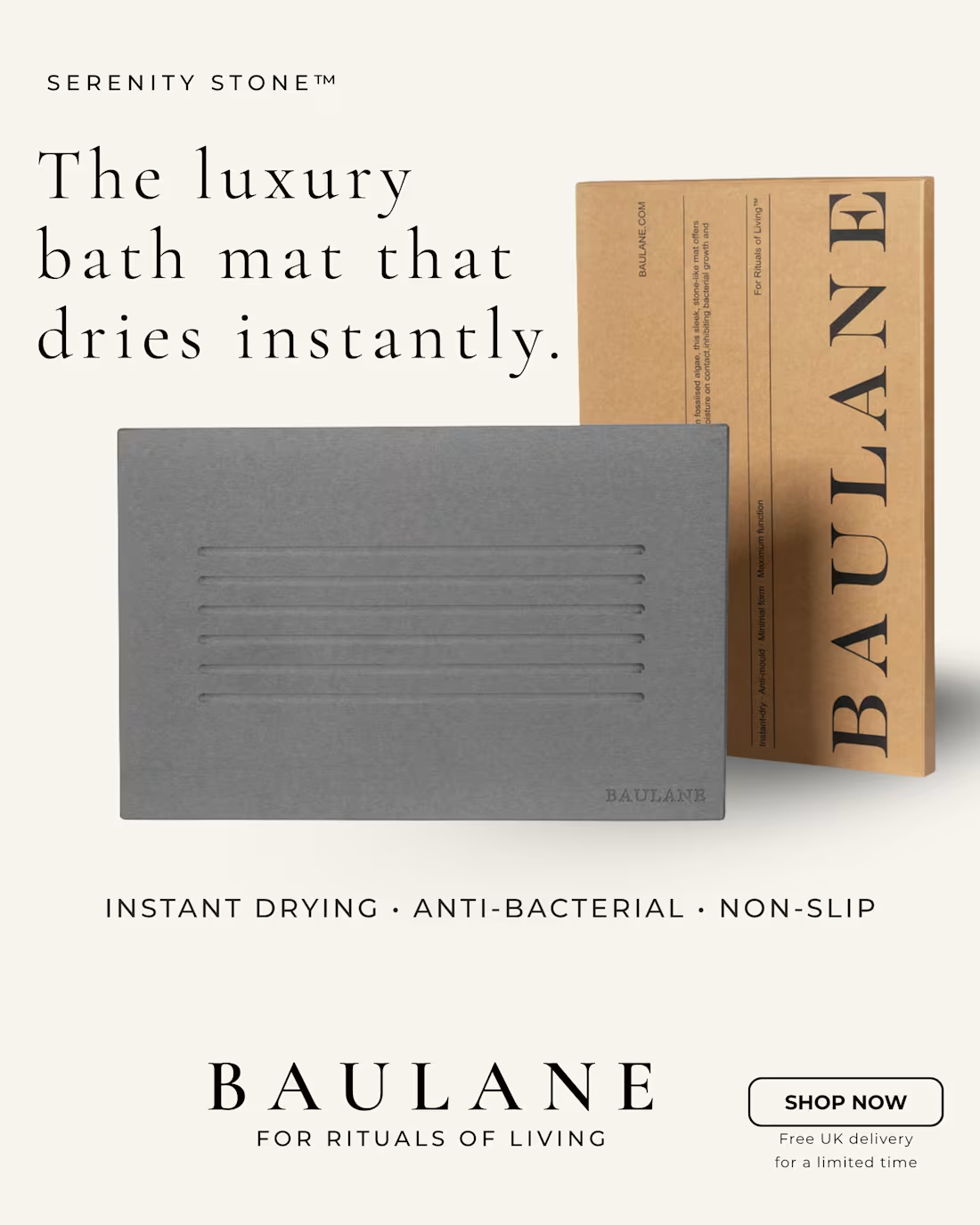
Title: Luxury Product Advertisement Concept for BAULANE (Spec Project)
Description
A self-initiated concept created for @BAULANE Serenity Stone™ Bath Mat.
The goal was to create a premium social media advertisement aligned with the brand’s luxury aesthetic while highlighting key product benefits such as instant drying, anti-bacterial properties, and non-slip functionality.
NB: This is an independent spec project and was not commissioned by BAULANE.
0
79
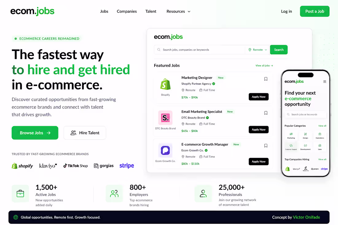
Concept redesign for @ecom.jobs (http://ecom.jobs)
Explored a cleaner brand identity and job board experience focused on helping ecommerce talent discover opportunities faster.
Designed:
• Homepage hero
• Job listing experience
• Mobile responsive view
• Brand direction
Open to feedback.
1
107
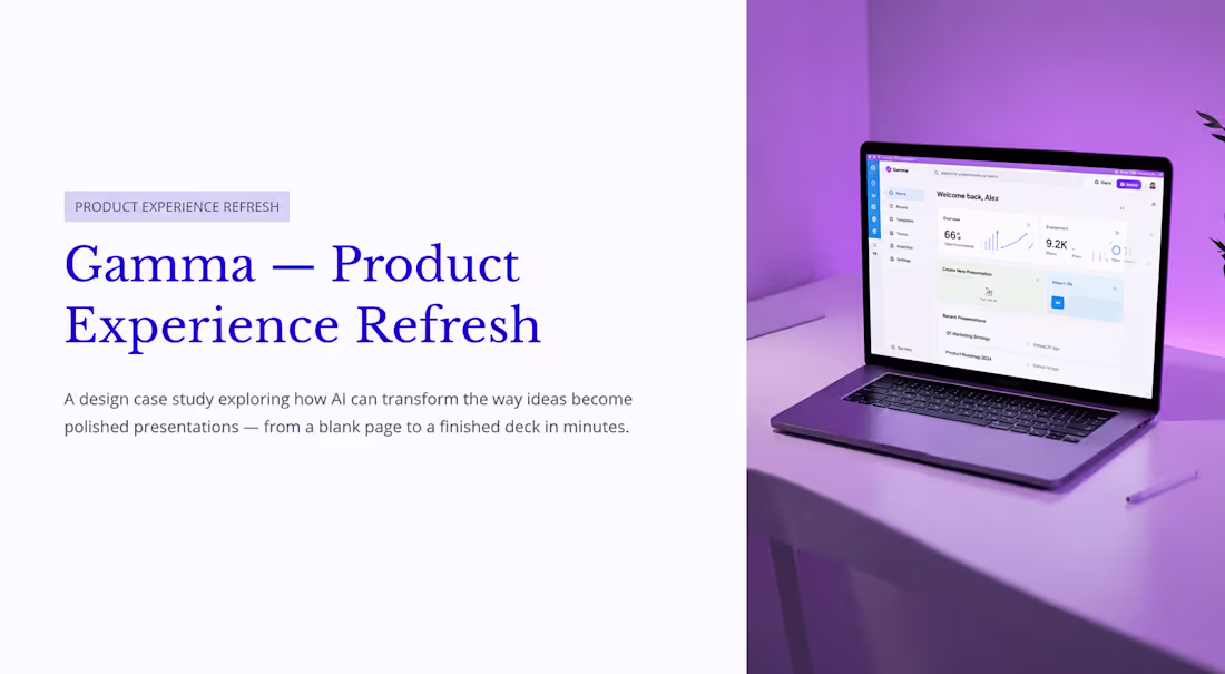
Project Title: Gamma — Product Experience Refresh
Project Description:
Gamma is an AI-powered presentation platform designed to help users turn ideas into polished decks in minutes.
This concept explores a refreshed product experience focused on clarity, speed, and ease of use. The project rethinks the presentation creation journey through a simplified landing experience, structured AI generation flow, and a focused workspace designed to reduce friction and help users move from idea to presentation faster.
A product design concept exploring how Gamma’s AI workflow could feel more intuitive, focused, and premium. The project covers the user journey from presentation generation to workspace collaboration, with an emphasis on clarity, speed, and modern SaaS design principles.
2
129
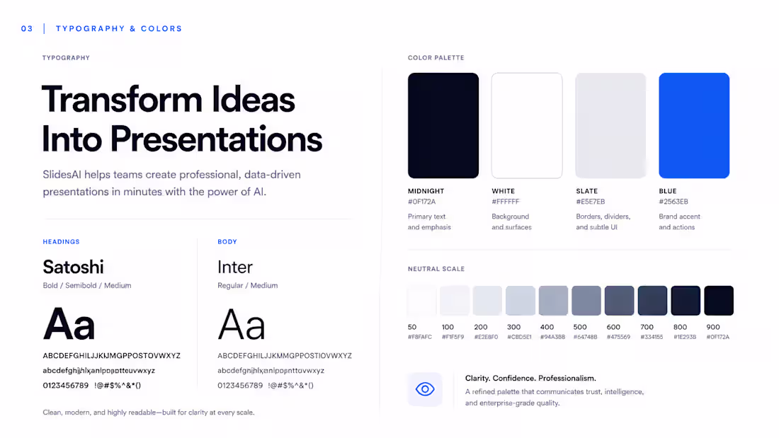
A brand evolution concept for @SlidesAI , focused on repositioning the platform from an AI presentation tool into a trusted enterprise solution. The project explores a refined visual identity, typography system, color palette, and product experience designed to communicate professionalism, clarity, and credibility for modern business teams.
0
76
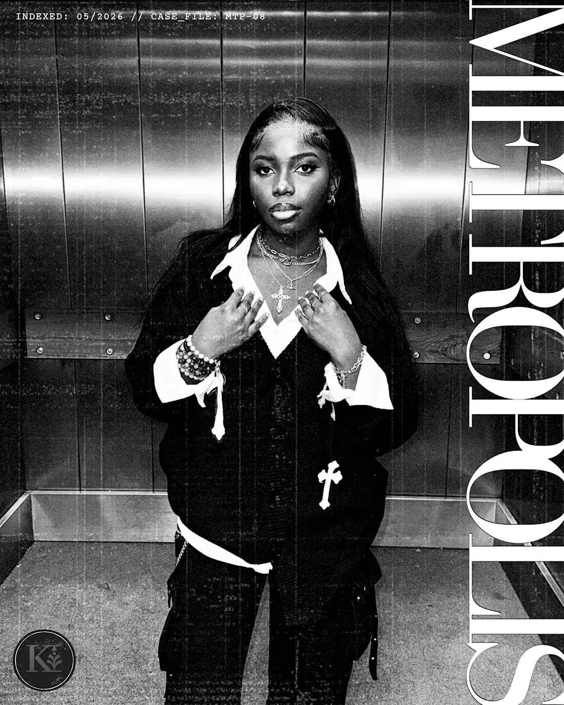
Project Title: METROPOLIS // Cinematic Editorial
& Visual Identity Concept
Description:
This project is a high-end editorial and visual concept titled "METROPOLIS," exploring the intersection of street culture, luxury minimalism, and a cinematic "classified database" aesthetic.
Pushing past traditional digital layouts, I directed and executed an immersive visual narrative. I developed a unified design system utilizing custom high-contrast monochrome grading, heavy film-grain textures, and precise manual photo manipulation. By integrating tactical Ul elements-like coordinate tracking and digital log entries-alongside bold, structural vertical typography, the project blends grit with high-fashion art direction. Every layout, crop, and asset was meticulously composed by hand to create a premium, story-driven portfolio piece.
2
122
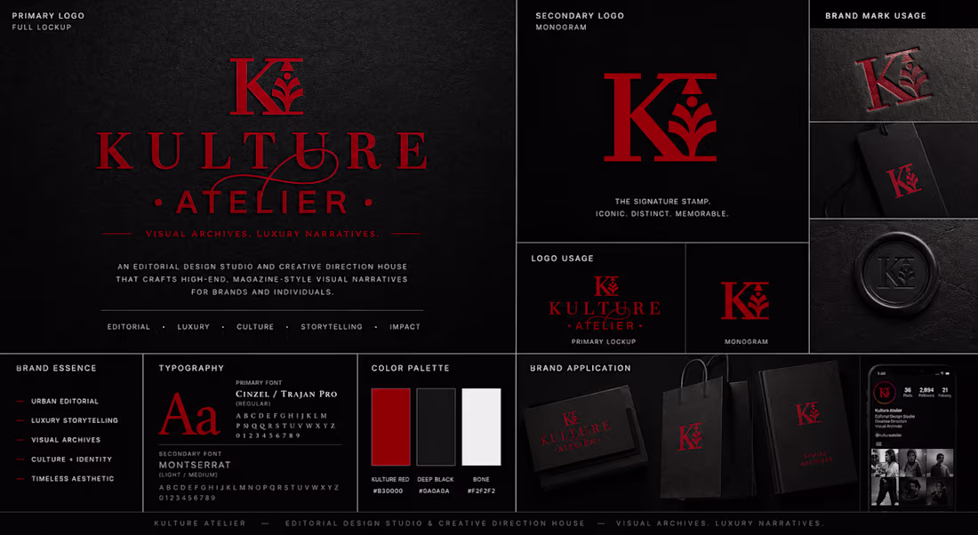
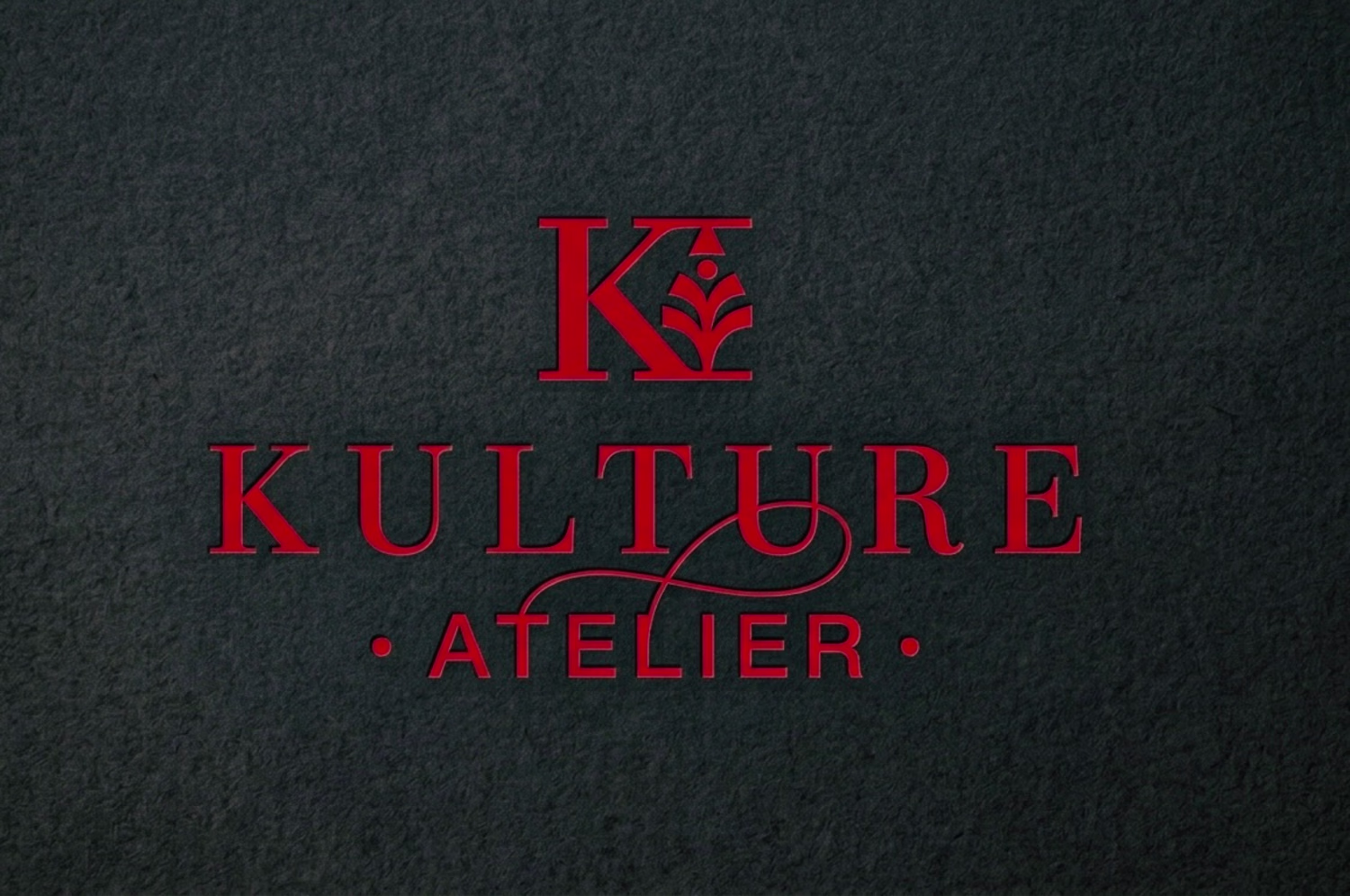
Kulture Atelier: Visual Archives. Luxury Narratives.
A comprehensive visual identity system for Kulture Atelier, an editorial design studio and creative direction house. The goal was to establish a brand mark that reflects 'Urban Editorial'-blending the discipline of high-fashion typography with the raw, textured aesthetic of luxury archives.
The identity centers on a custom monogram featuring an integrated botanical motif, symbolizing growth and structural form. By pairing the authoritative serifs of Cinzel and Trajan Pro with the modern functionality of Montserrat, the system creates a timeless visual language that scales from digital editorial layouts to physical luxury goods.
0
71
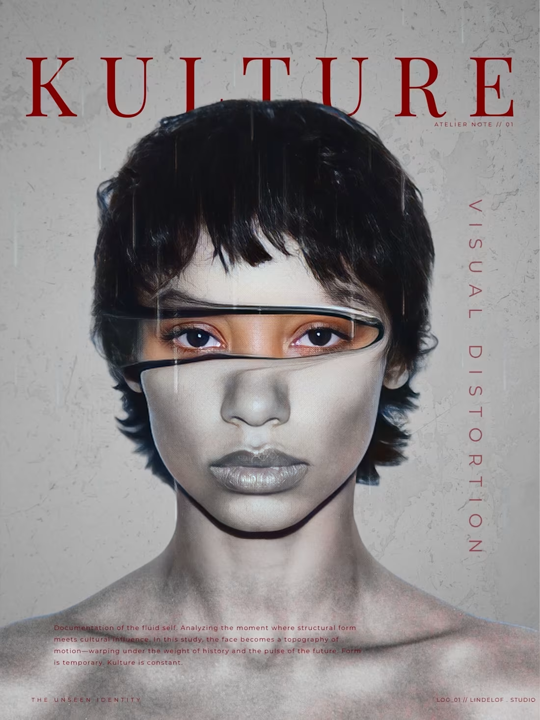
Visual Distortion
A study in the anatomy of motion. This piece for Kulture Atelier explores the intersection of structural form and high-fashion editorial discipline.
Executed with manual precision to achieve an archival, magazine-standard finish. A testament to the constant evolution of the Kulture aesthetic.
#VisualDesign #Editorial #KultureAtelier #Minimalism #GraphicDesign
1
102
Excited to share a conceptual direction for @Momentini 🕊️
Inspired by the brand's mission of 'considered luxury’, I've developed a visual identity that bridges the gap between high-end editorial aesthetics and the nurturing warmth of new beginnings.
My focus was on an 'archival' feel-using a muted, organic palette and timeless serif typography to ensure the brand feels like a heritage keepsake from day one. Check out the full case study on my profile!
#VisualDesign #Branding #Momentini #QuietLuxury #EditorialDesign
2
3
116

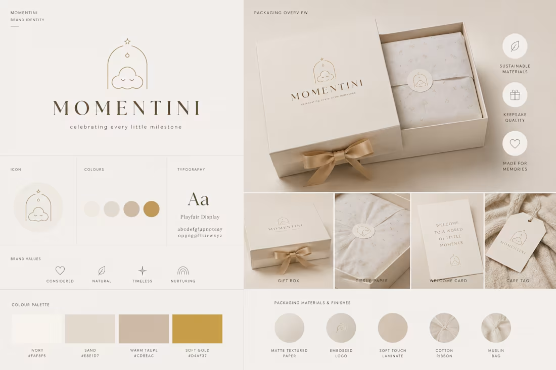
Momentini // Brand Identity Concept
Project Overview:
A comprehensive visual identity and packaging concept developed for Momentini, a premium newborn gift brand based in London. This project serves as a study in "Quiet Luxury," prioritizing warmth, heritage, and an editorial feel to resonate with the modern, high-end parenting market.
The Strategic Vision:
The goal was to move away from traditional juvenile aesthetics toward a "grown-up" editorial identity. By combining archival-inspired typography with a sensory-focused material palette, the brand is positioned not just as a retailer, but as a curator of family milestones.
Creative Execution:
Visual Identity (Option A: The Golden Milestone): This direction utilizes an Ivory, Warm Taupe, and Soft Gold palette to evoke a sense of timelessness and "keepsake" quality. The iconography features a minimalist arch and cloud, symbolizing a safe, nurtured beginning.
Visual Identity (Option B: Organic Heritage): This direction explores Sage, Eucalyptus, and Terracotta tones. It focuses on "Mindful" and "Natural" brand values, utilizing linen textures and debossed logos to create a tactile unboxing experience.
Typography: Both directions lead with Playfair Display, a classic high-contrast serif that provides the necessary editorial authority and prestige.
Packaging Suite: Designed a cohesive system including matte-textured gift boxes, custom-printed tissue paper, archival welcome cards, and muslin bags to ensure every touch point feels considered and luxurious
Technical Deliverables:
• Primary & Secondary Logos: Scalable vector designs for print and digital use.
• Brand Value Iconography: Custom icons for "Sustainable Materials," "Keepsake Quality," and "Made for Memories".
• Material Specification: A curated guide for paper finishes (Soft Touch Laminate, Embossed Logo, Cotton Ribbon) to guide physical production.
6
3
204
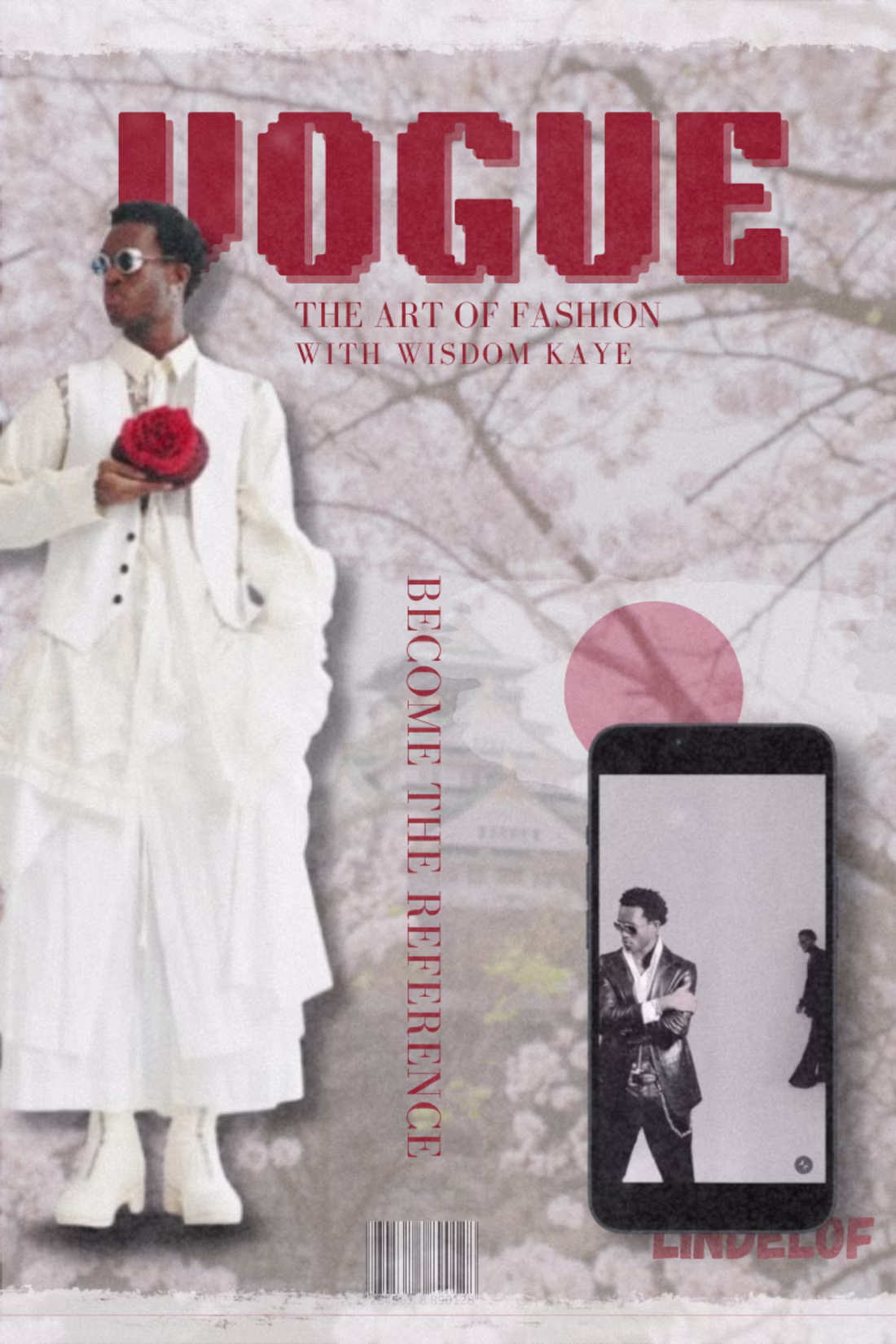
VOGUE // THE REFERENCE
The Theme: "Become the Reference"
This theme explores the idea of the "Digital Icon." It represents the moment a creator stops following trends and starts setting them. By featuring Wisdom Kaye—arguably the most influential fashion creator today—you are positioning your work at the very top of the fashion hierarchy.
PROJECT DESCRIPTION
A conceptual VOGUE cover and editorial layout focusing on the "Iconography of Influence". This project serves as a visual bridge between traditional print prestige and the modern digital era.
THE VISION:
'Become the Reference' is a study of presence. It utilizes a layered, textured aesthetic to celebrate Wisdom Kaye's impact on contemporary style. This piece emphasizes that fashion is not just what you wear, but the art of how you are perceived.
THE EXECUTION:
High-End Typography: Utilized the iconic
'VOGUE' masthead with a weathered, textured overlay to signify "timelessness".
Mixed Media Integration: Seamlessly blended a traditional Japanese cherry blossom motif with modern mobile Ul elements, symbolizing how we consume high-fashion through our screens.
Anatomy of Style: Positioned the subject as the central pillar of the frame, using vertical typography ("BECOME THE REFERENCE") to create architectural height.
The 'Lindelof' Signature: Included a barcode and custom studio branding to give the piece a finished, retail-ready feeling.
2
89
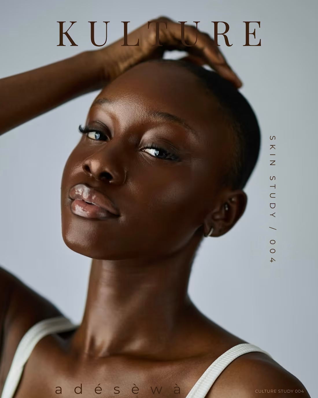
SKIN STUDY
PROJECT DESCRIPTION
A minimalist editorial series exploring the "Anatomy of Presence." This project strips away the noise of traditional fashion photography to focus on the raw intersection of skin texture, light as a physical element, and high-concept typography.
THE CONCEPT
'Clarity is the New Luxury.' This series documents a shift toward 'skin-first' aesthetics, where the influence of the image resides in the understated rather than the excessive. It serves as a visual manifesto for the Kulture Atelier brand—proving that recognition is a whisper, not a shout.
The Execution:
Visual Direction: Focused on a "Glass Skin" aesthetic, utilizing soft-box lighting and postproduction retouching to highlight the architecture of the face.
The Essentialist Uniform: Curated a visual narrative using a "less is more" approach-ribbed cotton, weathered denim, and natural textures to ground the high-fashion concept.
Atmospheric Lighting: Implemented 'Light as Texture' techniques, using shadows to define muscle and bone structure (a nod to my medical background's focus on anatomy).
Editorial Copywriting: Authored archival notes that frame the subject, Adésewa, as the apex of contemporary digital identity.
Deliverables: Creative Direction, High-End Retouching, Editorial Copywriting, and Layout Design.
1
100
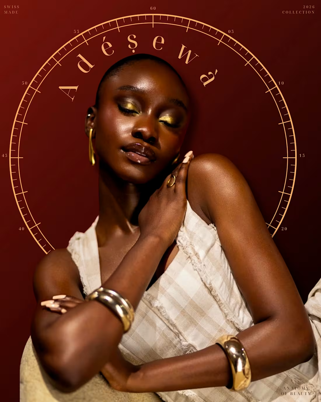
AURA
An editorial exploration into the intersection of human anatomy, minimalist luxury, and technical precision.
'AURA' is a study of form and feeling, designed to bridge the gap between clinical structure and high-fashion aesthetics. This project utilizes architectural framing and experimental 'sensor scans'—a split-frame visual language that contrasts organic texture with technical, archival metadata.
The Execution:
Visual Identity: Developed a cohesive 'Global Index' branding system for Kulture Atelier, utilizing high-contrast typography and cinematic lighting.
Editorial Layout: Created a multi-slide narrative that moves from soft, atmospheric portraits to hard, technical anatomical studies.
Technical Design: Integrated custom watch-dial overlays and x-ray motifs to simulate a
'digital archive' feel, referencing my background in medical sciences to ensure anatomical grounding in the creative process.
Deliverables: Creative Direction, Magazine-style Layout Design, Brand Storytelling, and Digital Asset Production.
1
72
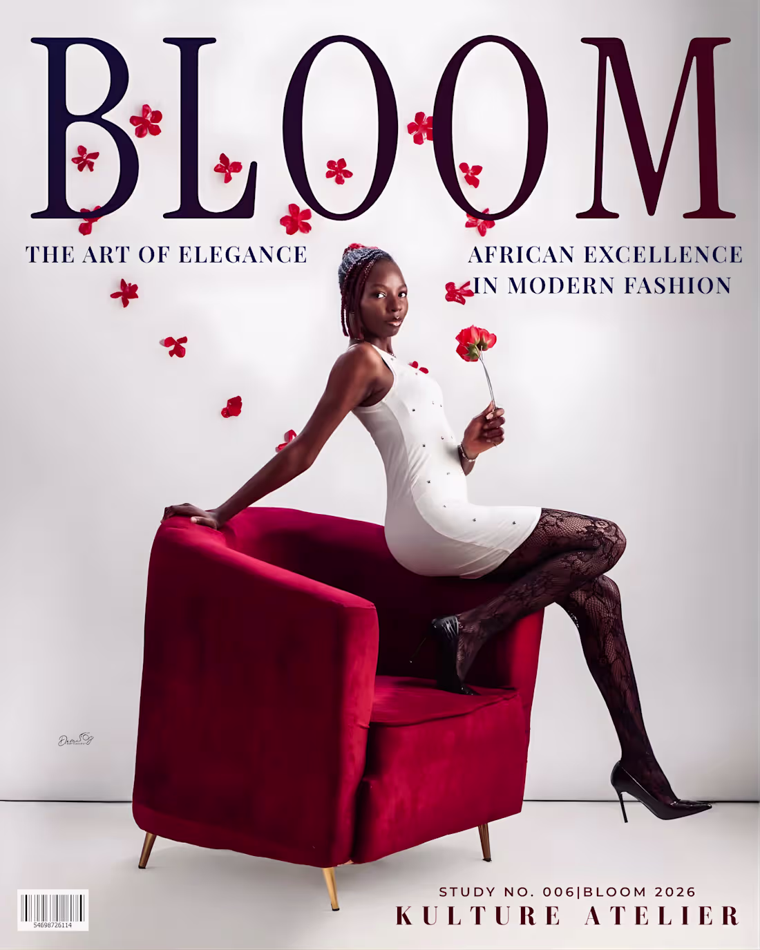
BLOOM is an editorial case study in visual restraint and architectural typography. By prioritizing negative space and cinematic depth, I transformed raw imagery into a luxury archival feature that challenges standard digital layouts
1
90