The network for creativity
Join 1.25M professional creatives like you
Connect with clients, get discovered, and run your business 100% commission-free
Creatives on Contra have earned over $150M and we are just getting started
Back to feedPost
Taste Test
I recently designed a Landing Page for Zitro Digital Banking for the liquidation of Assets.
Which mode is better? White or Dark?
5 voted
33%
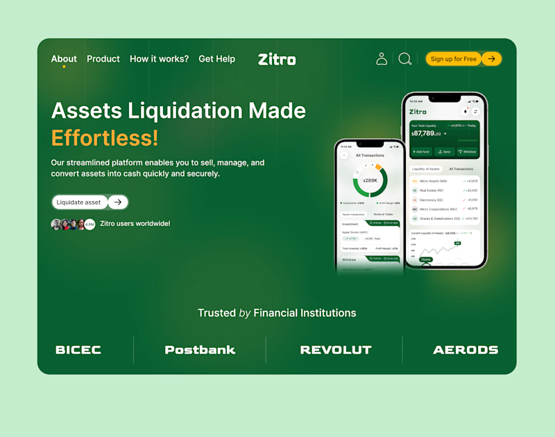
10 voted
67%
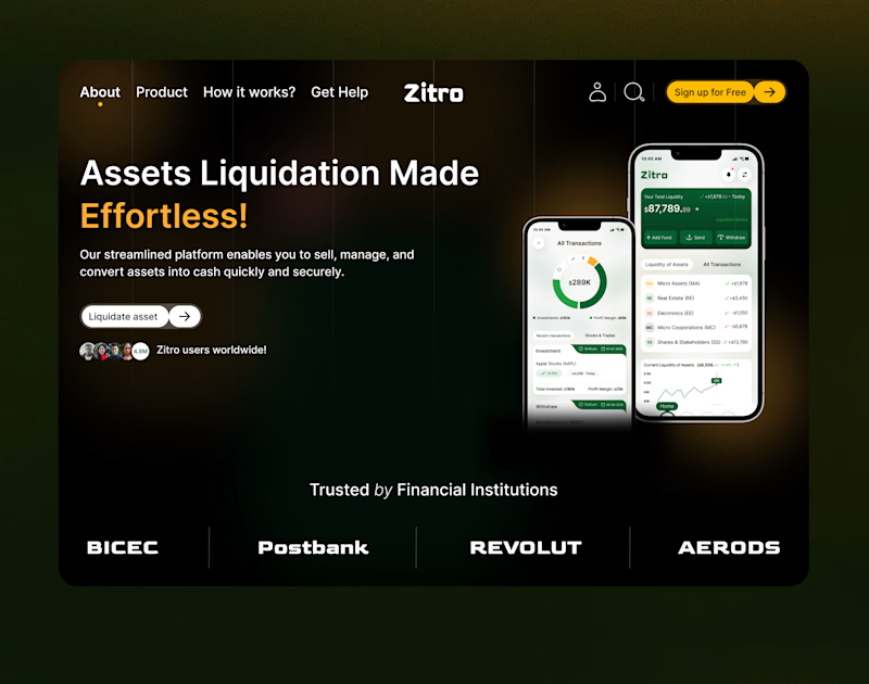
15 votes
Closed

Emmanuel both are great but dark mode instantly grab my attention

Thank you!


Dark mood
Thank you so much
You are welcome

Dark mode for me — for a fintech dealing with asset liquidation it reads more "serious institution" than the white version. Is Zitro an existing client or a self-directed portfolio piece?
Thank you so much for your feedback.
The concept is not yet live but is still in the production phase, more like a portfolio piece.

Dark mode
Thank you!

Outstanding work !
Thank you so much!

The Dark Mode definitely gives off premium banking vibes. The green one feels like it's trying to remind me of the money I'm about to liquidate. 💸 Nice layout!
Thank you so much for your feedback!

Both work are great
Thank you!
The network for creativity
Join 1.25M professional creatives like you
Connect with clients, get discovered, and run your business 100% commission-free
Creatives on Contra have earned over $150M and we are just getting started
Trending

Claude
Claude has entered the design space. How are you using it?

Contra University
Learn from expert creatives how to earn more using next-gen AI tools.
Brand Design
The best brand designers are on Contra. Scroll to see what's trending in brand design. What are you building?
creativeaiflow
Creative AI workflows are evolving. What tools do you use, and what are their strengths and weaknesses?
freelancerlife
Freelancer life is wins, pivots, and everything in between. What’s yours right now?





Related posts

Bold logo or clean layout which footer should I choose?
.
.
More of this over on X, in real time ideas, questions, and the people building cool stuff https://x.com/rightnextstep?s=11


13 voted
52%
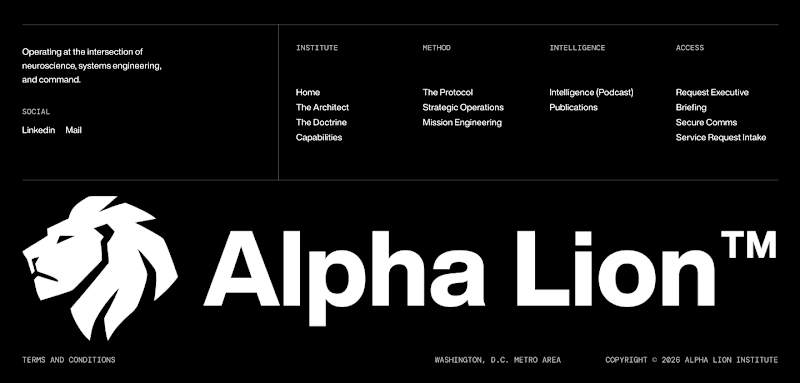
12 voted
48%
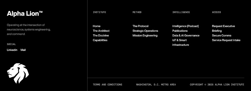
25 votes
Closed
Footer 2 feels more premium to me with the mark repeated smaller, but Footer 1 might win on scannability for a supplement brand. Which way are you leaning after seeing the early votes?

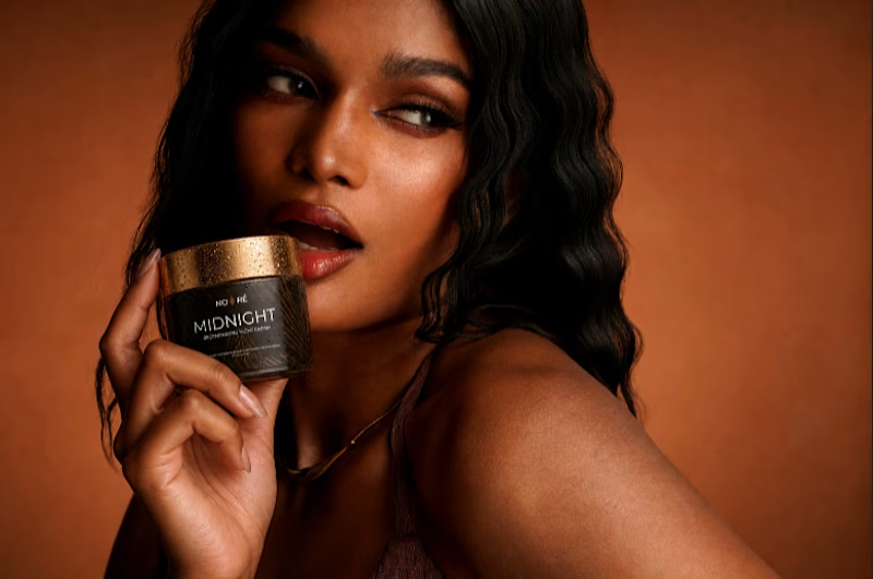
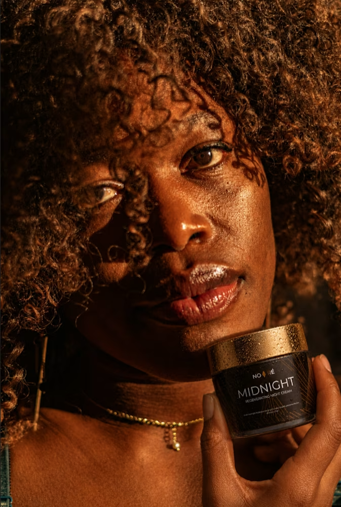
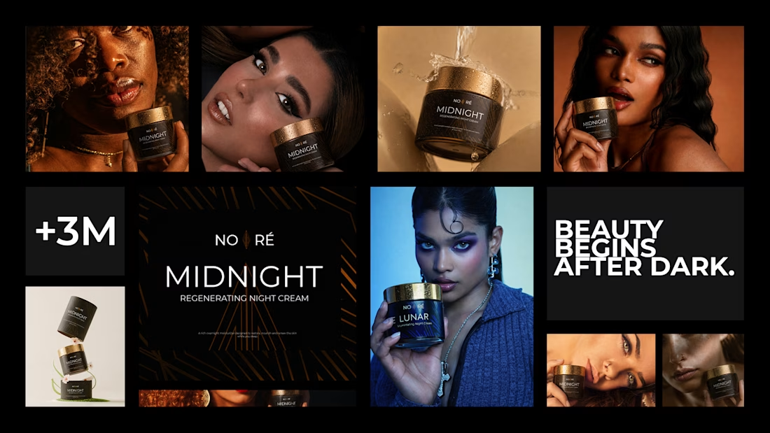
the night is when the real work happens. 🌙
NOIRÉ — a premium night skincare concept built around two products that do their best work while you sleep. midnight recovery for deep nourishment. lunar illuminating for natural radiance.
dark packaging. silver and gold accents. the ritual that happens while the world is quiet.
packaging design concept ✦
#packagingdesign #brandidentity #graphicdesigners



Amazing work


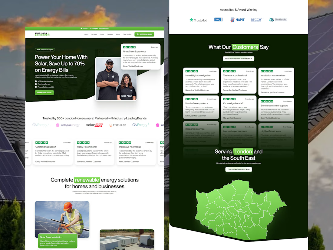
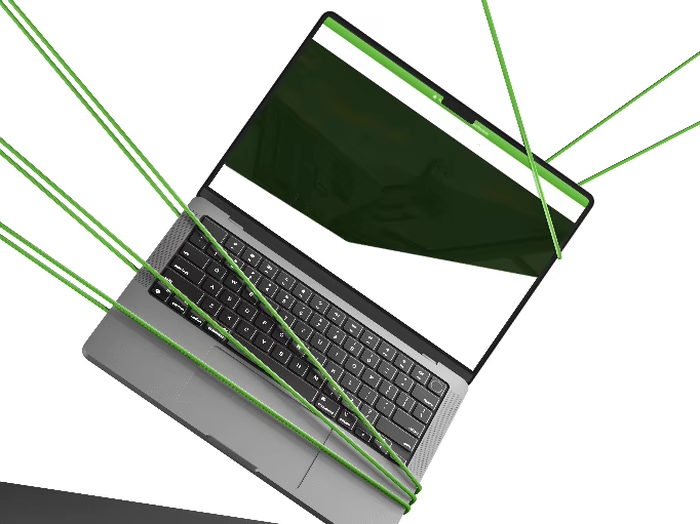
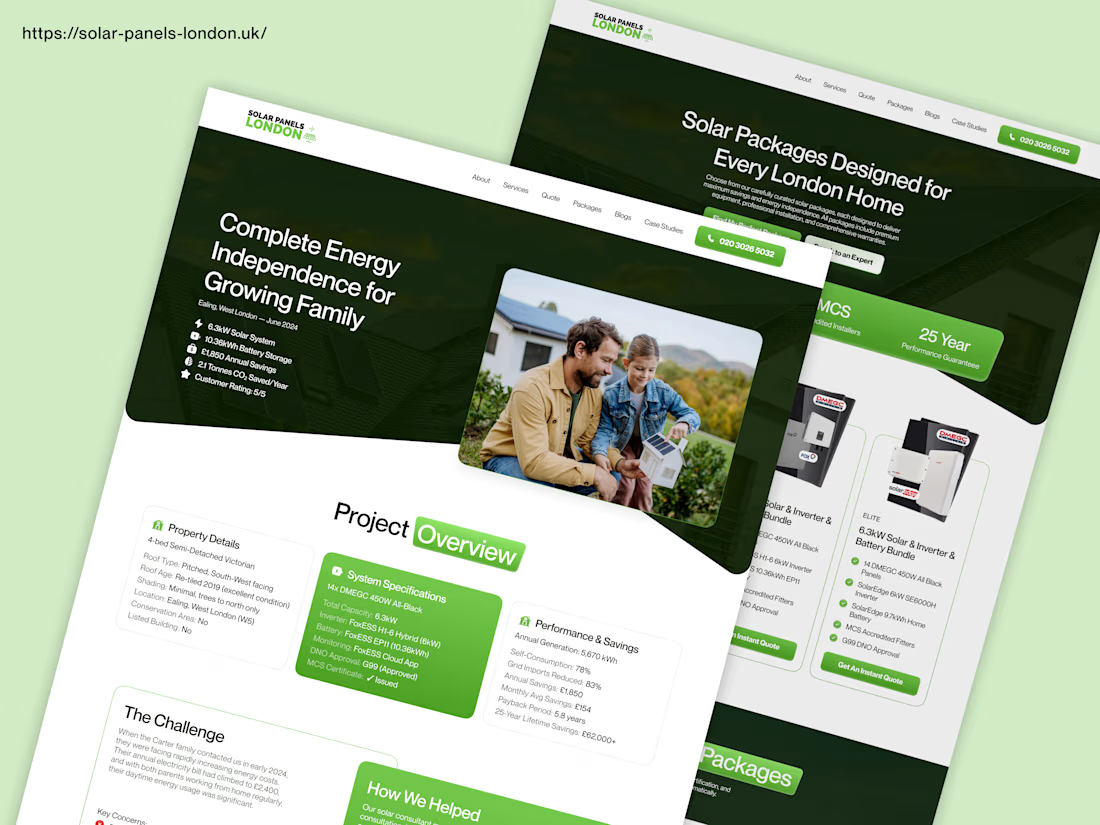
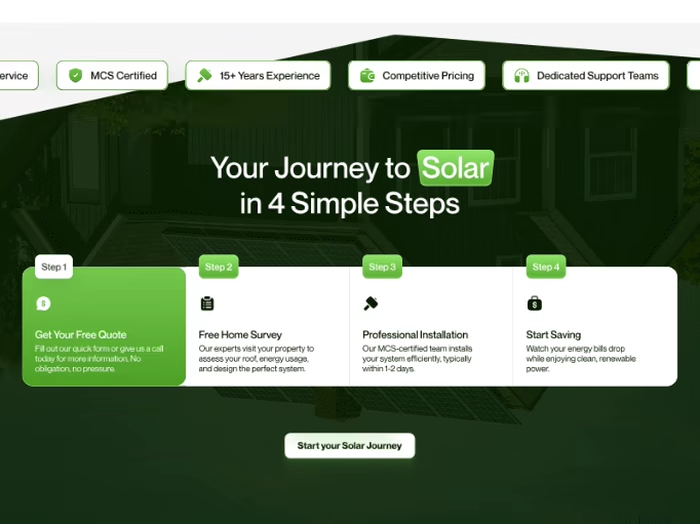
Check out this website redesign I did for Solar Panels London.
I started with Figma to plan the design. Then I built the website in Framer. After that, I did full SEO so the website can rank better on Google and get more solar customers.
This is how I help solar companies get more leads online through good design and SEO.



Amazing Design