The network for creativity
Join 1.25M professional creatives like you
Connect with clients, get discovered, and run your business 100% commission-free
Creatives on Contra have earned over $150M and we are just getting started
Back to feedPost
Taste Test
I recently designed a Landing Page for Zitro Digital Banking for the liquidation of Assets.
Which mode is better? White or Dark?
5 voted
33%
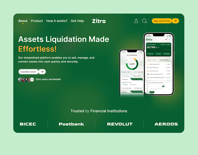
10 voted
67%
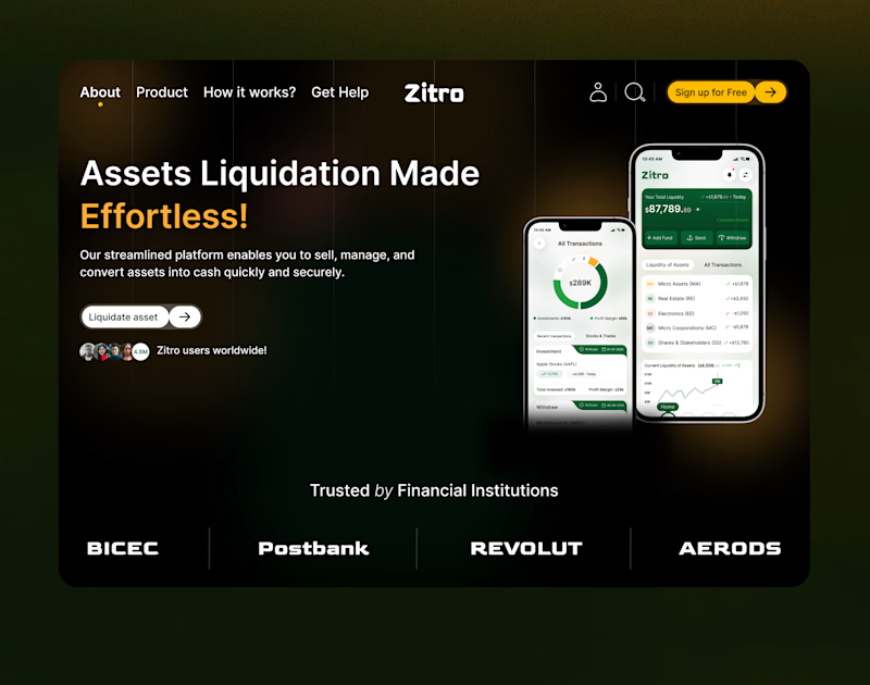
15 votes
Closed


Dark mood

Thank you so much
You are welcome

Dark mode for me — for a fintech dealing with asset liquidation it reads more "serious institution" than the white version. Is Zitro an existing client or a self-directed portfolio piece?
Thank you so much for your feedback.
The concept is not yet live but is still in the production phase, more like a portfolio piece.

Dark mode
Thank you!

Outstanding work !
Thank you so much!

Emmanuel both are great but dark mode instantly grab my attention
Thank you!

The Dark Mode definitely gives off premium banking vibes. The green one feels like it's trying to remind me of the money I'm about to liquidate. 💸 Nice layout!
Thank you so much for your feedback!

Both work are great
Thank you!
The network for creativity
Join 1.25M professional creatives like you
Connect with clients, get discovered, and run your business 100% commission-free
Creatives on Contra have earned over $150M and we are just getting started
Trending
retrofuturism
Share your favorite designs from the past exploring the distant future. Or your own take on the aesthetic 🚀
halftone
Dots. Texture. Grain. Let's see your designs using the halftone technique.

Midjourney
Creatives are showing off what they're making with Midjourney.
colorgrade
Video editors sound off: How do you enhance the mood of your video in color grading?


Related posts


Incredible. Love the way you put this together

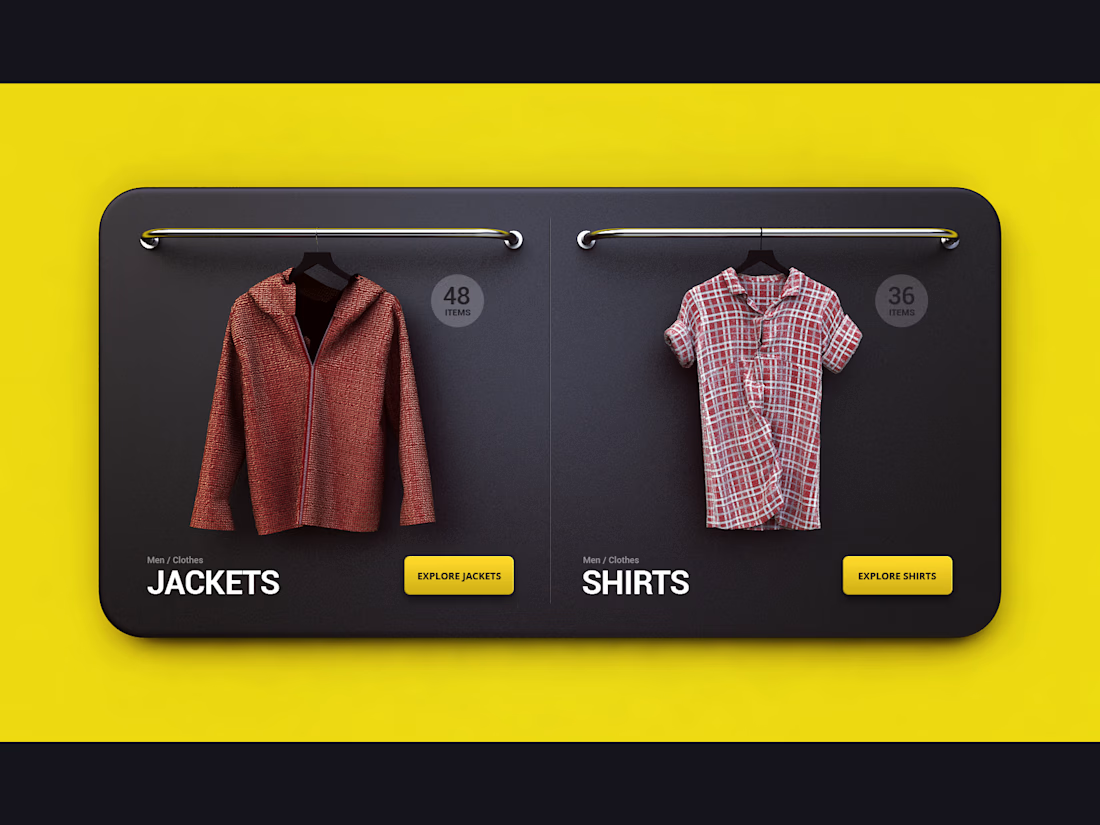
Designed a visual category section for an online fashion store, combining 3D clothing renders with clean UI.
The goal was to make browsing categories feel more visual and engaging while keeping the interface clean and easy to navigate



so cool !!

new Framer web template: RUSHES. 🎬
built for video production studios — where your work does the talking.
cinematic layouts, video-masked type, a camera-HUD thumbnail with a live timecode ticking on hover. dark, bold, made for people who cut for a living.
CMS-ready case studies, custom code components, accessible motion — the kind of details you feel before you notice.
see the sneak peek 👇
also, good excuse to introduce myself — I'm a Framer web designer with 10 years in marketing and 4 in UX/UI. if you need a website, I've still got a few spots open this year. reach out anytime 🚀


Niching a template down to video production studios specifically, instead of a generic portfolio template, is a smart bet since that audience will actually recognize the camera-HUD thumbnail as speaking their language. Was that niche the plan from day one, or did the concept start broader and narrow as you built it out?