The network for creativity
Join 1.25M professional creatives like you
Connect with clients, get discovered, and run your business 100% commission-free
Creatives on Contra have earned over $150M and we are just getting started
Back to feedPost


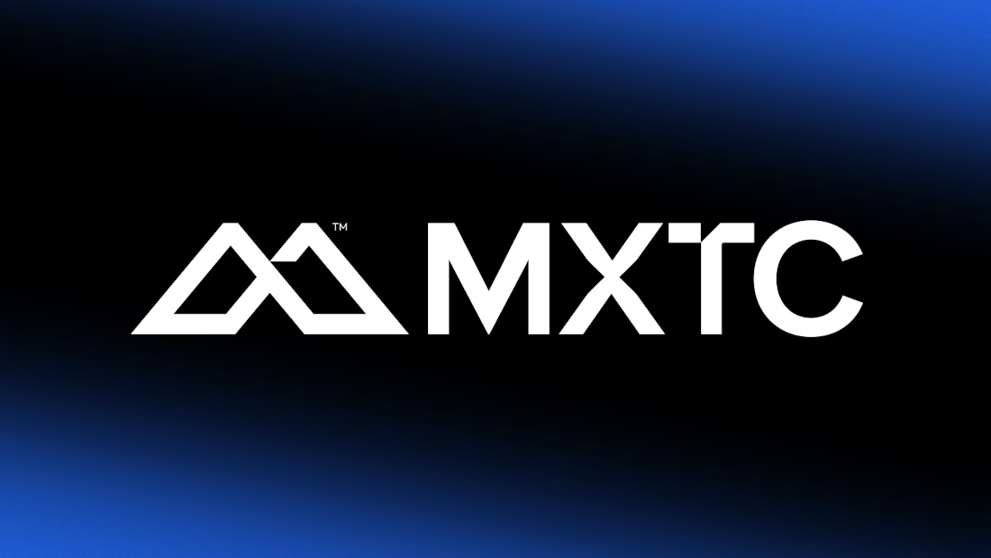
MXTC™ — New Look. New Chapter.
In 2025, MXTC™ entered a new chapter with a new visual identity.
As the studio continued to grow, the previous identity no longer fully reflected the direction, ambition, and character of the work. The rebrand was an opportunity to create a sharper and more dynamic visual language.
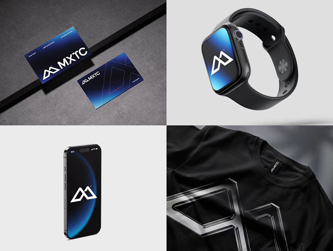
At the core is a custom M + X monogram, supported by geometric typography, dynamic gradients, motion, and grain.
A new identity for where MXTC™ is today — and where it’s heading next.
Design & Art Direction: @Adrian Rovina (Falling Melon) & Petar Matić (MXTC™)
#BrandIdentity #Branding #Rebrand #VisualIdentity #GraphicDesign #MotionDesign #WebDesign #MXTC



Outstanding work
Thank you, Rahman!

Love it 😍
Thanks, Jitinder!

The design looks awesome. Great project!
Thanks, Md Abdur!

The M + X monogram is such a strong centerpiece. Love how the gradients, grain, and motion give the identity energy while still keeping it sharp and cohesive. Beautiful rebrand 👏
Thank you, Gabriela! 🙌🏻
The network for creativity
Join 1.25M professional creatives like you
Connect with clients, get discovered, and run your business 100% commission-free
Creatives on Contra have earned over $150M and we are just getting started











Related posts

Every AI product apologizes for the wait. I designed the wait instead.
Latency: identity, interactive site and campaign built on Ma, the space that gives a thing its shape. The headline breathes in weight until the answer lands.
Design the pause.


Man, you’re superhuman; your consistency and quality are out of this world... congratulations on your work.

I created a brand identity concept for Velora, an AI productivity platform. I explored the logo, colors, typography, and how the brand could look across a website, mobile app, and everyday products. I wanted everything to feel consistent, modern, and easy to recognize.

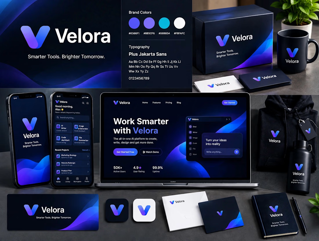

The blue is perfect for this. I’ve seen so many AI brands do boring black/white but this gradient gives it energy. And Plus Jakarta Sans was a great choice, keeps it friendly.
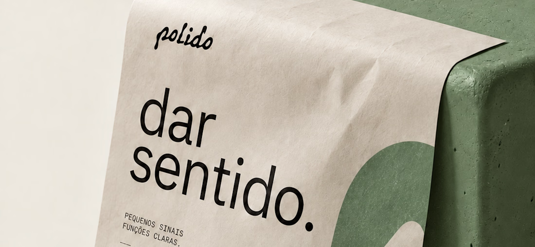
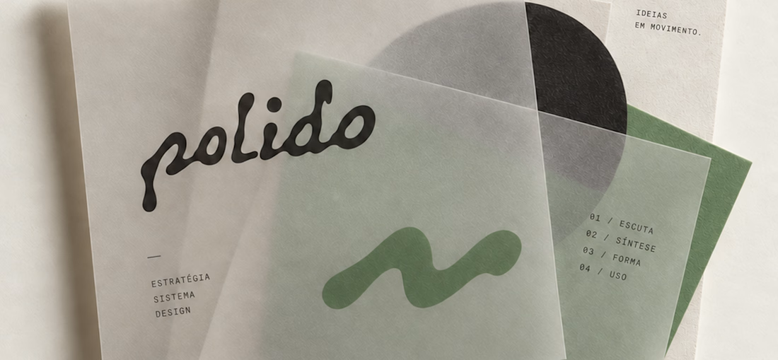
POLIDO — Brand Identity & Visual System
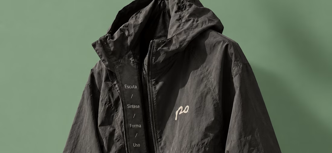
POLIDO is the visual identity of my independent brand design practice, shaped by a process of listening, synthesis, form, and use.
The identity brings together a hand-drawn signature, restrained typography, tactile materials, and a palette of warm paper, graphite, and Basil green.
From printed matter to apparel and physical applications, the project explores how a consistent visual language can adapt to different materials and contexts while maintaining its character.
Scope: Brand Strategy, Visual Identity, Art Direction, and Mockup Design.


High end branding