The network for creativity
Join 1.25M professional creatives like you
Connect with clients, get discovered, and run your business 100% commission-free
Creatives on Contra have earned over $150M and we are just getting started
Back to feedPost
I created a brand identity concept for Velora, an AI productivity platform. I explored the logo, colors, typography, and how the brand could look across a website, mobile app, and everyday products. I wanted everything to feel consistent, modern, and easy to recognize.


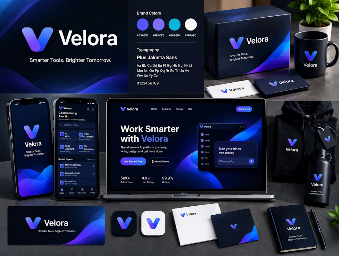

This Velora concept is really well executed man. Love how you kept the same vibe across website, app and even the merch. The blue and purple gradient really works for an AI brand, feels modern but not too much

Thanks Ashik! Yeah wanted to keep the AI vibe modern but friendly with that blue/purple gradient.


Clean work! You nailed the consistency part. From logo to website to packaging, everything feels like the same brand. The V mark is simple but memorable.
Thanks Anisur! That V mark simplicity was the main goal.

Exactly! Most miss the ecosystem part. Thanks Mim!

The blue is perfect for this. I’ve seen so many AI brands do boring black/white but this gradient gives it energy. And Plus Jakarta Sans was a great choice, keeps it friendly.
thank you so much Shishir! haha yeah tried to stay away from that typical black/white ai look. happy the blue + jakarta combo worked 🙏

The V with the tick inside carries the whole system, and it reads on the phone, the card and the cap without changing. Smarter Tools, Brighter Tomorrow feels a bit generic for a mark this confident though, it deserves a sharper line.
thanks man, means a lot! yeah the V+tick was tricky to get right but glad it holds up on small sizes. and totally agree on the tagline, it was client's initial idea - still working on a sharper one.
Client tagline ideas are usually the hardest part to move. If the V is the anchor, the line could lean on the tick: something about getting it right, not just getting it done. Good luck with it.
that's a great angle actually. love that framing - getting it right vs just getting it done. will definitely explore that direction, thanks for the push!

Great job bravo


The violet-to-cyan gradient on that V mark carries nicely onto the dark packaging and app screens, very cohesive system.
Thanks Arek! Appreciate you noticing that — tried to keep that violet-to-cyan V as the hero across all touchpoints, from packaging to UI, so the whole system feels like one brand, not separate pieces.

Your design is good, but it was made by AI
Thanks! Shakil

Love how cohesive and modern this identity feels! The consistency across different touchpoints is what makes a brand truly memorable.
The network for creativity
Join 1.25M professional creatives like you
Connect with clients, get discovered, and run your business 100% commission-free
Creatives on Contra have earned over $150M and we are just getting started



Related posts

New project! Me and @Mary Delaney helped out the folks at Balloon with a rebranding a redesign of their mascot! Check out the new appstore listing and stay tuned for much more!
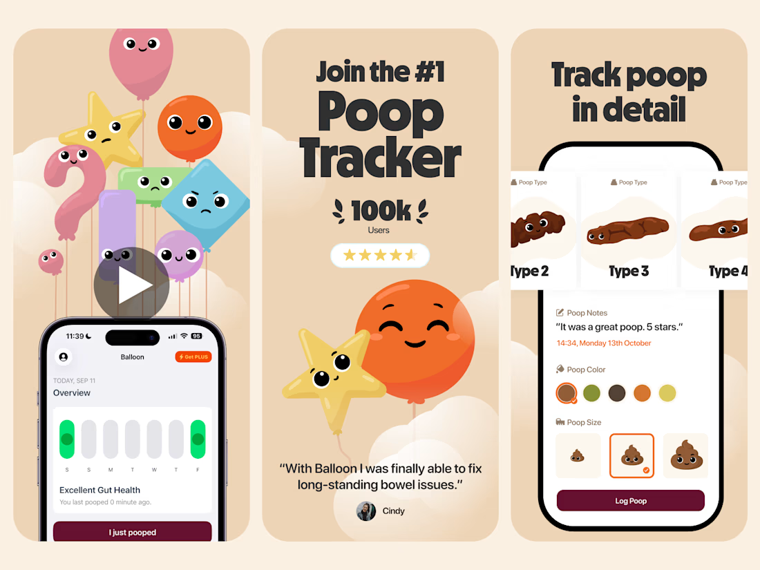
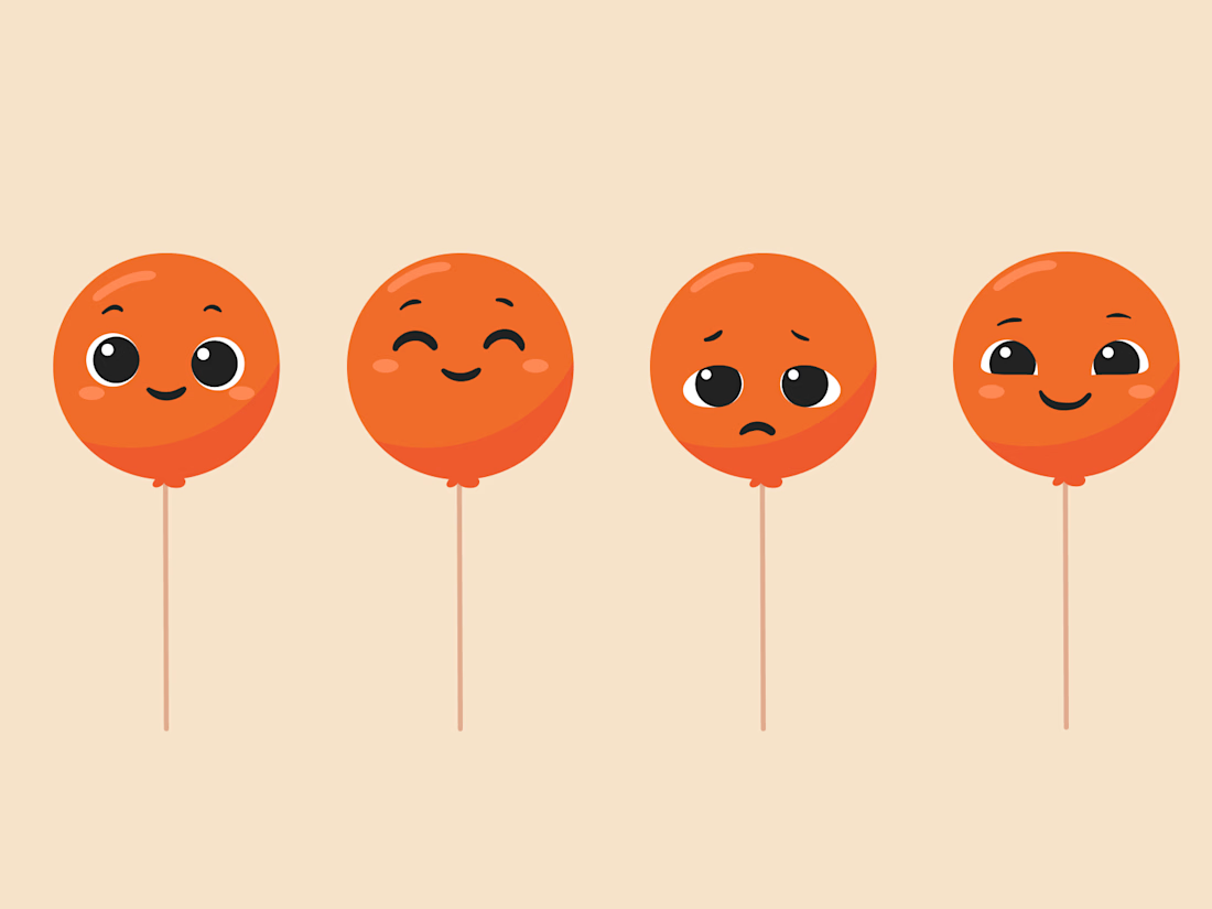

Everything has character! Good job. I like the little faces on the terds 🤣

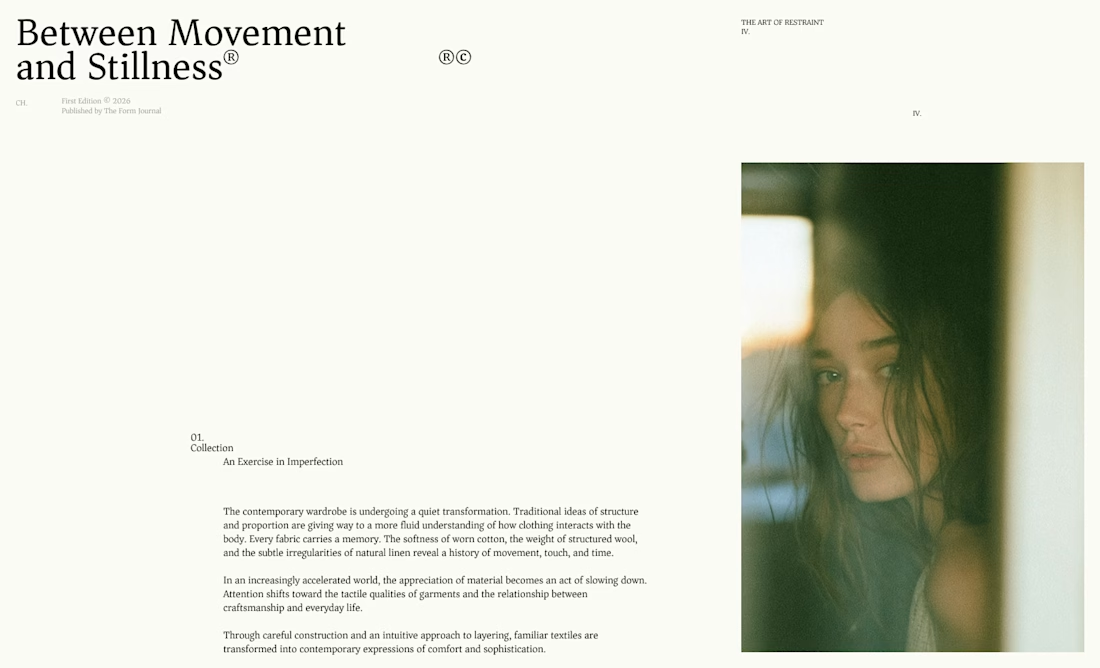
I designed these editorial-inspired layouts as part of an exploration for a fictional photography and fashion magazine
↳ Master typography & layout - The foundation of timeless web design. Join 350+ designers inside my 13-hour online course https://typomonday.com/course
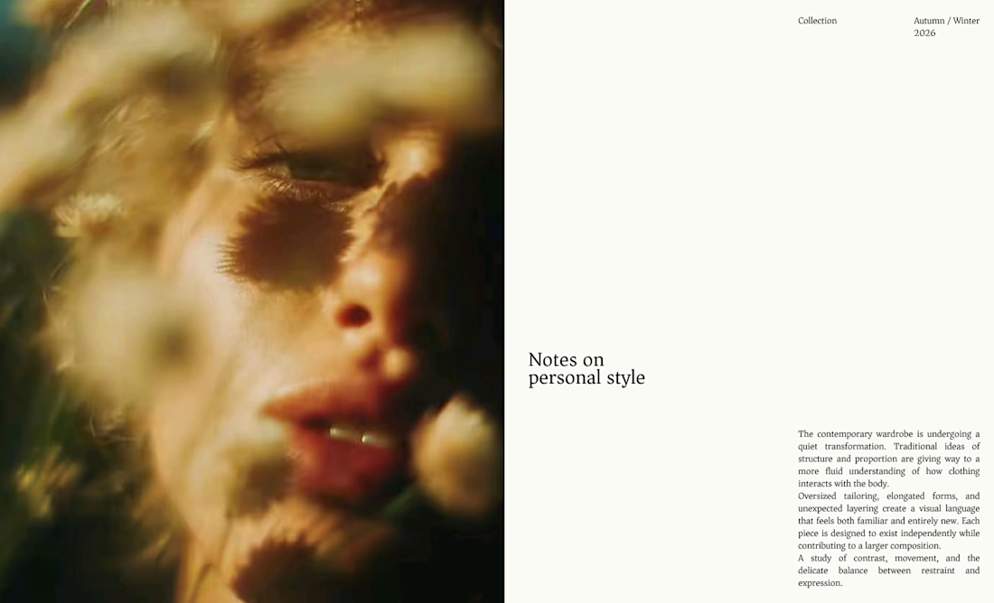
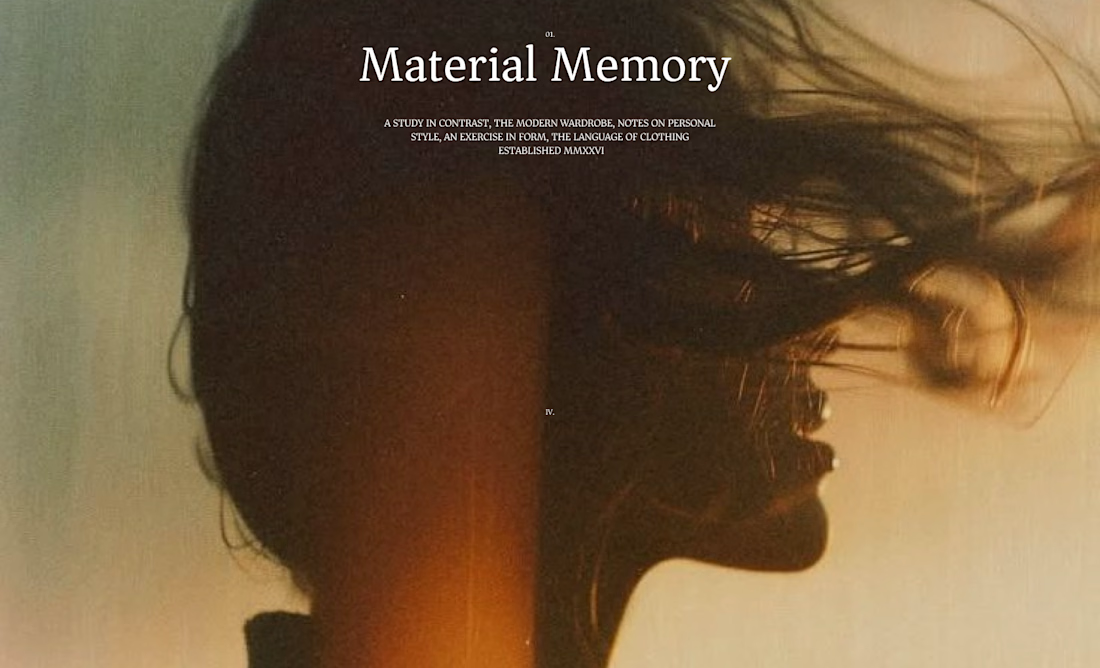
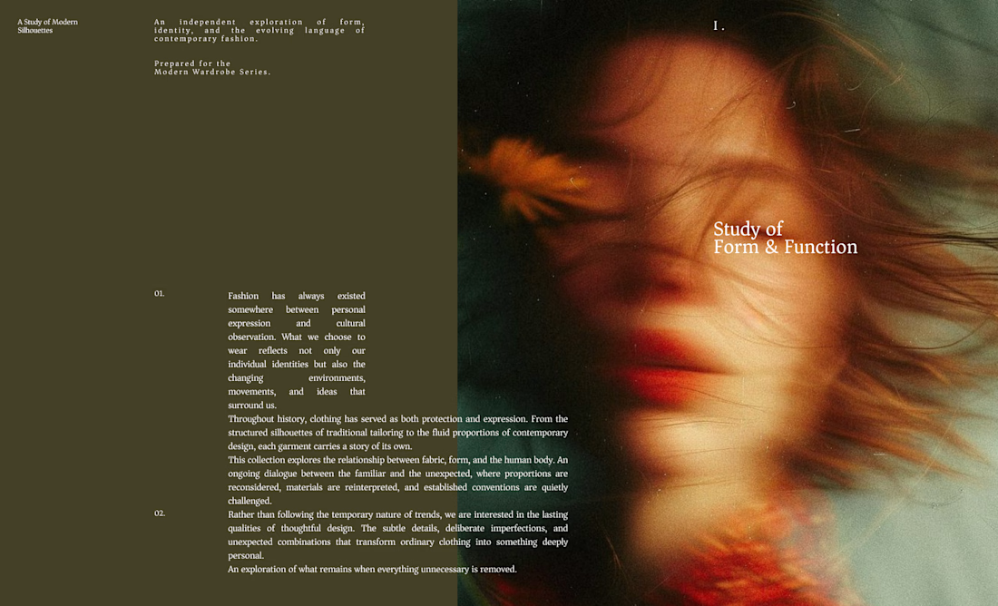

Really nice exploration 👍


Here’s a little piece from my current project. As I watch the Swiss design concept become a part of my creative DNA, I find myself constantly gravitating towards this direction in web design.
What’s really interesting is that Volume 3 studio and I are experimenting here, mixing things that seem completely unmixable at first glance.
Since Volume 3 is a CGI and VFX studio, it was crucial to incorporate a 3D dimension into their brand communication. On top of that, a Terminal UI is exactly what keeps that technical vibe going.
So, the final mix is International (Swiss) style, a Terminal UI, and a 3D feel brought to life by neumorphism. Crazy, right???
It looks simple and clean, but behind the scenes, there’s a massive amount of work on the details. We focused on all those little things that push the UX/UI into the premium segment — the things you don't necessarily see right away, but you definitely feel when you're on the page.
The work is still ongoing, so I can't dive into reflecting on the whole process just yet, but I'm gonna keep revealing small parts here.


Swiss grids on the web never get old when they're this clean. What are you and Volume 3 mixing it with?