MXTC™ — New Brand Identity

Petar Matić
1 collaborator


MXTC™ — New Look. New Chapter.
About
MXTC™ is a fast-growing creative studio from Croatia specializing in digital experiences across Motion, Graphic Design, and Web.
As the studio evolved, its existing identity no longer fully reflected the ambition, energy, and breadth of its creative work. The rebrand was an opportunity to build a more distinctive and flexible identity—one that could grow alongside the studio and communicate what MXTC™ does best: transforming brands into dynamic visual experiences.
The Mark
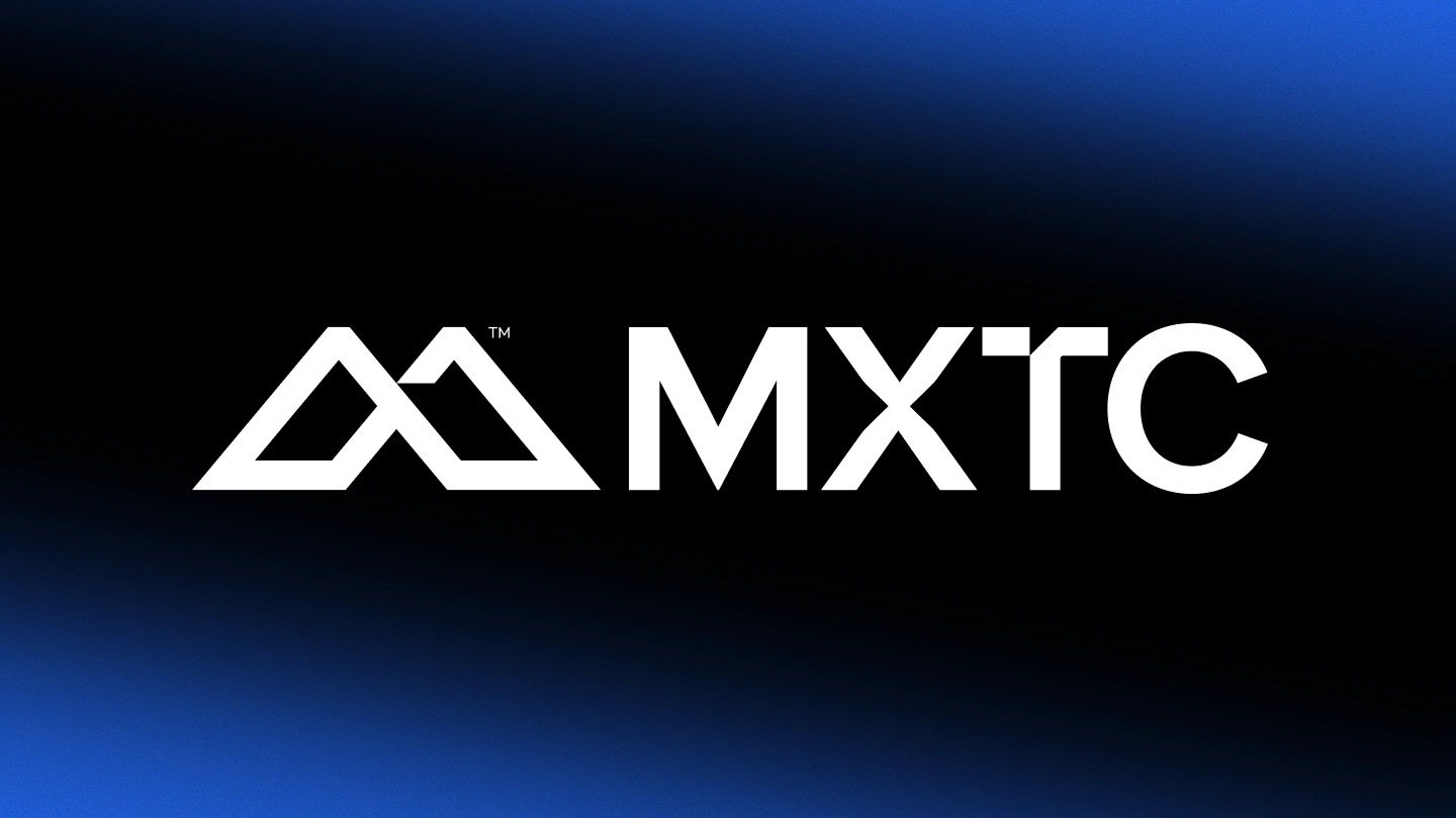
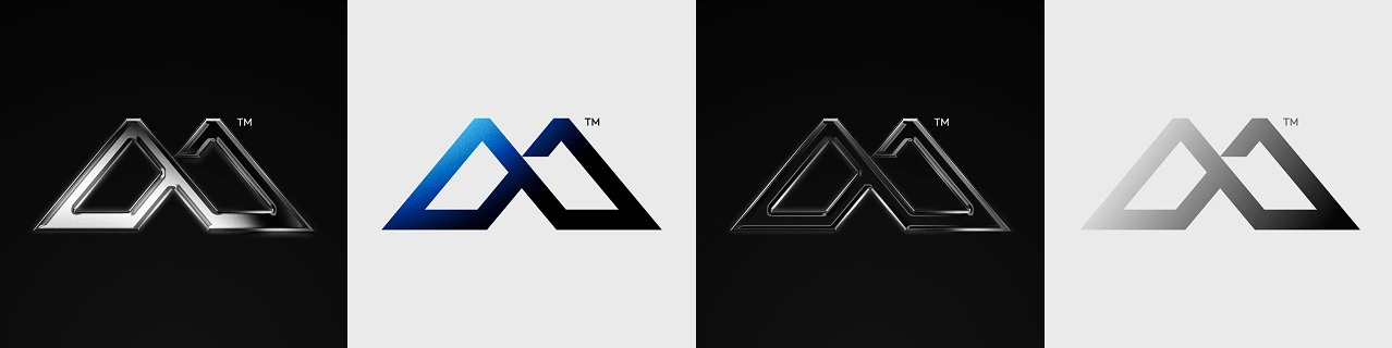
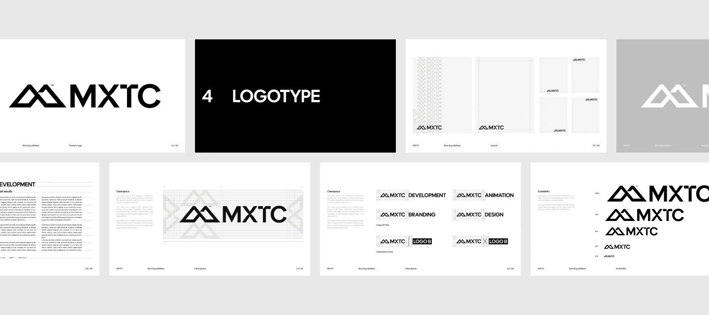
At the core of the identity is a custom monogram combining the letters M and X into a unified symbol. MX represents the initials of MXTC while also referencing the surname Matić, shared by the studio’s founders.
The mark is built through a sharp, clear, and dynamic visual language, reflecting the studio’s focus on movement, precision, and contemporary digital design.
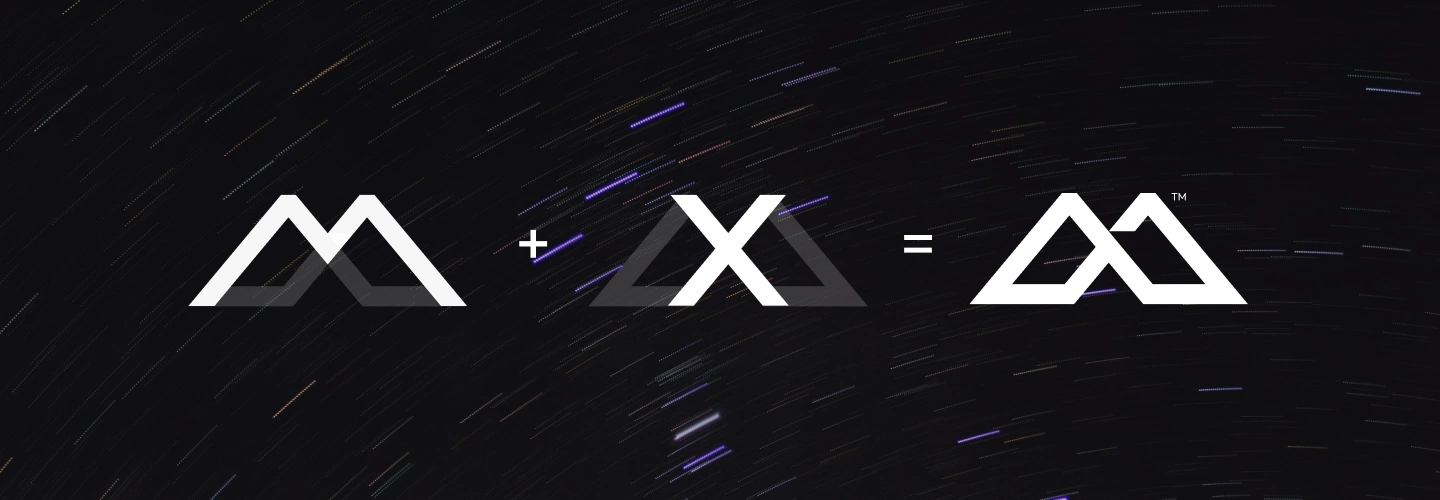
Creating the MXTC Symbol
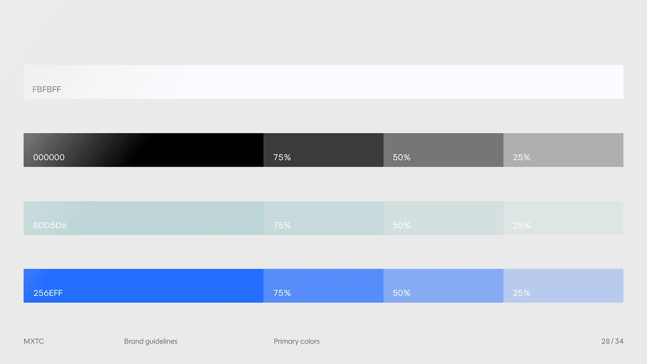
Color Palette
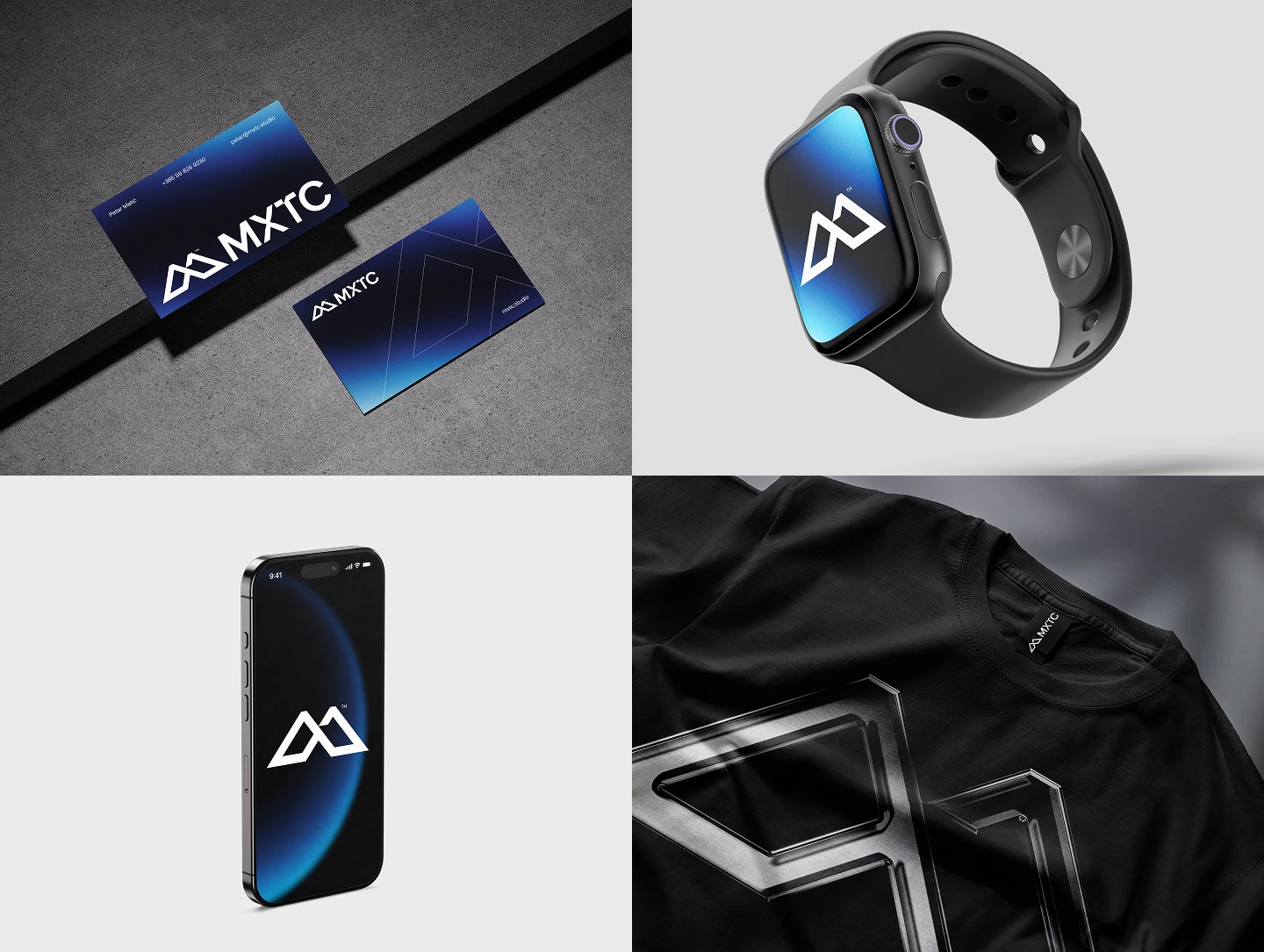
A balance of clean neutrals and bold digital accents. Soft white and black form the foundation, while muted cyan and electric blue add depth, energy, and a contemporary character.
In Motion
The visual language extends beyond the static identity through a series of abstract backgrounds derived from the flow and movement of animation.
Fluid forms and shifting compositions introduce a sense of energy and motion, allowing the identity to feel alive across both digital and static applications.
Typography
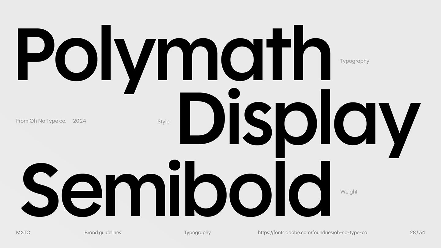
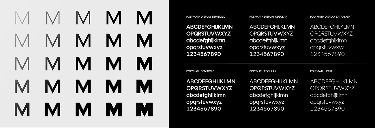
The identity is set in Polymath, a geometric sans-serif typeface selected for its sharp and clean character.
Its precise construction complements the monogram while providing a strong typographic foundation for the wider visual system.
The Grid
A strict and minimal grid forms the structural foundation of the identity.
The proportions of the MXTC™ symbol establish the origin point for scale, spacing, and composition across different formats, creating a system that remains consistent while allowing for flexibility.
A New Chapter
The resulting identity brings together a distinctive mark, dynamic motion language, precise typography, and a structured grid to create a visual system that reflects the evolving character of MXTC™.
A new look for a new chapter.
Client: MXTC™
Design: Adrian Rovina & Petar Matić (MXTC)
Art Direction: Adrian Rovina & Petar Matić (MXTC)
An original concept by Petar Matić (MXTC™),
developed together with Adrian Rovina (Falling Melon).
2025
Check out the full Behance project:
Like this project
Posted Sep 3, 2026
A complete visual rebrand for MXTC™, creating a dynamic identity that reflects the studio’s evolution across motion, graphic design, and web.
Likes
0
Views
12
Clients
MXTC™
Collaborators