The network for creativity
Join 1.25M professional creatives like you
Connect with clients, get discovered, and run your business 100% commission-free
Creatives on Contra have earned over $150M and we are just getting started
Back to feedPost
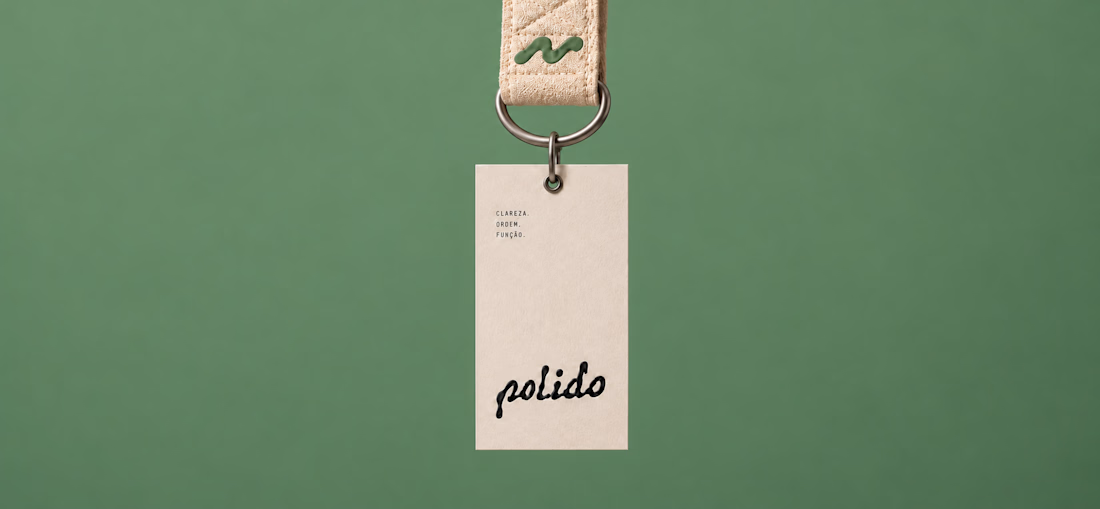
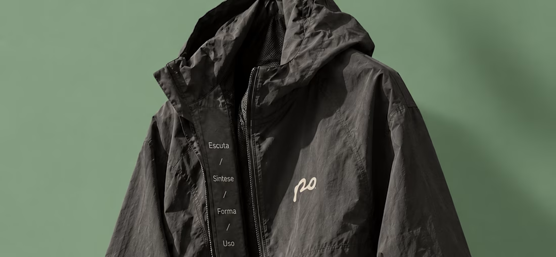
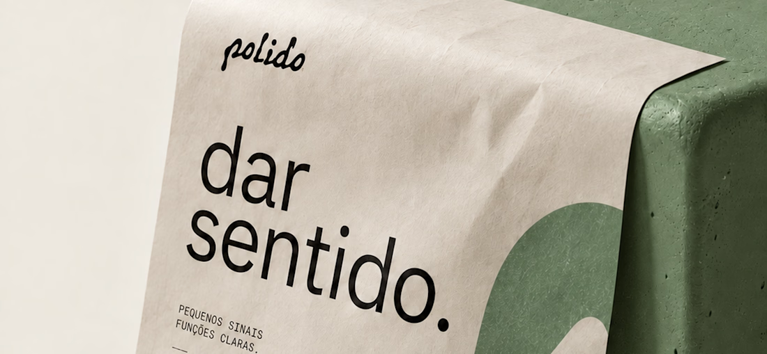
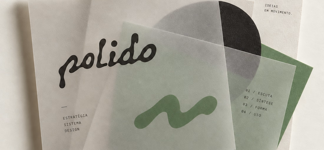
POLIDO — Brand Identity & Visual System
POLIDO is the visual identity of my independent brand design practice, shaped by a process of listening, synthesis, form, and use.
The identity brings together a hand-drawn signature, restrained typography, tactile materials, and a palette of warm paper, graphite, and Basil green.
From printed matter to apparel and physical applications, the project explores how a consistent visual language can adapt to different materials and contexts while maintaining its character.
Scope: Brand Strategy, Visual Identity, Art Direction, and Mockup Design.



It looks stunning!

thanks a lot friend!

The contrast between the handwritten "polido" and the clean sans is perfect. Feels very editorial and high-end but still human. Super well put together.
Thank you very much for your comment; you perfectly described the feeling I wanted to convey.

Good work
The network for creativity
Join 1.25M professional creatives like you
Connect with clients, get discovered, and run your business 100% commission-free
Creatives on Contra have earned over $150M and we are just getting started







Related posts

Recent work on MAE - Visual identity

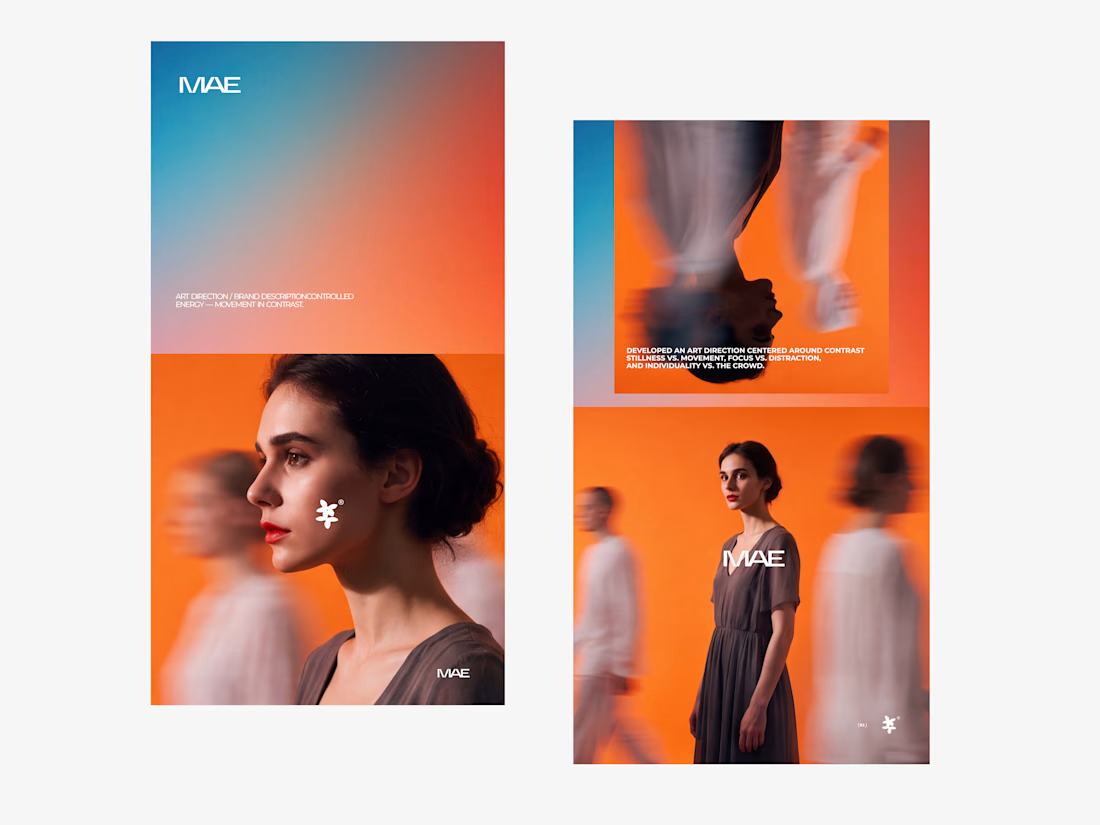

The motion blur on the figures gives the orange-to-blue gradient a reason to be there, and the small star mark stays readable on both the cheek and the shirt. Did the star come first as a standalone mark, or did it grow out of the photography direction?

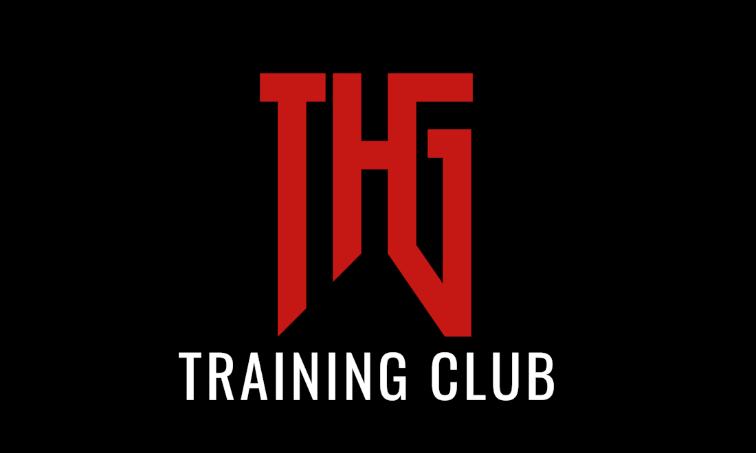
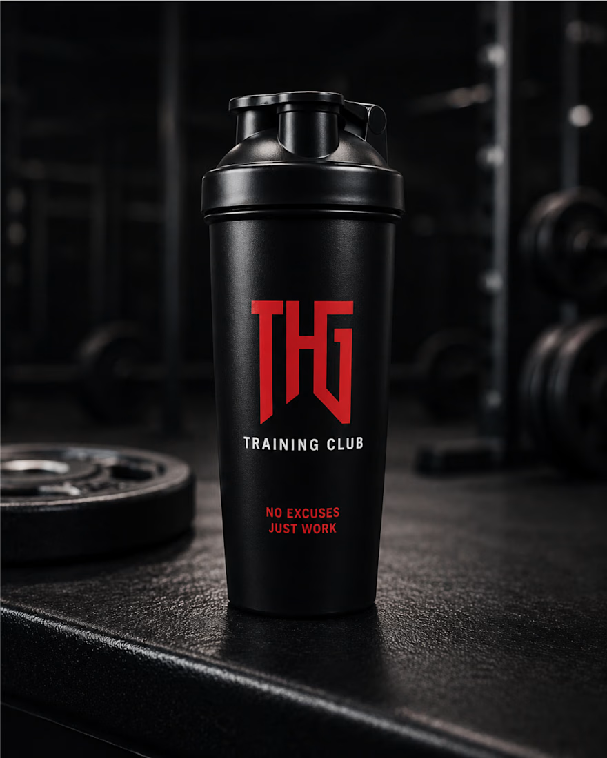
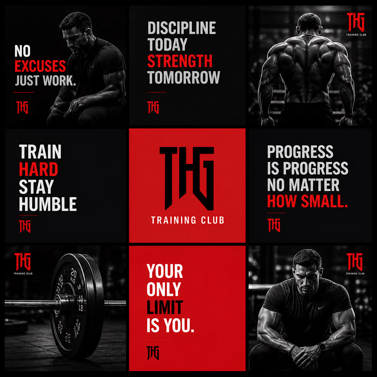
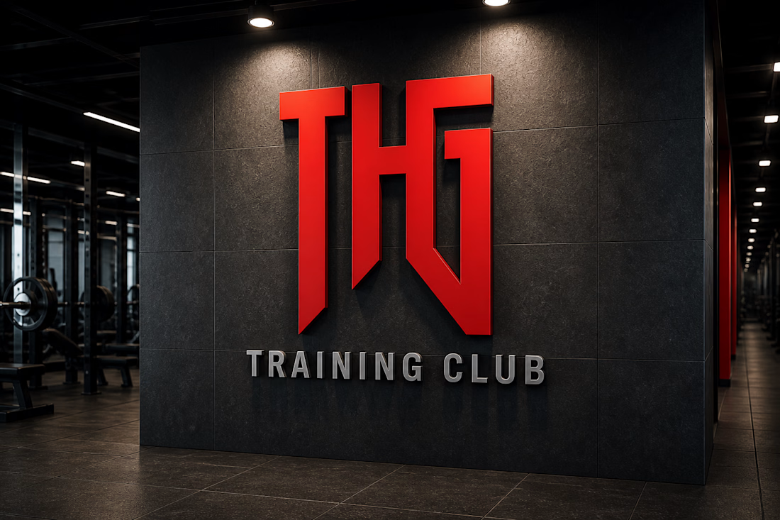
THG Training Club – Fitness Brand Identity & Mockup Design
A bold and modern fitness brand identity design created for THG Training Club. This project focuses on building a strong, powerful visual presence that reflects discipline, strength, and high-performance training culture.
The design revolves around a minimal yet aggressive aesthetic, using a dark theme combined with a striking red logo to create a premium and impactful look. The typography and visual hierarchy are crafted to enhance brand recognition while maintaining clarity across different applications.


whos the target member for THG, serious lifters or more of a general gym crowd

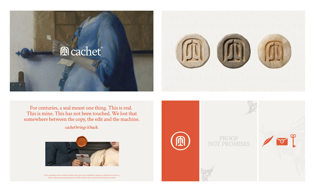
Cachet brand exploration.
Exploring patterns, textures, materials and hand-drawn illustrations

That's interesting I like it that's really unique ❤️❤️🎉🎉