The network for creativity
Join 1.25M professional creatives like you
Connect with clients, get discovered, and run your business 100% commission-free
Creatives on Contra have earned over $150M and we are just getting started
Back to feedPost


Clients often ask what style I have. I always answer that I'm super versatile. I get bored easily, so I like to explore many different approaches when working.

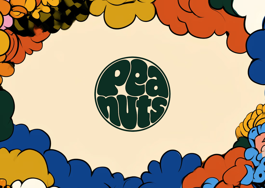
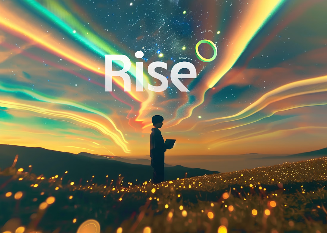
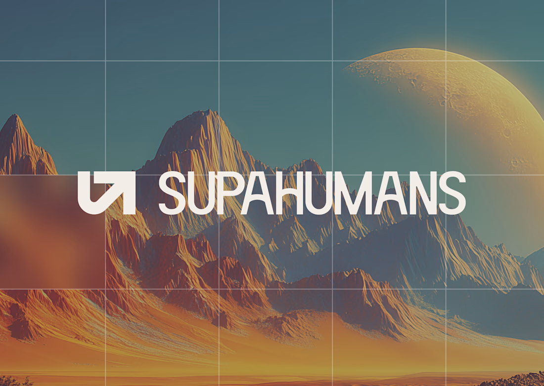
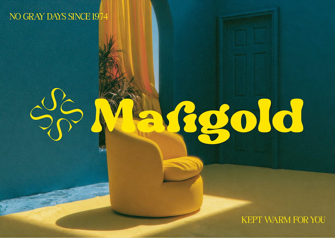

I guess we have something in common, I believe that's a stregth 😁

props to you, these are all so well executed! flexibility is a creative superpower.

Same here, I don't have one style, and want to change things up constantly so I dont get bored of the monotone.

love the strength

Versatility is honestly underrated, a lot of designers box themselves into one style and end up turning down interesting work. When a client can't articulate what they want, how do you narrow things down without just handing them a mood board dump?

COol

Nice

Oh Man, this is outstanding work. I just thinking how you implemented this masterpiece.

Peanuts is my favorite because of that nostagia feel

First one is hella dope bro!

Peanuts and Marigold could not be more different in tone, and yet both wordmarks feel fully committed to their own world instead of hedging toward a safe middle ground. That range is honestly the harder thing to pull off consistently.


Incredible works Daniel... very stunning

These are great collections

Looks great!


Well executed

Completely understand ahah!
My personal style leans more to Peanuts, but the work I actually do is miles away from it 😂

This is a great reminder that strong designers aren't defined by one style. Every concept feels unique and well executed. 🔥

Great work 👏

i love that marigold brand design so much 🤩
Thank you! Me too

Everything is so good and unique

🐐🐐🐐

great work

Very nice work

WOw Amazing Work

Absolutely amazing!👌
The network for creativity
Join 1.25M professional creatives like you
Connect with clients, get discovered, and run your business 100% commission-free
Creatives on Contra have earned over $150M and we are just getting started

Challenges
View all


Related posts

Sometimes it’s hard to visualise data clearly without overwhelming users, but that’s what we aim for.
A snippet from daily design explorations using Magicpath and Figma.

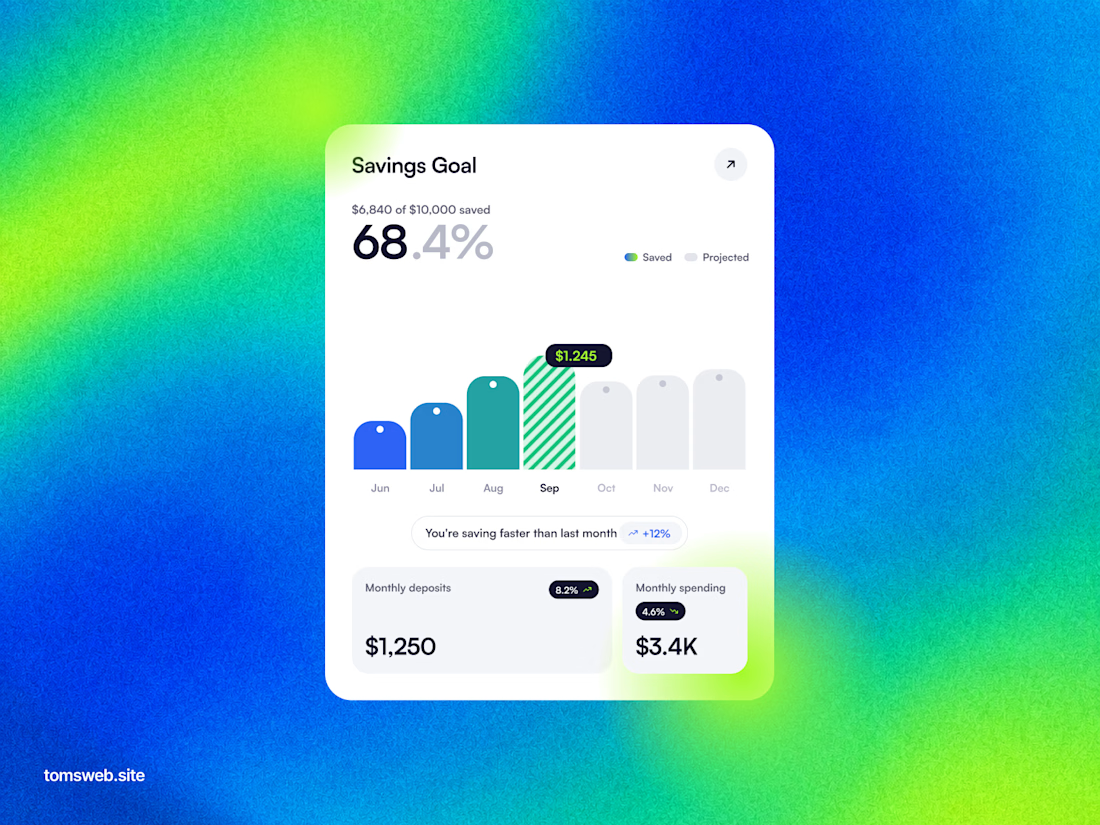

The chart keeps the progress story legible without turning the dashboard into a wall of metrics. The bright gradient is a bold backdrop, while the centered white card gives the key numbers a clear focal point.

Logo design for StocksWithJosh, a prominent online trading mentor with 195K YouTube subscribers.
The concept was simple: blend the initials SWJ with a subtle nod to his status as the "GOAT" (Greatest Of All Time), a moniker earned from his community.
The result is a bold, recognizable brand mark that fits his business perfectly.
What do you think of the end result?



The mark reads instantly at thumbnail size, and the framed SWJ lockup gives it a strong YouTube-avatar presence. The subtle crown/GOAT cue is a nice detail without overpowering the initials.

NEXOR — Creative Digital Agency Website 🔥
NEXOR is a futuristic website concept for a creative digital studio focused on digital products, brand systems, and bold digital experiences.
The goal was to create a memorable first impression while keeping the agency’s services and next steps clear.
Special attention was given to:
• a bold hero composition with oversized typography and futuristic imagery;
• a vibrant orange and black palette that creates a distinctive visual identity 🟠;
• a strong visual hierarchy that balances creative expression with usability;
• clear CTAs for starting a project or booking a call;
• a contact form integrated directly into the hero section;
• responsive mobile layouts that preserve the visual impact 📱;
• a full-screen mobile menu with intuitive navigation and prominent contact options.
The result is an expressive digital experience that combines bold visual storytelling with a clear path to conversion.
Looking to create a distinctive website for your creative agency, digital studio, or technology brand? Let’s build something extraordinary together ⚡
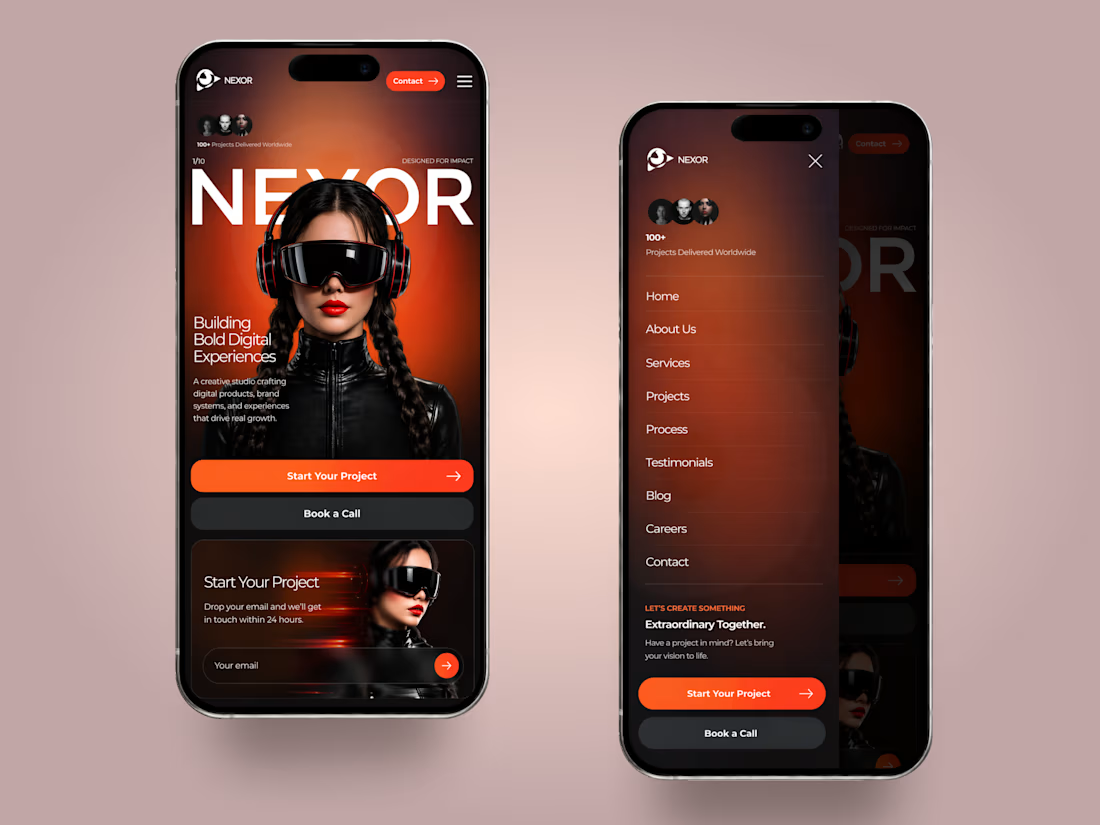
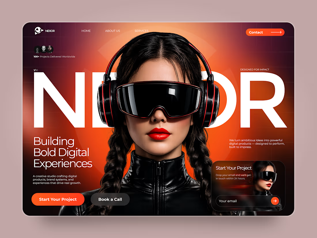
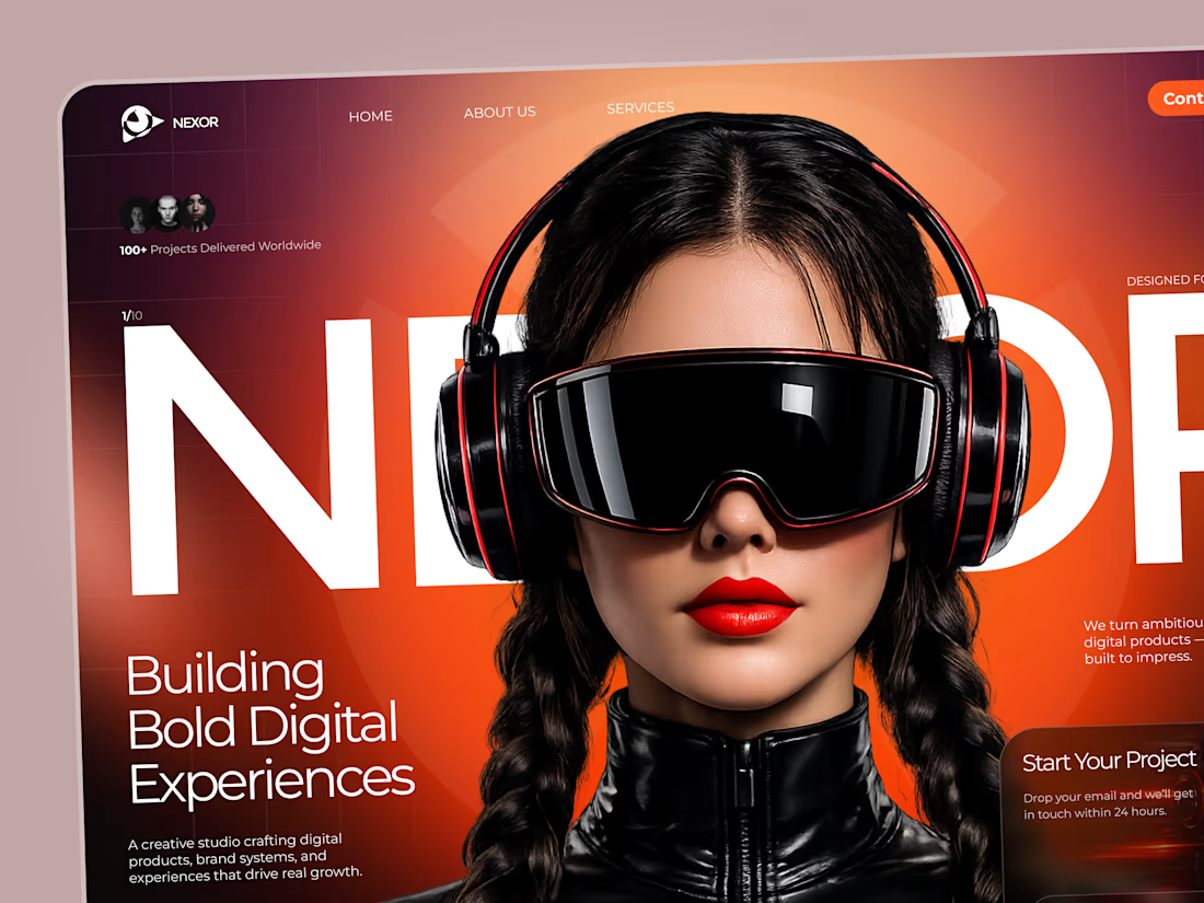
The orange-and-black system has real presence, and the mobile frames show the hierarchy holding together rather than just shrinking. The clear CTA placement is a smart counterweight to the oversized hero type.