The network for creativity
Join 1.25M professional creatives like you
Connect with clients, get discovered, and run your business 100% commission-free
Creatives on Contra have earned over $150M and we are just getting started
Back to feedPost


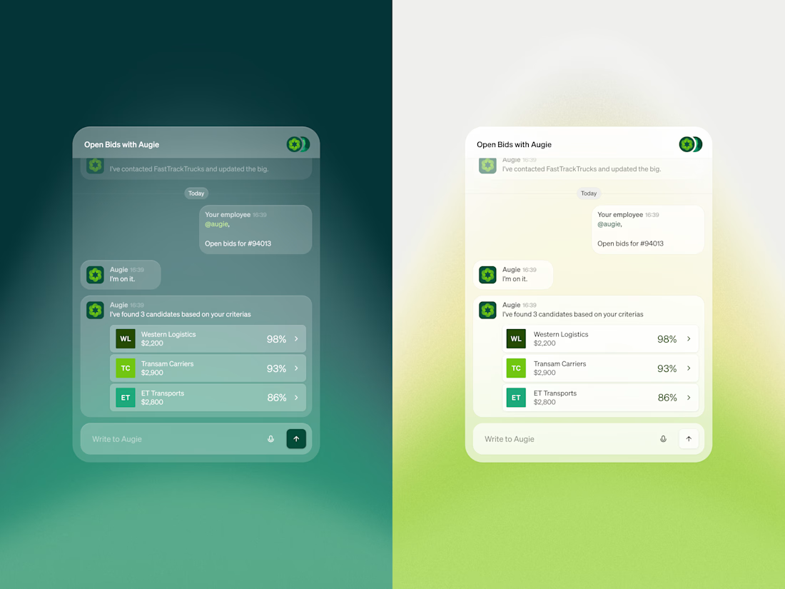
Augie has no fixed interface of its own. It lives inside whatever system a logistics team already runs, which created a specific design challenge: how do you show something visually when the product has no fixed home?
The answer was to build abstracted UI that puts the brand guidelines into practice as a working chat interface. We aimed to show founders what Augie does in one glance without requiring them to read a feature description or sit through a demo.
Both light and dark versions are shown side by side. This was also a styling exercise. The visual language defined here became the foundation for every use case animation across the product, giving the entire website a consistent feel even though Augie itself appears in many different environments.
For a product that lives inside other products, making it visible was the entire design job.

Super clean! ✨️👌

Love the details!

Clean work!

Really smart execution. The consistent visual language across light and dark themes gives the product a strong identity, even without a fixed UI. 🙌

Such a interesting design challenge. Since Augie lives across multiple different systems in the real world how did you land on this specific design language to represent the brand without clashing with the look of external platforms?

"Making it visible was the entire design job" is such a clean way to put it — that's such an underrated problem for embedded/white-label products. Did the light and dark versions end up being used in different host environments, or is it purely the user's own preference?

Designing for an embedded product is an interesting constraint, nice one

Amazing use of colours to make the gradient pop

So satisfying to watch.

Great design always solves problems!

Right one looks great

beautiful

great work

Really like this approach.

One of the best designs I’ve seen today. Really solid work 👏 That abstracted UI concept is brilliant and would look incredibly slick engineered into a live web layout.


Great design

the design is clean

Really like the idea of making the product understandable without relying on long explanations. The side-by-side light and dark versions are a great touch and make the concept feel even more complete.
The network for creativity
Join 1.25M professional creatives like you
Connect with clients, get discovered, and run your business 100% commission-free
Creatives on Contra have earned over $150M and we are just getting started
Trending
retrofuturism
Share your favorite designs from the past exploring the distant future. Or your own take on the aesthetic 🚀
halftone
Dots. Texture. Grain. Let's see your designs using the halftone technique.

Midjourney
Creatives are showing off what they're making with Midjourney.
colorgrade
Video editors sound off: How do you enhance the mood of your video in color grading?


Related posts



Fantastic work Samuel🔥


we are working on two framer templates in parallel
hero interaction magic ✨


Great work on animations

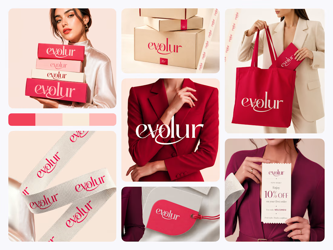
When building a fashion brand identity, most designers start with the logo.
We usually do too. It feels like the natural anchor point.
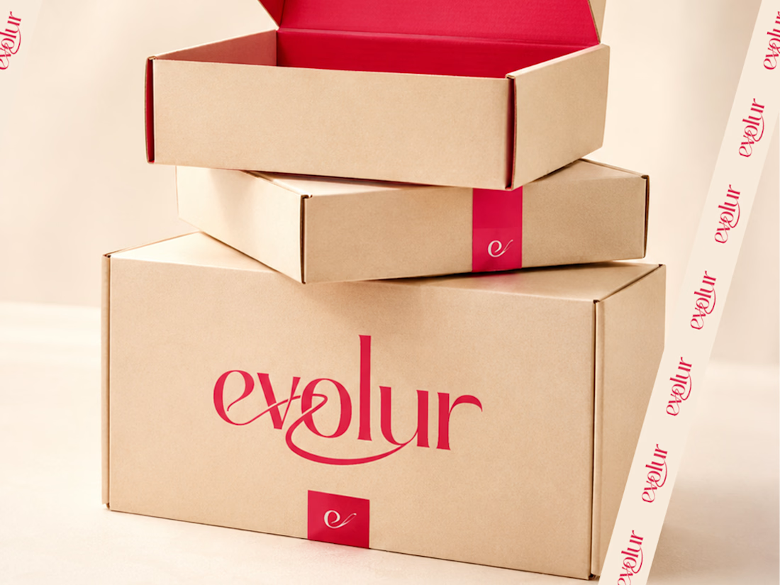
But when we worked on Evolur, we started with the touchpoint that gets touched last the packaging.
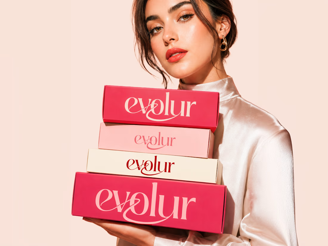
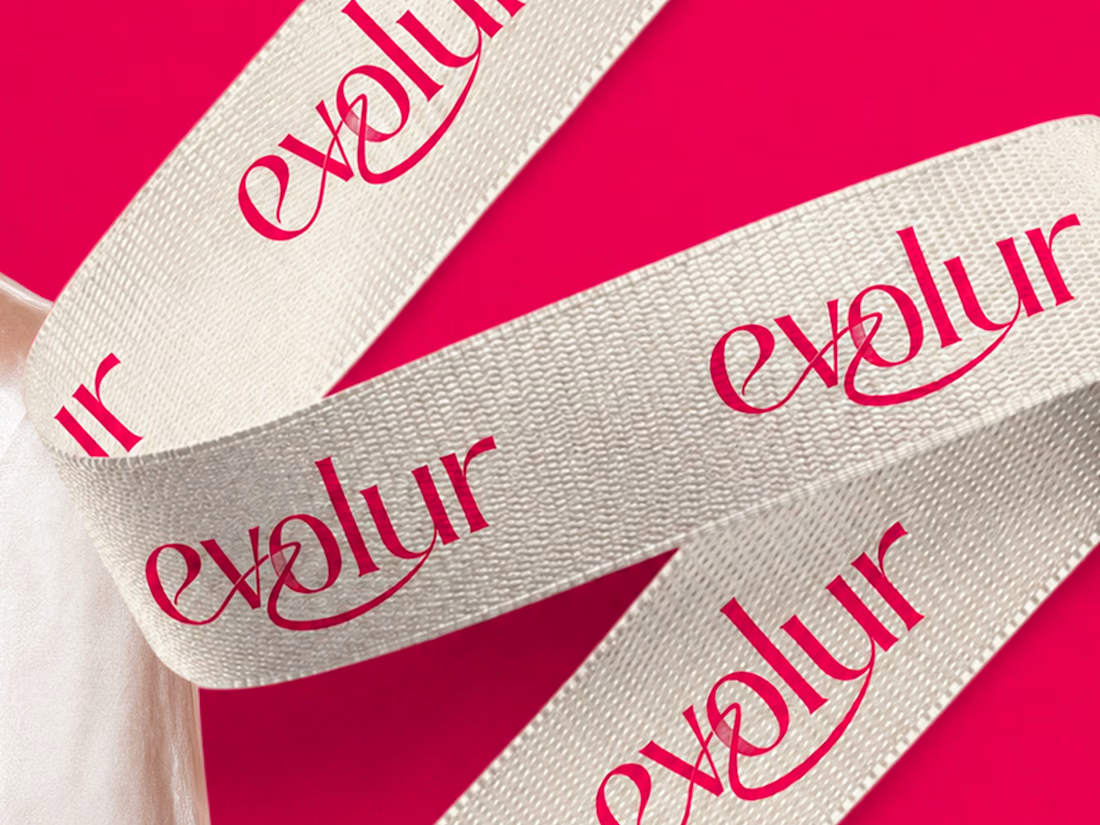
Because for a fashion label, the unboxing moment is the brand. The first impression doesn't happen on Instagram. It happens when someone pulls a ribbon-wrapped box out of a delivery bag.
So we built the identity outward from there. The wordmark came from asking what needed to look right on a swing tag at 2cm and on a tote bag at full size simultaneously. The crimson and blush palette came from asking what felt confident on kraft shipping boxes without needing a campaign photo around it.
This is what fashion branding looks like when every detail is treated like the hero shot.
What we noticed was that designing for physical touchpoints first made every digital decision easier. The hierarchy was already solved. The personality was already clear.
"Fresh styles. Timeless confidence." The brand found its own tagline by the end.
Does this feel like a brand worth wearing? 👇


Amazing branding