The network for creativity
Join 1.25M professional creatives like you
Connect with clients, get discovered, and run your business 100% commission-free
Creatives on Contra have earned over $150M and we are just getting started
Back to feedPost
Taste Test

I’m exploring two homepage hero directions for a Lumena Health concept and testing which one feels stronger for a preventive healthcare brand.
Both directions focus on the same core message: healthcare built around prevention, not reaction.
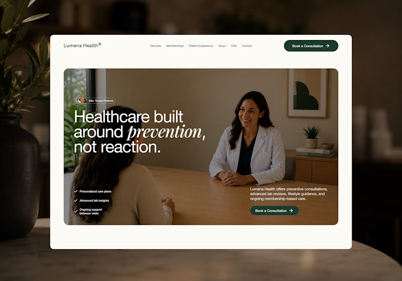
Direction 1 feels more warm, human, and consultation-focused.
The large lifestyle image creates a clear patient/provider moment right away, which helps the experience feel personal and trustworthy.
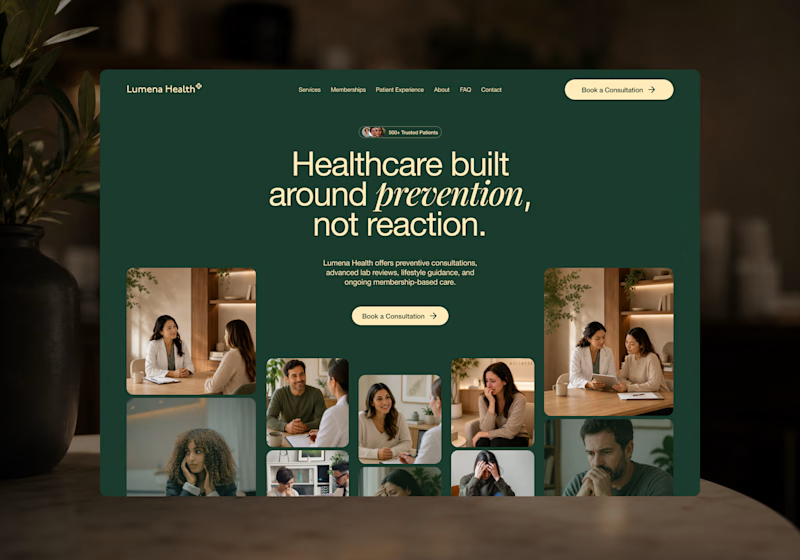
Direction 2 feels more premium, editorial, and brand-driven.
The dark green background, centered headline, and image collage make the page feel more elevated and visually distinctive.
Direction 1: personal, warm, trust-focused
Direction 2: premium, editorial, brand-forward
Which direction feels stronger for a preventive healthcare website?

25 voted
40%
37 voted
60%
62 votes
Closed

Good point. Direction 2 is more distinctive, but I agree some of the expressions may work against the prevention message. Direction 1 feels calmer and gives the service a clearer, more reassuring first impression.


Concept 01 brings that instant visual punch, but Concept 02’s editorial flow builds a much stronger narrative for a venture studio ecosystem. Both execution styles look crisp excited to see how the Framer interactions bring them to life
Thank you, I appreciate that. I’m still deciding where I’ll build it, but I agree — the interaction direction will be important. I’d want the motion to support the narrative and make the experience feel more intentional.

Direction 1's consultation-focused warmth feels like it'll convert better for anxious first-time patients, but Direction 2's premium editorial feel might build more trust with referral sources. Did you already have a lean going in, or are you genuinely torn?
That’s a really thoughtful read. I’m genuinely torn on this one for that reason.
Direction 1 feels more reassuring and conversion-friendly for first-time patients, while Direction 2 feels more elevated and memorable from a brand perspective.
I’m starting to think the strongest...

Direction 1 for me, The white border and text feel cleaner

Awesome work!

Voted Direction 1. For preventive care specifically, trust has to come before polish, and a patient looking at that page needs to feel like a person is going to listen to them, not just admire a nice layout.

Clean work !

Simple and straight forward

Direction 1 feels stronger because preventive healthcare requires active patient engagement, and the warm, human consultation shot instantly builds the trust needed to motivate behavioral change. A lifestyle image makes the intangible concept of "prevention" concrete and...

Direction 2 iis the best

Direction 2 definitely wins😍

direction 2 does it

option 2 looks different style of approach, really liked it
The network for creativity
Join 1.25M professional creatives like you
Connect with clients, get discovered, and run your business 100% commission-free
Creatives on Contra have earned over $150M and we are just getting started
Trending

Claude
Claude has entered the design space. How are you using it?

Contra University
Learn from expert creatives how to earn more using next-gen AI tools.
Brand Design
The best brand designers are on Contra. Scroll to see what's trending in brand design. What are you building?
creativeaiflow
Creative AI workflows are evolving. What tools do you use, and what are their strengths and weaknesses?
freelancerlife
Freelancer life is wins, pivots, and everything in between. What’s yours right now?






Related posts

testing two versions of the new Synth navigation
one cuts into the top edge like a notch
the other floats below it like a pill
which one feels better?

12 voted
40%
18 voted
60%
30 votes
Closed

I like both, but would go with the pill because of the functionality on Mac, it would be better than the notch.


For this design, I brought the Studio Kalili website to life using Squarespace's Finish Layer by layering in subtle animation across the page to turn a static layout into something that feels considered and dynamic without overwhelming the content.
The most intentional use of Finish Layer is the two-image interaction illustrating the core idea behind the studio's work: closing the gap. One image enters from the left, the other from the right, moving quickly at first and then easing as they meet in the center — fast enough to catch attention, slow enough to let the reader stay with the copy.
From there, hover states on buttons, text, and large images, plus scroll-triggered entrances, guide the eye down the page and give every interactive element a small, deliberate moment of response.
Squarespace's Finish Layer was used to add polished interactions across the website, creating a more dynamic browsing experience. Each interaction supports the overall experience while preserving the calm, editorial character of the Studio Kalili brand.


Hi Lillian!
I just commented on your Studio Kalili post. That work is incredible.
I'm Laxmiprasana and I'm new to Contra. I do web design, Kajabi, graphic design and video editing. I'm trying to get my first few clients here.
I really admire how you present your work and land...

Which is better for PlanUX: 3D Logo Mark Loader?


22 voted
59%
15 voted
41%
37 votes
Closed

i like it more with brand color