The network for creativity
Join 1.25M professional creatives like you
Connect with clients, get discovered, and run your business 100% commission-free
Creatives on Contra have earned over $150M and we are just getting started
Back to feedPost
Taste Test
testing two versions of the new Synth navigation
one cuts into the top edge like a notch
the other floats below it like a pill
which one feels better?

20 votes
Ends in 1d

proof the smallest details make big differences–– i think the pill shape feels so clean, it elevates the page overall.

I like both, but would go with the pill because of the functionality on Mac, it would be better than the notch.

My vote for pill!! Loved it


niche, with differentiation in mind
The network for creativity
Join 1.25M professional creatives like you
Connect with clients, get discovered, and run your business 100% commission-free
Creatives on Contra have earned over $150M and we are just getting started
Related posts

Hard to choose which layout I should go with 🤔

10 voted
31%
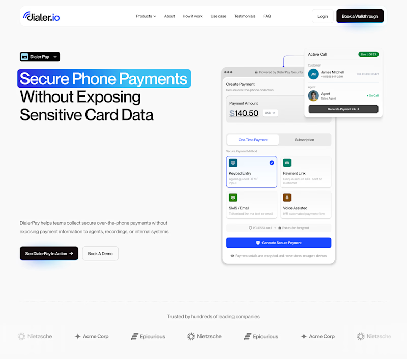
22 voted
69%
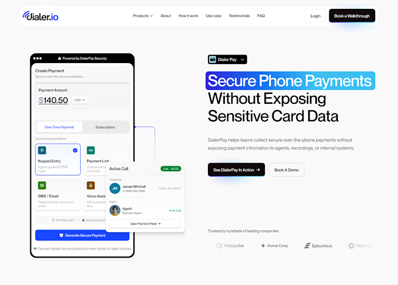
32 votes
Closed

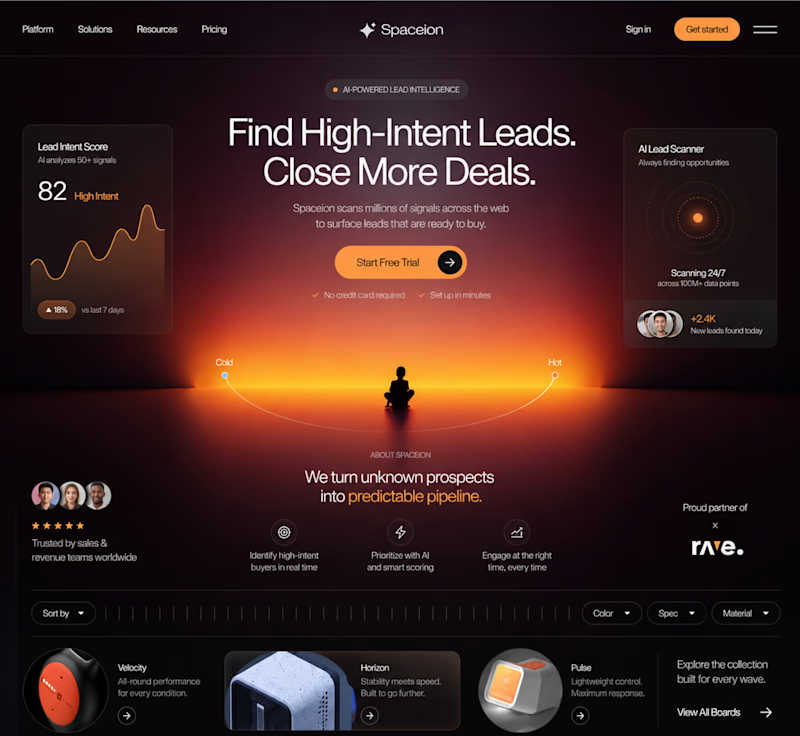
Hero Section 2


He plays the role of an venture OS expedition guide that works agentically in the background via routines as well as normal chat to get various tasks done.
Currently working on his hat collection and dance moves that can be configured from the settings panel of the platform.
Here's a preview:


Love this concept. Have you thought about adding idle animations while he is thinking like having frank pull out a compass or check a map while waiting for an AI response?











Trending

Claude
Claude has entered the design space. How are you using Claude Design?

Contra University
Learn from expert creatives how to earn more using next-gen AI tools.
creativeaiflow
Creative AI workflows are evolving. What tools do you use, and what are their strengths and weaknesses?
freelancerlife
Freelancer life is wins, pivots, and everything in between. What’s yours right now?