The network for creativity
Join 1.25M professional creatives like you
Connect with clients, get discovered, and run your business 100% commission-free
Creatives on Contra have earned over $150M and we are just getting started
Back to feedPost
Taste Test

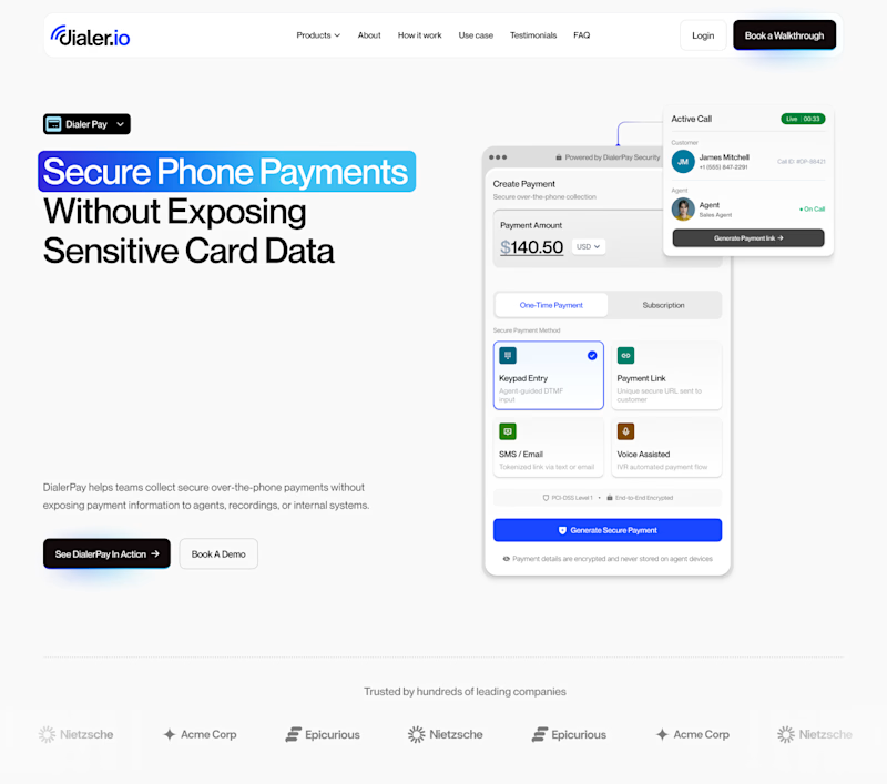
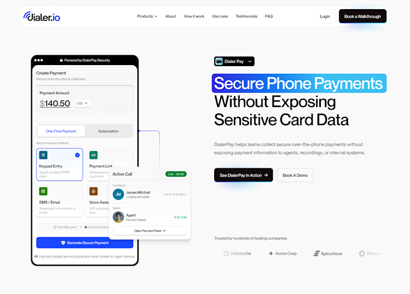
Hard to choose which layout I should go with 🤔


10 voted
31%
22 voted
69%
32 votes
Closed

Hero Section 2

Going for section 2. It looks less crowded that section 1

In my opinion, I'll go with her section 1


Outstanding design with a premium look and feel

Hero Section 1 for me, leading with the value prop headline before the phone mockup feels stronger for a fintech landing page. What's converting better in your testing so far?

I think section two has better information order. Text first then image.

Hero Section 2
Section 2 looks more professional and clean

Absolutely love the creative direction here. Feels fresh and unique also The layout structure and color harmony give this design a premium and modern feel.
The network for creativity
Join 1.25M professional creatives like you
Connect with clients, get discovered, and run your business 100% commission-free
Creatives on Contra have earned over $150M and we are just getting started
Related posts


Just shared a new furniture shopping app concept 🛋️ Would love to hear your feedback!


Love it! 🔥

Hi, Contra community!
I can't decide which is better: should the illustration appear only when the cursor hovers over it, or should it always be visible? 🤔
93 voted
78%
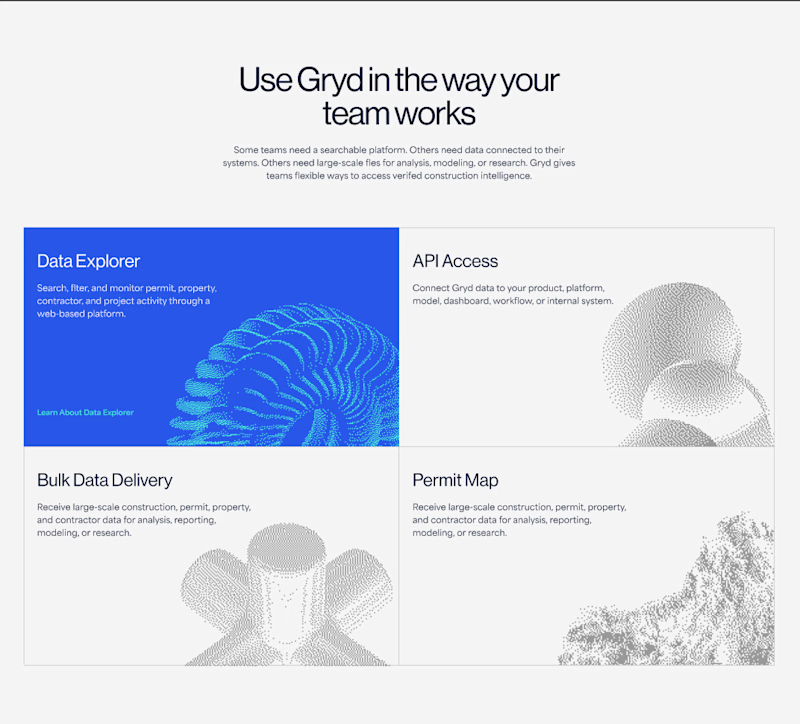
26 voted
22%
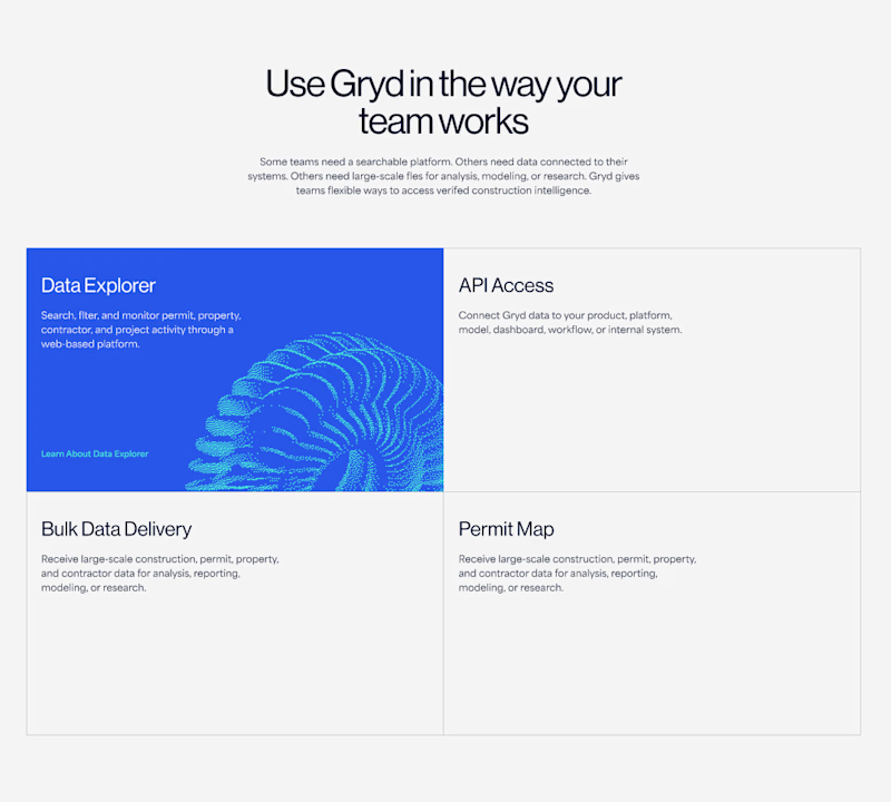
119 votes
Closed


The reason is simple, less gesture minimal friction 😉

✨ Two concepts. One winner.
Which UI catches your eye first?
💜 Vote: 01 or 02 below!
18 voted
86%
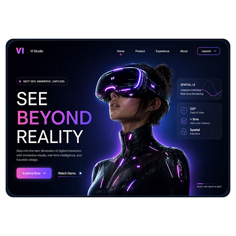
3 voted
14%
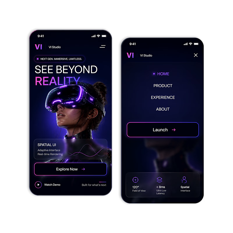
21 votes
Closed

Really nice work!







Trending

Claude
Claude has entered the design space. How are you using Claude Design?

Contra University
Learn from expert creatives how to earn more using next-gen AI tools.
creativeaiflow
Creative AI workflows are evolving. What tools do you use, and what are their strengths and weaknesses?
freelancerlife
Freelancer life is wins, pivots, and everything in between. What’s yours right now?