The network for creativity
Join 1.25M professional creatives like you
Connect with clients, get discovered, and run your business 100% commission-free
Creatives on Contra have earned over $150M and we are just getting started
Back to feedPost
Taste Test

Hi, Contra community!
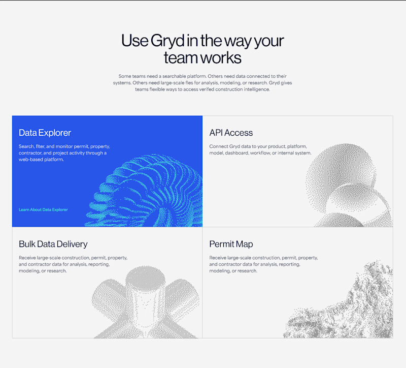
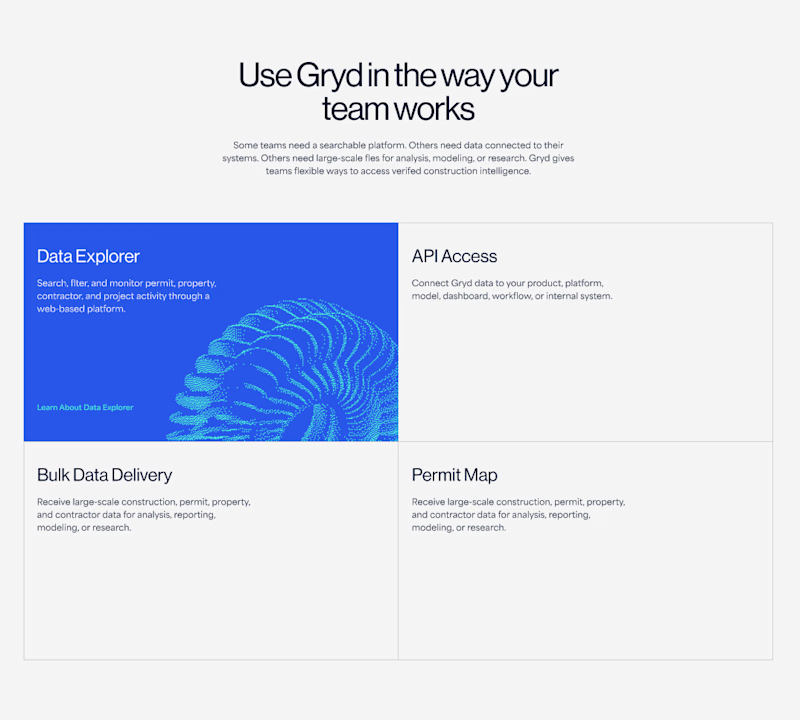
I can't decide which is better: should the illustration appear only when the cursor hovers over it, or should it always be visible? 🤔
93 voted
78%
26 voted
22%
119 votes
Closed

I love details in right option😍
thank you 👍


The reason is simple, less gesture minimal friction 😉
thank you 😊

Always be visible

always be visible


Always be visible

Always visible but maybe it can have color on hover and be b/w on "not hover" (if it isn't like that already)

Impressive design. The branding feels strong and consistent.

Always be visible 👍

Always on looks more complete.

though I love simple and clean but I think the "Always Be Visible" one will be look good

thanks! yes, it helps!👍

Both look great, but I do agree it is better having the images there the whole time. I have to ask, what is this for?
Thanks! This section leads to 4 different company solutions.

Nina, always be visible
thanks!

Always visible, for me. Hover interactions are invisible on mobile, so you'd lose the personality for most of your traffic. If you are going with "Hover only", make sure to keep it only for desktop. The illustrations really completes the design here.

Nice work as usual! I'd say hover it makes a web layout feel so much more tactile and interactive on canvas.

Big Typos for "Data Explorer", API Access etc and its description... and apply while hovering color only., keep icons always be visible

Thanks for your feedback!

Always be visible for sure more interesting!

I think it looks good with visibility of those illustrations.

Looks really clean! I’d recommend always visible and if you can, have the object animate on hover. (Maybe rotating, slowly moving)

Always visible is better. It gives instant context to the users about what each section offers.


Both look really nice but I am leaning more towards them always being visible.

I prefer the Always Visible option

such a cool layout section

I'd lean toward always visible. It adds personality to the layout without requiring users to discover it.
The network for creativity
Join 1.25M professional creatives like you
Connect with clients, get discovered, and run your business 100% commission-free
Creatives on Contra have earned over $150M and we are just getting started


Trending
retrofuturism
Share your favorite designs from the past exploring the distant future. Or your own take on the aesthetic 🚀
halftone
Dots. Texture. Grain. Let's see your designs using the halftone technique.

Midjourney
Creatives are showing off what they're making with Midjourney.
colorgrade
Video editors sound off: How do you enhance the mood of your video in color grading?
Related posts

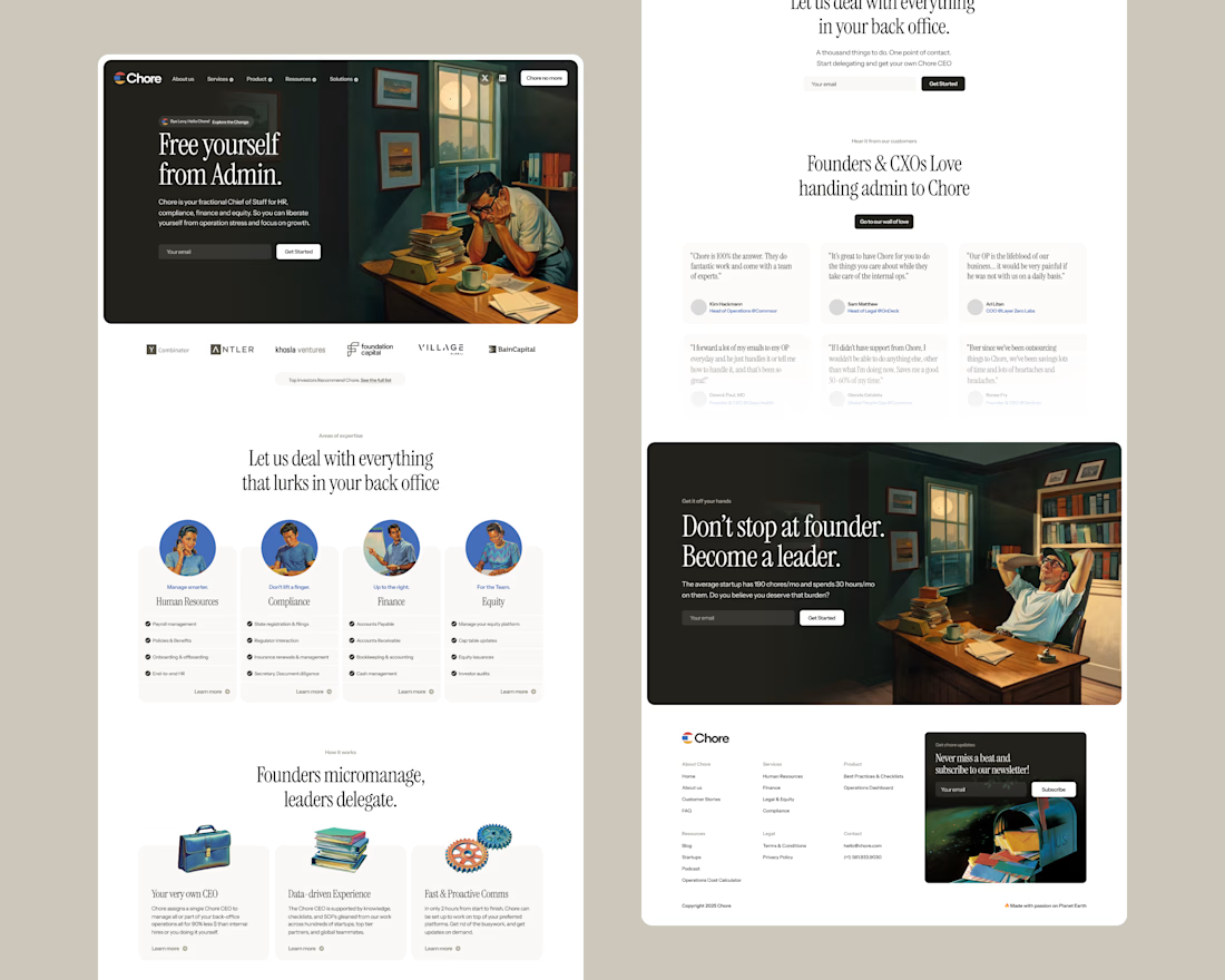


Really love this style, has so much personality.

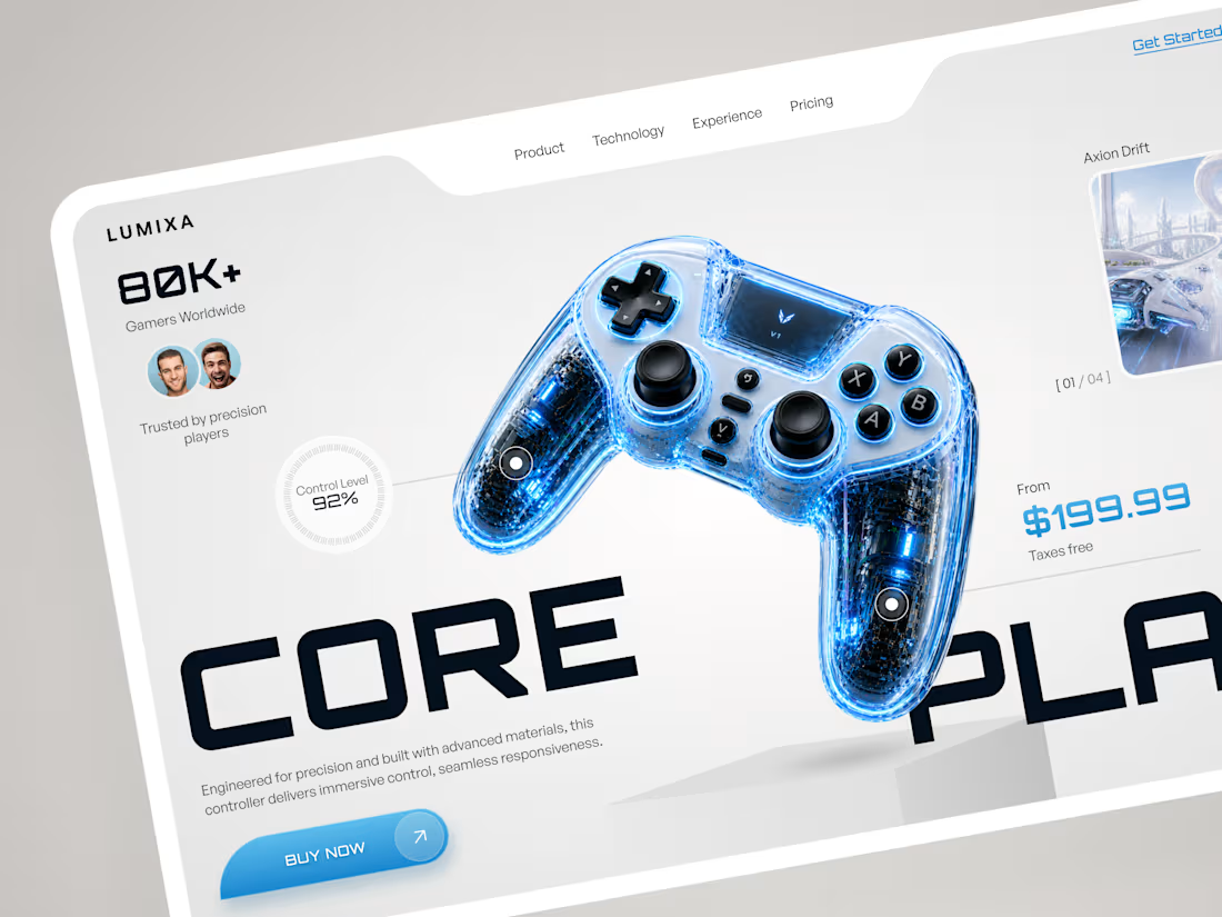
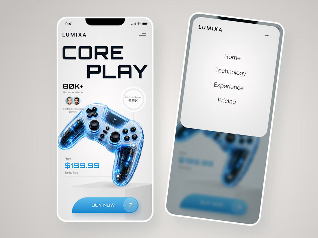
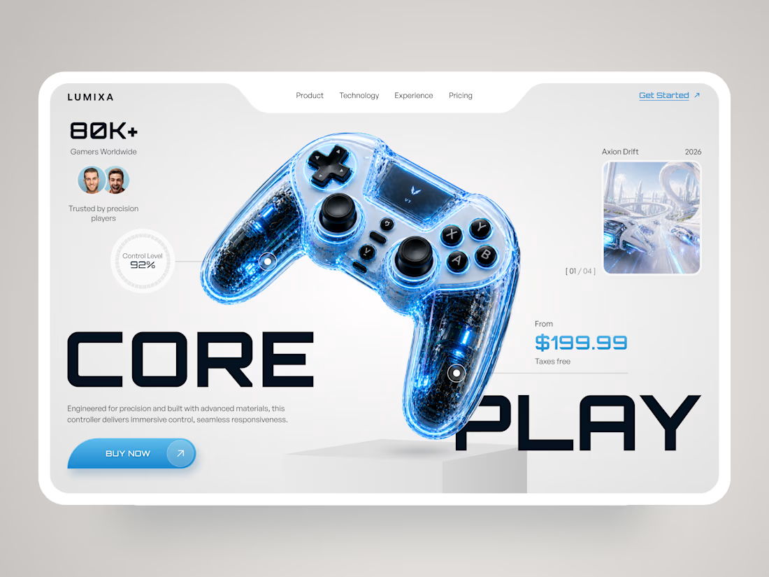
LUMIXA — Gaming Controller Product Landing Page 🎮⚡
LUMIXA is a futuristic product landing page concept created for a premium gaming controller built around precision, performance, and immersive play.
The goal was to make the product itself the center of the experience while giving the interface a clean, high-tech character. A minimal white canvas, electric blue accents, oversized typography, and detailed 3D product visuals create a strong gaming aesthetic without making the page feel overloaded.
Special attention was given to:
• a product-first hero section with the controller as the main visual focus;
• bold typography and asymmetric composition to create a sense of movement;
• key product information like pricing, control level, and social proof placed directly within the buying journey;
• interactive-style product hotspots that emphasize the controller’s technology and features;
• gaming imagery integrated into the interface without distracting from the product;
• a clear Buy Now CTA designed to stay visually prominent;
• a responsive mobile experience that keeps the same futuristic identity on smaller screens 📱;
• a simplified mobile navigation for quick access to technology, experience, and pricing.
The result is a sharp, product-focused eCommerce experience that combines gaming energy with premium product presentation — designed to make the controller feel as advanced as the technology behind it. ✨
Looking to launch a gaming or tech product with a digital experience that actually feels like the product? Let’s build it. 🚀



Looks amazing! 🔥

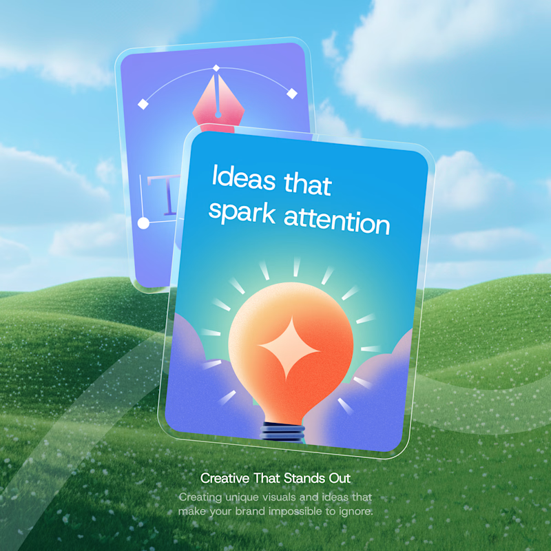
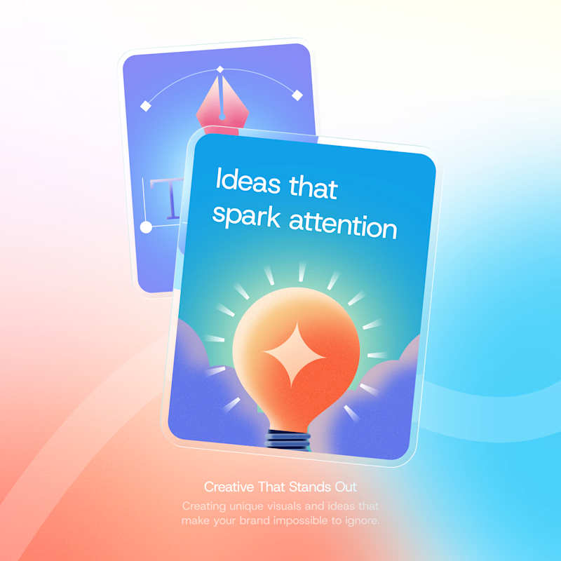
I’ve got 2 directions for this one. Which background would make you stop scrolling?
55 voted
61%
35 voted
39%
90 votes
Closed

ohh it's tough both