The network for creativity
Join 1.25M professional creatives like you
Connect with clients, get discovered, and run your business 100% commission-free
Creatives on Contra have earned over $150M and we are just getting started
Back to feedPost
Taste Test

Hi, Contra community!
I can't decide which is better: should the illustration appear only when the cursor hovers over it, or should it always be visible? 🤔
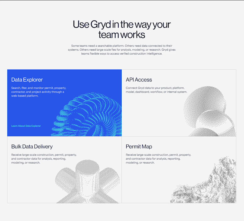
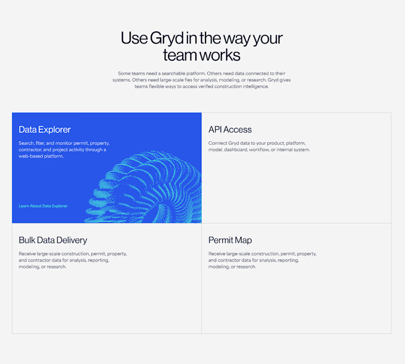
62 votes
Ends in 1d

Always be visible 👍

I love details in right option😍
thank you 👍


The reason is simple, less gesture minimal friction 😉
thank you 😊

Always be visible

Always be visible

always be visible

Always be visible

Always visible but maybe it can have color on hover and be b/w on "not hover" (if it isn't like that already)

Impressive design. The branding feels strong and consistent.

Always on looks more complete.

though I love simple and clean but I think the "Always Be Visible" one will be look good

thanks! yes, it helps!👍

Both look great, but I do agree it is better having the images there the whole time. I have to ask, what is this for?

Nina, always be visible

Always visible, for me. Hover interactions are invisible on mobile, so you'd lose the personality for most of your traffic. If you are going with "Hover only", make sure to keep it only for desktop. The illustrations really completes the design here.

Nice work as usual! I'd say hover it makes a web layout feel so much more tactile and interactive on canvas.

Big Typos for "Data Explorer", API Access etc and its description... and apply while hovering color only., keep icons always be visible
The network for creativity
Join 1.25M professional creatives like you
Connect with clients, get discovered, and run your business 100% commission-free
Creatives on Contra have earned over $150M and we are just getting started
Related posts


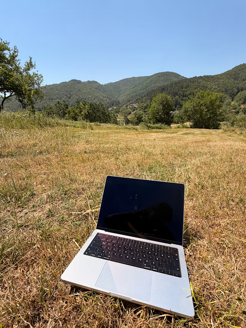

This is the dream honestly. Was there actually signal out there to get work done, or was this more of a "take the photo then find a cafe" situation?


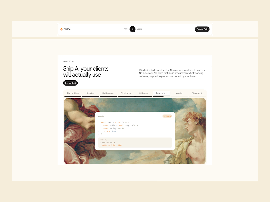

The renaissance painting next to the terminal window is an unexpected pairing that actually works, gives it more personality than the usual gradient blob hero. What made you go with that contrast?

Homepage of the website I designed and built in Webflow for Clara Fois - Illustrator and Graphic designer from Italy 🎨
See it live: clarafois.com
Project of the day and Top 100 Websites in Art, Design & Culture 2025 on We.directory 💯



So cool 🚀.
Love the scroll flow








Trending

Claude
Claude has entered the design space. How are you using Claude Design?

Contra University
Learn from expert creatives how to earn more using next-gen AI tools.
fifaworldcup2026
The World Cup is here and the whole world's watching. How are you designing for the world stage?
creativeaiflow
Creative AI workflows are evolving. What tools do you use, and what are their strengths and weaknesses?
freelancerlife
Freelancer life is wins, pivots, and everything in between. What’s yours right now?