The network for creativity
Join 1.25M professional creatives like you
Connect with clients, get discovered, and run your business 100% commission-free
Creatives on Contra have earned over $150M and we are just getting started
Back to feedPost
Taste Test

I’ve got 2 directions for this one. Which background would make you stop scrolling?
55 voted
61%
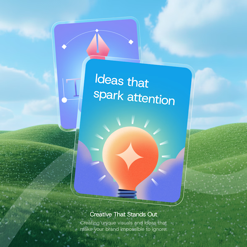
35 voted
39%
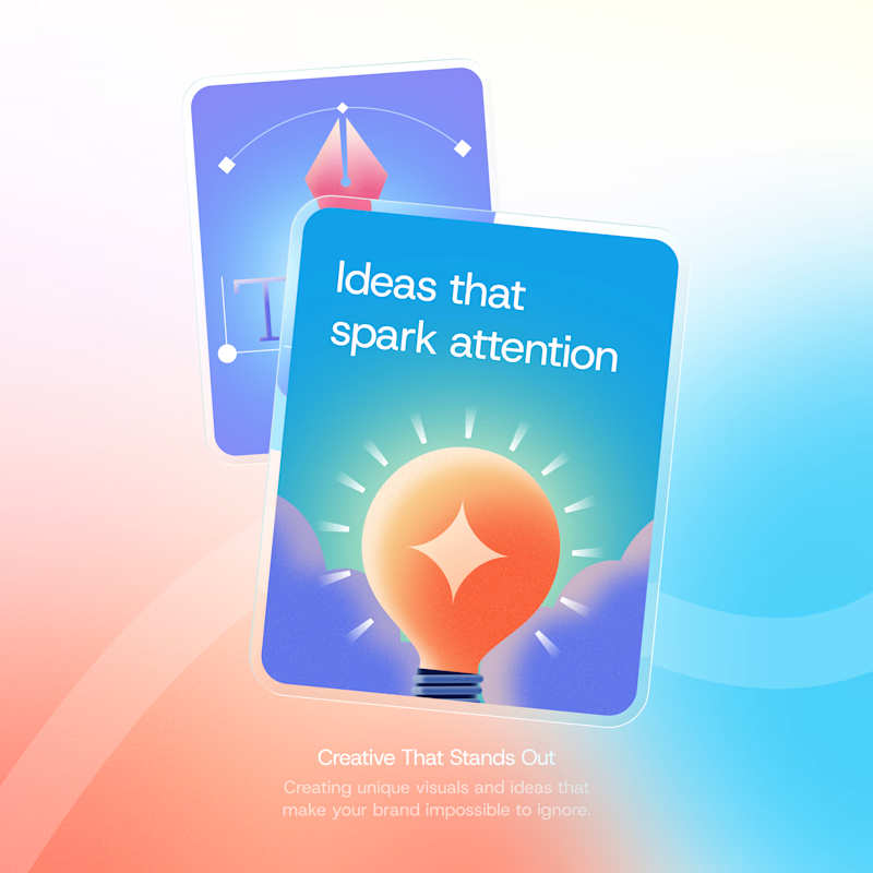
90 votes
Closed

ohh it's tough both
It was, Which do you think is the more goated one?
For me gradient

Gradient, because it has good contrast as compare to the other one.
This ones a great choice, We landed on the Gradient one in the end @Shabbir Manpurwala

Love both! The first one is clean and polished but the Meadows one just adds more personality to it and I think it fits the idea of “sparking attention” really well
It does add a but of personality. @Bella Brillantes

Gradient

For me, the gradient: It “fits” the cards. If you know what I mean.🤔

Count my vote for MEADOWS. Well polished and crafted.
Appreciate @Saira N ✦

The meadows for me

Gradient is looking real and has a great contrast 😊

Great Work!

It give better contrast (color and readability of the text)

it's meadows

It's very tough to choose. Both are awesome. But I prefer Gradient option.

Gradient a 100% !! The other one looks a bit forced.

The background for meadows reminds me of windows. Lovely color pairing for the illustration btw

To honest I like them both💯


Meadows
The network for creativity
Join 1.25M professional creatives like you
Connect with clients, get discovered, and run your business 100% commission-free
Creatives on Contra have earned over $150M and we are just getting started





Related posts


Same course. Same content. But two completely different feelings ✨
Which version would you choose?
27 voted
59%

19 voted
41%
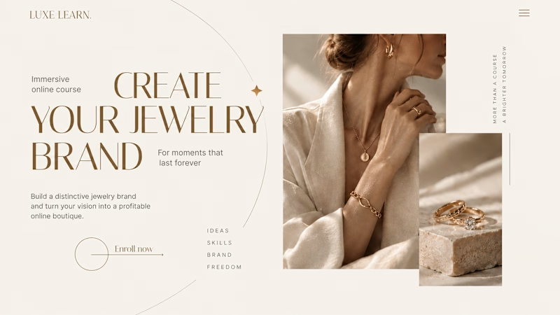
46 votes
Closed

Option 2 is more practical ❤️❤️


Which direction would you choose for a sourdough course sales page in Kajabi?

34 voted
59%
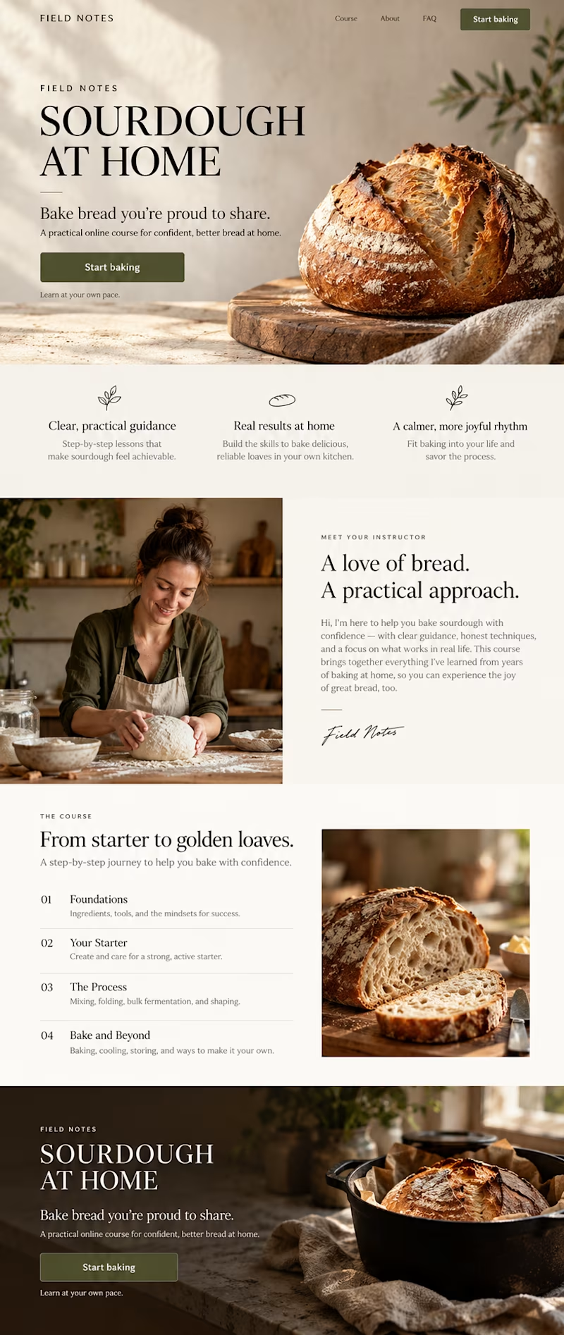
24 voted
41%
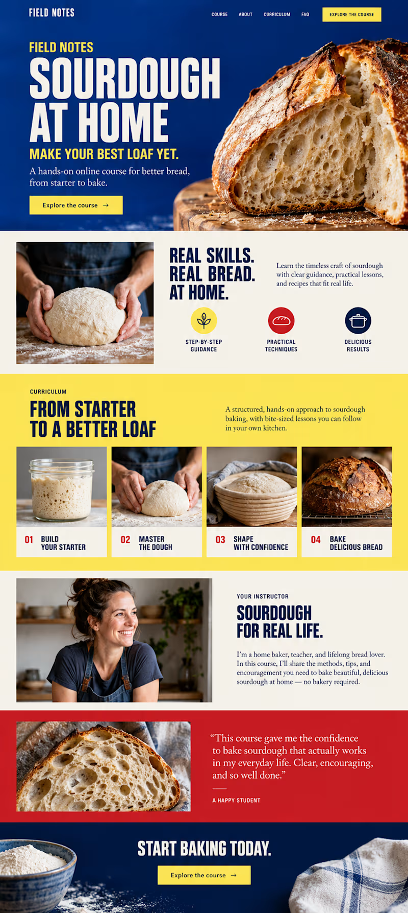
58 votes
Closed

take your favourite card for my new portfolio, left or right?
4 voted
36%
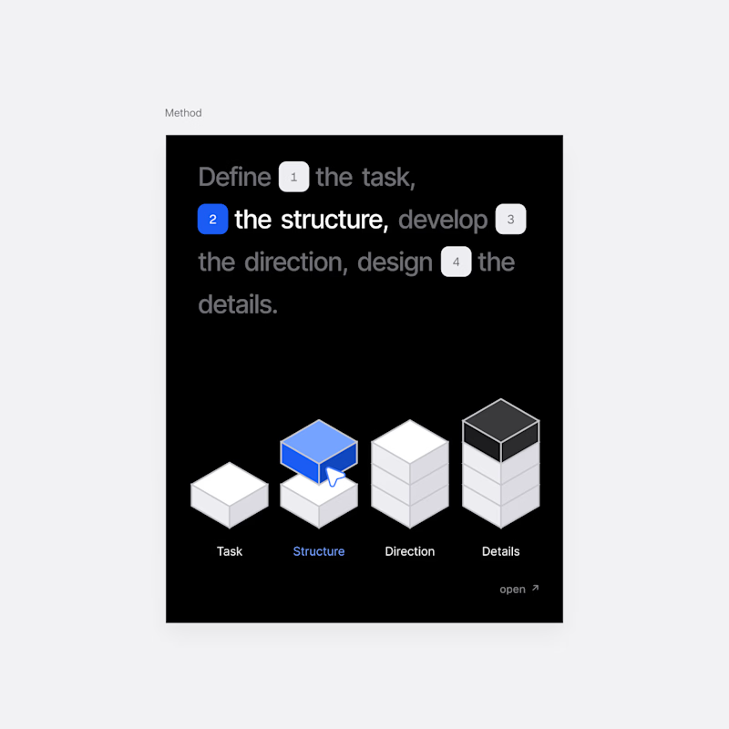
7 voted
64%
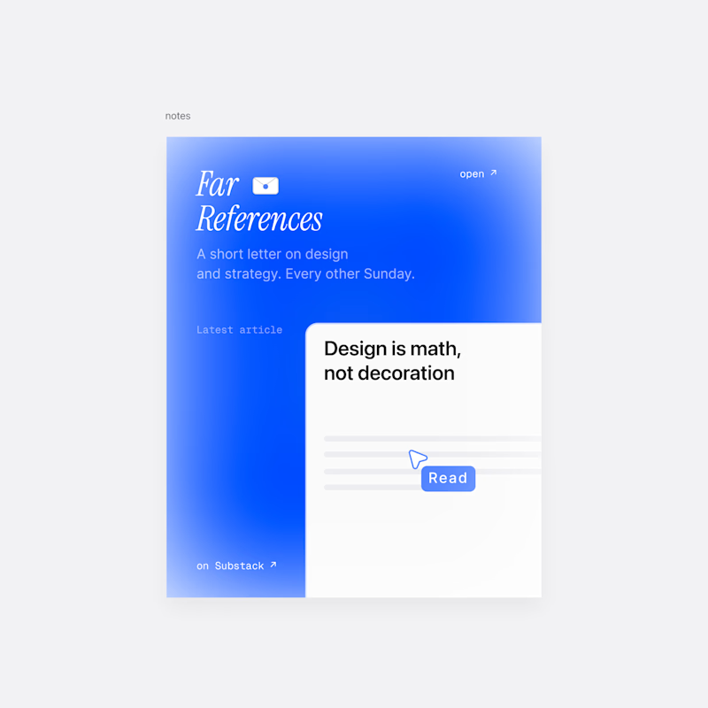
11 votes
Closed
A is better for a portfolio ❤️❤️