The network for creativity
Join 1.25M professional creatives like you
Connect with clients, get discovered, and run your business 100% commission-free
Creatives on Contra have earned over $150M and we are just getting started
Back to feedPost

Wowww me too man, this website has been in my references for quite some time and now I know who made these amazing visuals! 🚀 Amazing work bro.

Glad to inspire!


Awesome design !

Super clean buddy🔥

Nice work!


Really love this style, has so much personality.
thank you! I loved working on this, i agree its still quite unique, years after!

these are excellent, your art style is beautiful!

Awesome!

Great work


those still hold up


Nice work!


Pretty good! I remember two years ago I made some thumbnails for them. I remember the website!

Super clean. Where did got those illustrations?

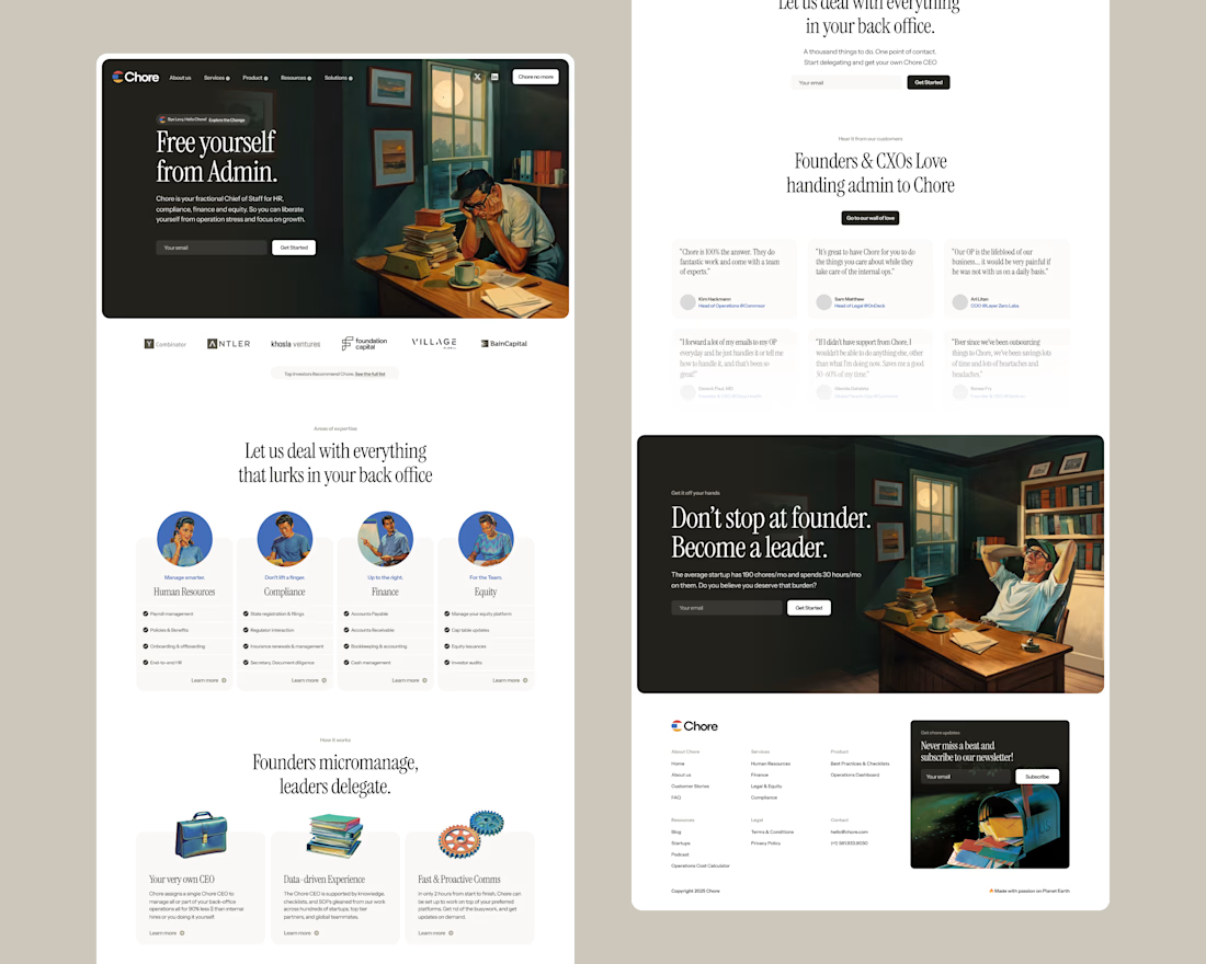
The muted palette and that grainy, mid-century printmaking texture on the illustrations does a lot of work here, it makes "Free yourself from Admin" feel less like SaaS copy and more like an old ad for a labor-saving appliance. Nice tonal match between the art and the message.

The 60s illustration style does real work here: it gives Chore a warmth that most admin and back-office tools never risk, so the product feels human before you read a single feature. What I like most is that the illustrations share the same palette as the UI, so they read as one...

Really love them!!


This is awesome 🔥


Really beautiful style here

Love the illustrations!

Amazing work🔥

impressive design👍


nice design

Cool❄️

Nice work

Nicely done!

The network for creativity
Join 1.25M professional creatives like you
Connect with clients, get discovered, and run your business 100% commission-free
Creatives on Contra have earned over $150M and we are just getting started




Related posts

💳 Making Financial Products Feel Simple
I designed this finance website for Sendit, with one goal in mind: make everyday payments feel simple, trustworthy, and effortless.
The design focuses on:
Clear messaging and strong visual hierarchy
Trust-focused finance UI
Simple payment interactions
Clean, modern layouts
Conversion-focused sections
A responsive experience designed around the user
For fintech products, good design isn’t just about looking modern. It’s about making people feel confident when money is involved.
If you’re building a fintech, SaaS, payment platform, or financial product and need a website that communicates trust and clarity, I’d love to work with you.


Solid execution on a hard brief.

Built it. It's live: Offseason Ghost
A fictional brand for a travel vlogger who never shows their face — not once, not even by accident. The scroll doesn't just reveal sections, it scrubs the actual hero video: you pull stillness into full-send velocity with your own scroll.
Concept, identity, motion system — all one weekend, all personal.


Very nice