The network for creativity
Join 1.25M professional creatives like you
Connect with clients, get discovered, and run your business 100% commission-free
Creatives on Contra have earned over $150M and we are just getting started
Back to feedPost
For this design, I brought the Studio Kalili website to life using Squarespace's Finish Layer by layering in subtle animation across the page to turn a static layout into something that feels considered and dynamic without overwhelming the content.
The most intentional use of Finish Layer is the two-image interaction illustrating the core idea behind the studio's work: closing the gap. One image enters from the left, the other from the right, moving quickly at first and then easing as they meet in the center — fast enough to catch attention, slow enough to let the reader stay with the copy.
From there, hover states on buttons, text, and large images, plus scroll-triggered entrances, guide the eye down the page and give every interactive element a small, deliberate moment of response.
Squarespace's Finish Layer was used to add polished interactions across the website, creating a more dynamic browsing experience. Each interaction supports the overall experience while preserving the calm, editorial character of the Studio Kalili brand.


Good one🔥👏👏


Very polished!


love the layout

Amazing work!


This looks clean and well thought out. How long did it take you to bring everything together?


Thank you! The full design was build out over a few weeks using CSS code in Squarespace.
ohkayy

Hi Lillian!
I just commented on your Studio Kalili post. That work is incredible.
I'm Laxmiprasana and I'm new to Contra. I do web design, Kajabi, graphic design and video editing. I'm trying to get my first few clients here.
I really admire how you present your work and land...
Hi Laxmiprasanna,
Welcome to Contra! I'm happy to share my top tips.
Focus on building a strong and polished portfolio that showcases the type of projects that you'd like to work on with clients. Be sure to share your design process too.
Bonus: While working on the projects, you...

The two images entering from opposite sides and easing together as a metaphor for closing the gap is a smart way to make the animation actually mean something instead of just looking nice.
Thanks! It was really fun to create!
The network for creativity
Join 1.25M professional creatives like you
Connect with clients, get discovered, and run your business 100% commission-free
Creatives on Contra have earned over $150M and we are just getting started











Related posts

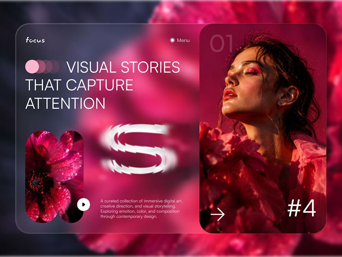
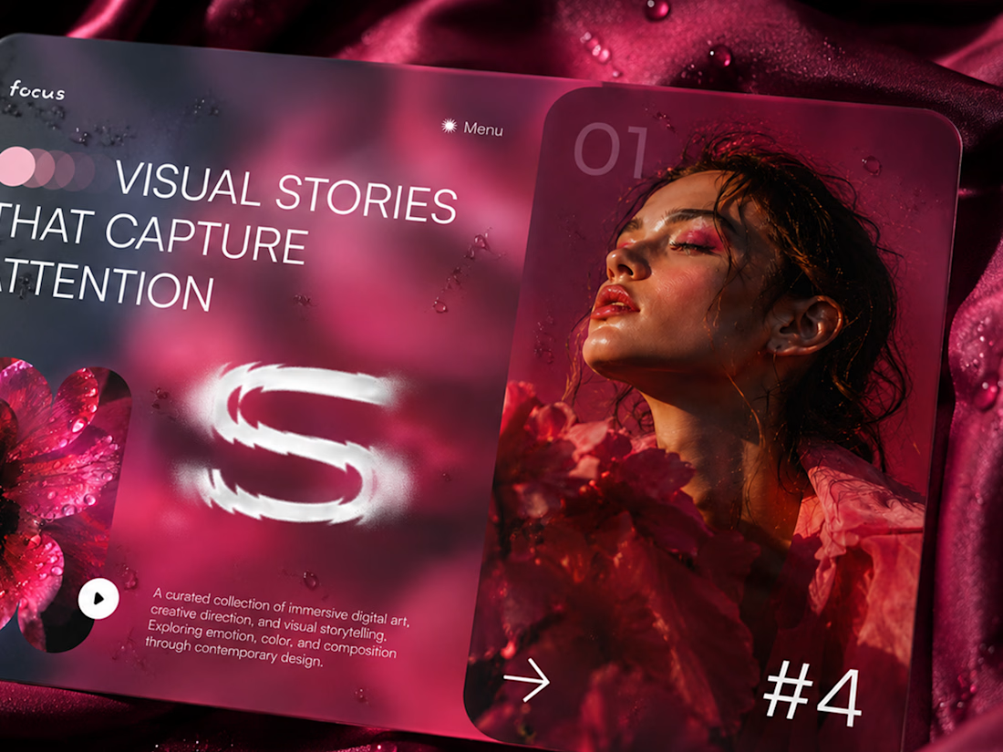
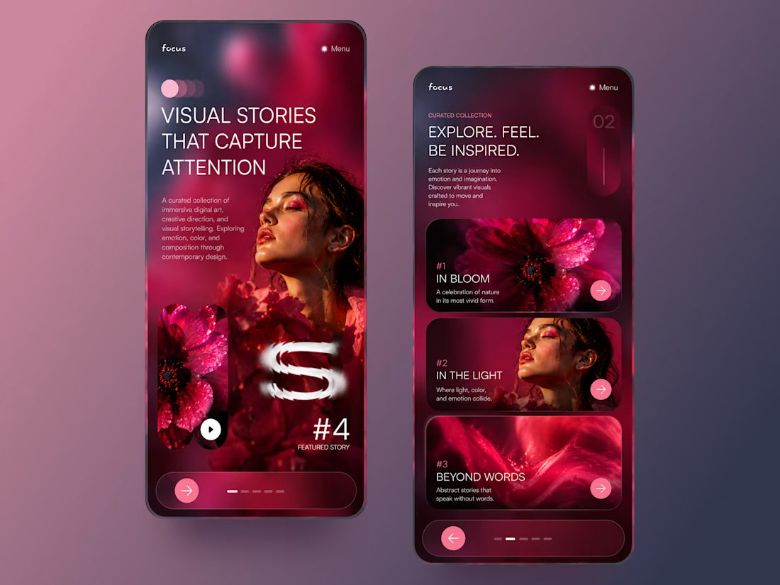
FOCUS — Creative Portfolio & Digital Art Website 🌸✨
A visually expressive website concept for a creative portfolio, built around digital art, bold imagery, and visual storytelling
The design combines vibrant pink tones, soft gradients, experimental typography, and immersive photography to create a distinctive editorial experience
Special attention was given to:
• Bold editorial hero composition
• Vibrant pink and dark color palette
• Experimental typography and visual details
• Immersive photography and digital artwork
• Creative project gallery and navigation
• Responsive mobile experience
• Clean layouts with a strong visual identity
The result is an expressive digital experience that puts creativity, emotion, and visual storytelling at the center of every screen 💗
Looking to create a standout portfolio or website for a creative brand? Let’s connect 🚀




This is wild to me!
I have worked so hard to build this profile and it just goes to show that you really do get out what you put in. Work has really picked up since I worked on my discovery score and the right clients seem to be finding their way to me. Couldn't be happier.

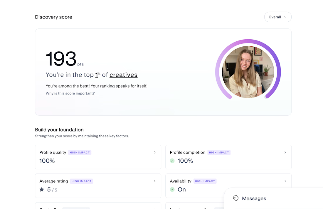

Congrats on Top 1% — that's huge! 193 is wild. If you don't mind sharing, what moved the needle most for your discovery score? Was it profile completion, case studies, or just consistent posting? Trying to build mine from scratch right now.

Design Exploration: Hero Section of Architecture Website. Which one do you think much better?


12 voted
43%
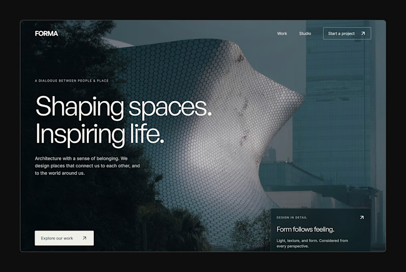
16 voted
57%
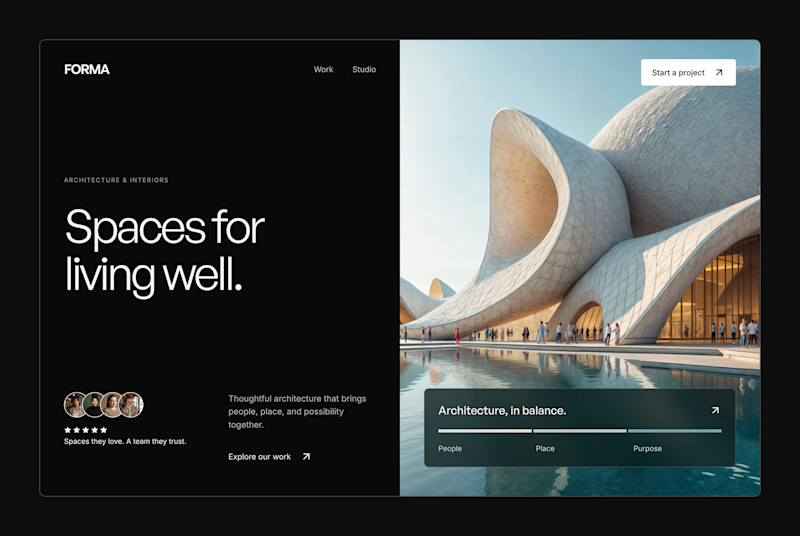
28 votes
Closed