The network for creativity
Join 1.25M professional creatives like you
Connect with clients, get discovered, and run your business 100% commission-free
Creatives on Contra have earned over $150M and we are just getting started
Back to feedPost
Taste Test
I’m exploring two homepage hero directions for a Lumena Health concept and testing which one feels stronger for a preventive healthcare brand.
Both directions focus on the same core message: healthcare built around prevention, not reaction.
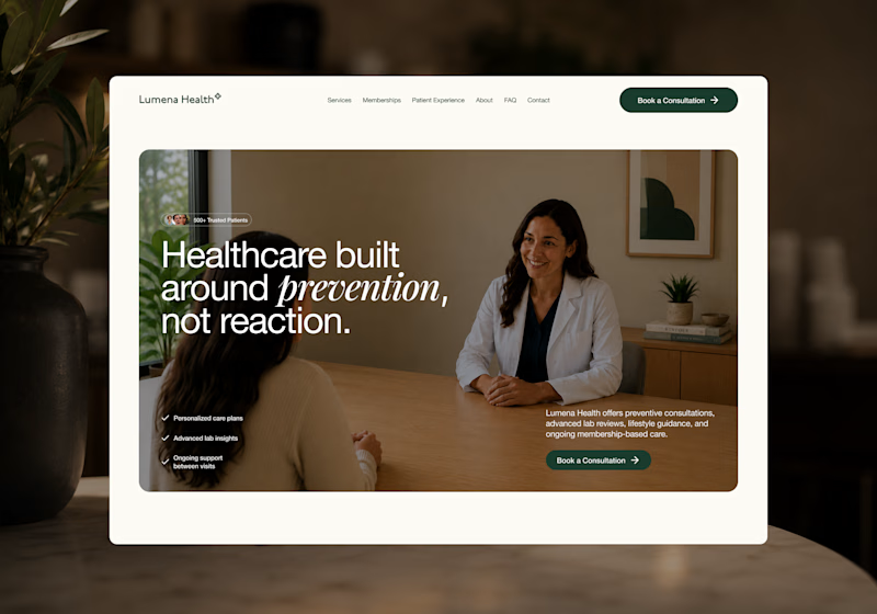
Direction 1 feels more warm, human, and consultation-focused.
The large lifestyle image creates a clear patient/provider moment right away, which helps the experience feel personal and trustworthy.
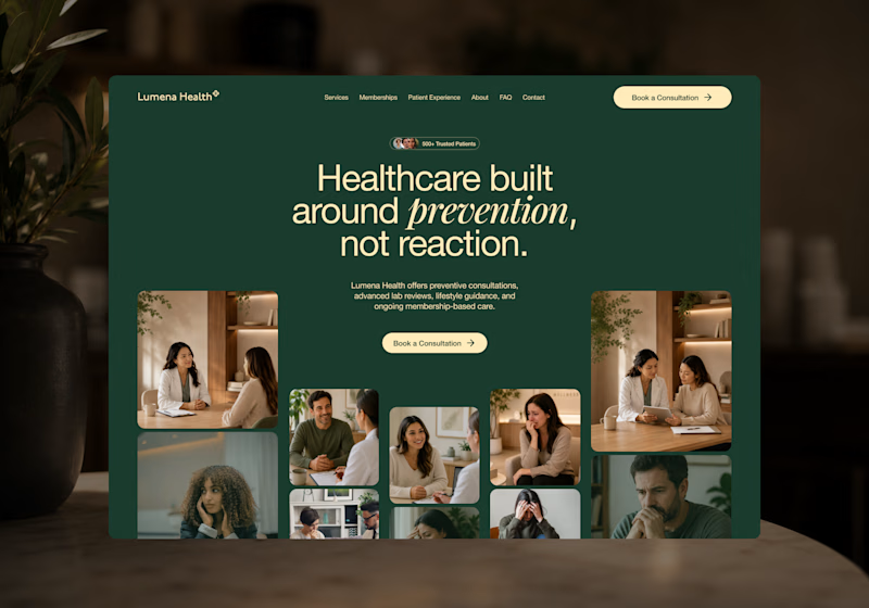
Direction 2 feels more premium, editorial, and brand-driven.
The dark green background, centered headline, and image collage make the page feel more elevated and visually distinctive.
Direction 1: personal, warm, trust-focused
Direction 2: premium, editorial, brand-forward
Which direction feels stronger for a preventive healthcare website?

25 voted
40%
37 voted
60%
62 votes
Closed


Good point. Direction 2 is more distinctive, but I agree some of the expressions may work against the prevention message. Direction 1 feels calmer and gives the service a clearer, more reassuring first impression.

Direction 1's consultation-focused warmth feels like it'll convert better for anxious first-time patients, but Direction 2's premium editorial feel might build more trust with referral sources. Did you already have a lean going in, or are you genuinely torn?
That’s a really thoughtful read. I’m genuinely torn on this one for that reason.
Direction 1 feels more reassuring and conversion-friendly for first-time patients, while Direction 2 feels more elevated and memorable from a brand perspective.
I’m starting to think the strongest...

Direction 1 for me, The white border and text feel cleaner

Awesome work!

Voted Direction 1. For preventive care specifically, trust has to come before polish, and a patient looking at that page needs to feel like a person is going to listen to them, not just admire a nice layout.


Clean work !

Simple and straight forward

Direction 1 feels stronger because preventive healthcare requires active patient engagement, and the warm, human consultation shot instantly builds the trust needed to motivate behavioral change. A lifestyle image makes the intangible concept of "prevention" concrete and...

Direction 2 iis the best

Direction 2 definitely wins😍

direction 2 does it

option 2 looks different style of approach, really liked it

Direction 2 is very Attractive
The network for creativity
Join 1.25M professional creatives like you
Connect with clients, get discovered, and run your business 100% commission-free
Creatives on Contra have earned over $150M and we are just getting started
Related posts

Hero section exploration for Oldhand
Framer MCP + claude doing magic


The dotted heads against such a clean hero is a nice touch. How much of the layout did you have to fix by hand after Claude?


Great stuff! Would love to know what the brief looked like. You clearly took it somewhere special.


New project in progress: the website for Adara, a residential architecture and planning practice in London. We'll post updates as the build comes together.
First, the services section on the homepage. As you scroll, the house comes apart floor by floor, and each service opens on the right, from planning advice to building regulations.

