The network for creativity
Join 1.25M professional creatives like you
Connect with clients, get discovered, and run your business 100% commission-free
Creatives on Contra have earned over $150M and we are just getting started
Back to feedPost

Welcome to Voxai, a landing page concept for a no-code AI voice agent platform.
Most B2B SaaS platforms look a bit like spreadsheets with a fresh coat of paint—cold, technical, and honestly, a little intimidating. When designing for AI, the default is usually dark mode with glowing blue nodes. The challenge here was to completely break away from that cliché and design a tech tool that doesn't feel like you're talking to a robot.
To solve this, I played with heavy contrast. Instead of a dense dashboard full of features, I used a clean split-screen layout. The left side is all business: sharp typography, social proof, and clear CTAs.
But the real UX magic happens on the right. I layered a soft, glassmorphic chat interface over a highly organic, floral background. Instead of forcing users to read long paragraphs about "natural language processing," they instantly see a warm, humanized interface transcribing a conversation in real-time. It visually communicates that this AI is natural, approachable, and easy to use. It's all about making complex enterprise tech feel simple and human!
Tools use:
Midjourney - animation flowers & AI Gradient
Jitter - Motion Design
ascii-magic - ASCII Effect


Everything about this feels premium. Fantastic work!
Thank you!

Amazing work 🩵

Nice work

nicee!

Every detail feels intentional. Beautiful execution.


The split-screen balance is beautiful, but the real magic is in the contrast between the sharp, structure-driven typography on the left and the glassmorphic transcription layout on the right. Layering the UI directly over the organic floral movement gives the interface a rare...

Great job!

love the flower animation 🌼

amazing work

Outstanding work !


Fantastic work!

Beautiful work 🧡

Amazed!!GOATED

Love it! Colors and UI style are amazing!

Fabulous😍

this should get my goat, but have none
you did nice job, do you mind connecting ?

great work

Love this 🔥

Looks really cool @Kris Anfalova


Great work!


such a premium feel. great work🔥

beautiful🙌

This is sooo true! Most AI product pages lean so hard into "futuristic" that they forget people need to trust the thing before they use it. The warm approach works way more better. Really loved the bg image + ASCII Effect on the right side!🔥

One of the best designs I’ve seen today. Really solid work 👏 The futuristic UI elements are perfect for a highly interactive Framer canvas.

Everything managed fully Uniformly👍

Nice project

It's Incredible Kris 🔥 . Do look for the visibility on to the right screen.

fantastic works!

Good work
The network for creativity
Join 1.25M professional creatives like you
Connect with clients, get discovered, and run your business 100% commission-free
Creatives on Contra have earned over $150M and we are just getting started
Trending

Claude
Claude has entered the design space. How are you using it?

Contra University
Learn from expert creatives how to earn more using next-gen AI tools.
Brand Design
The best brand designers are on Contra. Scroll to see what's trending in brand design. What are you building?
creativeaiflow
Creative AI workflows are evolving. What tools do you use, and what are their strengths and weaknesses?
freelancerlife
Freelancer life is wins, pivots, and everything in between. What’s yours right now?



Related posts
Finally get to share this one — been sitting on it for a while and couldn't post until now 🎉
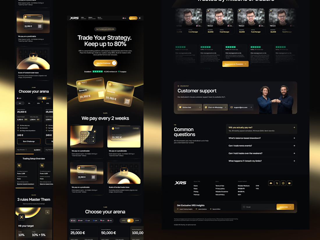
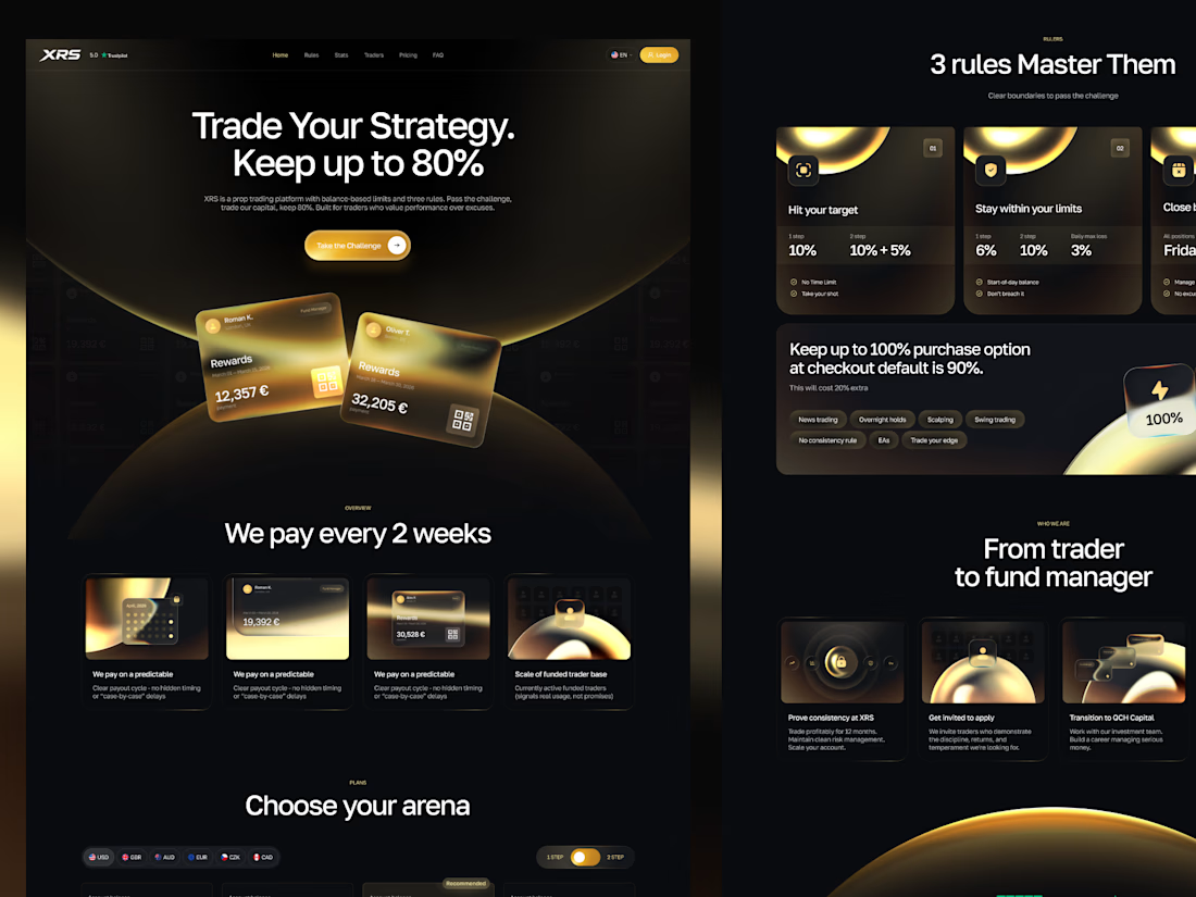
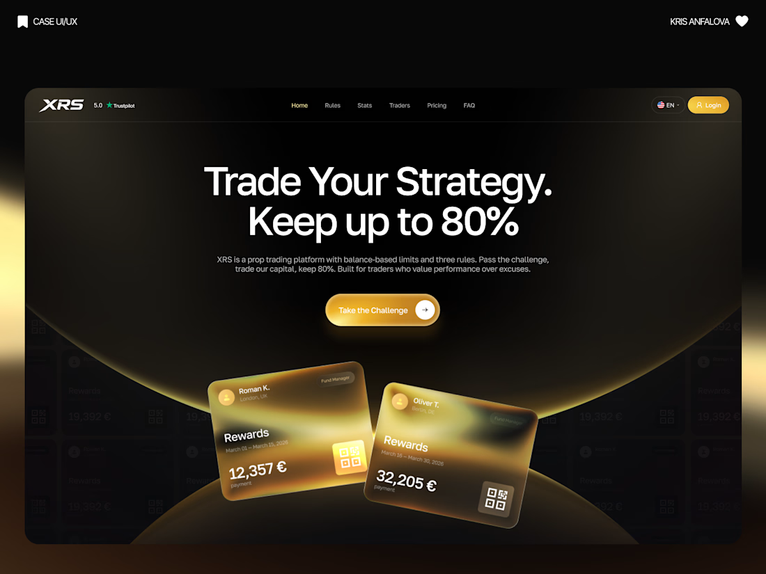
Designed the full landing page (and a bunch of product screens) for XRS, a prop trading platform. The idea: traders pass a funded-account challenge, trade the firm's capital, and keep up to 80% of the profits.
Prop trading is a pretty saturated space and most platforms look the same — dark UI, generic trading stock imagery, nothing that actually sticks. So instead of the usual playbook, I leaned into a black-and-gold identity — including custom, hand-crafted illustrations built specifically for this project (the glowing spheres, gradient icons, all of it) instead of stock assets or generic 3D packs.
Some of what's in there:
— Custom illustrated icons for the 3-rule system and "trader to fund manager" journey
— Floating reward/payout cards as social proof right in the hero
— A plan selector so people can pick account size, currency, challenge type
— Trustpilot ratings + a testimonial section for trust
— Support + FAQ blocks, because people are putting real money on the line
Genuinely proud of how this one came together — every visual element built from scratch for the brand, full case + more screens are up now, finally 👀




This came out great, the black-and-gold direction feels so much more premium than the usual trading platform look.


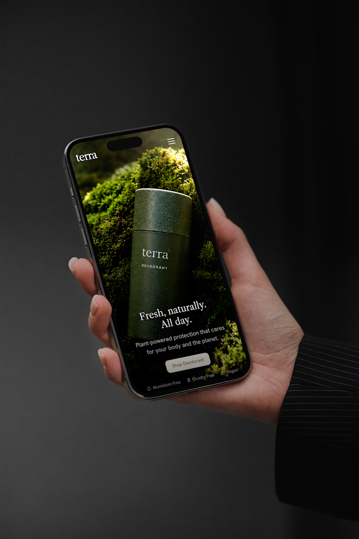
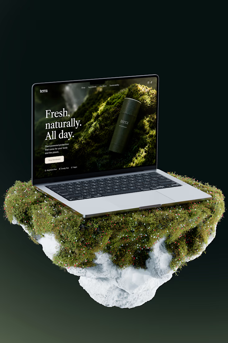
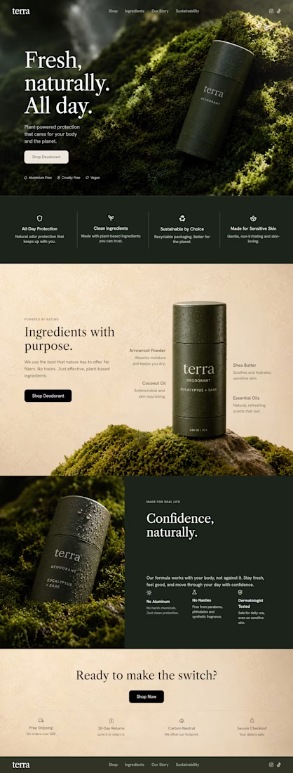
Terra — Natural Deodorant Landing Page
A premium short one page concept for a natural deodorant brand, designed around earthy textures, cinematic moss photography, and a refined editorial layout.
I used deep forest greens, warm ivory tones, elegant serif typography, and immersive product imagery to give the brand a more elevated and luxurious presence. I'm still building it.
Responsive layout for desktop and mobile, designed and built in Framer.
#Framer #WebDesign #LandingPage #BrandDesign #EcommerceDesign #UIDesign #CreativeDirection #NaturalSkincare




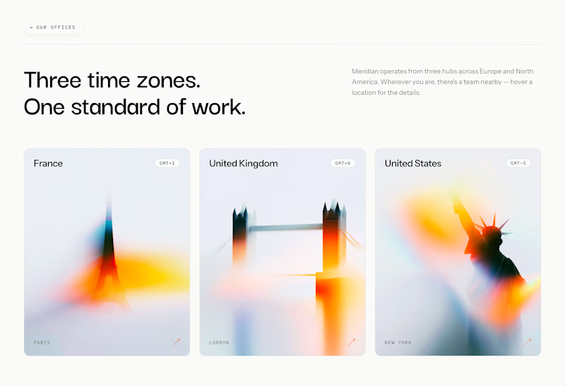
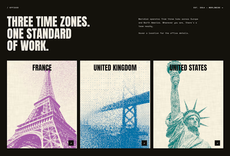
Two completely different directions for the same website location section. Which one you would lead with in a client presentation?
40 voted
53%
35 voted
47%
75 votes
Closed
