The network for creativity
Join 1.25M professional creatives like you
Connect with clients, get discovered, and run your business 100% commission-free
Creatives on Contra have earned over $150M and we are just getting started
Back to feedPost

A couple months ago I shared some thoughts on hand drawn logos, with a few images from a project I worked on. It wasn’t a finished case study and I didn’t even consider it among my strongest work.
It now has more than 50k views, 84 goats and 300 likes.
I’m very intentional about what I share and when, so this one caught me off guard. But it reminded me that we never really know how our work is going to land for someone else. As long as it’s thoughtful, sharing it is better than nothing. Keep going, keep perfecting your craft and keep showing your point of view.
And thank you to everyone who interacts and appreciates what I share. It never goes unnoticed. And of course to Contra for building a space where this kind of work finds its people.
I do wonder though, did this get traction because it was hand drawn in an era where everything is AI generated? Curious what you think.
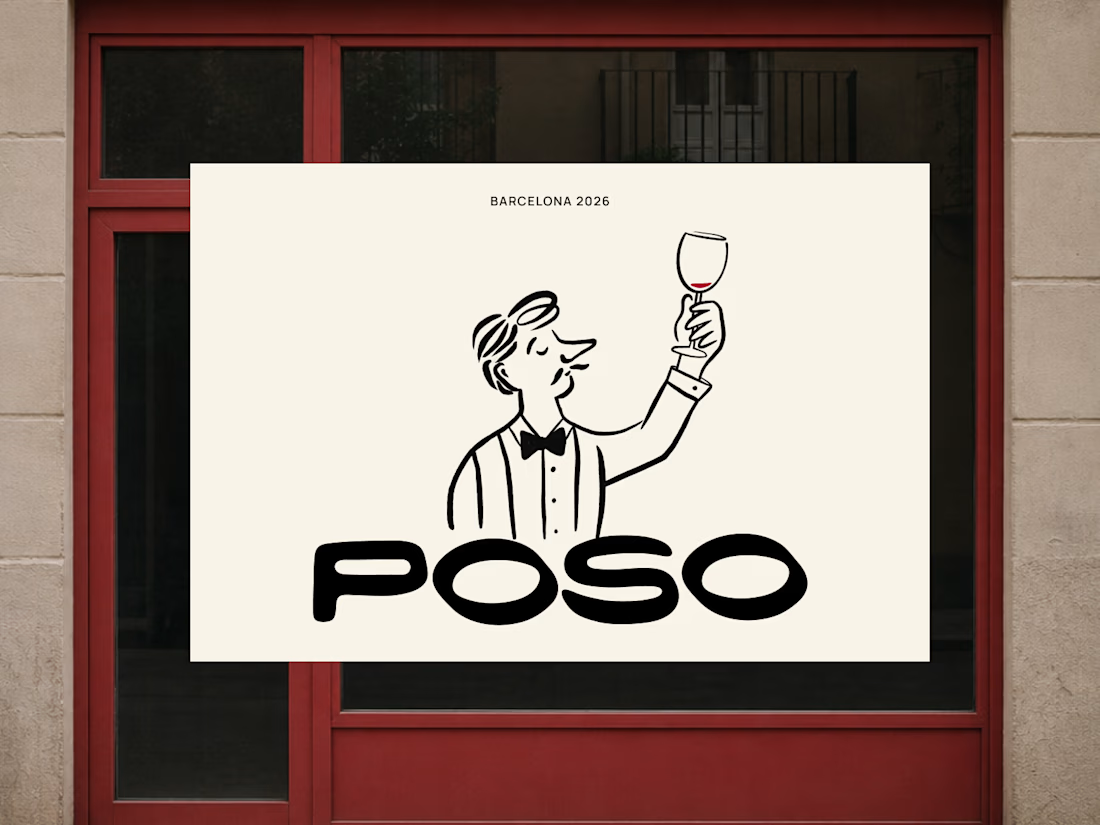

This story is so real! 🔥 Sometimes the work you think is not your strongest becomes the most loved. This POSO illustration is pure character - the wine glass guy + bold POSO type is so memorable. Hand-drawn has soul that perfect vectors don't. 50k views well deserved! Barcelona 2026 needs this! 👏🍷

Congrats on 50k views. I think hand drawn helps, but the character and the Poso lettering carry it. A real point of view stands out whatever the tools are.

Great design Chantel that's unique ❤️

wow, amazing illustration, like this


Even more special in a AI World - good job!

Superb!!!!!!

Hand-drawn work feels so refreshing right now. When everything online is starting to look like polished AI art, simple human sketches with real character immediately catch people's eyes. Did this start as a paper sketch or directly in vector tools?

lovelyy absolutely lovee it
The network for creativity
Join 1.25M professional creatives like you
Connect with clients, get discovered, and run your business 100% commission-free
Creatives on Contra have earned over $150M and we are just getting started








Related posts
How can branding make people feel part of a community?
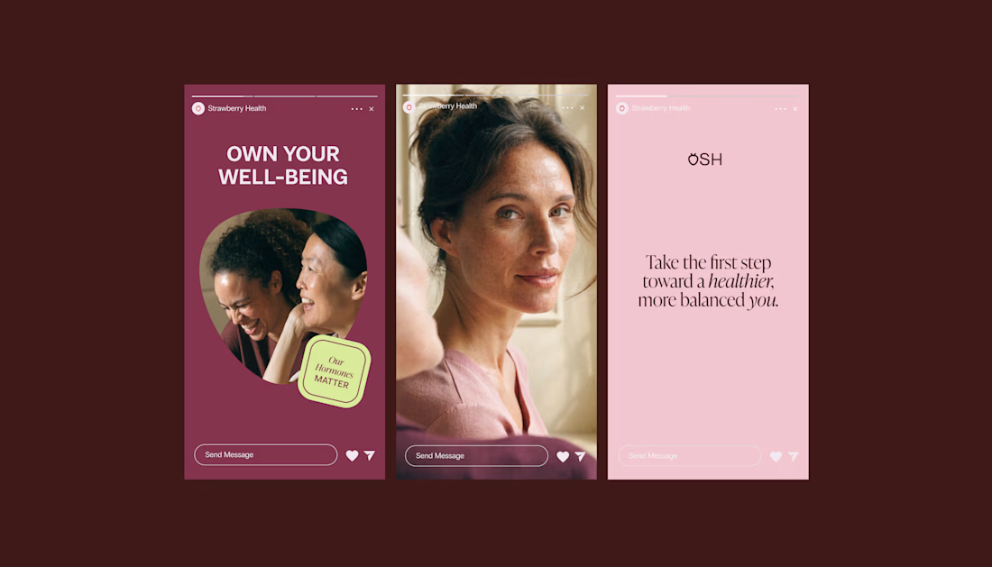
When working on Strawberry Health, we explored how visual identity could make women’s health feel more approachable and collective.
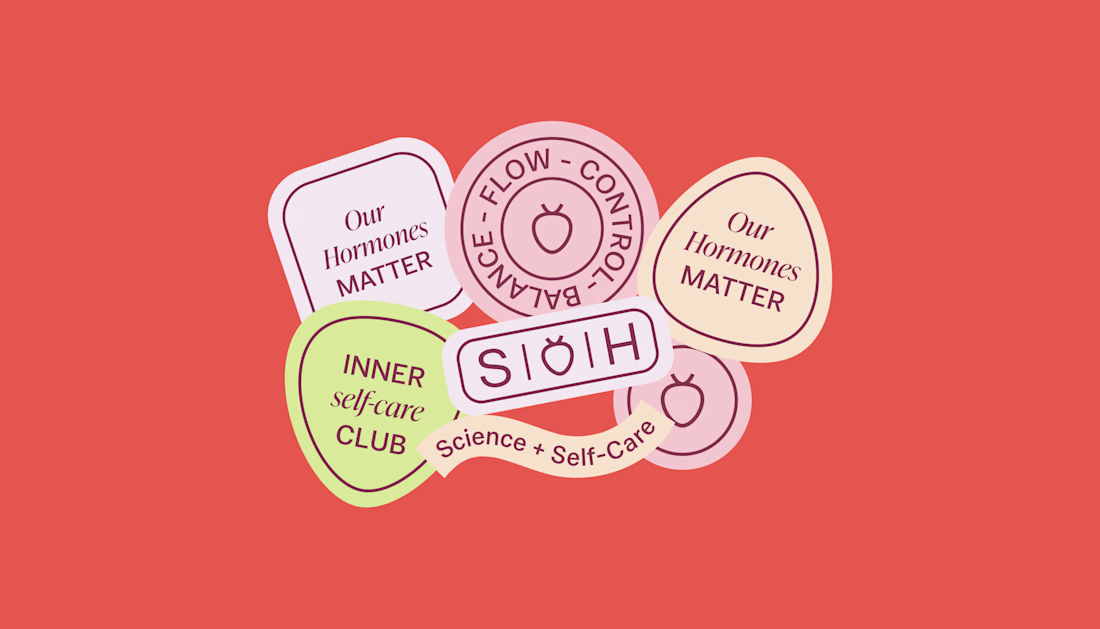
One of the ways was through supporting brand elements: stickers, badges and phrases that could live beyond the logo and become expressions of belonging.
These elements turned the identity into something people could interact with, share and make their own.
It’s a small detail, but I think it’s an important part of building brands around communities: the identity shouldn’t only identify the brand. It should give people something to identify with.
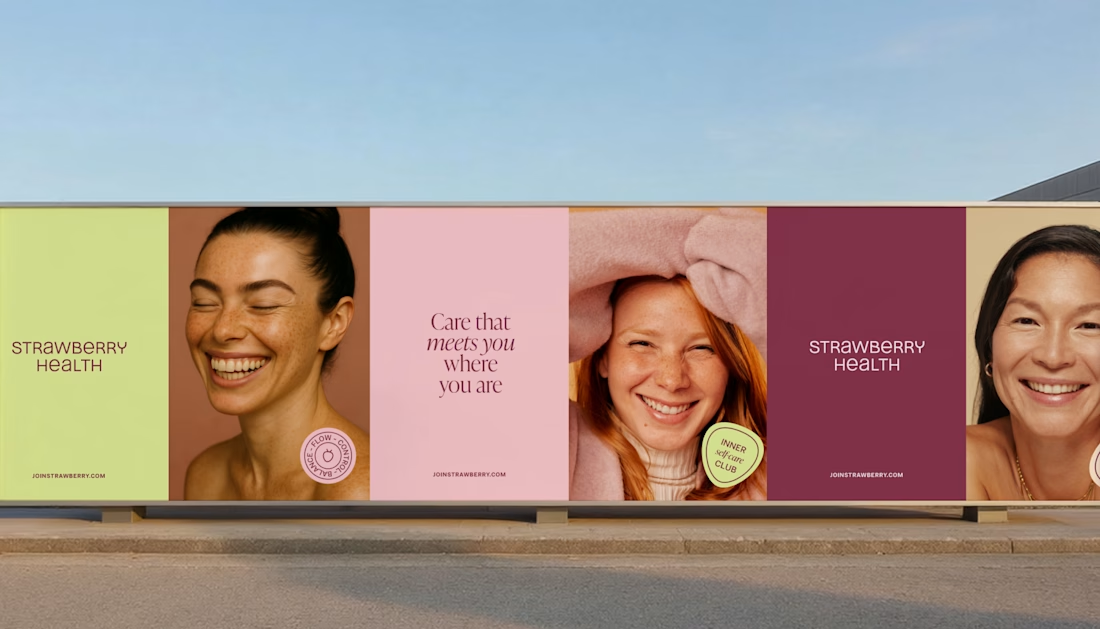
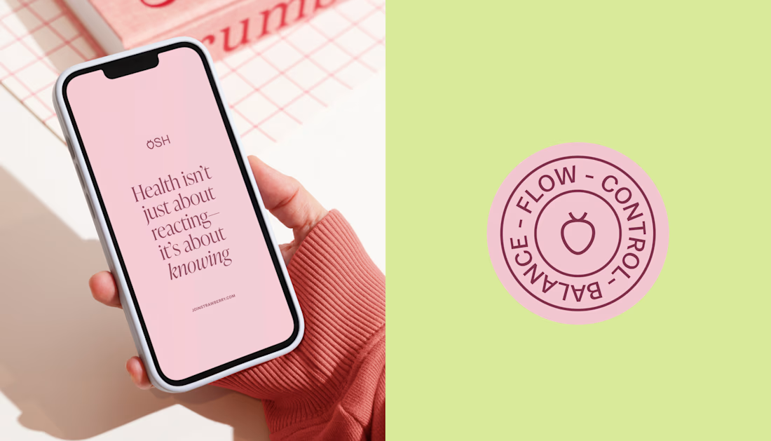

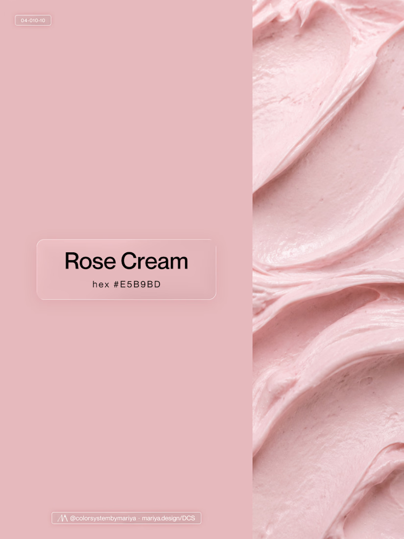
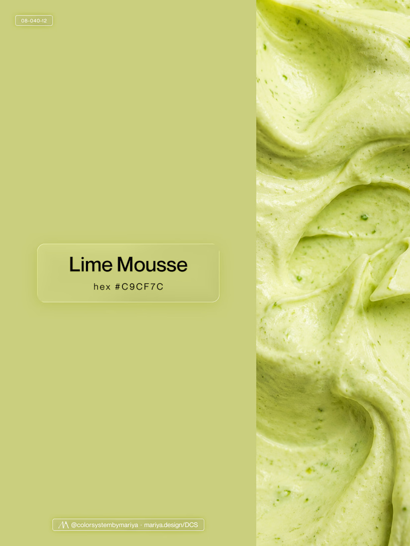
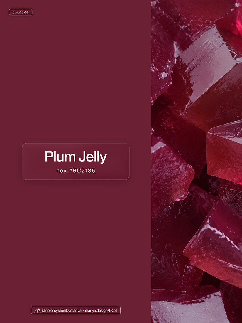
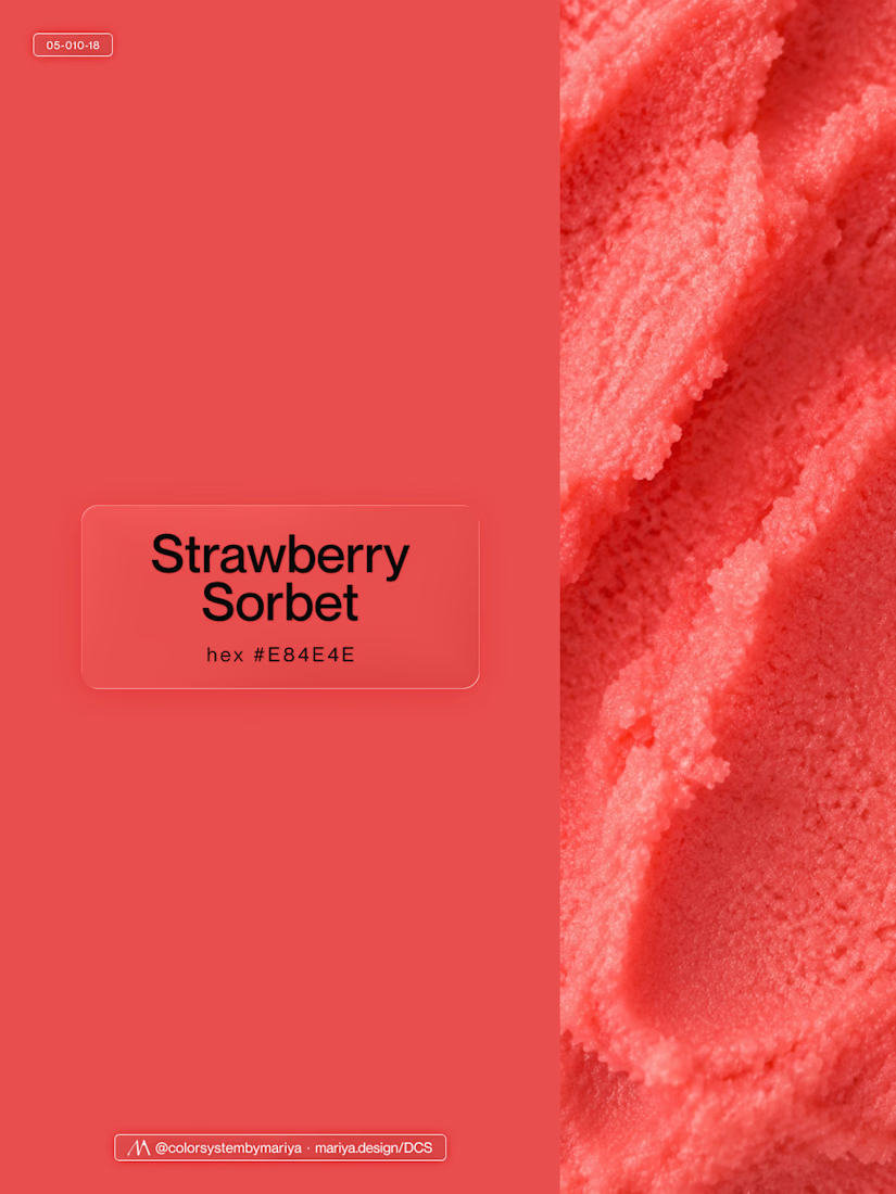
Love, love, love the colors. My mind goes: Rose Cream, Lime Mousse and Plum, hmmmm, which Plum... Plum Jelly. And of course, Strawberry Sorbet.
Let me match the vibe using my delicious swatches 😊

I’ve been working on a bold, modern-retro logotype and can’t decide between these two options.
🆘 Which one feels more aesthetically pleasing to you?

11 voted
26%
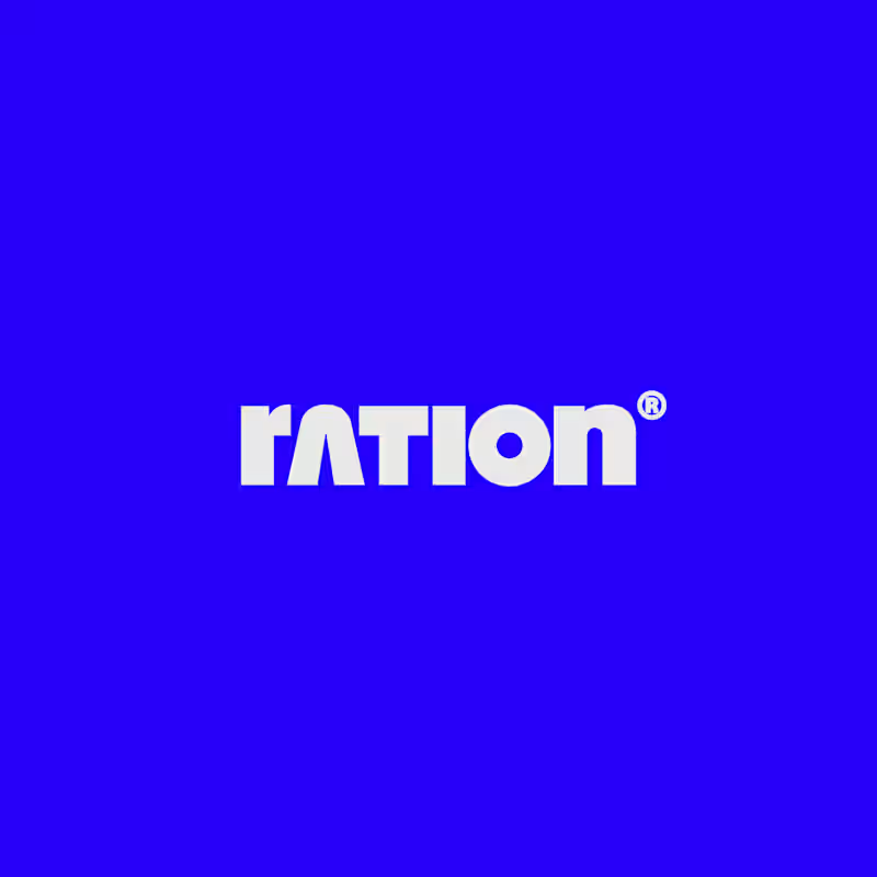
31 voted
74%
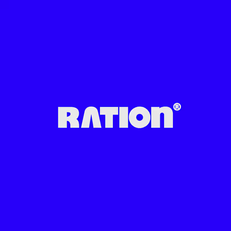
42 votes
Closed
CAPITAL is great but SMALL is unique great job Nawras 🔥🔥


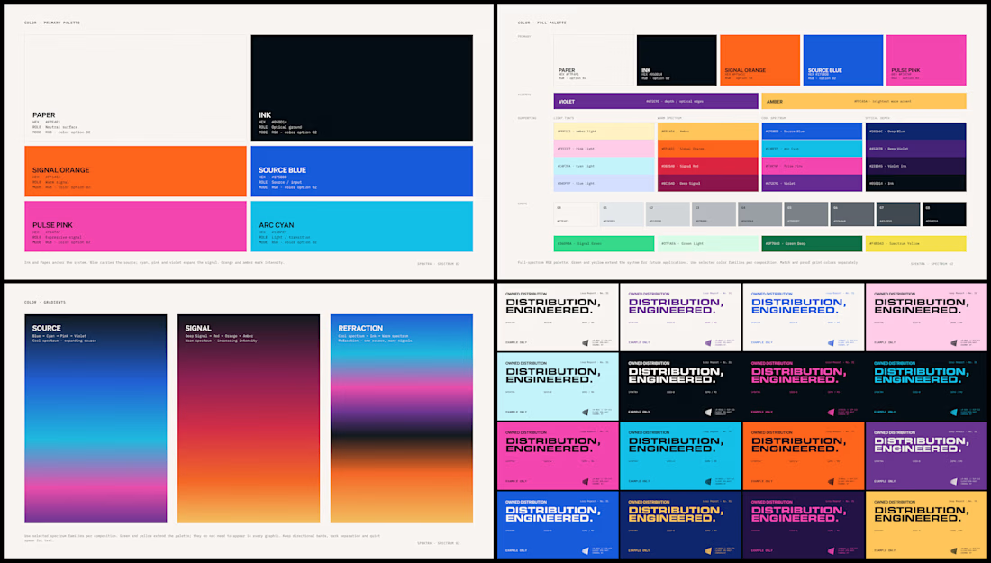
Spektra's founder had a practical question during the identity work: if the team needed green one day, would there be a green that belonged?
So I defined every color in the system, including green, with shades and pairings for each. When that day comes, the green is already there.