The network for creativity
Join 1.25M professional creatives like you
Connect with clients, get discovered, and run your business 100% commission-free
Creatives on Contra have earned over $150M and we are just getting started
Back to feedPost

How can branding make people feel part of a community?
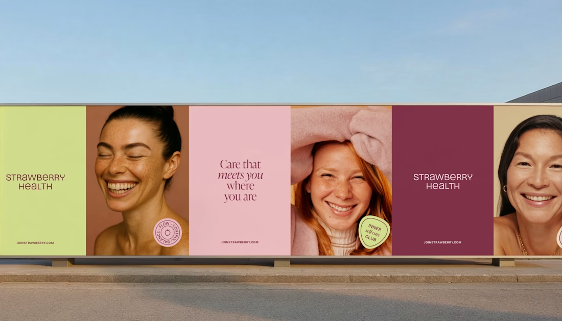
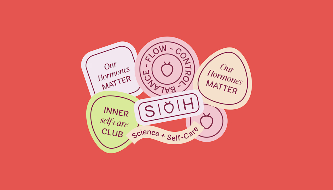
When working on Strawberry Health, we explored how visual identity could make women’s health feel more approachable and collective.
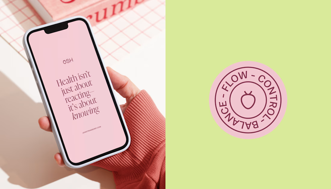
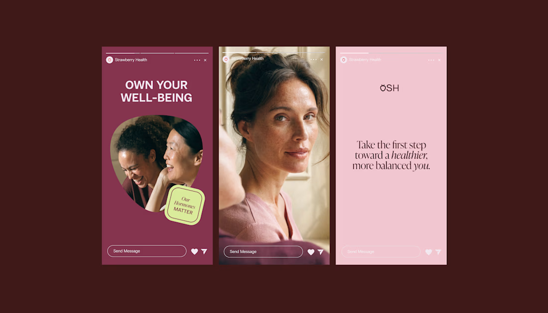
One of the ways was through supporting brand elements: stickers, badges and phrases that could live beyond the logo and become expressions of belonging.
These elements turned the identity into something people could interact with, share and make their own.
It’s a small detail, but I think it’s an important part of building brands around communities: the identity shouldn’t only identify the brand. It should give people something to identify with.

These stickers are so good!

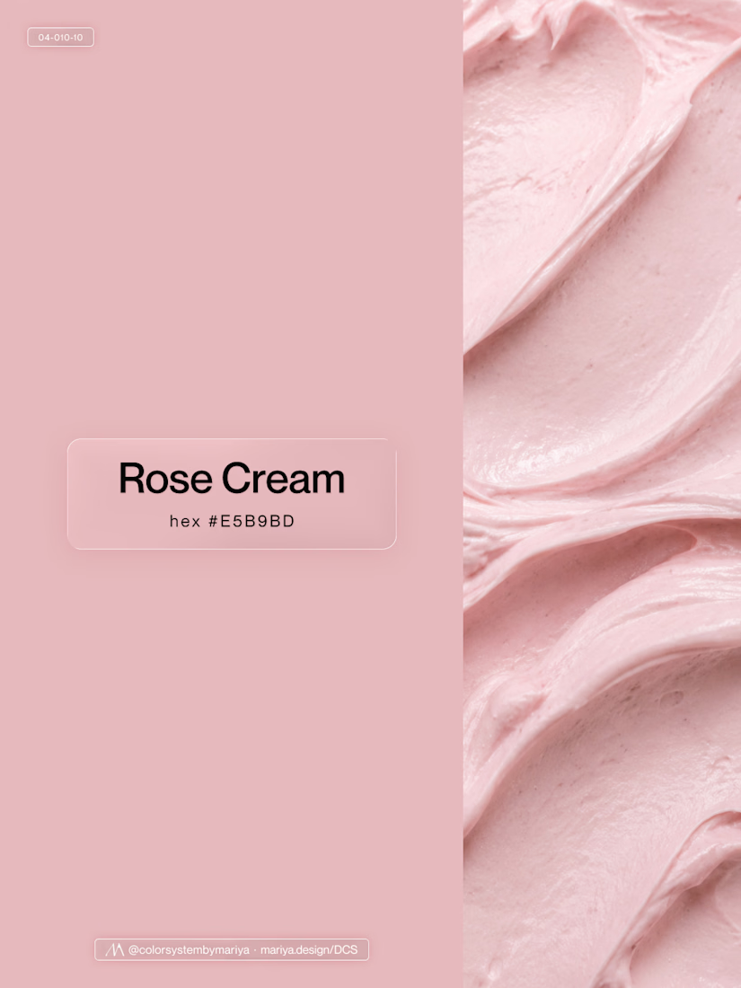
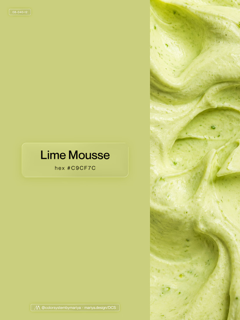
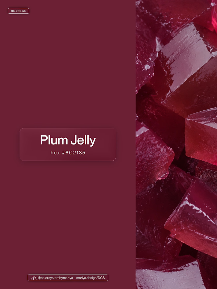
Love, love, love the colors. My mind goes: Rose Cream, Lime Mousse and Plum, hmmmm, which Plum... Plum Jelly. And of course, Strawberry Sorbet.
Let me match the vibe using my delicious swatches 😊


I love your attention to details Marita. So much to emulate.

Great work

Plum Jelly is stunning OMG 🔥

soooo cute!

Making the supporting pieces say something about the person using them rather than the brand is the part that usually gets skipped, and "Our hormones matter" on a sticker does exactly that. Would someone still put it on their laptop if the logo were removed? That feels like the real test.

omgg lovelyy love it so much😍
love the colorssss

Good design

The stickers are such a nice way to get people involved, they feel like something you'd actually want to share. Makes women's health feel a lot less clinical and more like a club.

Strong concept and thoughtful execution. The logo feels distinctive and communicates the brand identity clearly.


Those die-cut stickers in lime and coral feel like real badges people would wear 💚

Wondrfull
Amazing 👏

Looks gorgeous! Must be super difficult to make a community feel like home but I think you nailed it!

beautiful execution

That's really unique health brand design project the visuals design color palette it feels soft 🎉🎉
Great job Chantal ❤️

The stickers do a lot of work here. The Inner Glow Club badge sitting on the portrait reads like something a member would actually put on a laptop, which is a better loyalty test than any logo lockup. Did the client ship them as physical stickers or keep them digital?

Beautiful designs

love this. the stickers basically let people wear the brand instead of just looking at it. did any of the phrases come from the community itself or were they all written in house? letting users co-write a couple feels like it'd push the belonging thing even further

Love how the branding makes women’s health feel more welcoming and community-driven!

Beautiful branding! 💗 Love how the visual identity creates a sense of belonging while making women's health feel more approachable and inclusive. The stickers and badges are a lovely touch! 👏

Love the colors and community feel! 🍓

The stickers and badges are such a smart answer to your question. People don't join a logo, they join a phrase they'd happily put on their laptop. "Inner self-care club" does more community-building than any tagline could. Did any of the phrases come from real patients or the team?

Really warm brand system, nice work

Looking great.

Love this approach! A strong brand identity goes beyond visual consistency. It creates something people can connect with and feel part of. I think the same applies to websites, where thoughtful brand details and interactions can turn a functional experience into something more...

Love how you made women's health feel collective and approachable! The stickers and badges are such a smart community-building touch.

I like the idea. It's definitely impactful and complements the warm and welcoming feeling of the brand really well.

The pastel badge palette looks lovely. Did you test these phrases and badges directly with patients to see which ones they felt most connected to?

😍

The badge system and typography are just lovely. Really nice balance of science, care, and community vibe!
The network for creativity
Join 1.25M professional creatives like you
Connect with clients, get discovered, and run your business 100% commission-free
Creatives on Contra have earned over $150M and we are just getting started







Related posts

some visuals from iki, a matcha shop i’m currently working on 🍵
one of the most interesting parts of this project has been figuring out how to turn an abstract concept into something people can actually see and feel.
from the typography to the illustrations and overall visual language, every element is an opportunity to give the brand more personality and make it feel like its own world.
still exploring, but i’m really enjoying where this is going.
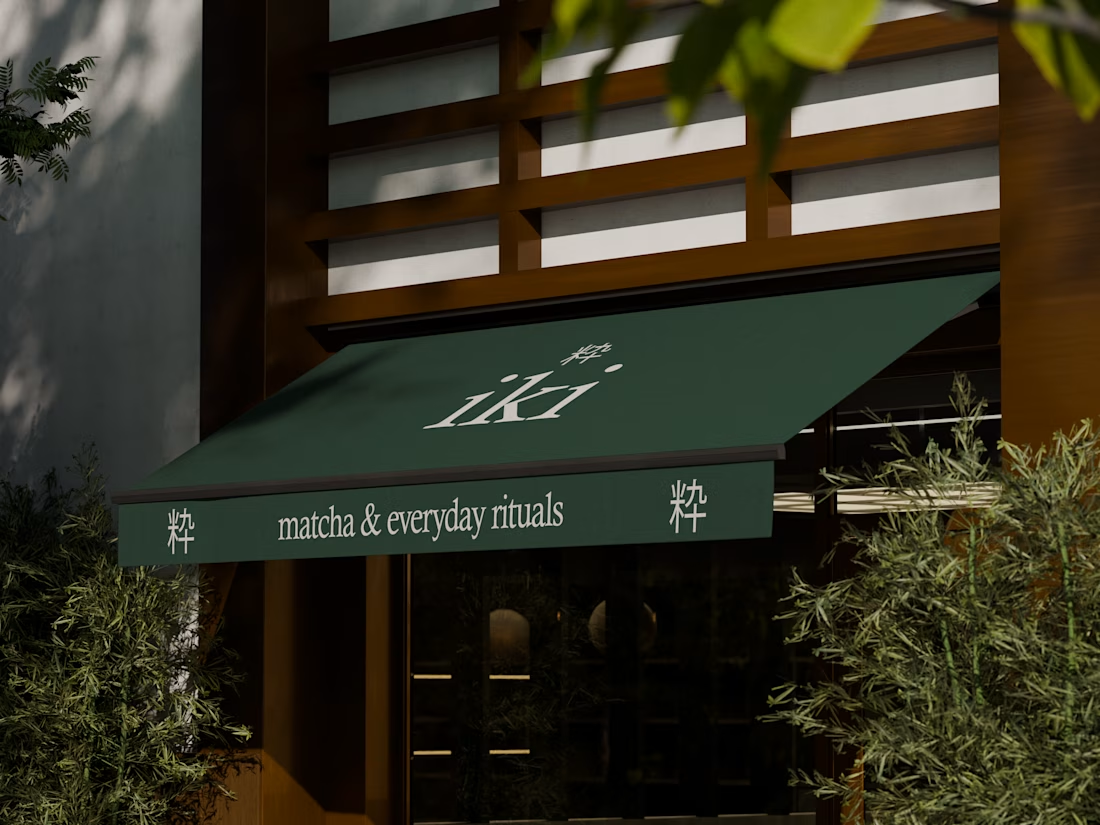
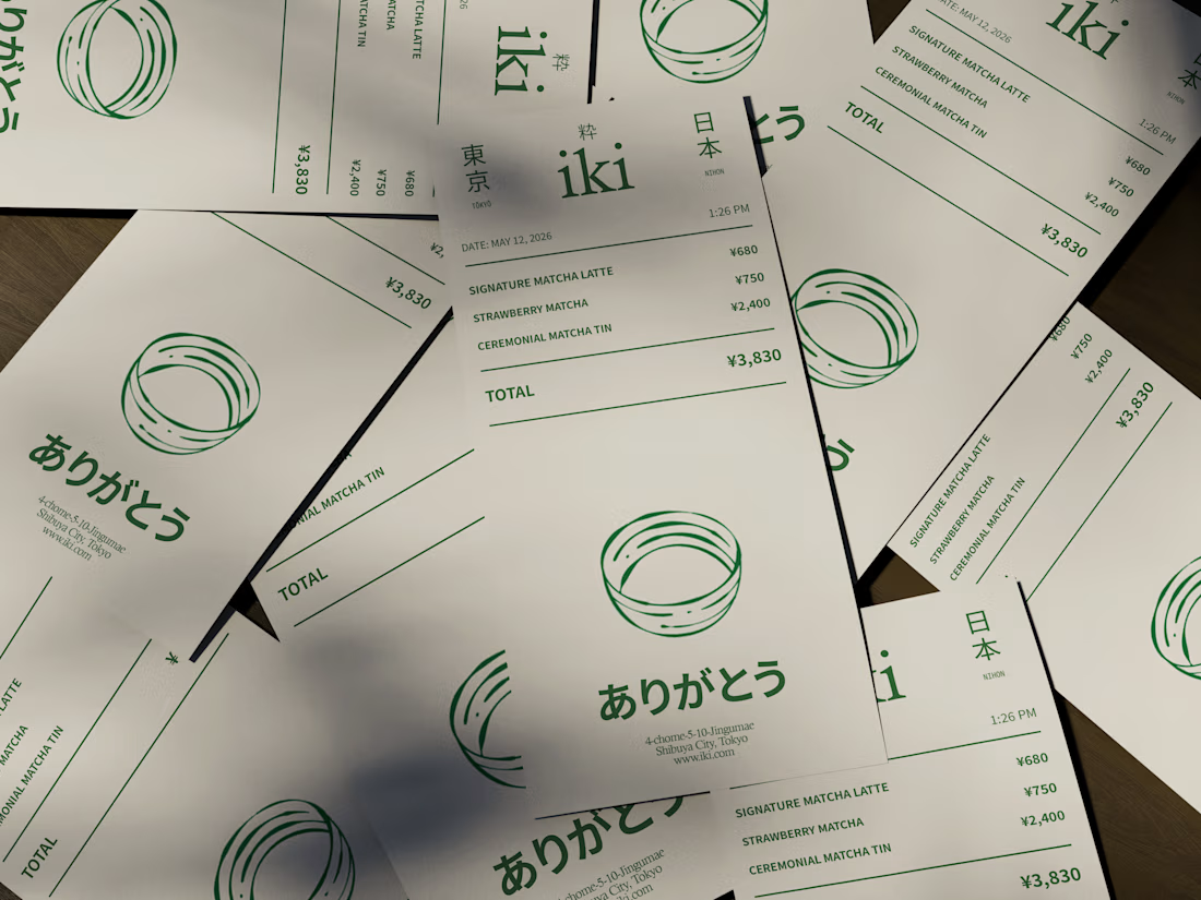
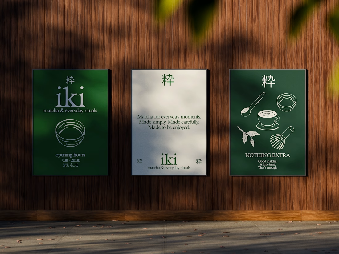
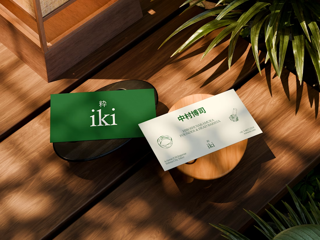


the illustration direction feels like it could take over the whole shop interior, not just the cups. thats usually where these projects fall apart

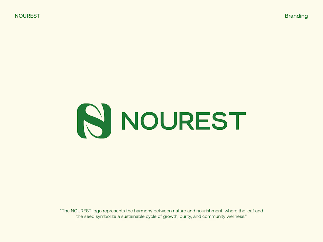
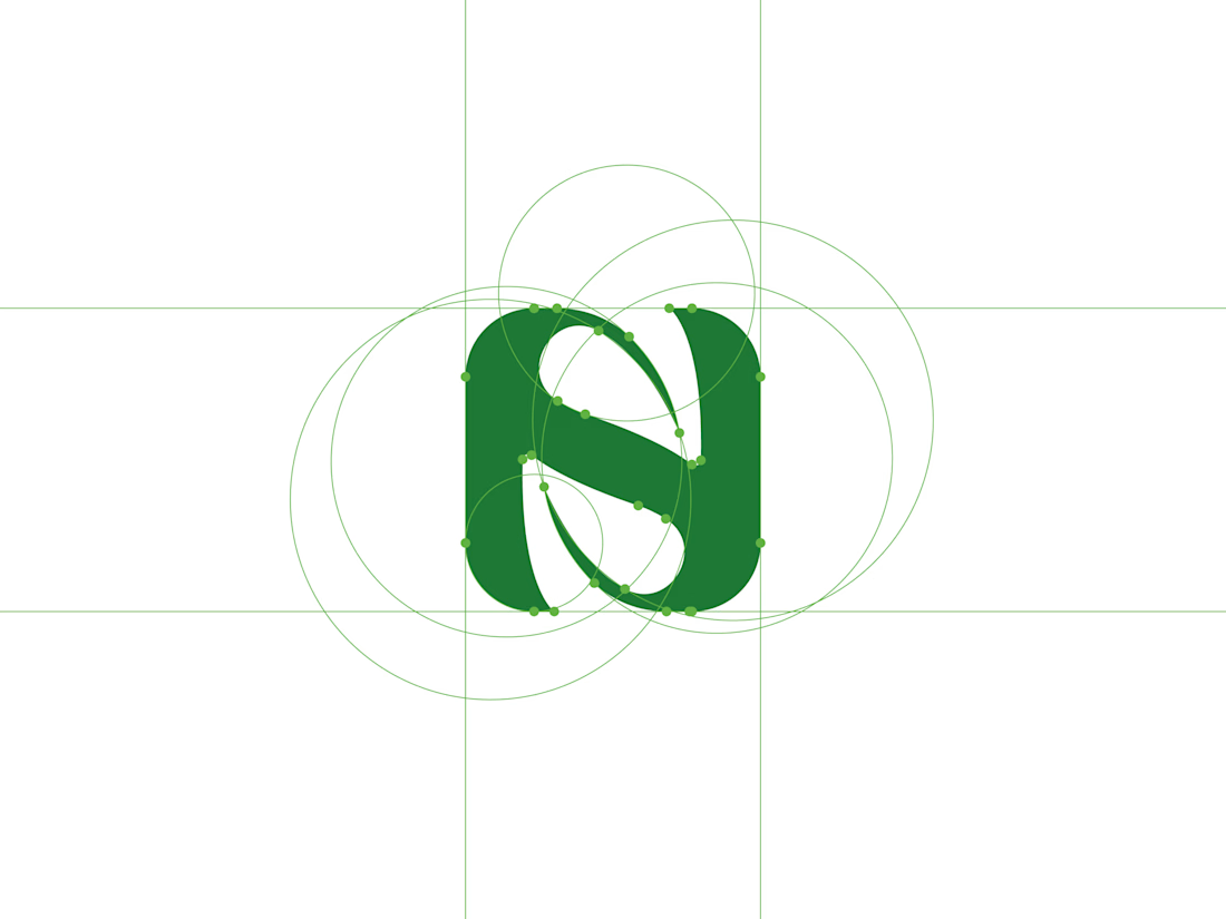
NOUREST — Nature-Led Brand Identity Design.
A brand about nature should feel natural at every touchpoint. 🌿
That's the idea behind NOUREST from its leaf-inspired monogram and green-led palette to packaging and brand materials.
One identity.
A consistent experience.
🏀 Full Design Showcase – Better View on Dribbble.
✅ https://dribbble.com/shots/27799268-NOUREST-Sustainable-Brand-Identity


Branding identity completed for Spotlesz in just few days!