The network for creativity
Join 1.25M professional creatives like you
Connect with clients, get discovered, and run your business 100% commission-free
Creatives on Contra have earned over $150M and we are just getting started
Back to feedPost
Taste Test

Working on a new project and can't decide which services section works better.
☀️ Light or 🌙 Dark?

59 voted
27%
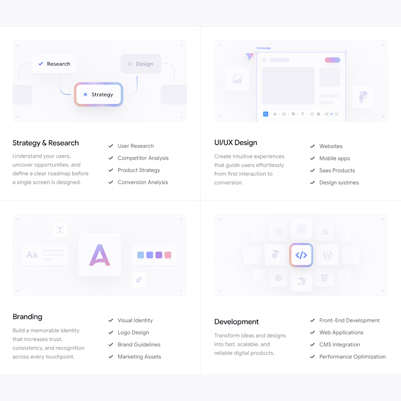
157 voted
73%
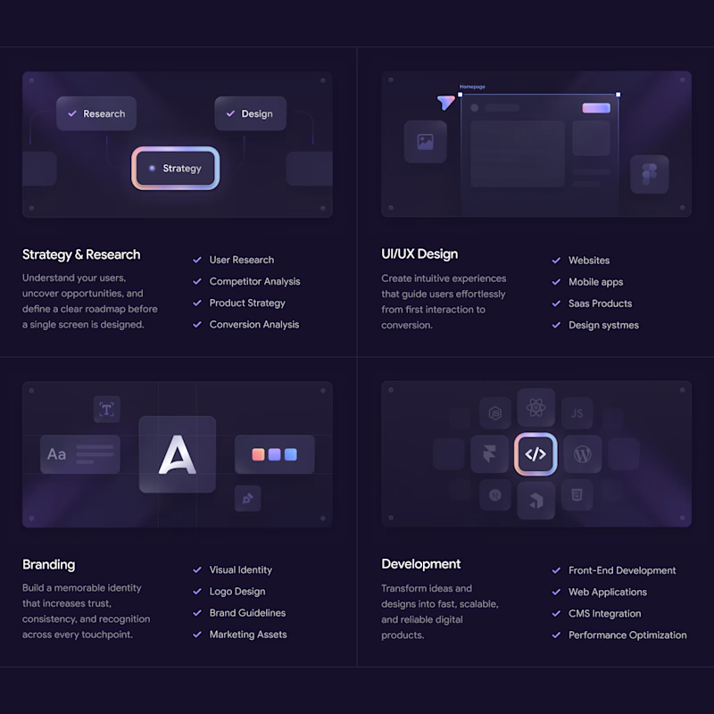
216 votes
Closed

The Dark section feels more responsive.

Dark section looking nice.

light always glow 😉

Am going for the dark theme

I will prefer dark option because in this option all the elements are visible and futuristic.

white one looks classy 😎

The Dark looks perfect 😊

Looking very clean! 🪞I struggled to decide what to focus on in the light version. But in the dark version my eyes moved smoothly from image, heading, list, and lastly text. UI/UX card didn't grab my attention though.


i will go for the dark section

The dark section draws my eyes more


I love the dark theme

nice work~

The dark theme feels much stronger. It creates a modern, futuristic vibe and improves the visual hierarchy, making it easier to see the cards. The images also stand out much better, while in the light version they tend to blend into the background and lose visibility.

Wow, they look so different in vibes:
Dark: elegant, luxury
Light: optimistic, clean

Let users decide

The dark one looks amazing!

Very polished design, great job 👌 (Both)


The Dark section looks much better in terms of readability.

Great job! I prefer the dark version, it looks more striking 🔥

In my opinion the light version is more attractive

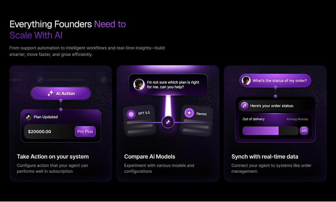
I am working on similar project and this is what i have done so far.


Awesome


dark design

The dark one is looking more modern and professional

Dark looks way better, but honestly I am always a little biased for dark mode.

Loved the dark one most here.

dark is more professional

Both sorry 😃
The network for creativity
Join 1.25M professional creatives like you
Connect with clients, get discovered, and run your business 100% commission-free
Creatives on Contra have earned over $150M and we are just getting started









Related posts

The team is cooking
Motion design for the logo we are making for Nation e-commerce


Wou

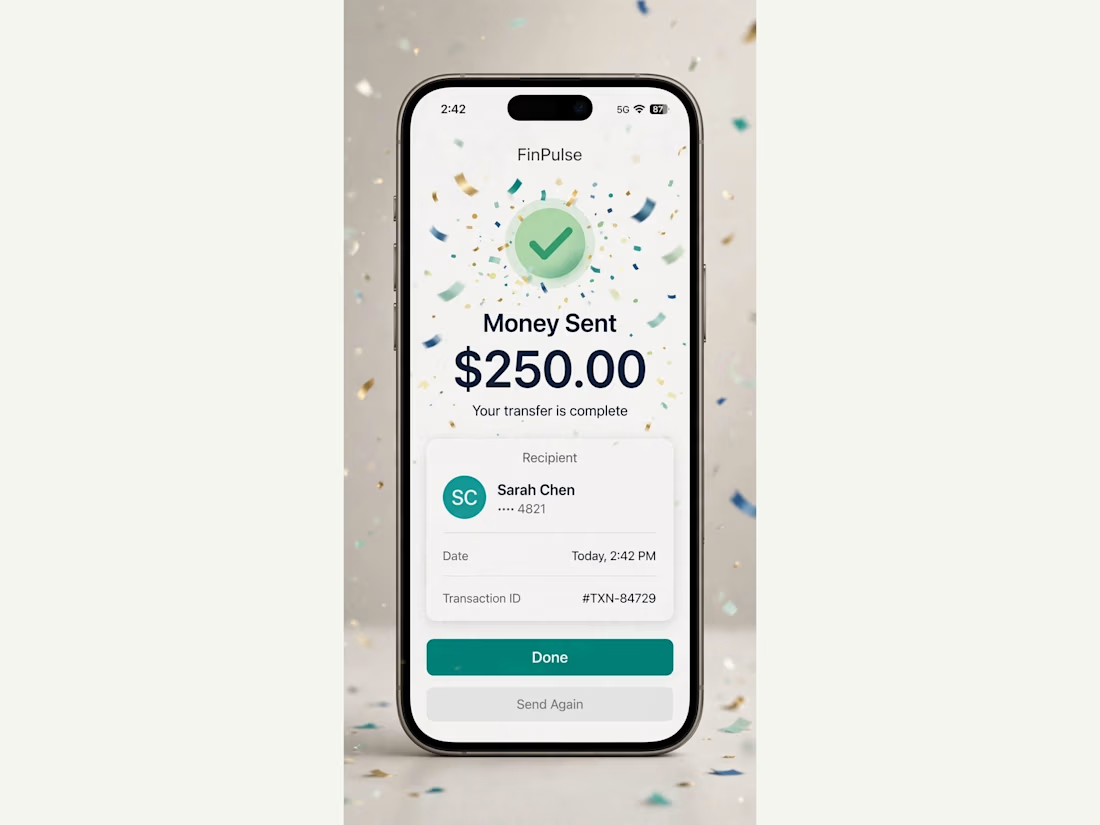
FinPulse — Premium Cross-Border Remittance App
Designed a trustworthy FinTech mobile app for global money transfers.
Process: Started with user flow & wireframes for 3-tap transfer, then built a scalable design system in Figma with 100+ components.
Outcome: Final UI focuses on clarity and trust — from onboarding to Home Dashboard ($12,450 balance), Send Money, and Money Sent success state. Built for conversion and speed.
Tools: Figma, iOS Design System, SF Pro
Tags: Mobile App, FinTech, UI/UX, Product Design


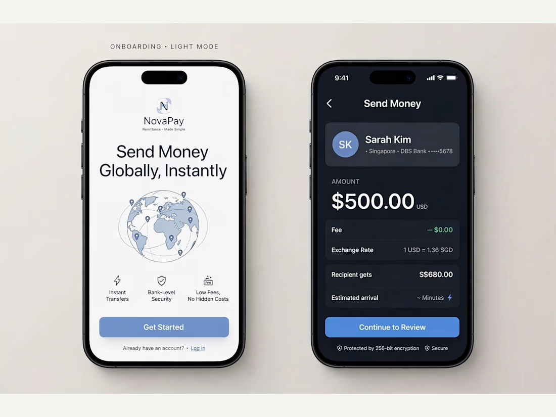
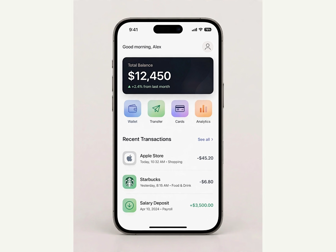
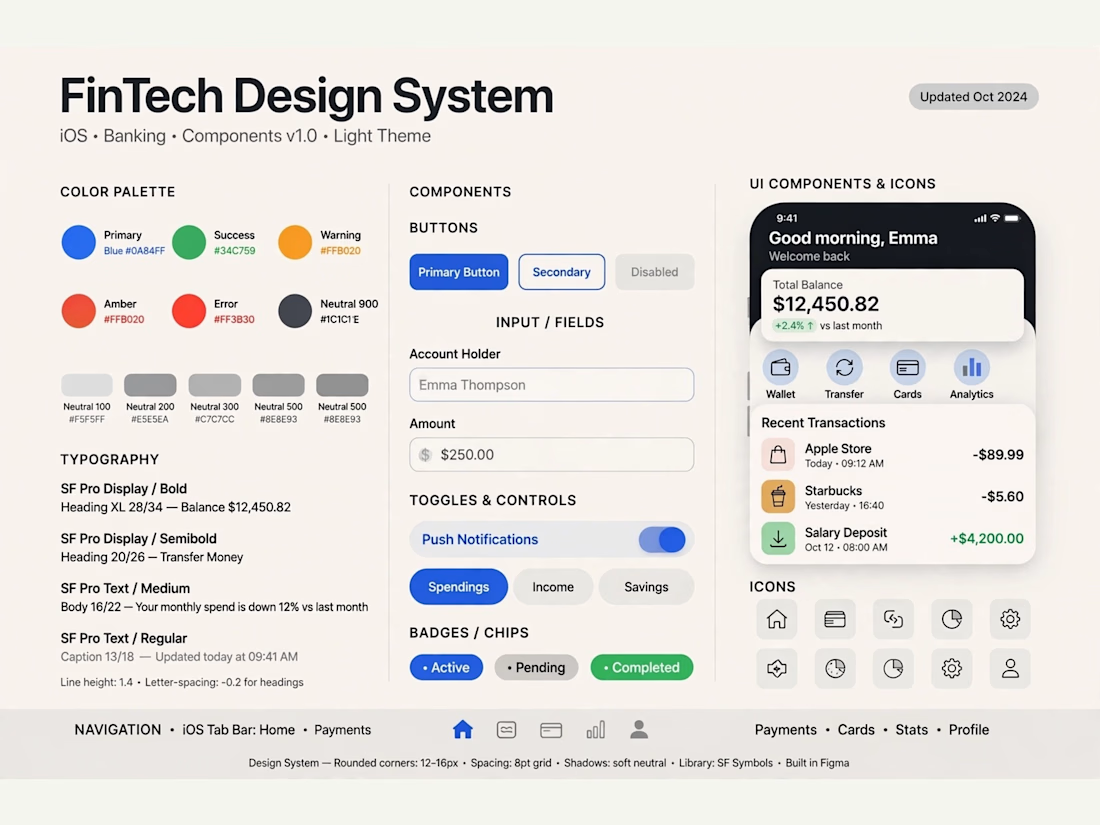

Really solid FinTech mobile design. Clean, trustworthy, and the user flow sounds well thought out. Great outcome on the final UI!

Poster Club turns a simple event template into your own print. I built two working Flutter versions and recorded the same editing flow in each.
Print Room: calm, editorial, with a mounted canvas and bottom tools.
Cutout Playground: bold, playful, with loose prints and tools at the edge.
Which one would you rather use?
What made the difference?
Grab it for free:
https://contra.com/products/cUHBysMu-poster-club-free-flutter-ab-ui-kit


37 voted
60%
25 voted
40%
62 votes
Closed

Print Room looks great!!